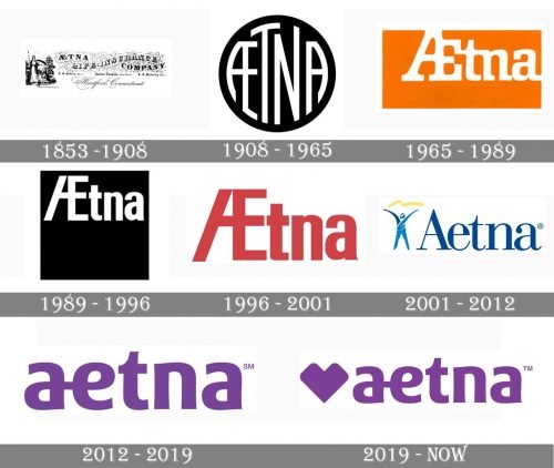
Aetna is a healthcare services provider, which was established in 1853 in the United States. The company offers various health insurance programs and packages and operates all over the country, having more than 50 thousand employees and partnering with millions of health-care specialists nationwide.
Meaning and history
The visual identity of the American insurance company has a long history. Its current logo is based on the concept, created in the middle of the nineteenth century, but has a modern and recognizable look, reflecting professionalism and creativity.
Today, Aetna is a key player in the American healthcare system, which provides health insurance to millions of individuals and families. However, the history of the company began in the middle of the 19th century. Aetna is one of the oldest and most influential health insurance companies in the United States, which was founded in 1853 in Hartford, Connecticut, initially as Aetna Life Insurance Company.
(By the way, the famous insurance company’s name was inspired by Mount Etna, the famous active volcano in Italy, symbolizing strength and stability.)
Already by the late 19th century, Aetna had established itself as a major player in the insurance market. The company started by providing medical coverage and later began offering accident and liability coverage, diversifying its portfolio further.
Aetna made a significant transition in the 20th century, adapting to the sweeping changes in the healthcare landscape. During the 1930s, it expanded into group health insurance to meet the growing demand for employer-provided benefits, which became more common during the Great Depression and World War II.
The 21st century brought further evolution. Aetna began emphasizing healthcare technology and wellness programs, seeking to reduce costs by improving patient health outcomes. In 2018, Aetna was acquired by CVS Health for $69 billion, creating a healthcare giant that integrated health insurance with pharmacy and retail health services.
The visual identity of the American insurance company has a long history. Its current logo is based on the concept, created in the middle of the nineteenth century, but has a modern and recognizable look, reflecting professionalism and creativity.
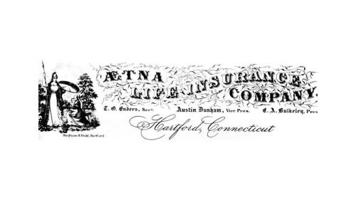
1853 — 1908
The first logo of the company was an elegant monochrome insignia, consisting of an emblem with a lady warrior and a sophisticated serif inscription, placed on its right. There were three different additional symbols, created during this period, all of them were rounded and had an ornate “ALI” monogram inside, standing for “Aetna Life Insurance Co”.
The first two letters of the “Aetna” were connected, so “A” and “E” shares one vertical bar, which became a symbol of the company, staying with it until today.
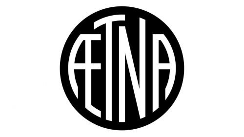
1908 — 1965
In 1908 the logo was redesigned in a modern and strong way. The white bold inscription in a geometric sans-serif with flat cuts and arched lines of the letters was placed inside a solid black circle, repeating its contour. The elongated letters looked stylish and made the logo instantly recognizable. The monochrome palette in this interpretation showed the company as professional and progressive.
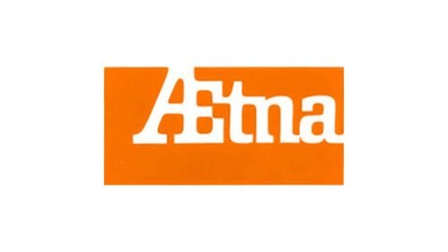
1965 — 1989
The color first appeared on the company’s logo in 1965. Now it was a bright orange rectangle with a white inscription on it. The palette reflected energy and dynamic, of a constantly growing company, which values the health and well-being of its customers above all. The white inscription was executed in a bold serif typeface with signature “AE” connected.
1989 — 1996
The redesign of 1989 brought back the monochrome palette, making the logo more contemporary and powerful. The inscription was also changed. Now the letters were written in a custom sans-serif font with distinct strict lines and edges. Two capital letters, “A” and “E” were connected, while the three “tna” in the lowercase were placed close to each other, but still had some space between them.
1996 — 2001
In 1996 the logotype gained a new color — now the inscription was executed in a calm red and placed on a white background. As for the typeface, it was also slightly modified — the letters became stronger and more masculine, the lower part of “T” was elongated and flattened.
2001 — 2012
In 2001 the company creates a logo, where the first two letters are disconnected. That was the first time in the 150 years history of the insurer. The inscription in blue was written in a delicate serif typeface and placed on a white background. There was a blue and yellow emblem on its left, depicting a figure of a man with his hands up and a yellow curved line above them.
2012 — 2019
In 2012 the company’s logo was redesigned by Siegel+Gale bureau. The emblem was gone and the wordmark was dramatically changed. Now the inscription in the lowercase is executed in a sleek and modern sans-serif, with letters “A” and “E” having a space between them, but still connected with a thin line, coming out on the middle of the “A” and finishing at the horizontal bar of “E”.
2019 — Today
The company was acquired by CVS Health Corporation in 2019 and the logo was redesigned according to their standards. The geometrically stylized heart emblem was added on the left of the logotype, the inscription hasn’t changed. As for the colors, the company uses a big color palette, but the most common one is purple, a symbol of balance, harmony, and creativity.
Font and color
The custom elegant sans-serif typeface, Aetna logotype is written in, has several unique details in it, including the smoothly connected first two letters of the inscription and the sleek upper part of the letter “T”. The font is based on one of the traditional typefaces, such as FF Signa around Pro Condensed or eSpectrum Extra Bold, but due to the use of smooth soft lines, it looks special and sophisticated.
The intense and luxurious purple color of the Aetna logo is a representation of the creative and progressive approach of the company, its friendliness, and responsibility. This shade of purple also evokes a sense of calmness, tranquility, and trustworthiness, making the customers rely on the brand and be confident in it.


