I recently came across a couple of websites using ink bleeds as transition effects. A great example is the Sevenhills website. At first I thought they were using a HTML canvas powered technique (for allowing transparency), then I checked the source code and found out they weren’t using a video, but a PNG image sprite.
By using a PNG sprite and the steps() timing function in CSS, we can create video effects and use them as transitions! In our resource, we used this technique to fire a modal window, but you can use it to transition between two different pages as well.
The process to create these effects is simple, let me break it down for you:
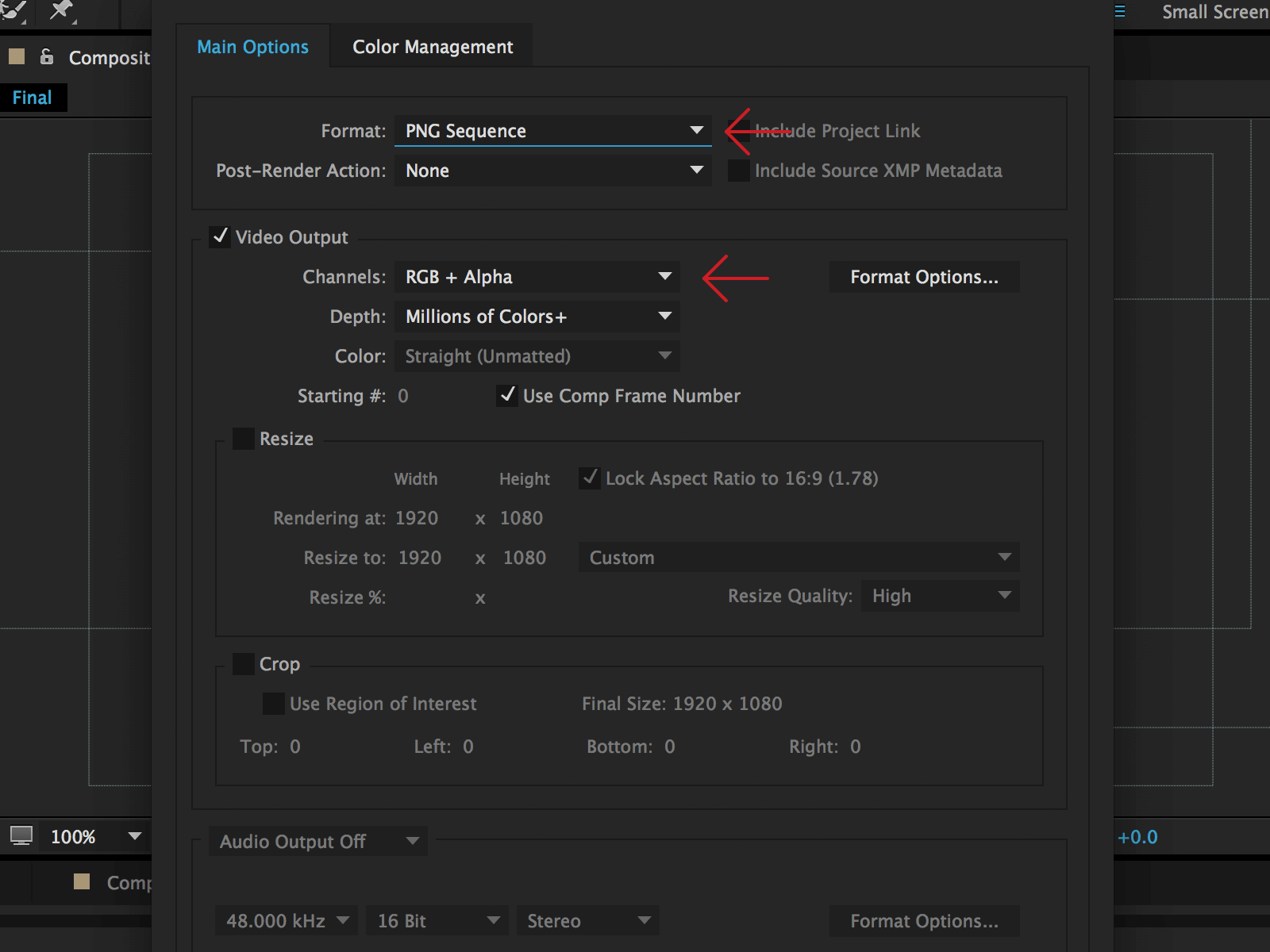
First, you need a video with a filling effect and a transparent area. Then you need to export this video as a PNG sequence. We used After Effects to export the sequence (make sure to export the alpha channel as well).

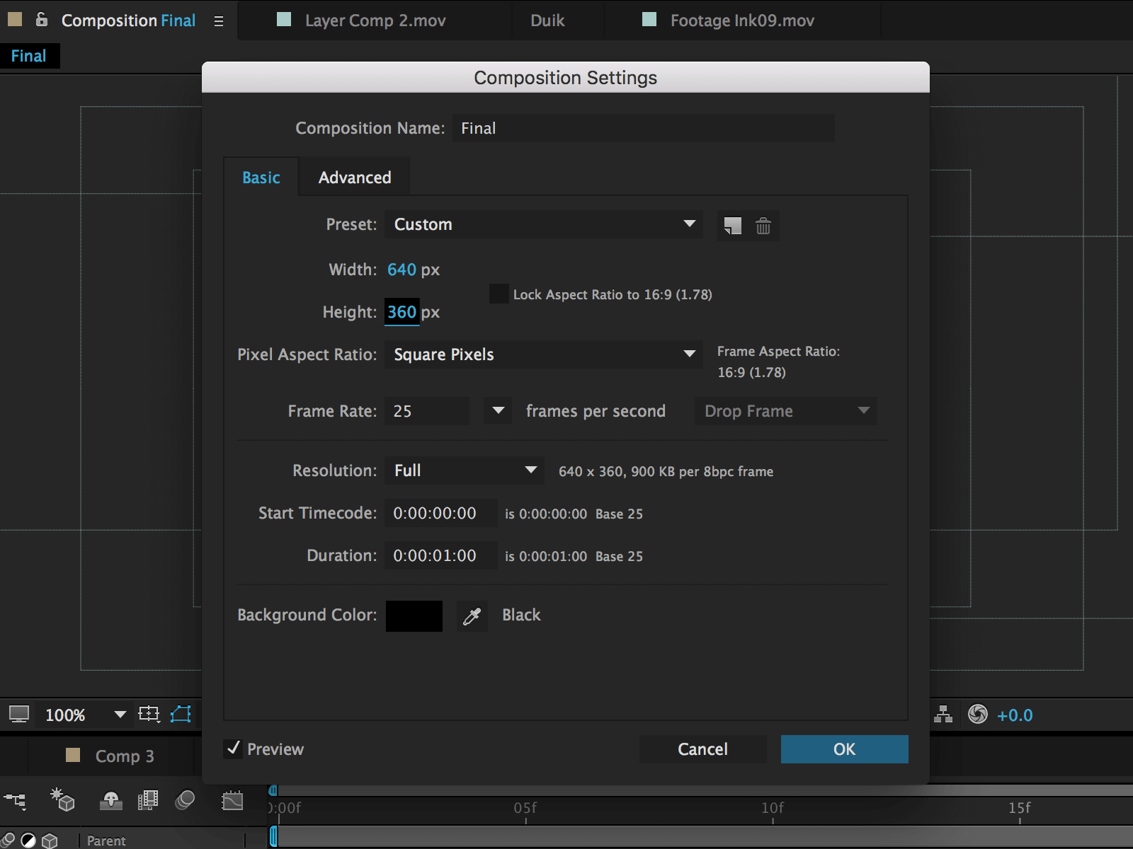
Since our video is composed of 25 frames, the assets exported are 25 PNG images. Just to give you more info about the composition settings, we created a 640x360px video with a duration of 1 second and a frame rate equal to 25.

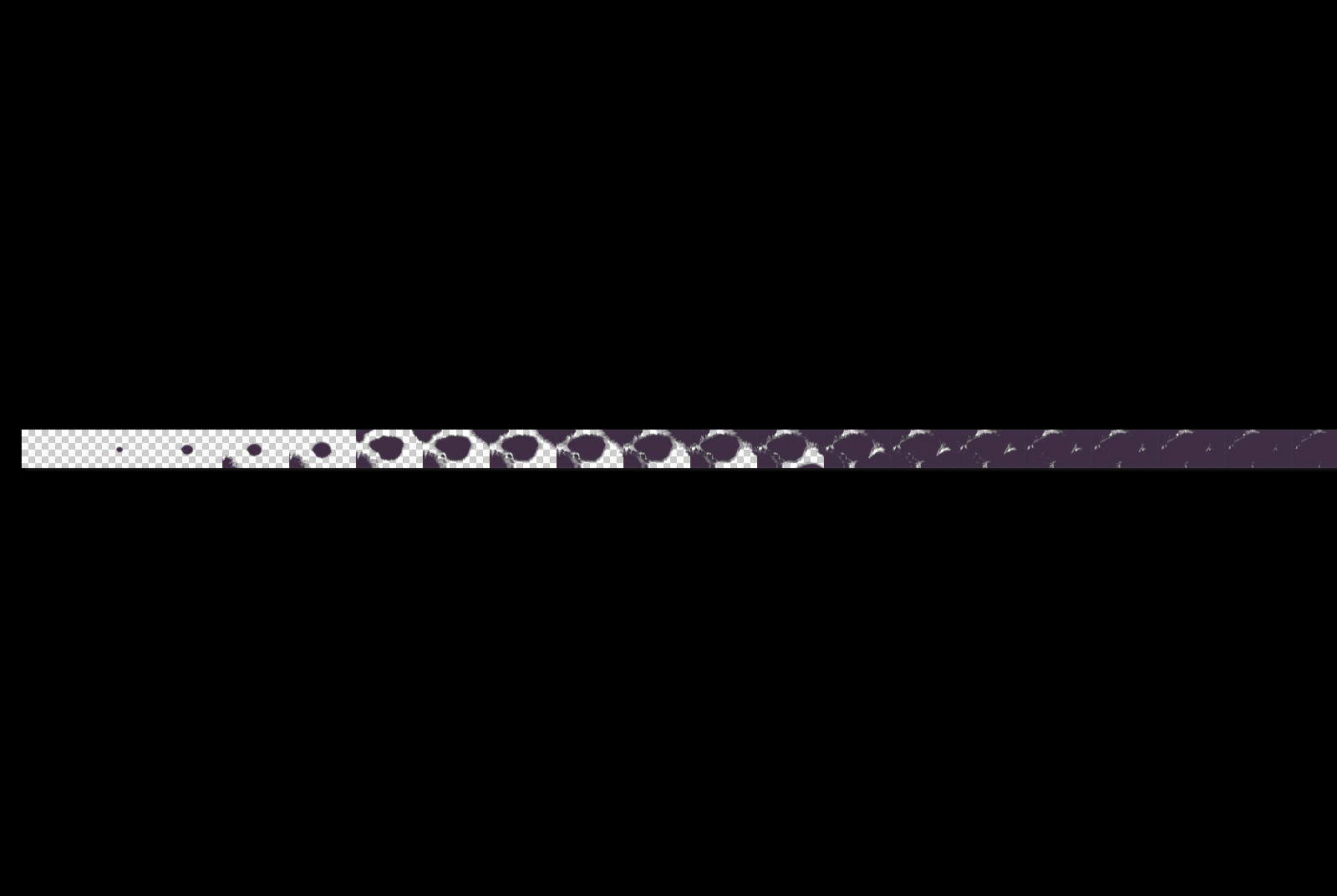
Finally the tedious part: you need to create the PNG sprite, by creating a new image that includes all frames on the same row. We did this manually using Photoshop, and combined all frames into a single 16000x360 pixels image.

In order to turn the sequence into a video, we just need to translate the PNG sprite, and use the steps() function to define the number of frames.
Now let’s jump into the code!
Creating the structure
The HTML structure is composed of 3 main elements: a main.cd-main-content for the page main content, a div.cd-modal for the modal window and a div.cd-transition-layer for the transition layer.
<main class="cd-main-content">
   <div class="center">
      <h1>Ink Transition Effect</h1>
      <a href="#0" class="cd-btn cd-modal-trigger">Start Effect</a>
   </div>
</main> <!-- .cd-main-content -->

<div class="cd-modal">
   <div class="modal-content">
      <h1>My Modal Content</h1>

      <p>
         Lorem ipsum dolor sit amet, consectetur adipisicing elit.
         Ad modi repellendus, optio eveniet eligendi molestiae?
         Fugiat, temporibus!
      </p>
   </div> <!-- .modal-content -->

   <a href="#0" class="modal-close">Close</a>
</div> <!-- .cd-modal -->

<div class="cd-transition-layer">
   <div class="bg-layer"></div>
</div> <!-- .cd-transition-layer -->
Adding style
The .cd-modal window has, initially, visibility: hidden, height: 100% and width: 100% and is in fixed position.
When a user clicks the a.cd-modal-trigger, the visibility of the modal window is changed to visible and its opacity to 1 (using the .visible class).
.cd-modal {
  position: fixed;
  top: 0;
  left: 0;
  z-index: 3;
  height: 100%;
  width: 100%;
  opacity: 0;
  visibility: hidden;
}
.cd-modal.visible {
  opacity: 1;
  visibility: visible;
}
The div.cd-transition-layer element is used to create the transition ink effect: it has visibility: hidden, height: 100% and width: 100% and is in fixed position.
.cd-transition-layer {
  position: fixed;
  top: 0;
  left: 0;
  z-index: 2;
  height: 100%;
  width: 100%;
  opacity: 0;
  visibility: hidden;
  overflow: hidden;
}
Its child element div.bg-layer has the ink.png sprite as background-image, a background-size: 100%, height: 100% and width: 2500% (the ink.png sprite is composed of 25 frames); its left/top/translate values are set so that, initially, the first frame of the ink.png sprite is centered inside the div.cd-transition-layer:
.cd-transition-layer .bg-layer {
  position: absolute;
  left: 50%;
  top: 50%;
  transform: translateY(-50%) translateX(-2%);
  height: 100%;
  /* our sprite is composed of 25 frames */
  width: 2500%;
  background: url(../img/ink.png) no-repeat 0 0;
  background-size: 100% 100%;
}
Note: to center an element inside its parent, you would use:
position: absolute;
left: 50%;
top: 50%;
transform: translateY(-50%) translateX(-50%);
In our case, though, we want to center the first frame of the ink.png sprite, and since div.bg-layer width is 25 times the one of its parent, we use a translateX(-(50/25)%).
To create the ink animation, we change the translate value of the div.bg-layer; we defined the cd-sequence keyframes rule:
@keyframes cd-sequence {
  0% {
    transform: translateY(-50%) translateX(-2%);
  }
  100% {
    transform: translateY(-50%) translateX(-98%);
  }
}
This way, at the end of the animation, the last frame of the ink.png sprite is centered inside the div.cd-transition-layer element.
Note: since we have 25 frames, to show the last one you need to translate the .bg-layer of -100% * (25 - 1) = -96%; but then, to center it inside its parent, you need to add the additional -2%.
When a user clicks the a.cd-modal-trigger, the .visible class is added to the .cd-transition-layer to show it, while the .opening class is used to trigger the ink animation:
.cd-transition-layer.visible {
  opacity: 1;
  visibility: visible;
}
.cd-transition-layer.opening .bg-layer {
  animation: cd-sprite 0.8s steps(24);
  animation-fill-mode: forwards;
}
Note that we used the steps() function: that's because we don't want the translate value to change continuously, but rather change through fixed steps, in order to show one frame at a time; the number of steps used is equal to our frames less one.
Events handling
We used jQuery to add/remove classes when user clicks the a.cd-modal-trigger or .modal-close to open/close the modal window.
Besides, we change the .bg-layer dimensions in order not to modify the png frames aspect ratio. In the style.css file, we set .bg-layer height and width so that each frame has height and width equal to the ones of the viewport. Viewport and frames could have a different aspect ratio though and that could distort the single frame. The setLayerDimensions() function has been used to prevent this from happening:
var frameProportion = 1.78, //png frame aspect ratio
    frames = 25, //number of png frames
    resize = false;

//set transitionBackground dimentions
setLayerDimensions();
$(window).on('resize', function(){
   if( !resize ) {
      resize = true;
      (!window.requestAnimationFrame) ? setTimeout(setLayerDimensions, 300) : window.requestAnimationFrame(setLayerDimensions);
   }
});

function setLayerDimensions() {
   var windowWidth = $(window).width(),
       windowHeight = $(window).height(),
       layerHeight, layerWidth;

   if( windowWidth/windowHeight > frameProportion ) {
      layerWidth = windowWidth;
      layerHeight = layerWidth/frameProportion;
   } else {
      layerHeight = windowHeight;
      layerWidth = layerHeight*frameProportion;
   }

   transitionBackground.css({
      'width': layerWidth*frames+'px',
      'height': layerHeight+'px',
   });

   resize = false;
}

