T H E J O U R N E Y. . .
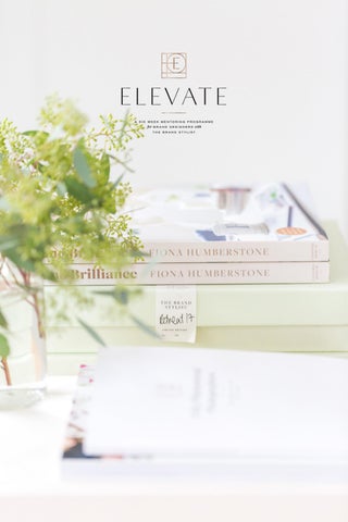
ELEVATE
a six week mentoring programme for brand designers committed to excellence
3
4
THE STORY
six weeks to elevate Just a few short months ago, an intrepid collective of brand designers and I began a journey that would ultimately culminate in the work you see here today. The premise was simple. Six weeks, a selection of nine visionary and inspirational design briefs which would culminate in three stellar portfolio pieces for each participant. Two weeks for each project, with two rounds of feedback from me alongside carefully chosen content that would elevate their process, boost their creativity and enable them to produce more intentional, beautifully crafted work. The results have been astonishing. This is the first time I’ve run one of these courses and I honestly didn’t know what to expect. I certainly never, in my wildest imagination, could have predicted the outcome you see here. These designers have made incredible progress. The impact this programme has had, on their quality of work, their confidence, creativity and vision in just seven short weeks has been an incredible transformation and thoroughly energising. These designers have demonstrated commitment, resilience, creativity and the capacity to elevate. They have worked fast (this is not an invitation to ask them to do the same!) and consistently produced this work alongside their own work and business commitments as well as life. It’s been intense, challenging and thoroughly rewarding. The designers have needed to dig deep, to draw on their inner resources and respond to my often exacting critique with perspective and professionalism. The results though, speak for themselves, with hugely boosted levels of confidence, more polished, professional, creative and intentional design and a sense of clarity for the future. Each has brought with them a unique level of skill and experience and they finish this class at different levels. There was no prerequisite level for joining and no ‘pass mark’ at the end. Instead, the focus has been on elevating their own work and moving their own unique creativity, vision and skill forwards. By showing up, producing the work and taking on board
5
They have worked fast (this is not an invitation to ask them to do the same!) and consistently produced this work alongside their own work and business commitments as well as life. It’s been intense, challenging and thoroughly rewarding. The designers have needed to dig deep, to draw on their inner resources and respond to my often exacting critique with perspective and professionalism. The results though, speak for themselves, with hugely boosted levels of confidence, more polished, professional, creative and intentional design and a sense of clarity for the future. Each has brought with them a unique level of skill and experience and they finish this class at different levels. There was no prerequisite level for joining and no ‘pass mark’ at the end. Instead, the focus has been on elevating their own work and moving their own unique creativity, vision and skill forwards. By showing up, producing the work and taking on board the feedback, these designers have achieved some incredible things and it’s important to celebrate that. So please, charge your glasses (or raise your mug, if it’s that time of day), I give to you, The Elevate Collective, Class of 2019. Do soak up the creative inspiration on their websites, show them some love on Instagram and put them under consideration for your next branding project. Warmest Fiona ps. If you’d like to join us next year, bookings open for the January intake this week at thebrand-stylist.com/elevate
6
7
‘I never imagined I’d have the confidence or ability to go in the direction I am headed - and that’s mostly down to you and your course. I’m so excited for where I’m planning to take my “new” business.’ G E M M A
8
A N D R E W S
PAGE + LOOKER
goosebumps and tears of joy! As those of you who have ever briefed a creative agency will know, reviewing design work is tough. It can be nerve-wracking (did they ‘get’ my brief ?), terrifying (are they going to be as good as I think they are?), anxiety-inducing (will the work they do for me be as good as they’ve done for everyone else?) and downright scary (will I like it? did I do the right thing taking them on?). Opening those first assignments was quite the emotional rollercoaster, and then I downloaded one project that brought tears (of joy) to my eyes and goosebumps to my arms. Pam Holmes, founder and creative director of Page + Looker blew my mind with her interpretation of the brand identity for Breen, a fictional boutique hotel, restaurant and spa on the majestic Geirangerfjord. Taking her inspiration from the famous seven sisters waterfall in the area, Pam really pushed the boundaries of creativity and crafted something utterly breathtaking. It wasn’t just her design skills that blew me away though, it was her sheer level of vision and inventiveness. Pam had thought of everything: from the art on the walls to the interior design to the dishes on the menu. Gorgeous. I’ve seen this level of vision, creativity and flair brought to every project she has worked on. A true joy and inspiration. PAGEANDLOOKER.COM
9
10
BREEN | © Page + Looker Ltd 2019
11
12
BREEN | © Page +13Looker Ltd 2019
14
Jasper Khatari | © Page +15Looker Ltd 2019
16
Jasper Khatari | © Page +17Looker Ltd 2019
18
19
The brand identity is ma which can be used alone, This allows great freedo also giving you cons 20
ade of several elements together or as variations. om for your brand whilst sistency and clarity. 21
Figline Valnardo | © Page+Looker 2019
22
‘I don’t want the course to end. It’s been so useful and I feel like I’ve found my natural style again.’ PA M E L A
H O L M E S ,
PA G E
+
L O O K E R
23
HALEY GRAND
beautiful hand lettering and illustrations Brooklyn-based Haley is a designer and hand-lettering artist whose vision and creative flair has really evolved throughout this programme and she’s produced some gorgeous work. This project for the fictional Italian retreat, Villa Figline Valdarno beautifully demonstrates how her passion for hand-crafting really enhances her work. I absolutely loved the logo and presentation Haley created for Verbena, her own invention of the on-site restaurant. That beautiful lettering, those swooshes! This was the project where Haley really built out her clarity and vision for the brand which really shows in the end result. Just beautiful! HALEYGRAND.COM
24
25
26
27
28
29
STRENGTH OF CHARACTER The history of the Embassy Theatre will be reflected throughout the Club’s brand identity. An example is the bar, named after one of the theatre’s founders, English stage and film actress Sybil Arundale.
30
31
32
T E X T U R E A N D T R E AT M E N T The use of luxurious and heavy linen-like texture and foil emboss reflects the brand’s substance, and should be used across papers and printed materials.
33
THE DESIGN
Restaurant Logo Verbena’s logo design resembles the vineyard vines, flowing grasses and flowers throughout the property.
34
35
36
‘All of this has left me eager to start rethinking my brand and positioning, so I’m excited to start exploring that as well.’ H A L E Y
G R A N D
37
38
39
TRANQUILO CREATIVE
gentle, simple, stylish I have loved being a part of Kay’s journey on this programme. Over the past six weeks, I’ve seen her style evolve into something that feels simple, stylish and very much of the now. Kay’s presentation game has been seriously transformed and her latest project, for the Italian retreat just goes to show the impact that her elevated process has had on her design. Kay chose to name the brand Villa Flores (a smart move, beautiful and much less wordy than Villa Figline Valdarno!) and has crafted a stunning brand identity. It feels elegant, elevated and contemporary and really shows what Kay is capable of. I cannot wait to see where she takes her work next. TRANQUILOCREATIVE.COM
40
LOGO PRESENTATION
12
41
LOGO PRESENTATION
15
42
BRAND IDENTITY PRESENTATION - PRIMARY LOGO
16
43
LOGO & BRAND DESIGN PRESENTATION
‘I’ve really loved working on the briefs Fiona came up with - they’ve been truly inspirational, and at times, challenging. Sometimes we need to be pushed out of our comfort zones. That’s where the magic happens.’ K AY
44
B E AT O N ,
T R A N Q U I L O
C R E AT I V E
14
LOGO & BRAND DESIGN PRESENTATION
15
45
LOGO & BRAND DESIGN PRESENTATION
20
46
47
LOGO & BRAND DESIGN PRESENTATION
18
48
LOGO & BRAND DESIGN PRESENTATION
19
49
DENTITY STYLING FOR VILLA FLORES - PRIMARY LOGO
50
51
BRAND IDENTITY STYLING FOR VILLA FLORES
24
52
53
MONIKA BURGER
dynamic, edgy, exciting! I first met Monika on my retreat in Mallorca back in 2017 and having seen her beautifully crafted and very consistent portfolio, thought I knew what to expect from her creatively. Her first project, for skincare line Jacinta was light, ethereal and beautiful, just as I’d hoped it might be. Then vision, creativity and flair took over and since project two, Monika’s work has gone in a whole new, elevated direction. This project for tailor and fashion designer Jasper Khatari felt utterly thrilling and thoroughly unexpected. She took the brief and she ran with it, giving our tailor some serious edge and flair along the way. Her third project for the dance school was equally directional (you’ll find that on the blog) and I know this is just the start of something very exciting. What Monika is now doing really sets her apart. She is producing dynamic, edgy, elevated work with a real sense of vision. It feels so authentic to her unique vision and I’m so excited to see how her business evolves over the next year or so as she really gets into her stride. Exciting things to come! EIMOTION.COM
54
55
56
PA C K A G E
recommended by
57
BRAND STYLEGUIDE
The Tailor
eim
DESIG
58
THE FOUNDATION
01. Your Business JASPER KHATARI
graduated from Central Saint Martins in 2012 with a first
class honours degree in fashion design and an eye for tailoring. So enthused was he by the art of pattern cutting that he went on to hone his skills with a two year apprenticeship on London’s Saville Row with Patrick Grant of Norton and Sons. His idol is Yves Saint Laurent. Jasper has been working as a freelance tailor and fashion designer for the past few years and is now ready to launch his eponymous label and bespoke tailoring service. Jasper is known for his flair for colour and pattern, with flashes of an intricately printed Liberty of London silk gracing a pocket or lining a blazer. Jasper designs for both men and women and is known for his well-structured, super flattering shapes. His style is simple, elegant and refined. His tailoring clients are wealthy, successful and style conscious. His is a timeless style designed to flatter rather than respond to the latest fads, so an investment in a J A S P E R
KHATARI
piece will stand the test of time for many
years to come.
motion
GN STUDIO
59
60
‘Oh this was aneimotion exciting week and I’m so pushed and fascinated about what I can possibly do. Can’t wait to style the next Masterpiece!’ DESIGN STUDIO
M O N I K A
B U R G E R ,
E I M O T I O N
61
62
63
64
65
RACHAEL ROSE
romantic, beautiful, elegant Rachael has produced some truly beautiful work throughout the programme and this project for the Italian retreat is, I think, her strongest yet. Handwriting fonts are seriously tricky beasts to pull off; often feeling too scruffy, too scatty or simply too sentimental. Quite often they will make the design look dated and downmarket and yet Rachael has pulled this off with bells on. Not only has Rachael sourced one with just the right level of energy, she has also integrated it with such care into the lettering above that it feels like a compelling and cohesive whole. The attention to detail in this project and the others I’ve shown is gorgeous, but it’s the clarity of vision that carries throughout the presentation that’s utterly compelling and thoroughly intentional. I couldn’t help but include a couple of Rachel’s projects. That mockup for Michelin-starred restaurant Samphire is gorgeous, isn’t it? RACHAELROSE.CO.UK
66
67
68
luxury redefined
69
70
71
72
73
option
STEFANO
PORT
RACHAEL ROSE / SAMPHIRE 74
ISSAC
n two
GUBBLEI
CORNWALL
75
76
77
78
79
‘It’s boosted my confidence and given me a high new level of motivation, determination and I have fallen in love with brand design all over again!’ R A C H A E L
80
R O S E
DESIGNED BY NESS
style and passion I’d first worked with Ness in a design capacity on my retreat this year when she used the time to work on her own brand identity. She blew me away with her innate sense of vision, style and passion for her work so I knew that we were starting from a great place. Ness is vivacious, warm and funny and brought passion and creativity to the projects she completed. I really loved the detail of the ‘e’ blending into the ‘r’ for this project for tailor Jasper Khatari. A simple colour palette with a measured punch of bold red adds energy and flair whilst retaining a refined and poised feel. DESIGNEDBYNESS.CO.UK
81
CHECK INTO YOUR:
82
welcome to place o
f mind | body | soul
83
MIND | BO
BREEN
USING THE BREEN LOGO ICON W LO G O TO C R E A
84
ODY | SOUL
N HOTEL
W E H AV E U S E D S E C T I O N S O F T H E AT E S U B B R A N D S
85
SOUL
BREEN
Guests have the opportunity to eat delicious, wholesome, modern food prepared by one of Norway’s hottest names in cuisine. Fresh fish, flavoursome vegetables and plenty of plant-based options will nourish the body and feed the soul. At BREEN food is to be enjoyed and deprivation is very much not on the menu.
C O LO U R PA L E T T E
86
L: FOOD
N HOTEL
87
THE
JASPER
USE O F W H ITE | LI N KI N G O F LE T TER I N G TO SH OW C A R E I N TH E T Y P O G R A
88
VISION
K H A TA R I
A P H Y | S T I T C H S Y M B O L T O H I N T AT TA I L O R I N G | T I M E L E S S S I M P L I C I T Y
89
LO
JASPER
SIMPLE YET STYLISH CARE
90
OGO
K H A TA R I
E F U L LY C R A F T E D L O G O
91
T H E FA S H I O N S H OW
J A S P E R K H A TA R I X
92
‘One of the hardest things I’ve done... It’s made me realise my creativity is my absolute pull.’ M Y E R S ,
D E S I G N E D
B Y
N E S S
D E S I G N E D BY N E S S
VA N E S S A
93
JULIA CARTWRIGHT
passionate, fearless, committed An experienced fashion designer with two decades brand building behind her, Julia was keen to bring robustness of process to her work before she launched her brand design business. I hope Julia won’t mind me sharing that of all the participants, she has been on the biggest learning curve of all. Julia has worked tirelessly throughout this programme, transforming her work and elevating her vision. She has consistently taken on board my feedback with grace and a staggering determination to succeed. As a result, her work has transformed over the past six weeks. This project for the Italian retreat is a fantastic example of just how hard Julia has worked throughout this process. Not content with shoring up her sense of clarity or creating a powerful vision, Julia also chose to teach herself to use Illustrator over this past fortnight! The gate is hand drawn and the thought process behind it really relevant. Julia may be at the start of her journey as a brand stylist but if her track record is anything to go by, she will continue to grow and develop her skills at an incredible pace. I’m truly excited to see what’s next for her. JULIACARTWRIGHT.COM
94
BREEN Mood
H OT E L
The rooms are large and light, decorated with accents of the beautiful deep Fjoord blue together with touches of the warm muted yellow, creates an intimate, relaxing and luxurious feel.
95
BREEN HOTEL
|
GEIRANGERFORD
|
NORWAY
ABCDEFG IJKLMN OPQRSTUVWXYZ
CINZEL DECORATIVE REGULAR
ABCDEFG IJKLMNOP QRSTUVWXYZ abcdefghijklmnopqr stuvwxyz
LATO LIGHT
ABCDEFG IJKLMNO PQRSTUVWXYZ
MONTSERRATBOLD
TYPE
96
HOTEL
HOTEL
HOTEL
BREEN |
GEIRANGERFORD
|
NORWAY
BREEN |
GEIRANGERFORD
|
NORWAY
BREEN |
GEIRANGERFORD
|
NORWAY
MAIN LOGO 97
Logo Design Options
MAIN LOGO
98
HEIGHT OF LUXURY AT THE HEART OF NATURE L U X U R Y | I N T I M AT E | E S C A P E
SUB LOGO
99
M A I N LO G O
W W W. J U L I A C A RT W R I G H T. C O M
100
R E S TA U R A N T C O L L AT E R A L
W W W. J U L I A C A RT W R I G H T. C O M
101
R E S TA U R A N T
102
W W W. J U L I A C A R
C O L L AT E R A L
RT W R I G H T. C O M
103
PRIMAR
Villa Figli 104
Y LOGO
ine Valnardo 105
WINE BOT TLE L A BELS
106
JULI A CA R T W R IGHT
Italian Retreat
ELEVATE/PROJECT NO.3 BY JULI A CA R T W R IGHT
107
‘I wanted to learn from some of the best and this group did not disappoint. I did not want to launch my design services until I knew I could deliver. I am so ready now and cannot wait to launch.’ J U L I A
108
C A R T W R I G H T
WEITSICHT DESIGN
a journey towards a more nuanced, layered and feminine style Lilly’s design work has really blossomed throughout the last six weeks. From the projects she has completed, we’ve gained the sense of a really lovely design style emerging which has been so wonderful to see. You can see some of it reflected here, this more feminine, elegant, slightly more refined aesthetic. Her work is becoming so much more layered, nuanced and carefully considered and Lilly has worked really hard to develop her process and elevate her offering. WEITSICHT-DESIGN.DE
109
BRANDBOARD
The brand identity is solid and full of substance. A mix of the well-situated area where the cafe is located and the less salubrious areas of West London, where the two boys grew up. Colours are bold, muted and warm. Padderns are built on handdrown illustrations and natural paper textures. The logo has a strong and simple, but expressive font and without any icons or graphics. So that the brand can develop and grow in the future. For a little flair, a natural handrendered font is added, as well as a semi serif font for the strapline, for a more contemporary and informal look.
110
SECONDARY LOGO
ROUND LOGO
COLOUR PALETTE
PETROL
balanced
PURPLE
purposeful
COFFEE
grounded
PAPERBAG reliable
MUSTARD confident
PATTERNS
111
112
113
114
PRIMARY LOGO
SECONDARY LOGO
115
116
117
seconda
118
ry logos
‘I am feeling the progress and I love it.’ L I L LY
C S I Z M A Z I A
119
120
121
Brochure A brochure about the restaurant, which includes the philosophie that Stefano is following, as well as information about the rooms and the spa services. There are also informations about the building and cornwells history, tradition and ideas for beautiful walks in the landscape. Every subject has its own colour theme, that changes in the subheaders, icon and the frame around the text.
122
123
GEMMA ANDREWS
stylish, evocative, contemporary Gemma has crafted some truly breathtaking pieces of work throughout this programme and her work has elevated at an astounding rate. She has challenged herself to create some really exciting work, has worked so hard on developing a clear vision for the projects she has worked on and has really refined her style over the past six weeks. She has a real flair for putting together stylish and evocative colour palettes and I adore the style she’s developed to present them in. I found it really hard to pick between Gemma’s Saltmarsh project and the Villa Figline (shown) but in the end, felt that this final project was more elevated, more edgy, more exciting and should be celebrated. Cheers to that! BOBBLEGRAPHICS.CO.UK
124
m a c bo o k
125
your pr im 126
m a r y l ogo 127
FRANkie
128
YO U R B R A N D O N PA C K A G I N G handmade
personal
rustic
natural
129
B O BBL E
yo u r pr i m
Est.
S A LT M R E S TA U R A N T
130
B R A N D C O N C E P T - S A LT M A R S H
mar y l o g o
2019
MARSH AND ROOMS
131
B O BBL E
yo u r bra n
apron 132
B R A N D C O N C E P T - S A LT M A R S H
n d i n p r i nt
133
B O BBL E
Est.
S A LT M R E S TA U R A N T
134
B R A N D C O N C E P T - S A LT M A R S H
2019
MARSH AND ROOMS
135
136
137 22
-16-
VILL A F IGLIN E VA LDA RN O
GEMMAANDREWS.CO.UK
138
25
139
‘I never imagined I’d have the confidence or ability to go in the direction I am headed - and that’s mostly down to you and your course. I’m so excited for where I’m planning to take my “new” business.’ G E M M A
140
A N D R E W S
BREW BRANDING
robust and energetic design with a flair for clarity and copy Founder of Brew, Kate Squier, has consistently delighted with her incisive vision and ability to find the clarity and magic within a brand. Her level of thinking is astonishing and I’ve loved seeing how she’s interpreted each and every project throughout the programme. Kate has a strong, bold and robust style and has chosen her projects for this course wisely. I love the energy and confidence she brought to The Herbert Club, opposite. This carefully crafted logo was complemented by several other sub brands for the bars and restaurants within this fictional new London members’ club and created a great impact. Most impressive of all though, was Kate’s creative vision and flair for really getting under the skin of a brand, building out a brief and really running with an idea. She has a knack for developing brilliant straplines and really understanding the essence of a brand. BREWBRANDING.CO.UK
141
142
143
144
UNDERSTATED STYLE
LIGHT, SIMPLE & LUXURIOUS
145
Pa s s i o n l e
146
e d yo u h e r e
147
148
PRIMARY LOGO A logo full of impact for a members’ club that’s going to achieve big things. A soft curvaceous introduction paired with a bold type to bring the gravitas. A great combination to be aspirational but also inclusive.
149
150
151
152
153
#noneedfora
Ima
154
addedspirit
age
155
BRAND APPLIC
156
CATION
/
25
157
Packaging
ALIGNED DESIGN
simple, colourful, playful Nancy has a passion for type and a real flair for colour and brought these passions in spades to her Elevate projects. Her simple, colourful and playful style came to the fore in her final two projects which really played to her strengths and she’s been really open to feedback and responsive to my suggested changes. I really loved her thoughtful ‘typographic cocktail’ treatment (over the page) for this fictional alcohol-aperitif brand, Esperanza. A brilliant way to engage the client and show a little flair and creativity in the presentation! ALIGNED-DESIGN.CO
158
159
Print style
160
161
The
162
Logo The logo uses P22 Underground, a typeface designed in 1916 by Edward Johnston for the London Underground. This iconic London typeface is updated with an outlined style and paired with a flourish on ‘The’ inspired by the original Embassy Theatre logo.
163
164
165
166
ALIGNED-D
ESPERANZA / THE CONCEPT
DESIGN.CO
The Concept The brand and packaging concept injects energy with positive, punchy colours. Textures add a grounded and authentic feel.
A botanical pattern tells the story of the drink’s ingredients with bold shapes for a modern look, steering away from the whimsical or clichéd.
Together with a strong logo typeface it shows that this is a bold brand that’s up for fun and adventure.
A hand-written secondary font supports the
167
168
169
ALIGNED-D
170
ESPERANZA / PACKAGING CONCEPT
DESIGN.CO
171
‘Thank you so much for a phenomenal course. It seems so long ago now that we all started and I don’t think I can quantify just how much I’ve learned!’ N A N C Y
172
P O L L E R
KATHERINE SCOTT
a simple, thoughtful and elegant style Having recently graduated from design school, lawyer-turned designer, Katherine has really honed her skills and developed her style throughout the course of this programme. Katherine has such clarity of vision when it comes to developing a concept for a brand and it’s been a true joy to see her develop her design skills throughout this course. From the get-go, she’s created some really exciting and intentional mood boards and really managed to get to the heart of the brand. As we’ve progressed through the design briefs, her work has become more sophisticated and this beautiful brand identity for a performing arts school is a great example of her thoughtful style. KSCOTTDESIGN.CO.UK
173
174
175
176
177
logo
a hand illustrated, ink drawing of a sam modern serif font to give a first imp 178
mphire plant is paired with an elegant, a handcrafted, thoughtful pression 179
180
S
EST 2008
181
182
183
Y
184
KSCOTTDES
I G N. CO. U K
185
LOGO M
THE LITVIN
KSCOTTDES
186
M O C KU P
NJOV DANCE ACADEMY
I G N. CO. U K
187
M O C KU P
188
K S CO T T D E S I G N. CO. U K
‘...amazing mentoring course. K AT H E R I N E
S C O T T
189
THE UNUSUAL BRAND
elegant, feminine, intentional Patricia Galvao has quietly and consistently produced beautifully crafted and thoughtfully created work throughout the three Elevate projects. Her soft, feminine and elegant style really lent itself to the projects she selected and her vision boards, muses and curated images to build out the brand were so inspiring. I know that this is just the start of a very exciting journey for Patricia and I’m so excited to see her business grow this year. THEUNUSUALBRAND.COM
190
Secondar y Logo
191
T H E P RO D U C T S
OUR STORY
CONESEQUI NUM EOSTIN EUM DOLORUM AUT
JACINTA GRAHAM IS A FAIPSA AUTEM AS REPRA
DIAM, UT QUAT ETURE.
D AY CREAM
MAIO. IS SIM RE DOLLUM DOLUPTA ESSEQUI-
OUR STORY
CONESEQUI NUM EOSTIN EUM DOLORUM AUT
JACINTA GRAHAM IS A FAIPSA AUTEM AS REPRA
DIAM, UT QUAT ETURE.
MAIO. IS SIM RE DOLLUM DOLUPTA ESSEQUI-
100% NATURAL 60ML Net wt. 3 0z
100% NATURAL 60ML Net wt. 3 0z
192
Night Cream Day Cream
Jacinta - Or ganic Skincare
193
Jacinta - Or ga
194
The program has been amazing so far and I’m so glad that I have joined it... It is so helpful to have such great feedback that can push me forward to achieve fantastic work. PAT R I C I A
G A LVA O
195
THE LOGO
196
Samphire - Exquisite gastronomy & rooms
197
B R A N D S TAT E M E N T
198
Samphire - Exquisite gastronomy & rooms
199
C O L L AT E R A L
200
Samphire - Exquisite gastronomy & rooms
201
THE LITVINJOV D
202
DANCE ACADEMY
203
Symbol
THE LITVINJOV D
estd
1994
The symbol was inspired by the architecture and windows of the Dance Academy builing in Covent Garden. This represents a mix of history and a modern and rigorous approach to ballet.
204
DANCE ACADEMY
205
THE LITVINJOV D
the logo
PRIMARY LOGO
206
DANCE ACADEMY
SYMBOL
estd
2 5 TH A N N I V E R S A R Y
1994
207
JACK WATKINS
bold, energetic, dynamic Jack has poured a staggering amount of passion and enthusiasm into each and every project on this programme and has presented his work beautifully. It’s been such a pleasure to see his process develop and see how he has challenged himself to adapt his bold, simple, energetic style to create the right impact for this dance academy. This project felt inspired, elevated and dynamic and bang on brief !
JACKWATKINS.CO
208
209
210
211
‘I have learnt so much over the past six weeks… it’s been incredible. My process and approach has gone to a whole other level and I’m already creating more intentional, valuable and commercially impactful work for my clients.’ J A C K
212
WAT K I N S
213
214
asper Khatari
29
215
WELC
Timeless tail thinkers and
216
HOME
MEN
WOMEN
ABOUT
BOOK A FITTING
COME
loring for big d high flyers.
217
218
219
ANON DESIGN CO
light, elegant and romantic Lyndsey Gribble’s work and process have developed at a rate of knots throughout this programme and it’s been an absolute joy to be a part of this. From an initial presentation for Project One that comprised simply of a brand board, Lyndsey has added a robust strategic element to her process and seriously elevated her presentations. Her work has been utterly beautiful and this project for Villa Figline really shows off her soft, elegant, romantic style to its best.
ANONDESIGNER.CO.UK
220
BRAND VALUES
MINDFUL | PEACEFUL | NATURAL | SUSTAINABLE
COLOUR PALETTE
MONOGRAM
TEXTURE
TYPOGRAPHY
athelas regular a b c d e f g h i j k l m n o p q r s t u v w x y z
autumn chant a b c d e f g h i j k l m n o p q r s t u v w x y z
DESIGNED BY WWW.ANONDESIGNER.CO.UK
221
222
223
224
225
226
227
228
229
230
231
232
C O L O U R PA L E T T E
mmer tones selected from the surround landscape of rolling hills and f pressed red wine grapes - these are soothing complimentar y tones g location that has modern yet rustic interiors.
MORAIOLO
CMYK 28.64,81,24 RGB 148,93,59 HEX #945d3b
HONEYC OMB
CMYK 73,49,49,43 RGB 64,80,83 HEX #405053
SERENE
CMYK 17,32,62,5 RGB 205,172, HEX #cdac76
T
233
S
‘I’ve really, really enjoyed the course it’s reignited something in me that had been lost for a while...’ LY N D S E Y
234
G R I B B L E
HANNAH VAN WOERT
visionary, evocative, engaging Hannah has created consistently well-crafted, beautifully executed and thoughtfuly envisaged work at every turn and even as a notoriously exacting Creative Director there was little refinement needed in her work. What was truly exciting was to see that despite this, Hannah’s journey was one of creative confidence and inspiration. Her vision for what’s possible with her business is now expanded and I have no doubt that she will create an incredibly successful company when she leaves her job as Design Manager and goes full time in her own company in the new year. I am seriously excited to see her business grow and develop in 2020.
HANNAHVANWOERT.COM
235
PRIMARY LOGO
236
H A N N A H VA N W O E R T. C O M
/
8
237
SECONDARY LOG
238
HANNAHVANWO
O & SUB-MARKS
O E R T. C O M
/
9
239
240
241
QUA RTERLY MEMBERS PUBLIC AT
H A N N A H VA N W O E R T. C O M
242
/
14
TION
‘... this whole inspiration and an mentorship engaged community, process has The Herbert Club can publish their own reminded me why I fell magazine titled, Spotlight. in love with design in This short publication featured thecanfirst place. I have not articles on your own fabulous members, felt this creatively alive provide industry tips and tricks, and give and inspired an overview of the amazing events the in years!’ Four times a year, to encourage
club will be hosting for the season.
H A N N A H
VA N
W O E R T
243
BAR-W
244
WARE
245
246
247
248
HANNAHVANWOE
E R T. C O M
|
12
249
250
251
‘Not only do I feel like I’m uncovering my true style and what types of projects fill me with joy, but it’s given me the validation I needed to trust that I’m following the right path. ’ H A N N A H
252
VA N
W O E R T
ELEVATE
cheers!
253
254
‘I’ve never felt so inspired for what’s next. The learnings throughout the programme have been immense. It’s been one of the best investments I’ve ever made in my business.’ J A C K
WAT K I N S
FANCY JOINING US IN JANUARY? BOOKINGS ARE NOW OPEN AND S I G N I F I C A N T S AV I N G S AVA I L A B L E FOR THOSE GO-GETTERS WHO BOOK BEFORE 1 DEC. T H E B R A N D - S T Y L I S T. C O M / E L E VAT E
255
256
a brief background Fiona Humberstone is an exacting Creative Director and commercially minded Brand Consultant, who works with ambitious brands, bringing clarity and vision to every project she works on. Fiona has spent nineteen years in the industry: styling brands, creating websites and running workshops. She has owned, grown, sold and run franchises as well as founding, building and selling her own company. She’s the author and publisher of the best selling How to Style your Brand and more recently, Brand Brilliance. Fiona is passionate about empowering entrepreneurs to create incredible brands and runs inspirational online courses, game-changing workshops and highly sought-after retreats. She has a knack for capturing the essence of a business, finding clarity in a contradictory brief and translating commercial goals into visual assets. She is a creative thinker, an innovative marketer and a thought leader. discover more at thebrand-stylist.com.
257