Opinion
Why the Centers for Disease Control’s Creepy Illustration of the Coronavirus Is Such an Effective Work of Biomedical Art
That image you are seeing everywhere is actually the work of Alissa Eckert and Dan Higgins.

That image you are seeing everywhere is actually the work of Alissa Eckert and Dan Higgins.

Ben Davis

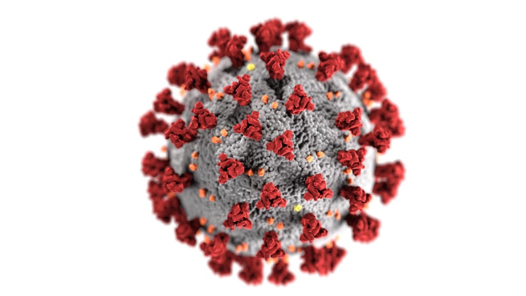
The inscrutable sphere with a speckled gray body that bursts with bright red spines has been seen everywhere now. It accompanies everything the Centers for Disease Control and Prevention (CDC) puts out and illustrates countless news stories.
It has become the unmistakable image of the novel coronavirus, dubbed Severe Acute Respiratory Syndrome coronavirus 2 (SARS-CoV-2), which causes the illness COVID-19, currently ravaging the world. And it is a case study in how artists can, in giving things a visual form, help make the terrifying world around us feel more comprehensible.

Illustration created at the Centers for Disease Control and Prevention (CDC) of the ultrastructural morphology exhibited by coronaviruses. Image by CDC/ Alissa Eckert, MS and Dan Higgins, MAMS, courtesy the CDC.
As the New York Times reports today, the picture of the coronavirus is—quite literally—a work of art. Specifically, it is the work of Alissa Eckert and Dan Higgins, medical illustrators and “biomedical artists” at the CDC. They were tasked with making the so-called “beauty shot” image of the virus—a solo close-up—that would serve in public awareness campaigns, “bringing the unseeable into view.” It was created in the computer graphics program Autodesk 3ds Max, and whipped together in about a week, apparently pretty quick as these things go.
If you want a little bright spot in a bad day, I found this charming clip of Eckert talking about her job just last February, from the government agency’s “I Am CDC” campaign, where she discusses her art hobbies (portraits of pets) and the prop arm she created to model anthrax blisters on:
“I love getting up every day not knowing what disease I will be working on next, but knowing I can help impact people’s health, safety, and security,” Eckert says. “It’s amazing to see your artwork reaching so many people and actually making a difference.”
The now-familiar SARS-CoV-2 image is meant, on one hand, as a medical illustration, serving an educational purpose. A separate version released by the CDC labels the different kinds of proteins on the virus.
The spines in the picture—the “corona” in coronavirus—are rendered fire engine red to label them as especially important: this particular virus is distinguished by spines that are 10 to 20 times more likely to bind to human cells than previous such viruses, which is what makes it particularly dangerous.

SARS-CoV-2. Image by Alissa Eckert, MS; Dan Higgins, MAMS for the Centers for Disease Control.
But the CDC image is also a work of visual communication with a goal to convey an attitude as well as information. Consider how much more arresting it is than another widely distributed illustration of the virus, from Rocky Mountain Labs.
Taken by the lab’s scientists using an electron microscope and colorized by the RML visual medical arts office, these images (all available for use via a public Flickr page) look much more literally scientific, but they are also more indefinite. Indeed, in releasing them, the lab noted specifically that the images “do not look much different” from images of other respiratory coronaviruses.

Transmission electron microscope image showing SARS-CoV-2—also known as 2019-nCoV, the virus that causes COVID-19—isolated from a patient in the U.S. Image courtesy NIAID-RML.
The Eckert/Higgins illustration, on the other hand, renders the virus very distinct. The simulated shallow focus makes it appear as if you are looking at a 3-D orb looming in real space. All the elements are crisply delineated, from the scaly, alien gray surface of the virule, to the knotted structure of the spines, which make it look like a mine.
The shadows cast by the spines, as the Times notes, are pure fiction, meant to convey symbolically the gravity of what this virus represents to the public. The crisply delineated colors, in addition to serving labeling purposes, function as a color scheme for this virus’s “identity,” the red-on-grey orb serving a logo-like function for information about the pandemic.
Deployed as a news illustration, the Rocky Mountain Labs image connotes the message “science at work on the unknown.”
For its part, the CDC image combines two ideas very effectively: it renders the virus as something scary, unnerving, and present that you have to take seriously; but it also conveys lucidity—that this thing is being mapped and figured out. It manages to thread the needle between the sobering “you need to pay attention” and the reassuring “we will help you understand this.” Frankly, isn’t that what we all wish government would do in a crisis?