Bioinformation
by Biomedical Informatics Publishing Group
open access
Prediction Model
www.bioinformation.net
_____________________________________________________________________________
XYLab: an interactive plotting tool for mixed
multivariate data observation and interpretation
Matteo Ramazzotti1, Elodie Monsellier1 and Donatella Degl’Innocenti1, *
1
Department of Biochemical Sciences, University of Florence, Italy; E-mail: matteo.ramazzotti@unifi.it; *Corresponding author
received March 04, 2008; revised May 23, 2008; accepted May 27, 2008; published July 03, 2008
Abstract:
The correct display of data is often a key point for interpreting the results of experimental procedures. Multivariate data sets suffer
from the problem of representation, since a dimensionality above 3 is beyond the capability of plotting programs. Moreover, non
numerical variables such as protein annotations are usually fundamental for a full comprehension of biological data. Here we
present a novel interactive XY plotter designed to take the full control of large datasets containing mixed-type variables, provided
with an intuitive data management, a powerful labelling system and other features aimed at facilitating data interpretation and subsetting.
Availability: XYLab program, test dataset and manual is available at www4.unifi.it/scibio/bioinfo/ XYLab.html
Keywords: multivariate data; scatter plot; labels; search; subset
Background:
Multivariate data set can be defined as a set of observations for
each of which a number of variables are present. Nowadays,
life science researchers are often in contact with such data set
generated by bioinformatics programs or high-throughput
applications such as microarray technology or mass
spectrometry-based proteomics [1]. In many cases, numerical
data are mixed with textual ones, e.g. deriving from protein or
gene databanks like those at EMBL or NCBI, just to cite the
two major collections, or emerging from functional databases
such as GO (Gene Ontology) [2] or KEGG pathway [3].
Numerical variables can be treated with multivariate statistics
in order to reduce the dimensionality of the full sample dataset
and to locate the most prominent trends. Clustering strategies
are also very useful for their ability to group multivariate data
into subcategories with homogeneous features [4]. For such
purposes a number of packages are available, including generic
mathematical packages such as R, MATLAB, SPSS or
SYSTAT or dedicated applications such as CLUSTER [5].
The representation of multidimensional datasets reaches its
higher level of complexity with three-dimensional plots, which
in many applications may have scattered points with
colours/dimensions proportional to other variables and may be
rotated. In addition, labels containing additional data can
usually be appended to points. The above mentioned packages
are provided with excellent data display capabilities, and a
number of stand alone applications can be used to represent
multidimensional plots (e.g. Graphis, Voxler). Nevertheless,
such graphical complexity is usually targeted to the finest
representation of selected data and not intended for routine
interpretation tasks, when a multitude of variables is to be
screened and evaluated. Besides, the generation and
management of such graphs require time and an expertise level
that is not common among experimentalists.
ISSN 0973-2063
Bioinformation 2(9): 392-394 (2008)
For routine usage, two-dimensional (XY) scatter plots are the
most used plot type and, despite their simplicity, they can offer
details that are not evident in other approaches. On the other
hand, they segregate multivariate data in pair-wise spaces, thus
increasing the number of plots and frequently making them
hard to coordinate and, eventually, to re-unify.
Software
We propose a minimalist approach that addresses the problem
of multidimensionality in an intuitive fashion. We developed a
highly interactive, one-window-based plotting tool (XYLab,
see Figure 1) that loads data from simple column-based tables
to build up an XY scatter plot with per-point pop-up labels.
The plot area is controlled by three easily accessible selectors,
named “X”, “Y” and “Lab” since columns containing
numerical variables are automatically detected and used to feed
the first two selectors, while the latter may also contain nonplottable variables such as text-based ones.
XYLab is aimed at offering to the user an easy-handling, fast
and full control of what to plot and which labels to show: a
simple change in the variable choice from the selectors makes
an update of the plot with automatic rescaling and
optimization. This allows to visually explore a number of data
trends and interrelations in minutes.
The presence of a dedicated and real-time effective “Lab”
selector makes the labels readily tuneable and grants them an
importance similar to the X and Y coordinates, instead of
being relegated to a less accessible plot option as usually
happens in other applications. To exploit at best this label
integration, XYLab implements a search-in-plot procedure: in
practice, we introduced a text box that is read before plotting
the points and that may contain a query directed against the
variable selected in the “Lab” selector. Such query can be
verbose, acting on text-based labels, or numerical (e.g.
greater/lesser than), acting on numerical labels. All the
392
Bioinformation, an open access forum
© 2008 Biomedical Informatics Publishing Group
Bioinformation
by Biomedical Informatics Publishing Group
www.bioinformation.net
open access
Prediction Model
_____________________________________________________________________________
positive matches are scored directly in the plot by changing
the point appearance, without affecting their position in the
Cartesian space. The deep integration with labels we
implemented can be extremely useful when considering
microarray or proteomic data; for example it may allow to
highlight the elements involved in the same metabolic
pathway, searching for integrated expression profiles [6]. This
approach was used in a recent work of our group to draw
observations about Codon Adaptation Index (CAI) of
ribosomal proteins in different bacterial subdivisions [7].
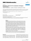
Figure 1: A snaphot of XYLab one-window-based interface. The program has three main sections: the interactive plot area at the top,
where scatterplots are displayed, the copy area at center, where information about copied points is displayed and the control area in the
bottom containing the three plot controllers, the “Find” box and other elements that coordinate the plot interaction.
The presence of a dedicated and real-time effective “Lab”
selector makes the labels readily tuneable and grants them an
importance similar to the X and Y coordinates, instead of being
relegated to a less accessible plot option as usually happens in
other applications. To exploit at best this label integration,
XYLab implements a search-in-plot procedure: in practice, we
introduced a text box that is read before plotting the points and
that may contain a query directed against the variable selected in
the “Lab” selector. Such query can be verbose, acting on textbased labels, or numerical (e.g. greater/lesser than), acting on
numerical labels. All the positive matches are scored directly in
the plot by changing the point appearance, without affecting
their position in the Cartesian space. The deep integration with
labels we implemented can be extremely useful when
considering microarray or proteomic data; for example it may
allow to highlight the elements involved in the same metabolic
pathway, searching for integrated expression profiles [6]. This
approach was used in a recent work of our group to draw
observations about Codon Adaptation Index (CAI) of ribosomal
proteins in different bacterial subdivisions [7].
Since XYLab is oriented to genome-based datasets, usually
containing thousands of elements, the per-point labels pop-up
when the mouse rest over a point for a user configurable delay
ISSN 0973-2063
393
time. In fact, the simultaneous visualization of e.g. text-rich data
to all points, as frequently implemented in other programs,
usually makes the plot unreadable if the number of points is
high. Obviously in XYLab the classic all/none approach is also
present and can take full advantage of the unlimited mousebased zoom to analyse specific regions of the plot.
Another peculiar aspect of the XYLab is a sub-setting
mechanism that we called select-and-paste. Being the plot an
interactive area, the user can draw a rectangle in a region
containing interesting points and all the associated features are
automatically visualized in a dedicated program area, ready to
be exported. Thus, the plot itself guides the data selection and
avoids the tedious task to look at the full data table to trace-back
the desired information. This could be of great importance if
points are clustered for reasons that are not obvious and that
could depend on biological functions.
Other features of the XYLab can be found on its dedicated page,
where a detailed manual and a test multivariate dataset are also
available (see above). In conclusion, the XYLab offers a simple
and intuitive plotting interface aimed at the rapid interpretation
of large multivariate datasets in which text and numbers have a
comparable importance.
Bioinformation 2(9): 392-394 (2008)
Bioinformation, an open access forum
© 2008 Biomedical Informatics Publishing Group
Bioinformation
by Biomedical Informatics Publishing Group
open access
Prediction Model
www.bioinformation.net
_______________________________________________________________________________
a mathematical data management to the current visualization
efficiency.
Input:
XYLab input consists in simple text files organized in
tab/comma-separated entries with variable names in the first
row. Every spreadsheet program or bioinformatics application
can easily generate such files. In addition, properly formatted
data can be pasted directly in the XYLab from the computer
clipboard for a rapid visualization.
References:
[01] D. M. Rocke, Semin Cell Dev Biol., 15: 703 (2004)
[PMID: 15561590]
[02] M. Ashburner et al., Nat Genet., 25: 25 (2000)
[PMID: 10802651]
[03] M. Kanehisa et al., Nucleic Acids Res., 30: 42 (2002)
[PMID: 11752249]
[04] I. T. Joliffe and B. J. Morgan, Stat Methods Med Res.,
1: 69 (1992) [PMID: 17233561]
[05] M. B. Eisen et al., PNAS, 95: 14863 (1988) [PMID:
9843981]
[06] F. Markowetz and O. G. Troyanskaya, Mol Biosyst.,
3: 478 (2007) [PMID: 17579773]
[07] M. Ramazzotti et al., In Silico Biology, 7: 0035
(2007)
Output:
The XYLab exports the plots as vector images. The results of
the search-in-plot and select-and-paste procedures can be saved
as text files or copied to external applications. In addition, the
program can save plot-based subsets of the full dataset.
Caveat and future development:
The program is written in perl (with the Tk graphic library)
and developed on MS Windows and tested on Debian linux
machines. In the future we are planning to introduce curvefitting and multivariate analysis modules in order to integrate
Edited by W. Cuff
Citation: Ramazzotti et al., Bioinformation 2(9): 392-394 (2008)
License statement: This is an open-access article, which permits unrestricted use, distribution, and reproduction in
any medium, for non-commercial purposes, provided the original author and source are credited.
ISSN 0973-2063
Bioinformation 2(9): 392-394 (2008)
394
Bioinformation, an open access forum
© 2008 Biomedical Informatics Publishing Group
Keep reading this paper — and 50 million others — with a free Academia account
Used by leading Academics

Prof. Dr. Rasime Kalkan
European University of Lefke

Hikmet Budak
University of Nebraska Lincoln

Fezal Ozdemir
Ege University

Branka Vasiljevic
University of Belgrade