


This is a fantastic book that I assign as supplement to my econometric course. The text is clear and direct, with great guidance for best practices on how to create beautiful and engaging figures for data analysis.
What I like most about the text is that unlike many data viz books, it focuses on concrete features of data visualization that can immediately improve presentation, rather than leaving aesthetic decisions up to the reader. As someone who is not particularly artistic, it was very helpful to see what dimensions are most important to focus on -- I will not necessarily be creating pictures on the NYTimes homepage, but I can make far better figures than I used to.
Enjoy fast, free delivery, exclusive deals, and award-winning movies & TV shows with Prime
Try Prime
and start saving today with fast, free delivery
Download the free Kindle app and start reading Kindle books instantly on your smartphone, tablet, or computer - no Kindle device required.
Read instantly on your browser with Kindle for Web.
Using your mobile phone camera - scan the code below and download the Kindle app.

Frequently bought together
This item: Better Data Visualizations: A Guide for Scholars, Researchers, and Wonks
$26.67
Get it as soon as Sunday, Sep 15
In Stock
+
$27.73
Get it as soon as Sunday, Sep 15
In Stock
+

$24.88
Get it as soon as Sunday, Sep 15
In Stock
Total price:
To see our price, add these items to your cart.
Choose items to buy together.
Similar items that ship from close to you
Page 1 of 1 Start overPage 1 of 1
About the author
Follow authors to get new release updates, plus improved recommendations.

Reviews with images
Helpful but too much text
I get it, the author needs to write a book, but anyone in the field of UX will tell you, people don't read. I will pick this up from time to time when I have some data that needs a unique visualization and I am looking for ideas. I did not read this book cover to cover.
Top reviews from the United States
There was a problem filtering reviews right now. Please try again later.
Reviewed in the United States on April 3, 2023
Reviewed in the United States on March 12, 2022
Reviewed in the United States on June 21, 2021

Reviewed in the United States on September 3, 2024
Reviewed in the United States on March 12, 2021
Reviewed in the United States on November 21, 2022


Great content. Well-written. Good examples. One of the best intro books on the topic. And I've read a lot of these for the data viz part of my job.
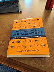
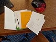
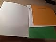
3 stars because the binding is poor quality. It's some kind of light glue holding the pages in. I'm three chapters in and the first 20 pages are now loose and falling out. More are going to peel out.
3 stars because the binding is poor quality. It's some kind of light glue holding the pages in. I'm three chapters in and the first 20 pages are now loose and falling out. More are going to peel out.
Images in this review


Top reviews from other countries
D.Coutts
An incredibly thoughtful guide to data visualization
Reviewed in Canada on July 12, 2021
Bianconi Francesco
Ottimo libro, peccato la rilegatura
Reviewed in Italy on November 1, 2022Bianconi Francesco
Reviewed in Italy on November 1, 2022
Aggiornamento: Amazon ha sostituito il libro senza spese (ottimo servizio), e la nuova copia sembra non avere problemi di rilegatura.
Images in this review


Thomas
There's loads of value in this book for anyone who creates charts
Reviewed in the United Kingdom on August 29, 2022