Abstract
The aim of this paper is to present a set of Python-based tools to develop forecasts using time series data sets. The material is based on a 4-week course that the author has taught for 7 years to students on operations research, management science, analytics, and statistics 1-year MSc programmes. However, it can easily be adapted to various other audiences, including executive management or some undergraduate programmes. No particular knowledge of Python is required to use this material. Nevertheless, we assume a good level of familiarity with standard statistical forecasting methods such as exponential smoothing, autoregressive integrated moving average (ARIMA), and regression-based techniques, which is required to deliver such a course. Access to relevant data, codes, and lecture notes, which serve as based for this material, is made available (see https://github.com/abzemkoho/forecasting) for anyone interested in teaching such a course or developing some familiarity with the mathematical background of relevant methods and tools.
1 Introduction
According to Makridakis et al. [1], forecasting is the process of making predictions of the future based on past and present data and most commonly by analysis of trends, and usually needed to determine when an event will occur or a need arise, so that appropriate actions can be taken. Broadly speaking, forecasting approaches can be split into two categories: qualitative and quantitative forecasting methods, and we can even add a third one that we label as semi-qualitative, where a combination of both qualitative and quantitative methods can be employed to generate forecasts. Qualitative forecasting methods are often used in situations where historical data is not available. For more details on these concepts, interested readers are referred to the books [1, 2] and references therein.
Our focus in this paper is on quantitative methods, as we assume that historical times series data (i.e. data from a unit (or a group of units) observed in several successive periods) is available for the variables of interest. Within quantitative methods, we also have a number of subcategories that can be broadly labelled as statistical methods, which are at the foundation of the subject, and machine learning ones, which have been developing rapidly in recent years; see, e.g. [3,4,5,6,7,8,9] for a sample of applications and surveys on the subject.
The material to be presented in this paper is based on statistical forecasting methods; see, e.g. [1, 2, 10,11,12] for related details. Despite the fast development of machine learning techniques, they have been consistently shown through the last two M competitions [13, 14] to generally be outperformed by statistical methods in terms of accuracy and computational requirements; these comparisons (see relevant details in the papers [13, 14]) are done on more than 100 thousand practical data sets, related to a wide range of industries, based on the ForeDeCk database (http://fsudataset.com/). Note that the M competition series (with M referring to Spyros Makridakis, one of the world leaders in the field) is a famous open competition, which can also be seen as a benchmarking exercise, where competitors evaluate and compare the performance of a wide range of forecasting methods on thousands of practical data sets.
The aim of this paper is to introduce the reader to existing Python tools that can be used to deliver a practical course on basic statistical forecasting methods; namely, we will focus on the exponential smoothing, autoregressive integrated moving average (ARIMA), and regression-based methods, which are (or a combination of them) part of core techniques shown to have the best performance in the M competitions mentioned above.
1.1 Background
The material presented in this paper is based on a course named Forecasting, that the author has taught for the past 7 years within the School of Mathematical Sciences at the University of Southampton, based in the UK. This is an optional course, but which is very popular, and is taken by students from the eight MSc programmes listed in Table 1, spanning both the School of Mathematical Sciences and the Southampton Business School.
The course is very practical and hands on, designed to run for 16h across 4 weeks, with 2h of weekly lecture and the remaining 2h dedicated to a workshop/tutorial/computer lab, where the students are supported to go through the Python material to test and apply the methods on some practical data sets. The lectures focus on taking the students through the mathematical background of the methods that will be covered here [15]. During the computer labs, students are taken through the Python codes covered in this paper, which implement the methods that form the content of the lectures, and support them in using these methods to develop forecasts on practical data sets. Note that this course can easily be expanded to cover a few more weeks, as necessary, and the material can also be adapted to an undergraduate level for programmes around operations research, statistics, business analytics, and management science.
It is important to mention that before the start of the course, a brief material with a basic introduction to Python is made available to the students, in order to bring them up to speed with some basic elements of Python, in case they have had no prior exposure to the language. This brief material essentially covers the relevant Python ecosystem discussed in Section 2 and an overview of the basic steps needed to get Python up and running on their personal computers or the university machines. Additionally, note that each of the weekly computer labs, which take place during the course, is an opportunity for the instructors to guide the students on how to use the different libraries needed to implement the mathematical concepts covered in the lecture of that week.
The author has taught the course over the last 7 years, first using Excel and relevant Visual Basic for Applications (VBA) codes to enhance some of the techniques. The transition to Python was done much recently, considering the demand both from industry and students, and also to keep up with the pace of developments in data science more broadly. The motivation to prepare this paper came as a result of the transition from Excel to Python, as the author was unable to find a single book or resource relevant to prepare for a complete delivery of this course using Python.
1.2 Contribution of the Paper and Relevant Literature
The paper will mostly focus on the use of existing Python tools to generate forecasts, although a bit of the background on the mathematical concepts will be provided as necessary. Also, although prior knowledge of Python is not necessary, it will be assumed that the reader has some level of familiarity with methods involved in the corresponding mathematical material, as it would be required for anyone teaching such a course. The lecture notes [15] that form the material of the course discussed here are based on the books [1, 2].
As for the Python material, we only found the book [16] during the preparation of the first draft of the computing material, to be presented here, in 2019. While preparing this paper, we came across the two new books [17, 18] on the use of Python to generate forecasts on time series data. There are two common denominators to these three books; the first is that they are mostly geared towards machine learning–based techniques for time series forecasting, with the exception of ARIMA models, which are covered in detail. Secondly, they essentially focus on the use of Python tools to generate forecasts, and hence do not specifically pay attention to the mathematical background of the methods, which are the based on the corresponding Python forecasting tools.
Clearly, there are two differences between the content of this paper and what is covered in the books [16,17,18]. At first, considering the page limitation of an article such as this one, we also mostly only focus on the coding side of the methods; however, our presentation is essentially organized along the lines of the corresponding lecture notes [15], which provide the necessary mathematical background to develop a deep understanding of all the methods covered in this paper. Secondly, unlike in these books, we focus our attention on statistical methods, which form the basis of most of the methods which are at the heart of the successful practical implementations in the context of the M competition series, as discussed at the beginning of this introduction.
It is also important to mention that our philosophy in the preparation and delivery of the course discussed in this paper is inspired in part by the book [2]; that is, giving the reader a balanced mathematical background of the forecasting methods, while accompanying them with relevant practical software tool to use these methods on practical data sets. However, the fundamental difference is that [2] uses R while we use Python.
The lecture notes on which this course is based (i.e. [15]), as well as all the corresponding codes presented here, can be accessed online via the following link: https://github.com/abzemkoho/forecasting.
1.3 Outline of the Paper
We start the next section with an overview of the main Python packages needed to work with the tools that we will go through in this paper. Subsequently, we present tools that can be used for a basic data analysis (i.e. time, seasonal, and scatter plots, as well as correlation analysis, just to mention a few) before the start of any forecasting task based on the methods covered in this paper. Section 3 is devoted to exponential smoothing methods, which are very efficient on time series that involve trends and/or seasonality. Section 4 covers ARIMA methods; and finally, Section 5 presents tools for regression analysis and how they can be used for forecasting. Note that the exponential smoothing and ARIMA methods are blackbox techniques, as are they are built under the assumption that historical patterns in the time series will keep repeating themselves in the future. However, regression-based approaches assume that the behaviour of the time series of interest (dependent variable) is influenced by other variables (independent variables), and this is explored through linear regression to possibly build more accurate forecasts.
2 Preliminaries on Python and Data Analysis
2.1 The Necessary Python Ecosystem
No prior knowledge of Python is required to use the material in this paper. However, we assume that the reader/instructor who wants to use the tools presented here has Python up and running on their device (desktop, laptop, etc.) The codes and corresponding results are based the use of Python under Anaconda 3 with Spyder 3.6 as editor, all running on Windows 10 Enterprise (processor: Intel(R) Core(TM) i5-6300U CPU @ 2.40 GHz). The advantage of using Anaconda is that it installs Python with many important packages that are useful for time series analysis of the type covered in this paper. This therefore helps in part to reduce dependency issues between various packages used, and hence ensure that key packages are set to work nicely together. Nevertheless, all the codes presented here should be able to work smoothly on most platforms running a version 3 of Python (see https://www.python.org/). The main packages needed are as follows:
-
SciPy;
-
NumPy;
-
Matplotlib;
-
Pandas;
-
Statsmodels.
As an ecosystem of open-source software for mathematics, science, and engineering, SciPy (https://scipy.org/) includes the NumPy library (https://numpy.org/) for multi-dimensional array operations and the Matplotlib library (https://matplotlib.org/) specifically designed for plotting.
Pandas (https://pandas.pydata.org/) is an open-source data analysis and manipulation tool. It is important to mention here that all the data sets used for our illustrations are stored in Excel spreadsheets. Hence, we use pandas function named read_excel in almost all our codes, to read data from Excel worksheets. Finally, the statsmodels library (https://www.statsmodels.org/stable/index.html#) is at the heart of most of the data analysis and forecasting methods presented in this paper, as it includes packages to generate forecasts using exponential smoothing, ARIMA, and regression-based methods. Occasionally, we could also use scikit-learn for a few tasks, such as generating some error measures.
It is also important to mention that the abovementioned libraries all work together, with NumPy and Matplotlib building on SciPy, while Statsmodels is built on top of NumPy and SciPy, integrating with Pandas for data handling, as already mentioned.
2.2 Basic Data Analysis Tools
In this subsection, we discuss the following five key topics, which are crucial in the preliminary analysis of time series data sets:
-
Time plots;
-
Adjustments;
-
Decompositions;
-
Correlation analysis;
-
Autocorrelation function.
A time plot is simply a two-dimensional graphical representation of a time series. A time plot is typically the starting point of any forecasting task, as it enables a first dive into the data set, to assess, for example, whether any errors or particular patterns are present in it. To build a time plot, matplotlib can be used after the data has been loaded using the read_excel function from pandas, as described above. Listing A.1 provides the code for the time plot in Fig. 1(a); the remaining ones are obtained just by replacing the clay bricks data set by the corresponding ones. Note that read_excel includes a number of options to specify the sheet and other information to be returned for use by the series.plot() command, which generates the plot.
Time plots for three data sets demonstrating different patterns, with (a) showing a strong increasing trend until about 1965, a global increasing trend in (b), while we have a decreasing trend in (c). As for all the data sets used in this paper, they are drawn from material related to the book [1] and will be made available in the supplementary files
Obviously, Fig. 1(a), (b) show a globally increasing trend, while the trend in (c) is generally decreasing. However, in the clay bricks sale, there is overall a global trend with steady increase over time up to 1965, where we start having some occasional large fluctuations which are difficult to explain, and hence, hard to predict without knowing the underlying causes. But this could be a reflection of a cyclical trend behaviour in the clay bricks sale time series.
Clearly, trend and cyclical behaviour can be easily identified from a graph. However, unlike trends and cyclical patterns, seasonality can be trickier to observe. Considering the important role that the identification of seasonality plays in developing/selecting some forecasting methods (e.g. exponential smoothing and ARIMA methods, as it will be clear in the following sections), we need to pay some attention on how to assess it. There are various ways to assess whether a time series has seasonality, including zooming out specific chunks of the corresponding time plots. Also, a time plot can sometimes already give an initial indication on the presence of seasonality in a time series; for example, intuitively, Fig. 1(b) already suggests that we might be having peaks and troughs occurring at regular intervals. But some further steps need to be taken to check this.
In this paper, we are going to mainly use the seasonal plots and the concept of autocorrelation function (ACF) to decide whether a time series is seasonal or not. The ACF will be defined at the end of this section. Before that, we start with the seasonal plots, which correspond to a superposition of time plots over a succession of limited time periods (e.g. 12 months in the context of monthly observations, which is what we have for most of the data sets used in our illustrations). Listing A.2 provides a code that can be used to build seasonal plots after having organized our data in months for over a few years.
Seasonal plots for the time series plotted in Fig. 1; we can see signs of relatively strong seasonality in (a) and (b), while seasonality seems weak in (c). The level variation in each of the graphs is further evidence of the increasing or decreasing trends that clearly appear in the time plots
Clearly, there is an indication from Fig. 2 that the clay bricks and electricity data may have seasonality, while it is unlikely to be the case for the treasury bills data. From the time plots in Fig. 1, an initial guess could have already been made about the electricity data, but maybe not necessarily for the clay bricks data. At the end of this section, we will see how the ACF plots can help to further confirm seasonality identified here.
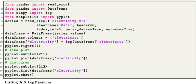
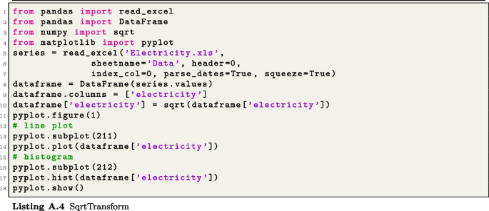
Besides the different patterns that can be assessed using time plots, they can also enable an assessment of the need for adjustments (e.g. mathematical transformations or calendar adjustments). Ideally, the role of a mathematical transformation is to attempt to stabilize variance in a time series, where rapid changes in some parts of a time plot can affect the ability of a forecasting method to generate accurate results. For instance, the power (including the square root, as a special case) and log transformations are the most commonly used transformations in the literature; the square root can help, in the case where the time series has the shape of a second-order quadratic function, to promote a “linear” shape, which can improve the predictability capacity of some forecasting methods. On the other hand, the log (of course, applicable only for positive time series) has an additional advantage, in terms of its interpretability. For more details on these transformations and many other adjustments, which can positively impact the forecasting ability of some methods, see [2, Chapter 3]. Listings A.3, A.4, and A.5 provide appropriate codes to generate a log, square root, and calendar adjustments, respectively. The code in Listing A.5 runs on a special data set, where a calendar adjustment can be useful, as in the milk production of a cow, the difference in the observations from one month to the other can essentially be due to the number of days in months. Hence, the calendar adjustment can help to remove such a calendar effect before any further analysis of this time series.
For a given time series \(\{Y_t\}_t\), it is sometimes important to look for ways to split it by means of a decomposition function f in such way that
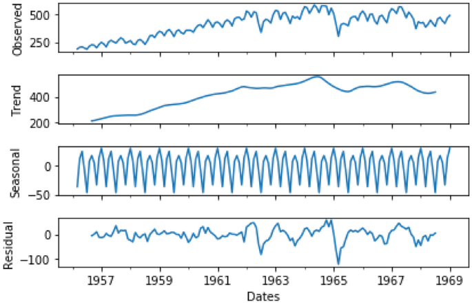
where for a given t, \(T_t\) and \(S_t\) denote the trend-cycle and seasonal components, respectively, and \(E_t\) corresponds to the error that results from such a decomposition. Decompositions are useful in developing a better understanding of the constituting patterns in a time series, but not necessarily for generating forecasts. Standard selections for a decomposition function are \(f(T_t, S_t, E_t):= T_t + S_t + E_t\) (additive decomposition) and \(f(T_t, S_t, E_t):= T_t \times S_t \times E_t\) (multiplicative decomposition). The statsmodels function seasonal_decompose can be used to generate these decompositions, with the option “model” suitable for indicating the nature of the decomposition (i.e. additive or multiplicative); see Listing A.6 for an additive decomposition code (used to generate Fig. 3, for illustrative purpose) and Listing A.7 for a multiplicative one.
It is important to note that in terms of the background algorithm on how a decomposition is computed, one usually starts with the trend estimation, and then, depending on the nature of f (1), the seasonal component is estimated; interested readers are refereed to the lecture notes associated to this material [15, Section 2] and references therein.
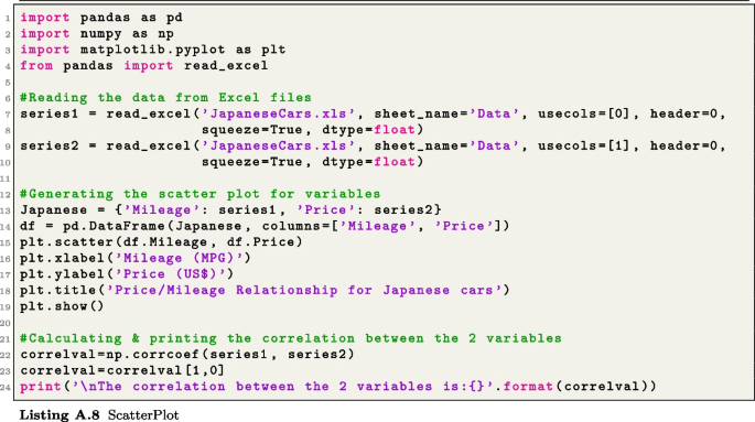
Correlation analysis comes into play when we want to explore relationships between variables in cross-sectional data. There are at least two possible tools to assess correlation between variables. Namely, scatter plots and correlation values, both concepts are strongly related in the sense that the scatter plot provides a graphical representation that can demonstrate how strong the relationship between two variables is, while the correlation is a numerical value materializing the strength level of such a relationship. As an example to illustrate these two concepts, consider a data set made of a variety of used cars and their price (based on their mileage). For instance, we might want to forecast (price) against one possible explanatory variables (mileage, here). Running the code in Listing A.8 clearly shows that the price of a car decreases as the mileage increases. Each point on the graph represents one specific vehicle.
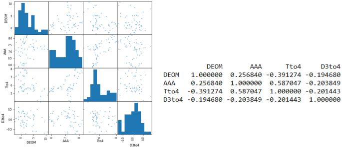
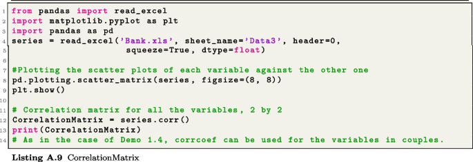
A scatter plot helps us to visualize the relationship and suggests that if one wants to forecast the price of used car, a suitable model should include mileage as an explanatory variable. In Listing A.8, the scatter plot function scatter function from matplotlib is applied with arguments being the mileage and price as separate entries. Note that pandas also has the function scatter_matrix, which can generate scatter plots for many variables in one go; this could be particularly important in Section 5 when studying the regression approach to forecasting. Figure 4, for example, generated by the code Listing A.9, shows scatter plots in a matrix form for four time series.
Left, we have the matrix of scatter plots for four times series labelled as DEOM, AAA, Tto4, and D3to4. On the right, we have the correlation matrix, which gives the correlation value that reflects the relationship in each pair in these four data sets. As it can be seen in the scatter plots, the strongest correlation is between AAA and Dto4, as confirmed by the correlation value, which is strictly larger than 0.50
The correlation is a statistic corresponding to a number between −1 and 1 to measure the level of the linear relationship for bivariate data (i.e. when there are two variables). The corrcoef function from numpy, see Listing A.8, calculates the correlation between the mileage and prices of the cars, as discussed above. Note that in principle, corrcoef is generated as a symmetric matrix, hence the use of correlval[1,0] to extract the necessary value. In a situation where one is interested in evaluating the relationships between various pairs of variables, the correlation matrix enables the calculation of these values in one go, as discussed above in the context of scatter plots, as illustrated in the left-hand-side of Fig. 4; the corresponding correlation values are generated with the function corr from pandas; see the table in the right-hand-side of Fig. 4 for an illustration with four time series.
For a given time series \(Y_t\), the concept of correlation can be extended to the time lags \(Y_t\) and \(Y_{t-k}\) of this same series. Hence, such a correlation is called autocorrelation. The autocorrelation is used to measure the degree of correlation between different time lags in a time series. The autocorrelation function (ACF) is crucial in assessing many properties in statistics, including seasonality, white noise, and stationarity. In this section, we limit ourselves to the use of the ACF in assessing seasonality. For its use in assessing white noise and stationarity, see Sections 3 and 4, respectively.
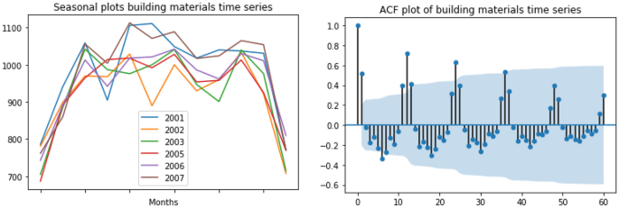
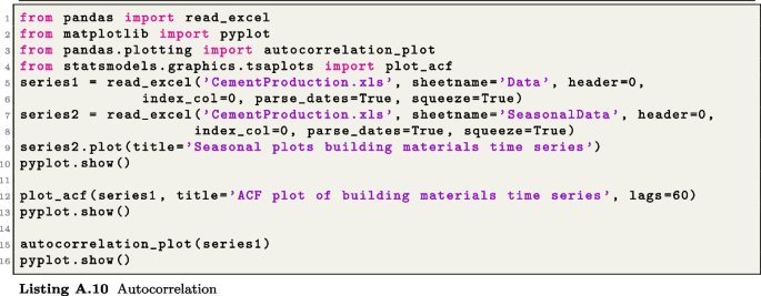
The function plot_acf from statsmodels can be used to generate ACF plots. As illustration, we use the code in Listing A.10 to generate the ACF plot for some building material data from Australia in Fig. 5. It can be seen that the seasonal plots (left-hand-side) might be slightly unclear. But the ACF plot (right-hand-side) strongly confirms the presence of seasonality, as peaks and troughs are approximately occurring at regular interval, namely, at every 12 time lags, as the data is made of monthly observations. Note that autocorrelation_plot from pandas can also be used to produce ACF plots, but instead with a curve shape; this can be seen by running the code in Listing A.10, where the relevant command is also included.
3 Exponential Smoothing Methods
Considering the importance of accuracy in forecasting, we start this section by discussing a few tools that can be used to assess the accuracy of a method; namely, we discuss error measures, the concept of white noise via the ACF function, and confidence intervals. After this, in Subsection 3.2, we introduce the exponential smoothing methods, which, together with the ARIMA methods, represent the most widely used forecasting techniques in practice.
3.1 Accuracy Measures
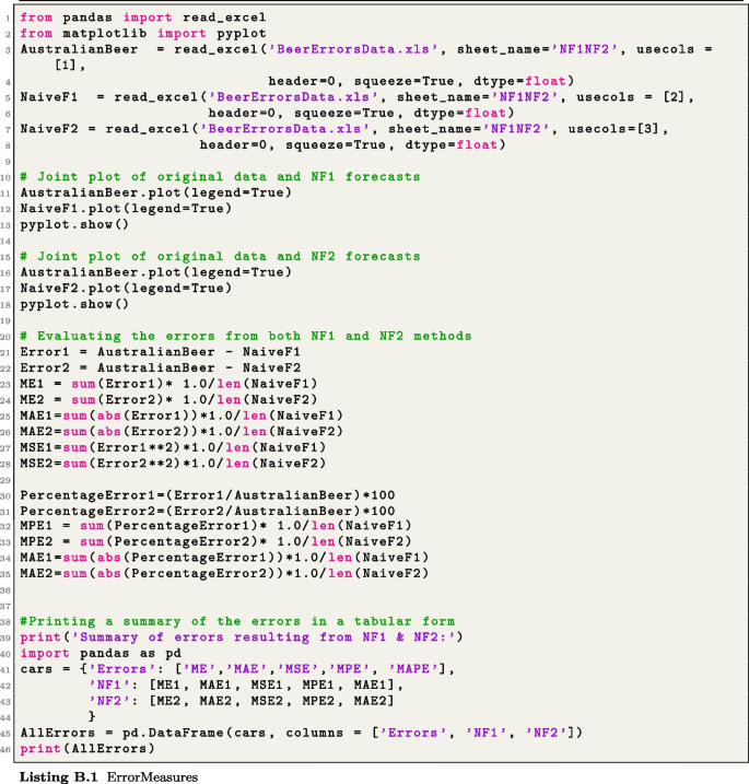
As accuracy is the first main concern when forecasting, we start here by discussing how some standard error measures, i.e. the mean error (ME), mean absolute error (MAE), mean square error (MSE), percentage error (PE), mean percentage error (MPE), and the mean absolute percentage error (MAPE), can be computed using Python. To proceed, it is crucial to recall that an error measure on its own does not mean much, but rather, it can only make sense in a comparison setting of 2 or more methods. Hence, we introduce two naïve forecasting methods to illustrate how these error measures can be used in practice. We begin with a naïve forecasting, labelled as NF1, which assumes that for a times series \(\{Y_t\}\), the forecast at time point \(t+1\) is obtained as \(F_{t+1} = Y_t\). Next, we consider a second naïve forecasting method labelled as NF2:
where \(S_t=Y_t\) for \(t=1, \ldots , 12\) and with m is the number of complete years of data available; for the initialization of the method, we set \(F_{t+1}=Y_t\) for \(t=1, \ldots , 12\).
The code in Listing B.1 generates the results in Fig. 6, which show both the NF1 and NF2 forecast plots, as well as the corresponding error measures stated above. Note that the ME and MPE are not to be taken very seriously as their values essentially reflect the fact that positive and negative values just cancel each other throughout the range. Clearly, NF2 outperforms NF1 on almost all the measures, especially, on the positive ones (MAE, MSE, and MAPE), which are more meaningful. This is not surprising, considering the fact NF2 contains more structure capturing the nature of the data set much better than NF1, which is essentially a one-step translation of the original data set. Similar comparisons can be done for any two or more forecasting methods.
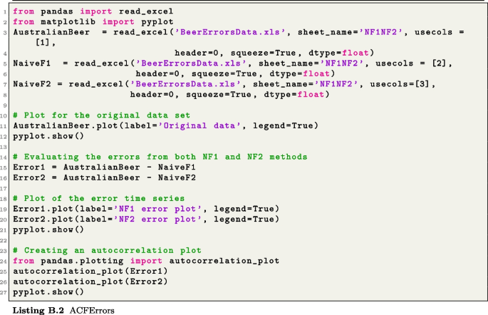
Another tool to assess the accuracy of a forecast method is the ACF of the errors. Basically, the expectation is that if the results of a forecasting methods are reasonably accurate, the time plot of the errors, seen as a time series, should be purely random. Therefore, no patterns from the original data should be preserved in the errors/residuals. Using the corresponding code in Listing B.2 on the data used for Fig. 2, we get the graphs in Fig. 7, which clearly show that the forecasts from NF1 preserve seasonality from the original time series, with the large spikes appearing after every 12th time lag. Such a pattern is not clearly obvious for NF2.
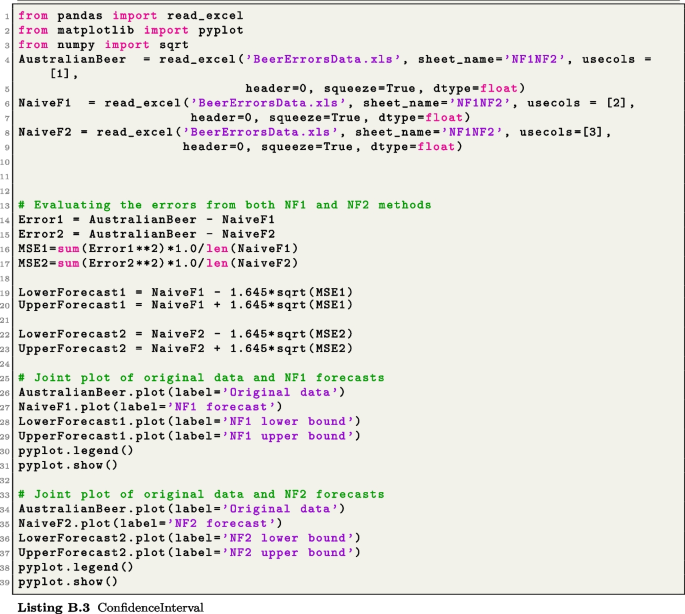
Finally, providing the confidence interval for a forecast can help decision-makers in building their management perspectives. Let \(F_{t+1}\) be the forecast from a given method, then, the corresponding lower and upper bounds can be obtained as
respectively, where MSE represents the mean square error over a suitable range of the data, while z is a quantile of the normal distribution, which is a conventional number that determines the level of confidence of the corresponding interval. Standard values commonly used in practice for z can be seen in Section 2 of [15]. Figure 8, generated with the code in Listing B.3, provides the confidence intervals for the data and corresponding NF1 and NF2-based results.
3.2 Exponential Smoothing Methods
There are four main types of exponential smoothing methods, which can be applied based on characteristics of our time series and sometimes also considering our intended purpose. Before diving into these methods, it is important to mention that all the related Python tools that we are going to describe here are from the statsmodels library. The first and simplest such method is the so-called single exponential smoothing (SES) method. The SES is usually applied only on time series that do not exhibit any specific pattern and can only produce one step ahead forecast.
To set the stage for the general process of all the forecasting methods that we are going to present in this paper, we are going to provide a brief overview of the mathematical background of the SES method. To proceed, let us assume that we are given a time series \(Y_1\), ..., \(Y_t\), where data is available from time point \(T=1\) up to \(T=t\). Then, the forecast for this time series at time point \(T=t+1\) using the SES method can be calculated as
where the parameter \(\alpha \in [0, \; 1]\). There are various ways to initialize the method; one possibility is to select \(F_1=Y_1\). The first key observation that can be made on the formula (2), and which justifies the name of this class of methods, is the fact that if one looks carefully at the factor \((1-\alpha )\), we will observe that it decays exponentially as the power j increases. More interestingly, by the nature of the expression, this increase is associated with the decrease of the indices of \(Y_j\). Hence, this means that the value of \(F_{t+1}\) relies heavily on more recent values of the time series \(Y_1\), ..., \(Y_t\). This is one of the particular characteristics of any exponential smoothing methods.
Additionally, being able to optimally select the value of the parameter \(\alpha\) is critical for the performance of the method. The strategy commonly used in this case is the least square optimization approach to select its best value. It corresponds to minimize the MSE
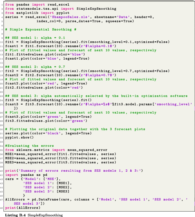
where \(F_j\), \(1=1, \ldots , t\) is obtained from (2). The function from statsmodels to generate forecasts using the SES method is SimpleExpSmoothing. Applying it, as in Listing B.4, to an example of data set generates the results in Fig. 9, where we can clearly see that the models based on manually selected values \(\alpha =0.1\) and \(\alpha =0.7\) for models 1 and 2, respectively, are not as good as the 3rd model, which is obtained by solving the optimization problem in (3); clearly, the MSE values in the right-hand-side table in Fig. 9 confirm that the parameter \(\alpha\) obtained from the optimization problem (3) incurs the smallest error.
The core part of the code in Listing B.4 is SimpleExpSmoothing imported from the subpackage statsmodels.tsa.api of statsmodels. Everything else is essentially the selection of the parameter \(\alpha\) for models 1 and 2 using the option smoothing_level; obviously, in the case where \(\alpha\) is optimally selected, the default selection of the optimized option is set at True. Also, recall that as the SES method can only produce a one-step forecast, the number 10 that appears in the command fit2.forecast(10).rename (r’\(\alpha =0.7\)’), in the 2nd model, for example, sets the number of times that the single value of \(F_{t+1}\) is going to be repeated. This is essentially to clearly visualize the result in the graph; however, it creates an impression that the forecast values beyond t are a line.
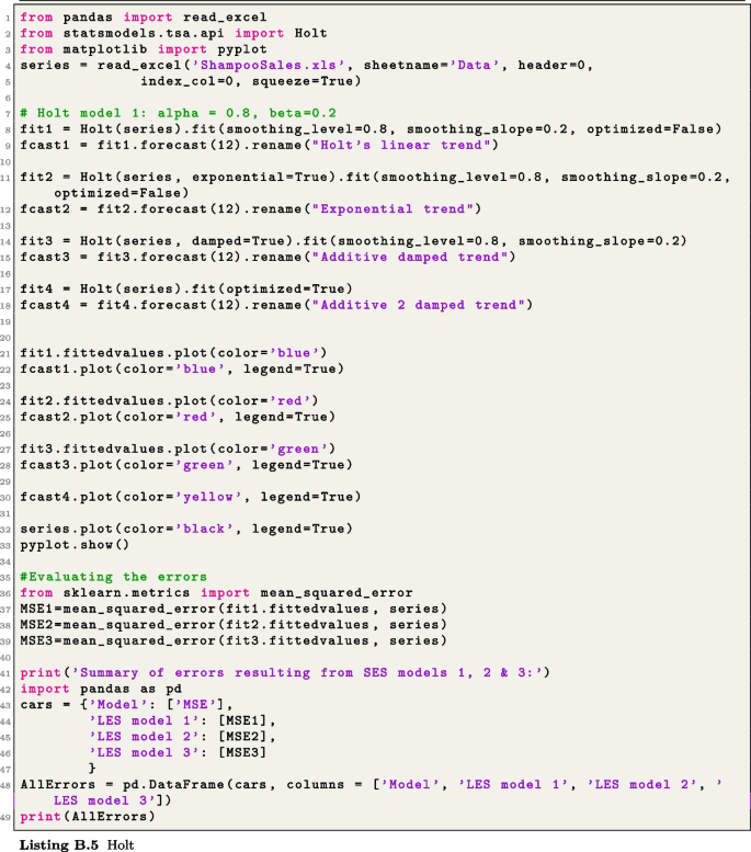
The second basic exponential smoothing method is the Holt linear method, which builds on the same path as (2)–(3). Holt’s linear method is suited for time series involving trend without the presence of seasonality. Hence, this method involves an estimate of the level and linear trend of the time series at a given time point. As a consequence, the Holt linear method involves level and slope parameters \(\alpha\) and \(\beta\), respectively. These parameters can be optimized using the minimization of the MSE, similarly to what is done in (3). Similarly to SES, Holt’s linear method is applied by simply calling the function named Holt from statsmodels.tsa.api. In the case where we want to set the parameters \(\alpha\) and \(\beta\) manually, we can use the options smoothing_level and smoothing_slope, respectively. To improve the forecasting performance of the Holt linear method, the Holt function provides an option to select the nature of the trend using the exponential or damped option, as it can be seen in the following excerpt of the Holt forecasting code in Listing B.5:

Obviously, the default selection of the trend in the first model (see first line in this excerpt) is the linear trend. For more details on the different type of trends and the corresponding mathematical adjustment, see https://www.statsmodels.org/stable/generated/statsmodels.tsa.holtwinters.Holt.html.
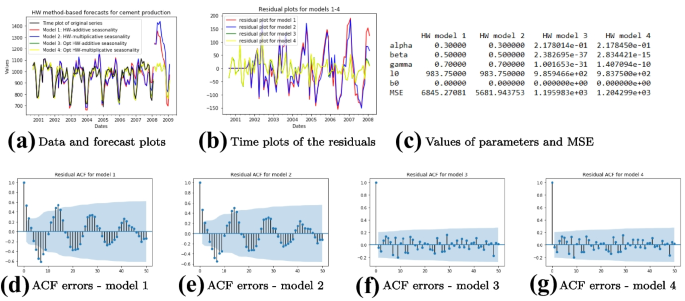
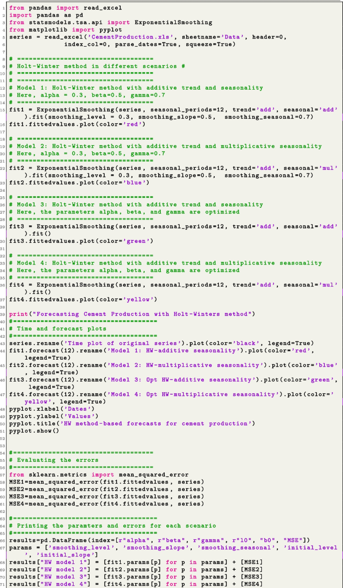
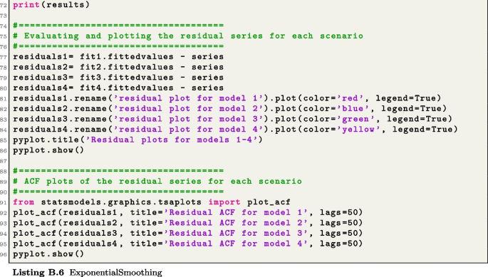
All the results here are generated with the codes in Listing B.6, where a is obtained from ExponentialSmoothing and b results from errors calculated with values extracted from the results from the ExponentialSmoothing function. The table in c is obtained by applying mean_squared_error from sklearn.metrics to forecast values extracted from the results from ExponentialSmoothing. The latter results can also be obtained straightforwardly from the formulas of the MSE. As for the second row (d)−(g), the plots there are generated with plot_acf from statsmodels. The data set is based on cement production in Australia
Finally, we now present the Holt-Winter forecasting method, which is suitable for time series involving both trend and seasonality. Hence, in addition to the level and trend components needed in the Holt linear method (design only for the case where trend in present in our time series), a seasonal component is needed. The seasonal component also comes with its parameter generally denoted by \(\gamma\). As it should be the case for the previous two methods, all the parameters are required to be real numbers from the interval \([0, \; 1]\). Since the Holt-Winter method is more general than the SES and LES, the corresponding function from statsmodels.tsa.api is labelled as ExponentialSmoothing.

As we can see from this excerpt of the corresponding code in Listing B.6, besides the parameters \(\alpha\), \(\beta\), and \(\gamma\), represented here by smoothing_level, smoothing_slope, and smoothing_seasonal, which can be fixed or optimized as in the previous two exponential smoothing methods, we have the nature of the trend and seasonality, which can be additive or multiplicative. Clearly, the term add (resp. mul) is used for additive (resp. multiplicative) trend or seasonality. More details on these concepts can be found in [15, Section 2].
We use the code in Listing B.6 to generate the results in Fig. 10, which clearly show that the optimized models 3 and 4 are the best, with the 3rd one with additive trend and seasonality being slightly better. The ACF of the residuals from each method are also included in the code, to further evaluate the performance of each method. It is clear that the residuals for models 1 and 2 retain the seasonality present in the original data set. On the other hand, Fig. 10(b), (f), and (g) just confirm that residuals seem relatively random.
4 ARIMA Methods
4.1 Preliminary Tools
As we have seen so far, the ACF plot can play an important role in showing that a time series is seasonal and also in assessing the accuracy of a forecasting method (mainly via the white noise concept). In this section, we are going to see how the ACF can also be helpful in assessing a few other properties relevant to the ARIMA method, namely, in assessing stationarity and the identification of an ARIMA model. However, to strengthen the capacity of the ACF in this role, we now introduce the concept of partial autocorrelation function (PACF), which is used to measure the degree of association between observations at time lags t and \(t-k\) (i.e. \(Y_t\) and \(Y_{t-k}\), respectively) when the effects of other time lags, \(1, \ldots , k-1\), are removed. Hence, partial autocorrelations calculate true correlations between \(Y_t\), \(Y_{t-1}\), ..., \(Y_k\) and can therefore be obtained using a regression formula on these terms, while proceeding as in the least square approach in (3) or the concept of maximum likelihood estimation, which is more common in this case [2].
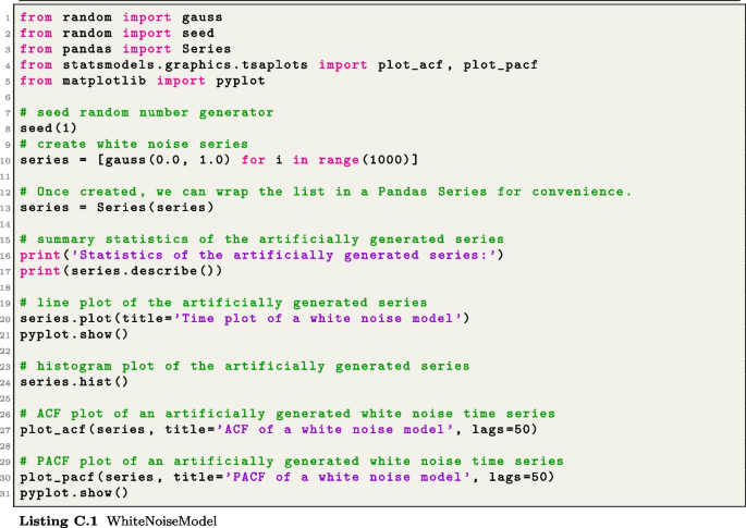
To get a good flavour of how the PACF can be applied, let us use it to further illustrate white noise in combination with ACF. Similarly to the ACF, as shown in Subsection 2.2, the PACF can be plotted by simply applying the function plot_pacf from statsmodels.graphics.tsaplots. The code in Listing C.1 generates the AFC and PACF for an example of white noise model. The important thing to note when this code is ran is how the ACF and PACF of a typical white noise model look like; recall that for a model to be statistically while noise, about 95% of the values of ACF and PACF are within the range ± \(1.96/\sqrt{n}\), where n is the total number of observations. This range is represented by the shadow band that appears in the graphs of both the ACF and PACF.
We now turn our attention to the concept of stationarity, which is at the heart of the development of ARIMA methods. Recall that a time series is stationary if the distribution of the fluctuations is not time dependent. This is easy to say, but it can be tricky to actually show that a time series is stationary. We try now to provide a few tools that can be helpful in identifying stationarity in a time series. To proceed, we start by stating the following scenarios or specific tools that we are going to rely on to identify whether a time series is stationary or not:
-
1.
A white noise time series is stationary;
-
2.
A time series with trend or seasonality is non-stationary;
-
3.
A cyclical time series with no trend and no seasonality is stationary;
-
4.
A non-stationary time series can be detected by means the ACF and PACF;
-
5.
A unit root test can be used to show that a time series is stationary.
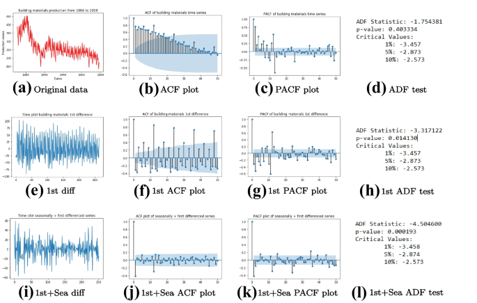
We have just seen how to determine whether a time series is white noise, using the ACF and PACF, which can be plotted with Python using plot_acf and plot_pacf, respectively. As for the second item, we already know, see Subsection 2.2, how to identify trend and seasonality, as well as cyclical patterns, using time plots. There is an interesting way to show that a time series is non-stationary by means of its ACF and PACF plots. Basically, the autocorrelations of a stationary time series drop to zero quite quickly, while those of a non-stationary one can take a significant number of time lags to become zero. On the other hand, the PACF of a non-stationary time series will typically have a large spike, possibly close to 1, at lag 1. This can clearly be observed in Fig. 11 generated with the code in Listing C.2.
The original time series is obviously not stationary as it can be seen in (a)−(d); after first differencing, trend is removed but the new series is still not stationary as it is seasonal; see (e) - (h). It is after both first and seasonal differencing that we obtain a stationary time series; cf. (i)−(l)
Ultimately, if the first four points above cannot help to make a definite decision on the stationarity or non-stationarity of a time series, then we can proceed with a unit root test. It is important to say beforehand that this is not a magic solution to demonstrate stationarity, as there are various types of unit root tests, which can sometimes provide contradictory results. The version of the unit root test that we consider here is the augmented Dickey-Fuller (ADF) test [19], which assesses the null hypothesis that a unit root is present in a time series sample.
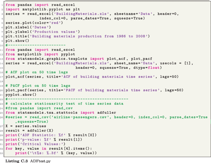
A simple understanding of the ADF test that is relevant to us is that it generates a number of statistics that we are going to present next. To generate these statistics, the function adfuller from statsmodels.tsa.stattools can be applied to our data set. This function simply takes in the values of the time series, as it can be seen in the example used in the code present in Listing C.3, which is used to generate the results in Fig. 12 from three different scenarios. Considering some building material production data from Australia, the first row of Fig. 12 presents the time, ACF, and PACF plots, respectively, as well as the statistics generated by the ADF test.
The ADF test (see last column of Fig. 12) generates three key categories of statistics. First, we have the ADF statistics itself, which needs to be negative and subsequently would need to be less than the 1% critical value to confirm the strength of stationary if additionally, the P-value is at least less than the threshold value of 0.05. We can clearly see from Fig. 12 how the ADF test helps to confirm that we go from a series, where the original and first differenced series are non-stationary to a stationary time series when first and seasonal differencing are done.
4.2 Models and Selection Process
A simplistic though seemingly nice way to introduce the ARIMA methods is to think about the corresponding forecast function as a polynomial \(f : \mathbb {R}\rightarrow \mathbb {R}\) defined by
where p is the order of the polynomial and \(a_0\), \(a_1\), ..., \(a_p\) are its coefficients. To get a complete description of this polynomial, we need to start by identifying the order p, which determines the number of the coefficients \(a_0\), \(a_1\), ..., \(a_p\), which can then be subsequently calculated. This is approximately what is done to build an ARIMA model. To make things a bit precise, let us consider a non-seasonal ARIMA(p, d, q) model
where \(B^kY_t := Y_{t-k}\) corresponds to the backshift notation. Here, the vector (p, d, q) represents the order of the model, and \(\phi _i\), \(i=1, \ldots , p\) and \(\theta _j\), \(j=1, \ldots , q\) are parameters/coefficients of the model. Algorithm 1 summarizes the building process of an ARIMA model, including the forecasting step.

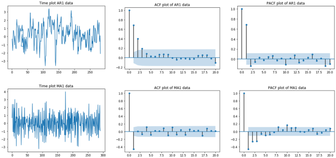
In Step 1, determining d is the most obvious thing, as it simply results from whether we need to do differencing or not to ensure that our time series is stationary. If no differencing is needed, then \(d=0\). Otherwise, \(d\ge 1\) simply represents how many times differencing is needed to obtain stationarity. p and q are much more trickier to obtain. An initial approximation of these numbers can be derived from the ACF and PACF plots. To proceed, let us first present graphs of the ACF and PACF of pure autoregressive and moving average models
respectively, for an artificially generated time series example. AR(p) is obtained if the ACF of this time series is exponentially decaying or sinusoidal and there is a significant spike at lag p in the PACF, but no larger one beyond lag p. As for the pure moving average model MA(q), the PACF is exponentially decaying or sinusoidal; and there is a significant spike at lag q in the ACF plot, but not larger than one beyond lag q. Of course, in the case of a non-stationary time series, these observations would be made on ACF and PACF of “sufficiently differenced” (in the sense of leading to stationarity) data. The graphs in Fig. 13 show an AR(1) and a MA(1) in the first and second row, as generated by Listings C.4 and C.5, respectively.
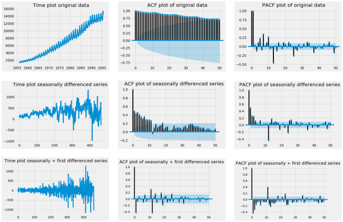
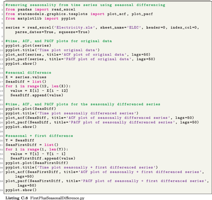
These graphs generated from Listing C.8 present the changes in the electricity demand times series data in Fig. 1(b), going from the original data and its ACF and PACF plots (first row), passing by the first difference (second row) to the graphs resulting from first and seasonal differencing (third row)
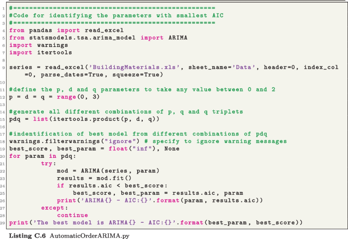
Considering the fact that the approach in Step 1 can only enable the estimation of pure AR and MA models, we need a way to check whether our series exhibits a more general ARIMA(p, d, q) model with \(p>0\) and \(q>0\) simultaneously. The AIC, which is a function of p and q, can help us to check whether there is a model better than the one obtained from Step 1. The smaller the AIC, the better the model is. To proceed, we can use the code in Listing C.6, which runs through a combinations of values p, d, and q from the interval [0, 2] to identify the order (p, d, q) with best AIC. For the selection of d, it is straightforward to use the process described above, repeating the differencing as necessary to get the best statistics from the ADF test based on the code in Listing C.3.
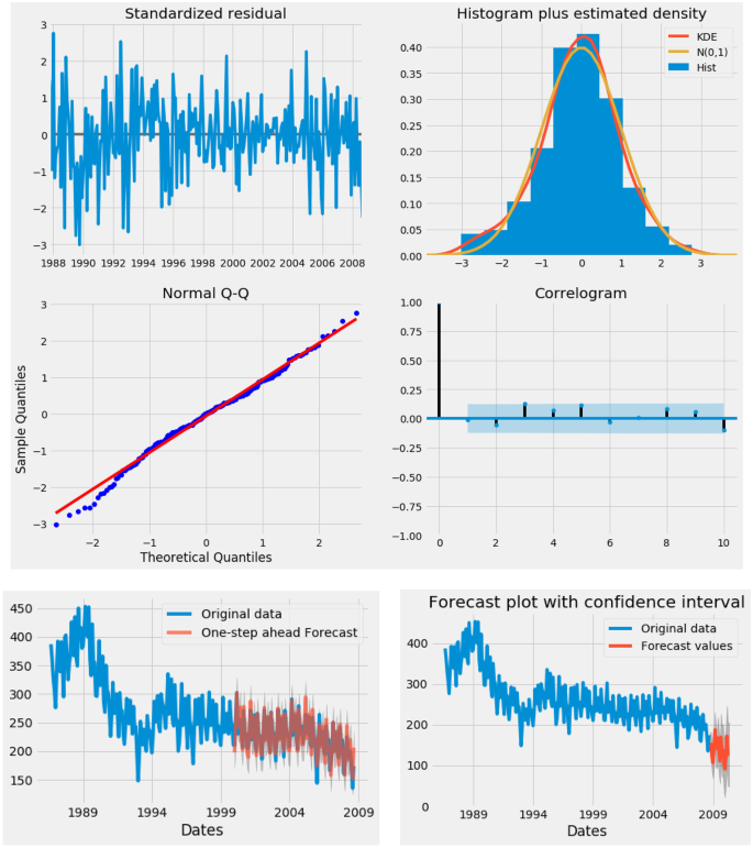
Summary of graphical results obtained by running the SARIMAX\((1, 1, 1)(0, 1, 1)_{12}\) model using the code from Listing C.10 on building material time series from 1986 to 2008 in Australia. The first four graphs assess the accuracy of the method, with (1) the residual plot, (2) the distribution of the error (close to a normal distribution), (3) the normal Q–Q plot, which compares randomly generated and independent standard normal data on the vertical axis to a standard normal population on the horizontal axis (the closest the data points are to a line suggests that the data are normally distributed), and (4) the correlogram for checking randomness in the residual. The last row shows the one-step forecasts on a section of the data for some visual assessment of accuracy, as well as the out-of-sample future forecasts over a 20-step horizon
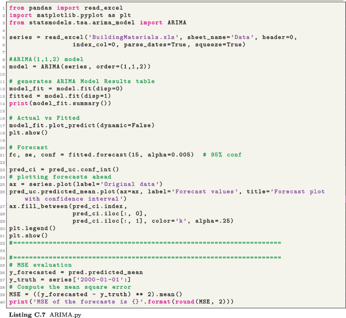
In terms of the content of the code in Listing C.6, its main feature is the ARIMA function from statsmodels. This function is also going to be used for Step 4 of Algorithm 1, but one of its most interesting features is that it also generates other important information such as the AIC of the corresponding model. However, in the context of Listing C.6, its main role is to print and compare the AIC to identify the best model. When the most suitable values of the order (p, d, q) have been identified, the ARIMA function can then be applied, using this order, to generate the forecasts, as it is done for the example in Listing C.7. Running the code generates forecast plots and some important statistics, including the AIC of the model and the corresponding coefficients/parameters \(\phi _i\), \(i=1, \ldots , p\) and \(\theta _j\), \(j=1, \ldots , q\) as described in the equation in (4).
So far, we have considered only time series that are not necessarily seasonal. In the seasonal case, the process is the same, except that the seasonal order (P, D, Q) and periodicity s have to be provided, as indicated in the general model
The first key difference between the non-seasonal (4) and seasonal (6) ARIMA models is the parameter s, which represents the number of time periods per season shown by the time series; for example, for the seasonal time series examples that we have covered so far (see, e.g. Figs. 2 and 5), the patterns repeat themselves every 12 months — hence, \(s=12\) in those cases. Similarly to d in (4), D in (6) represents the number of seasonal difference needed to remove seasonality in the time series. Furthermore, the pure seasonal autoregressive and moving average models
respectively, can be obtained in a way similar to (5) by looking whether the patterns from the ACF and PACF plots approximately repeat themselves after s time lags. For example, using the code in Listing C.8, first-order differencing and seasonal differencing can be done to remove trend and seasonality from the electricity data from Fig. 2(b). Based on the reference ACF and PACF plots in Fig. 13 (second row), this leads to the model ARIMA\((0, 1, 1)(0, 1, 1)_{12}\) in Fig. 14 (third row), as a MA(1) pattern approximately repeats itself from the 12th time lag.
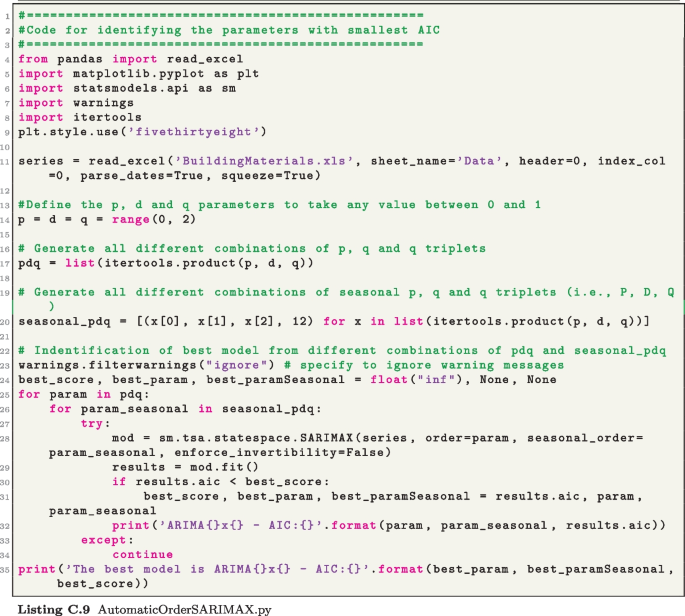
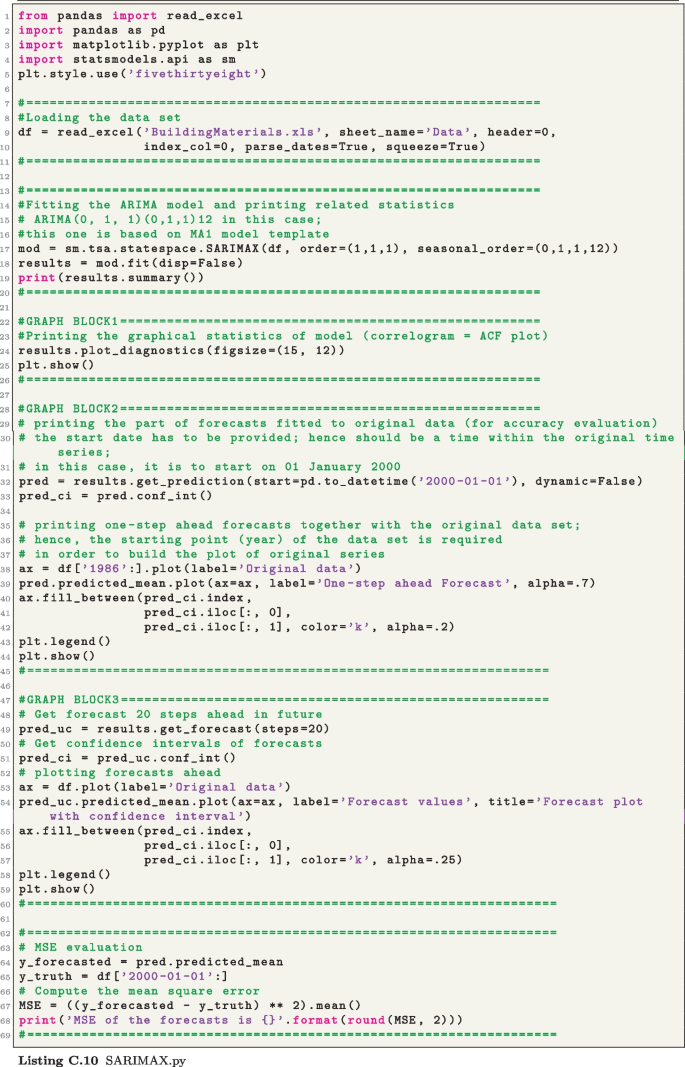
After this identification trial for a seasonal model based on the ACF and PACF plots, one can then proceed with the automatic identification process similar to the one introduced above (see Listing C.6), while using the corresponding seasonal code available in Listing C.9. Similarly, when the best seasonal order (p, d, q)(P, D, Q) with the corresponding number of time periods per season (s) has been identified, the seasonal ARIMA function (SARIMAX) also from statsmodels (see Listing C.10) can be used to generate the forecasts. Running SARIMAX with the code available in Listing C.10 applied on building material time series from 1986 to 2008 in Australia, we get the graphs in Fig. 15 together with a number of statistics assessing the quality of the model and the results.
5 Regression-Based Forecasting Method
The particularity of the method that we are going to discuss here is that it is explanatory, in comparison to the previous ones, which are blackbox methods. A regression model exploits potential relationships between the main (dependent) variable and other (independent) variables. We focus our attention here on the simplest and most commonly used relationship, which is the linear regression:
where Y is the dependent variable, \(X_1\), ..., \(X_k\) the independent variables, and \(b_0\), \(b_1\), ..., \(b_k\) the coefficients/parameters, where \(b_0\) specifically is often called intercept. It is important to start by recalling that a regression model as (8) is not a forecasting method by itself; there is a large number of applications of regression models in statistics and econometrics; see, e.g. [20] for a detailed analysis of regression models and some flavour of a sample of applications.
To apply the regression model (8) to develop a forecast for a time series \(\{Y_t\}\), we assume that it is influenced by other time series \(\{X_{it}\}\) for \(i=1, \ldots , n\). To have some flavour of this, we consider the mutual savings bank case study from [14, a regression model can be built to forecast EOM while considering AAA and Tto4 as independent variables. For some technical reasons (see [1]), our Y is the first-order difference of EOM (denoted by DEOM), and \(X_1\), \(X_2\), and \(X_3\) the AAA, Tto4, and D3to4 (first-order difference of Tto4), respectively. Note that historical time series data sets are available for the variables DEOM, AAA, Tto4, and D3to4, and there are some level of relationship between these variables as it can be seen from the scatter plots and correlation matrix in Fig. 4. However, this is not enough to guarantee that the regression model resulting from this relation would be significant. The analysis of a regression model starts with the evaluation of its overall significance.
For the overall significance of a model, key statistics are the \(R^2\) (known as the coefficient of determination) and the P-value, which gives the probability of obtaining a F statistic as large as the one calculated for the data set being studied, if in fact the true slope is zero. As the \(R^2\) is a number between 0 and 1, model (8) would be considered to be significant if it is at least greater than 0.50. Hence, the overall significance of the model increases as \(R^2\) grows closer to the upper bound 1. Furthermore, from the perspective of the P-value, a regression model will be said to be significant if the P-value is smaller than the conventionally set value of 0.05; and the significance improves as the P-value decreases below this threshold.
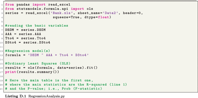
Before we expand this discussion further, let us show how the aforementioned statistics can be obtained with Python. Our analysis of a regression model here is based on the ols function from statsmodels, which means ordinary least squares, given that the parameters in (8) are computed by the same least square approach introduced for the SES model in (3). As you can see in the demonstration code in Listing D.1, it is incredibly easy to use ols. For example, to build the basic model for our above bank case study, what is needed is to start by writing the regression equation
formula = ’DEOM ÃAA + Tto4 + D3to4’,
recalling that Y = DEOM is the dependent variable and \(X_1\) = AAA, \(X_2\) = Tto4, and \(X_3\) = D3to4, respectively, are the independent variables. The function ols can then be applied as follows to the combination of this formula and the data set to produce the statistics:
results = ols(formula, data=series).fit(),
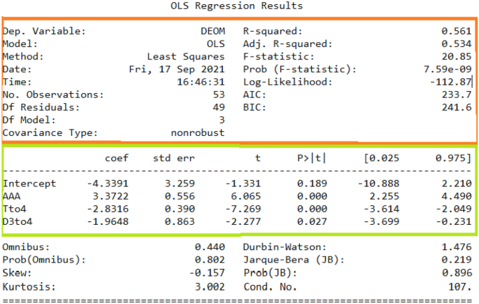
where series corresponds to the container with the time series data sets for the dependent and independent variables. The results from this function (generated with the code in Listing D.1) are given in the table in Fig. 16.
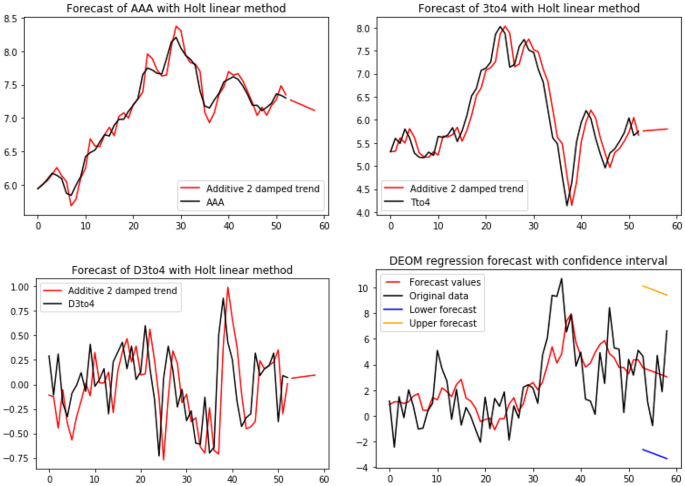
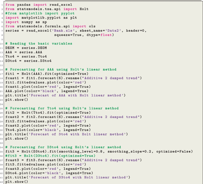
Generating forecasts for the time series involved in this model, i.e. AAA, Tto4, and D3to4 for the independent variables and DEOM for the dependent variable, is quite challenging as none of data sets exhibits a clear pattern. Hence, from the exponential smoothing methods covered in Section 3, only Holt’s linear method is the most suitable, as it enables the calculation of out-of-sample forecasts over a number of time points ahead. An ARIMA method could also be used to generate forecasts for AAA, Tto4, and D3to4
The orange box in Fig. 16 contains the statistics of overall significance of the model from the corresponding example, where Y is represented by time series DEOM, while \(X_1\), \(X_2\), \(X_3\), and \(X_4\), are represented by AAA, Tto4, and D3to4, respectively. It can clearly be seen that the overall model in this example is significant, with an \(R^2\) of 0.56 and a P-value of \(7.59\times 10^{-9}\). But the \(R^2\) suggests that the significance is not that strong, although the P-value is relatively good from the perspective of the threshold value of 0.05.
For the individual significance of each variable involved in (8), the main statistics is the P-value. Similarly to the F-test, the statsmodels function ols (ordinary least squares) generates P-values of each t-statistic. Each of these P-values is the probability of obtaining an absolute value of the t-statistics, of a given independent variable, as large as the one calculated for the data, if the parameter is equal to zero. So, if a P-value is small, then the estimated parameter is significantly different from zero. As with F-tests, it is common to conclude that an estimated parameter is significantly different from zero (i.e. significant) if the P-value is smaller than 0.05. The 5th column of the green box in Fig. 16 gives the P-value of each of the 3 independent variables in the example introduced above. Clearly, the significance of AAA, Tto4, and D3to4 is relatively good, as it is less than the threshold value of 0.05, although that of the latter variable is weaker.
Interestingly, the green box in the table in Fig. 16 also provides the coefficients of this example (cf. second column). After we have seen how the function ols can help to generate the key statistics to assess the overall and individual significance of the model, it remains to see how the forecast can actually be derived. To be able to do this, we need the forecasts
We can then use each of these forecasts of the independent variables in the expected value that determined the regression-based forecast for the independent variable Y using Eq. (8):
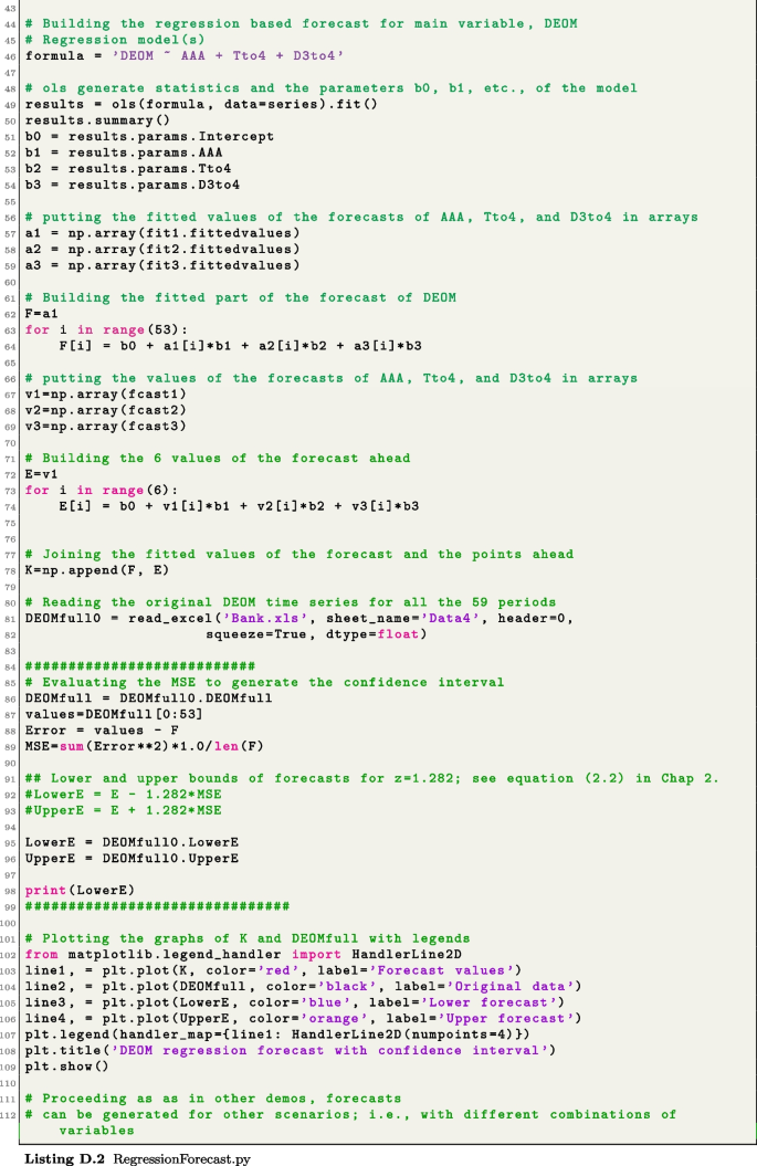
where the forecasts \(G_i\) of each independent variable can be obtained by any method that is most suitable. Applying (9) to our example above (see Listing D.2), we obtain the results in Fig. 17.
To conclude this section, some quick comments are in order. First, one of the typical preliminary step when building a regression model is to conduct a correlation analysis (e.g. scatter plots, correlation matrix), which can be done using tools that we have discussed in Subsection 2.2. This can be done here with matrix scatter plots and correlation tables; see Fig. 4. Also, often to improve an initial model as in (8) or resulting forecasting accuracy (9), a careful selection process of variables or features of the data sets can be done. Finally, the term prediction is usually confused with that of forecast. Prediction is much more broad, as it includes tasks such as predicting the result of a soccer game or an election, where only characteristics of the player of each team (soccer) or surveys from voters (election) not necessarily historical data can be used. Further details on these topics can be found in [1, 2, 15] and references therein.
6 Conclusion
This paper puts together a set of Python-based mostly off-the-shelf tools to develop forecasts for time series data using basic statistical forecasting methods, namely, exponential smoothing, ARIMA, and regression methods. It is important to mention that for each forecasting method and analysis tool described in this paper, there could be multiple Python approaches available, to undertake them, across different Python-based platforms. Secondly, within many packages, there could also be various ways to do the same thing. So, when using the material presented here, it will be useful to have a look at the most recent updates on the corresponding packages’ websites (see corresponding links provided in Section 2) for other possible ways to conduct specific analysis or for the most recent updates on possible improvements to these tools.
Data Availability
All the data sets used for the illustrations in this paper are based on the book [1]; all the data sets related to this book are available online: https://cloud.r-project.org/web/packages/fma/index.html. As for the specific times series from this database used in this paper, they are available via the following link, together with all the py files associated to the codes in the appendix: https://github.com/abzemkoho/forecasting.
References
Makridakis S, Wheelwright SC, Hyndman RJ (2008) Forecasting methods and applications. J Wiley & Sons
Hyndman RJ, Athanasopoulos G (2018) Forecasting: principles and practice. OTexts
Deng L (2014) A tutorial survey of architectures, algorithms, and applications for deep learning. APSIPA Transactions on Signal and Information Processing 3
Hamzaçebi C, Akay D, Kutay F (2009) Comparison of direct and iterative artificial neural network forecast approaches in multi-periodic time series forecasting. Expert Systems with Applications 36(Part 2):3839–3844
Robinson C, Dilkina B, Hubbs J, Zhang W, Guhathakurta S, Brown MA et al (2017) Machine learning approaches for estimating commercial building energy consumption. Appl Energy 208(Supplement C):889–904
Salaken SM, Khosravi A, Nguyen T, Nahavandi S (2017) Extreme learning machine based transfer learning algorithms: a survey. Neurocomputing 267:516–524
Voyant C, Notton G, Kalogirou S, Nivet ML, Paoli C, Motte F et al (2017) Machine learning methods for solar radiation forecasting: a review. Renew Energy 105(Supplement C):569–582
Zhang G, Eddy Patuwo B, Hu YM (1998) Forecasting with artificial neural networks: the state of the art. Int J Forecast 14(1):35–62
Zhang L, Suganthan PN (2016) A survey of randomized algorithms for training neural networks. Inf Sci 364-365(Supplement C):146-155
Adya M, Collopy F (1998) How effective are neural networks at forecasting and prediction? A review and evaluation. J Forecast 17(56):481–495
Chatfield C (1993) Neural networks: forecasting breakthrough or passing fad? Int J Forecast 9(1):1–3
Sharda R, Patil RB (1992) Connectionist approach to time series prediction: an empirical test. J Intell Manuf 3(1):317–323
Makridakis S, Spiliotis E, Assimakopoulos V (2018) Statistical and machine learning forecasting methods: concerns and ways forward. PLoS ONE 13(3):e0194889
Makridakis S, Spiliotis E, Assimakopoulos V (2018) The M4 Competition: results, findings, conclusion and way forward. Int J Forecast 34(4):802–808
Zemkoho A (2021) Forecasting. School of Mathematical Sciences, University of Southampton, Lecture Notes
Brownlee J (2018 ) Introduction to time series forecasting with Python. Ebook avaliable at https://machinelearningmastery.com/introduction-to-time-series-forecasting-with-Python/, (Accessed on 15 Nov 2019)
Korstanje J (2021) Advanced forecasting with Python. Apress
Lazzeri F (2021) Machine learning for time series forecasting with Python. J Wiley & Sons
Dickey DA, Fuller WA (1979) Distribution of the estimators for autoregressive time series with a unit root. J Am Stat Assoc 74:427–431
Montgomery DC, Peck EA, Vining GG (2021) Introduction to linear regression analysis. J Wiley & Sons
Acknowledgements
The lecture notes [15] (based on the textbooks [1, 2]), which have served as base for the mathematical background of the data analysis and forecasting tools discussed in this paper, have been developed and refined over the years thanks to contributions from many colleagues from the Southampton OR Group, in particular, I would like to mention Russell Cheng and Honora Smith for preparing and delivering the Forecasting course for many years, until the 2013–2014 academic year. The author would like to thank the referee and the guest editor for their constructive feedback, which led to improvements in the presentation of the paper.
Funding
This work is supported by the EPSRC grant with reference EP/V049038/1 and the Alan Turing Institute under the EPSRC grant EP/N510129/1.
Author information
Authors and Affiliations
Corresponding author
Ethics declarations
Conflict of Interest
The author declares no competing interests.
Additional information
Publisher’s Note
Springer Nature remains neutral with regard to jurisdictional claims in published maps and institutional affiliations.
This article is part of the Topical Collection on Model Development for the Operations Research Classroom.
Appendix
Appendix
1.1 Codes on Preliminaries on Python and Data Analysis




1.2 Codes on Exponential Smoothing Methods
1.3 Codes on ARIMA Methods



1.4 Codes on the Regression Analysis and Application to Forecasting
Rights and permissions
Open Access This article is licensed under a Creative Commons Attribution 4.0 International License, which permits use, sharing, adaptation, distribution and reproduction in any medium or format, as long as you give appropriate credit to the original author(s) and the source, provide a link to the Creative Commons licence, and indicate if changes were made. The images or other third party material in this article are included in the article's Creative Commons licence, unless indicated otherwise in a credit line to the material. If material is not included in the article's Creative Commons licence and your intended use is not permitted by statutory regulation or exceeds the permitted use, you will need to obtain permission directly from the copyright holder. To view a copy of this licence, visit http://creativecommons.org/licenses/by/4.0/.
About this article
Cite this article
Zemkoho, A. A Basic Time Series Forecasting Course with Python. Oper. Res. Forum 4, 2 (2023). https://doi.org/10.1007/s43069-022-00179-z
Received:
Accepted:
Published:
DOI: https://doi.org/10.1007/s43069-022-00179-z


