
In Mexico, Redefining Retail
FEMSA creates a digital ecosystem to increase customer value at its network of OXXO stores.
FEMSA, a leading Mexican retail, digital, and beverage firm, operates OXXO, the largest network of convenience stores in Latin America. More than just corner stores, the 22,000 OXXOs are also local hubs that simplify Mexican lives, offering thousands of services including payments for private services and banking, phone top-ups, and even utility bills. But FEMSA saw even greater potential for the chain, and wanted to create a digital ecosystem that would allow the 13 million people who visit the store every day to access even more features, like financial operations and loyalty benefits—all in one place. In 2022, the company created a new division in service of that goal. Digital@FEMSA partnered with IDEO to build that ecosystem, which would not only add convenience, but more value for each peso customers spent in both in-person and digital interactions.
4.7 stars
Spin Premia’s app store rating
22.8 million
active Spin Premia program users

13 million Mexicans visit FEMSA’s OXXO convenience stores every day. But the company had ambitions to leverage digital experiences to increase customer engagement.
To get there, Digital@FEMSA needed to deliver exceptional digital products with the agility to serve an entire population.
The IDEO team quickly discovered that the challenge of designing a Digital@FEMSA super app for tens of millions of customers was matched only by the operational complexity of bringing together different teams that had already created various apps with separate value propositions. Not to mention the 22,000 stores specifically tailored to local communities.
To kick off the project, the IDEO team built on FEMSA’s already deep understanding of its customers by meeting them in their homes and communities. The team discovered that users didn't care about long-term rewards; instead, they wanted everyday help to thrive long-term. Connecting omnichannel rewards to regular spending would allow them to save time and money—something they said was particularly important. Along with market research, insights like these directly informed the app's design, ensuring that it was compatible with users' everyday habits and preferences.

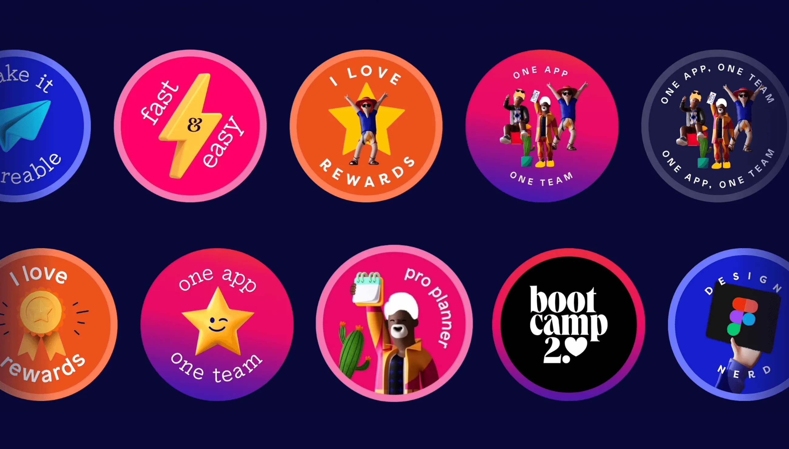
Meanwhile, the project team also worked to ensure the app fit the priorities of the various teams inside Digital@FEMSA, designing a comprehensive process for testing joint value propositions. Together, the team created a new design system, iconography, and set of unifying principles. IDEO also worked closely with the Digital@FEMSA teams to ensure that the app's design was in line with their strategic goals and technical capabilities, and built the app's initial information architecture. They incorporated secure transactions, effortless coupon redemption, personalized offers, and a cohesive loyalty program.

From there, the IDEO and Digital@FEMSA teams quickly transitioned into the design and development phase, producing prototypes of the new app, dubbed Spin Premia. With the help of user testing, they were able to continuously iterate to improve the app's features and functionalities, creating a user experience that was both seamless and intuitive. In just 10 months, they went from a small digital team with an ambitious idea, to a 150+ people product organization and an MVP launched in one region. And thanks to a tight partnership, the teams were able to seamlessly integrate Spin Premia into Digital@FEMSA's existing systems, resulting in a scalable implementation nationwide just a few months later.
The introduction of Spin Premia was a milestone in FEMSA's digital transformation path. Following a true ship and iterate model, just a few months into the project, the company released a smaller, focused version of the app in just one city in Mexico to quickly learn from customer experience before expanding to new regions. Since then, the Spin Premia app has quickly gained popularity, offering a safe and user-friendly platform that millions of Mexican consumers have embraced. It has also allowed FEMSA to broaden its digital portfolio and extend its customer base throughout Mexico, elevating customer satisfaction and fueling business expansion.
The IDEO team quickly discovered that the challenge of designing a Digital@FEMSA super app for tens of millions of customers was matched only by the operational complexity of bringing together different teams that had already created various apps with separate value propositions. Not to mention the 22,000 stores specifically tailored to local communities.
To kick off the project, the IDEO team built on FEMSA’s already deep understanding of its customers by meeting them in their homes and communities. The team discovered that users didn't care about long-term rewards; instead, they wanted everyday help to thrive long-term. Connecting omnichannel rewards to regular spending would allow them to save time and money—something they said was particularly important. Along with market research, insights like these directly informed the app's design, ensuring that it was compatible with users' everyday habits and preferences.

Meanwhile, the project team also worked to ensure the app fit the priorities of the various teams inside Digital@FEMSA, designing a comprehensive process for testing joint value propositions. Together, the team created a new design system, iconography, and set of unifying principles. IDEO also worked closely with the Digital@FEMSA teams to ensure that the app's design was in line with their strategic goals and technical capabilities, and built the app's initial information architecture. They incorporated secure transactions, effortless coupon redemption, personalized offers, and a cohesive loyalty program.

From there, the IDEO and Digital@FEMSA teams quickly transitioned into the design and development phase, producing prototypes of the new app, dubbed Spin Premia. With the help of user testing, they were able to continuously iterate to improve the app's features and functionalities, creating a user experience that was both seamless and intuitive. In just 10 months, they went from a small digital team with an ambitious idea, to a 150+ people product organization and an MVP launched in one region. And thanks to a tight partnership, the teams were able to seamlessly integrate Spin Premia into Digital@FEMSA's existing systems, resulting in a scalable implementation nationwide just a few months later.
The introduction of Spin Premia was a milestone in FEMSA's digital transformation path. Following a true ship and iterate model, just a few months into the project, the company released a smaller, focused version of the app in just one city in Mexico to quickly learn from customer experience before expanding to new regions. Since then, the Spin Premia app has quickly gained popularity, offering a safe and user-friendly platform that millions of Mexican consumers have embraced. It has also allowed FEMSA to broaden its digital portfolio and extend its customer base throughout Mexico, elevating customer satisfaction and fueling business expansion.

“The IDEO team helped us focus on user needs and evolving our ways of working, which was key to refining a compelling digital strategy for Spin Premia, creating a better product and aligning our team around a shared vision.”


