Using Headings
When is a heading not a heading? Serious question, the answer lies behind one of the most common accessibility problems on the web.
Headings are much more than a big bold title, they provide a solid structure to the webpage. Think of headings as an outline of your webpage.
The structure should be portrayed both in a visual and technical manner, so people can see the structure, and screen readers are able to identity the structure in order to read it out.
Users who can see the page decide within seconds whether or not the content is relevant to them by skimming through headings, glancing over sub-headings keeping an eye out for significant keywords. Breaking up content with headings allows the page to be easily scanned by the user
Without a heading structure, you force users to do extra work to find the information they’re looking for, who has the time and luxury?
From an accessibility point of view the structure in the code should align with the visual presentation and make sense as a “table of contents” for the page.
Use headings to introduce content, they are labels not statements.
Sections and sub-sections
Have you been structuring headings wrong this whole time? Let’s find out, use this diagram as a guide.

In total, there are six levels of headings you can use to structure sections of content on the page.
Heading 1 is the most important and is the heading for the page, this typically corresponds to the title of the page. It gives users an indication of what the page is about – you should have a single Heading 1 on each page.
Each heading 2 creates a section of content. They divide pages into consumable sections which help to organize the content.
When you get to the next heading, ask yourself: Is it a new section? If so then a Heading 2 would be appropriate. If it’s a sub-section of the last heading 2, then a Heading 3 would be suitable. If it’s a sub-section of the last Heading 3, then a Heading 4 would be a good fit, and so on.
Heading visuals
The heading level and visual appearance (e.g. size, boldness) should align, but a page must have a good structure regardless of how it looks.
This has two key implications:
- Don’t style text to look like a heading unless you use heading mark-up.
- The level of heading is not the same as the text size.
Skipping heading levels should be avoided (e.g. H1 directly to H3) from an accessibility point of view. People using screen readers often rely on navigating by heading so if the structure isn’t hierarchical they may not understand the relationship.
A good example:
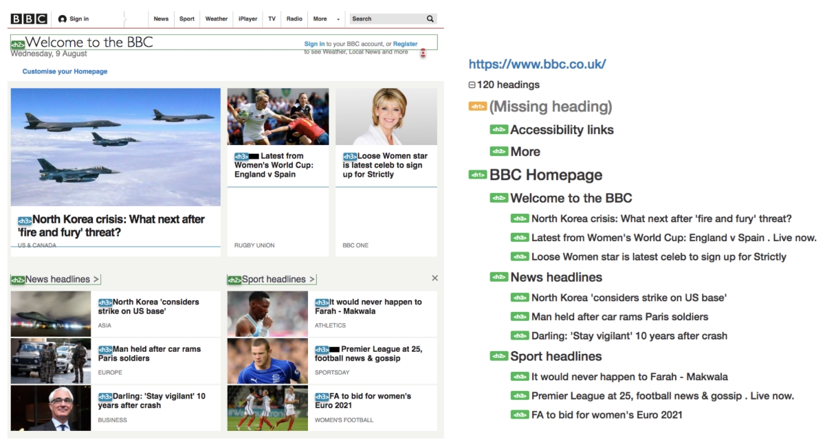
The BBC’s homepage is a good example of how headings should be structured.

A single Heading 1 has been used on the page, this is wrapped around the logo (which is appropriate for the homepage only). Visually, the ‘homepage’ aspect is hidden but it is there for assistive technologies to announce.
The different sections of the page are defined as Heading 2s (including some of the items above the heading 1), this allows users to scan the page easily to find the relevant section for them to read. The headlines under each topic are defined as Heading 3s.
In short, this is how the BBC’s homepage structure is broken down:
BBC Homepage
Headline Topic
News Headline 1
News Headline 2
News Headline 3
Headline Topic
News Headline 1
News Headline 2
News Headline 3
A not so obvious good example:

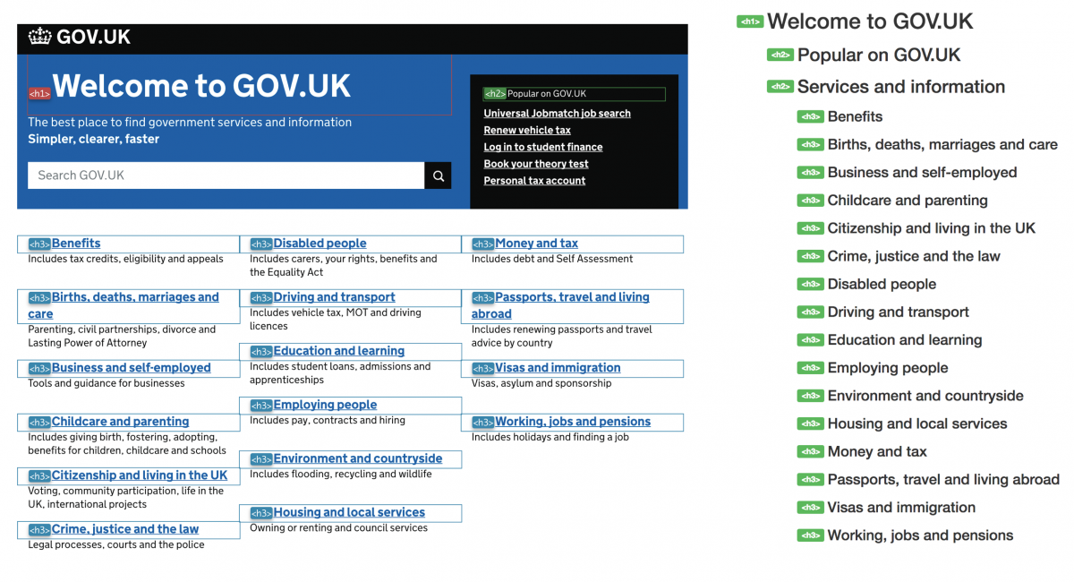
The GOV.UKs website is another example of a good heading structure, but visually it’s not as obvious.
Text size doesn’t matter! ‘Popular on GOV.UK’ seems like normal text. The text size is small, it’s not loud and bold, but actually assigning a
to the text is appropriate because it is a whole new section. Would you have guessed that?
There’s no indication of what the big section with links is all about, so how would users of screen readers know?
Guess what, where a section is visually obvious you can hide headings! There is a Heading 2 above the list of links called ‘Services and Information’. It is hidden from sighted users but it will still be read out to users of screen readers.
Let’s take a look at GOV.UKs homepage structure broken down:
Welcome to GOV.UK
Popular on GOV.UK
Link 1
Link 2
Link 3
>
…
Services and Information
(hidden)
Service 1
Service 2
Service 3
…
The BBC’s and GOV.UKs homepage are very different, visually. Programmatically, they have a solid heading structure which conveys the page structure effectively and keeps users of assistive technology happy!
An example of what not to do:
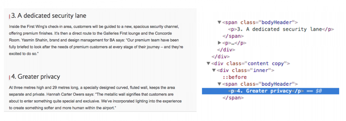
Take a look at this snippet from an article, that you would assume will make the most out of heading tags.

Sure, they look like headings, big and bold, divides the content into small chunks, but don’t be fooled. If we dig deep enough, we’ll find that actually a paragraph tag has been assigned
Fake heading alert! Avoid formatting text to give a bold or visual appearance of headings without using heading tags.
So the big question, when is a heading not a heading? When it’s just normal text in disguise!
You’re now ready to combat one of the most common accessibility issue on the web.
Start building accessibility into your projects at the beginning to save time and money, don’t just leave it hanging on the backlog letting it gather up dust. Drill it in.
Can we help?
Nomensa is an award-winning UX design agency with offices in Bristol, London and Amsterdam. If you would like us to help you with your accessibility challenges or to provide you with an accessibility evaluation of your website/mobile app, please don’t hesitate to get in touch. Take a full look at the digital accessibility services that we offer.
We drive commercial value for our clients by creating experiences that engage and delight the people they touch.
Email us:
hello@nomensa.com
Call us:
+44 (0) 117 929 7333


