Kit Kat_Advertising and Creative Strategy
•
10 likes•14,104 views

The document analyzes an advertisement for KitKat Mini chocolate bars using a crossword puzzle. It critiques flaws in the original ad such as lack of color, small logo, and irrelevance of puzzle words. Three improved advertisements are proposed using word searches instead and addressing the flaws. The best new ad features a bright, colorful word search that is almost complete with the KitKat package imprinted prominently to convey the "mini break" message more clearly and appeal to wider audiences including children.
Report
Share


Kit Kat_Advertising and Creative Strategy
- 1. Advertising & Creative Strategy
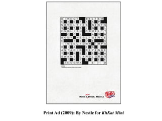
- 2. Print Ad (2009): By Nestle for KitKat Mini
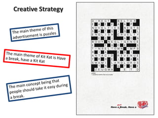
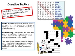
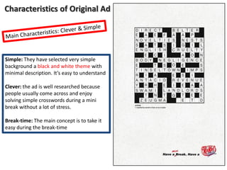
- 4. Creative Tactics Puzzle chosen: Crossword, a word puzzle usually in the form of a square, with black shaded squares. Reason Being: Crossword is the most well known puzzle and people usually solve crosswords during a mini break. The tone of the advertisement is simple using black and white as the main theme to blend in with the office/newspaper styles
- 6. Characteristics of Original Ad Simple: They have selected very simple background a black and white theme with minimal description. It’s easy to understand Clever: the ad is well researched because people usually come across and enjoy solving simple crosswords during a mini break without a lot of stress. Break-time: The main concept is to take it easy during the break-time
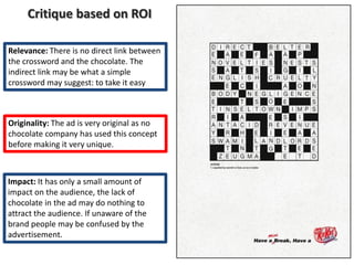
- 7. Critique based on ROI Relevance: There is no direct link between the crossword and the chocolate. The indirect link may be what a simple crossword may suggest: to take it easy Originality: The ad is very original as no chocolate company has used this concept before making it very unique. Impact: It has only a small amount of impact on the audience, the lack of chocolate in the ad may do nothing to attract the audience. If unaware of the brand people may be confused by the advertisement.
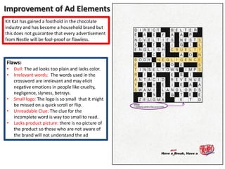
- 8. Improvement of Ad Elements Kit Kat has gained a foothold in the chocolate industry and has become a household brand but this does not guarantee that every advertisement from Nestle will be fool-proof or flawless. Flaws: • • • • • Dull: The ad looks too plain and lacks color. Irrelevant words: The words used in the crossword are irrelevant and may elicit negative emotions in people like cruelty, negligence, slyness, betrays. Small logo: The logo is so small that it might be missed on a quick scroll or flip. Unreadable Clue: The clue for the incomplete word is way too small to read. Lacks product picture: there is no picture of the product so those who are not aware of the brand will not understand the ad
- 9. New advertisements Theme: Common & Simple Puzzles about to be completed
- 10. Slogan: Have a mini break, have a Kit Kat mini
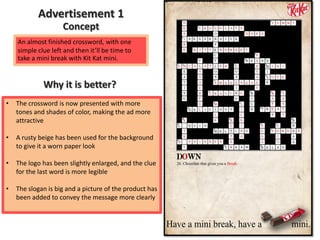
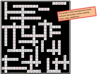
- 11. Advertisement 1 Concept An almost finished crossword, with one simple clue left and then it’ll be time to take a mini break with Kit Kat mini. Why it is better? • The crossword is now presented with more tones and shades of color, making the ad more attractive • A rusty beige has been used for the background to give it a worn paper look • The logo has been slightly enlarged, and the clue for the last word is more legible • The slogan is big and a picture of the product has been added to convey the message more clearly
- 13. Slogan: Have a break, Have a Kit Kat
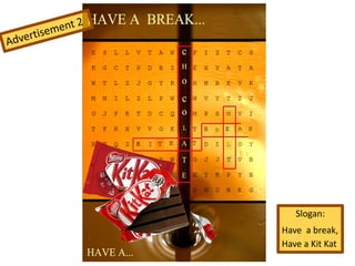
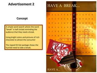
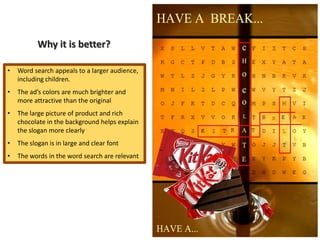
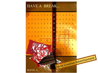
- 14. Advertisement 2 Concept A simple word search where the word “break” is half circled reminding the audience that they need a break. Using bright colors and pictures of rich chocolate to attract the consumer The ripped Kit Kat package shows the hurried need to take a break.
- 15. Why it is better? • Word search appeals to a larger audience, including children. • The ad’s colors are much brighter and more attractive than the original • The large picture of product and rich chocolate in the background helps explain the slogan more clearly • The slogan is in large and clear font • The words in the word search are relevant
- 16. Slogan: Have a Break , Have a mini Kit Kat
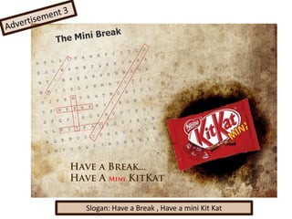
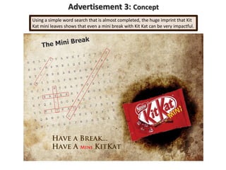
- 17. Advertisement 3: Concept Using a simple word search that is almost completed, the huge imprint that Kit Kat mini leaves shows that even a mini break with Kit Kat can be very impactful.
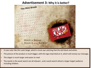
- 18. Advertisement 3: Why it is better? • It uses color like the rustic beige, which is more eye catching that the dull black and white. • The picture of the product is much bigger, with the logo imprinted on it, which will convey our message. • The slogan is much larger and easier to read • The words in the word search are all relevant , and a word search attract a larger target audience including children.
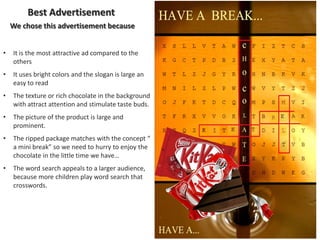
- 20. Best Advertisement We chose this advertisement because • It is the most attractive ad compared to the others • It uses bright colors and the slogan is large an easy to read • The texture or rich chocolate in the background with attract attention and stimulate taste buds. • The picture of the product is large and prominent. • The ripped package matches with the concept “ a mini break” so we need to hurry to enjoy the chocolate in the little time we have… • The word search appeals to a larger audience, because more children play word search that crosswords.
- 21. Have a Break, Have a Kit Kat! Thank You!