文章目录
水平居中
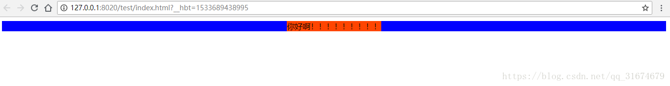
- 方法一:在父容器上定义固定宽度,margin值设成auto
<!DOCTYPE html>
<html>
	<head>
		<meta charset="utf-8" />
		<title>helloworld</title>
	</head>
	<style type="text/css">
		.div1{
			background-color: blue;
			width: 200px;
			margin: auto;
		}
		.div2{
			background-color: orangered;
		}
	</style>
	<body>
		<div class="div1">
			<div class="div2">
				你好啊!!!!!!!!!
			</div>
		</div>
	</body>

</html>

方法2:在子元素中将display设置为inline-block,父元素text-algin设置为center
<!DOCTYPE html>
<html>
	<head>
		<meta charset="utf-8" />
		<title>helloworld</title>
	</head>
	<style type="text/css">
		.div1{
			background-color: blue;
			text-align: center;
		}
		.div2{
			display: inline-block;
			background-color: orangered;
		}
	</style>
	<body>
		<div class="div1">
			<div class="div2">
				你好啊!!!!!!!!!
			</div>
		</div>
	</body>

</html>
垂直居中
<!DOCTYPE html>
<html>
	<head>
		<meta charset="utf-8" />
		<title>helloworld</title>
	</head>
	<style type="text/css">
		.div1{
			width: 200px;
			height: 200px;
			display: table-cell;
    		vertical-align: middle;
    		text-align: center;
		}
		.div2{
			/*display: inline-block;*/
			background-color: orangered;
		}
	</style>
	<body>
		<div class="div1">
			<div class="div2">
				你好啊!!!!!!!!!
			</div>
		</div>
	</body>

</html>
<!DOCTYPE html>
<html>
	<head>
		<meta charset="utf-8" />
		<title>helloworld</title>
	</head>
	<style type="text/css">
		.div1{
			width: 200px;
			height: 200px;
			display: flex;
    		justify-content:center;
    		align-items:Center;
		}
		.div2{
			/*display: inline-block;*/
			background-color: orangered;
		}
	</style>
	<body>
		<div class="div1">
			<div class="div2">
				你好啊!!!!!!!!!
			</div>
		</div>
	</body>

</html>
垂直水平居中
方式1:绝对定位
<!DOCTYPE html>
<html>
	<head>
		<meta charset="UTF-8">
		<title>居中</title>
		<style>
			*{
				padding: 0;
				margin: 0;
			}
			.box{
				width: 500px;
				height: 400px;
				background: red;
				margin: 100px;
				//border: 2px;
			}
			.child{
				position: absolute;
				width: 200px;
				height: 150px;
				background: blue;
				margin: 125px 150px;
			}
		</style>
	</head>
	<body>

				<div class="box">
				    <div class="child"></div>
				</div>

	</body>
</html>
方式二 定位+负margin
<!DOCTYPE html>
<html>
	<head>
		<meta charset="UTF-8">
		<title>居中</title>
		<style>
			.child{
				position: fixed;
				width: 200px;
				height: 150px;
				background: blue;
				top:50%;
				left: 50%;
				margin-top: -75px;
				margin-left:-100px ;

			}
		</style>
	</head>
	<body>
		 <div class="child"></div>
	</body>
</html>
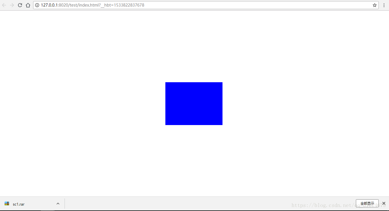
方式3:使用translate实现平移
下面的transform代码可以更换为transform: translate(-50%,-50%);
<!DOCTYPE html>
<html>
	<head>
		<meta charset="UTF-8">
		<title>居中</title>
		<style>
			.child{
				position: fixed;
				width: 200px;
				height: 150px;
				background: blue;
				top:50%;
				left: 50%;
				transform: translate(-100px,-75px);
			}
		</style>
	</head>
	<body>
		 <div class="child"></div>
	</body>
</html>
效果如上图。
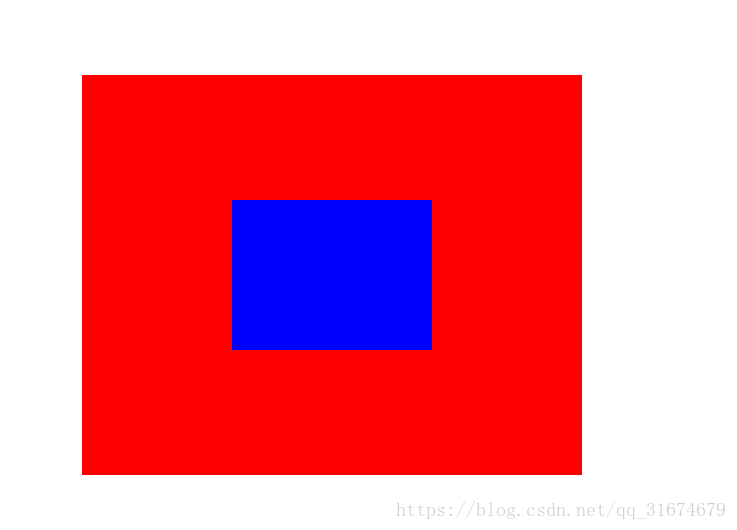
方式4:通过设置bottom top left right margin来实现
<!DOCTYPE html>
<html>
	<head>
		<meta charset="UTF-8">
		<title>居中</title>
		<style>
			.father{
				width: 500px;
				height: 500px;
				background: black;
				position: relative;
			}
			.child{
				position: absolute;
				width: 200px;
				height: 150px;
				background: blue;
				top:0;
				left:0;
				right: 0;
				bottom: 0;
				margin: auto;
			}
		</style>
	</head>
	<body>
		<div class="father">
			<div class="child"></div>
		</div>

	</body>
</html>

方式5:flex布局
最长使用,设置 display: flex;justify-content: center;align-items: center;三个属性;
<!DOCTYPE html>
<html>
	<head>
		<meta charset="UTF-8">
		<title>居中</title>
		<style>
	.father {
        display: flex;
        justify-content: center;
        align-items: center;
        width: 500px;
        height: 500px;
        background-color: rgb(197, 34, 34);
    }
    .child {
        width: 50px;
        height: 70px;
        background-color: rgb(36, 167, 64);
    }
	</style>
	</head>
	<body>
		<div class="father">
			<div class="child"></div>
		</div>

	</body>
</html>
方式6:使用tablecell
<!DOCTYPE html>
<html>
	<head>
		<meta charset="UTF-8">
		<title>居中</title>
	<style>
	  .father {

        display: table-cell;
    	vertical-align: middle;
    	text-align: center;
        width: 500px;
        height: 500px;
        background-color: rgb(197, 34, 34);

    }

    .child {
        display: inline-block;
        width: 50px;
        height: 70px;
        background-color: rgb(36, 167, 64);
    }
	</style>
	</head>
	<body>
		<div class="father">
			<div class="child"></div>
		</div>

	</body>
</html>
方式7:JS方式
<!DOCTYPE html>
<html lang="en">

<head>
    <meta charset="UTF-8">
    <meta http-equiv="X-UA-Compatible" content="IE=edge">
    <meta name="viewport" content="width=device-width, initial-scale=1.0">
    <title>Document</title>
</head>
<style>

    .father {
        width: 500px;
        height: 500px;
        background-color: rgb(197, 34, 34);
    }
    .child {
        width: 50px;
        height: 70px;
        background-color: rgb(28, 150, 123);
    }
</style>

<body>
    <div class="father">
        <div class="child">
        </div>
    </div>
</body>
    <script>
        let father=document.getElementsByClassName('father')[0];
        let child=document.getElementsByClassName('child')[0];
        fatherH=father.clientHeight;
        fatherW=father.clientWidth;
        childW=child.offsetWidth;
        childH=child.offsetHeight;
        child.style.position="absolute";
        child.style.top=(fatherH-childH)/2+'px';
        child.style.left=(fatherW-childW)/2+'px';


    </script>
</html>


 2万+
2万+

 被折叠的 条评论
为什么被折叠?
被折叠的 条评论
为什么被折叠?
 到【灌水乐园】发言