Location via proxy:   [ UP ]  
[Report a bug]   [Manage cookies]                
Page MenuHomePhabricator

Distinct user and article talk pages
Closed, ResolvedPublic

Description

1. Background

Start explorations of visual treatments of user talk page vs article talk pages. Our survey for experienced editors and comparative analysis revealed, that a visual refresh of the talk pages list and detail view should be considered. The comparative analysis revealed that a focus on other people in the interface and features to preview ongoing discussions in the list view. We are thinking of it as enhancing the current experience not drastic changes, as new users were mostly able to accomplish their goals.


2. User stories

  • When viewing user and article talk pages, I want a visual distinction between the two, so that I realize that they have different purposes and have better orientation.
  • When viewing user and article talk pages, I want to have a preview of the discussion topics in the list view, so that I can get a better idea on the topics that are discussed.

3. Designs (Figma)

  • ⚠️ If you’re reading this it’s too late: All images used below might be updated by now. They’re here for demo purposes only. Make sure to check out the latest designs on Figma.
  • Notice that user and article talk pages uses the same component system with minor differences, that’s why this task has not been split into two.

3.1. Updates to user talk pages (Figma)

Before

Talk pages redesign.png (1×720 px, 122 KB)

After
0102030405060708
Talk pages redesign 4.png (2×720 px, 143 KB)
Talk pages redesign 3.png (1×720 px, 97 KB)
Talk pages redesign 5.png (1×720 px, 108 KB)
Talk pages redesign 10.png (1×720 px, 97 KB)
Talk pages redesign 6.png (1×720 px, 102 KB)
Talk pages redesign 7.png (1×720 px, 103 KB)
Talk pages redesign 8.png (1×720 px, 95 KB)
Talk pages redesign 9.png (1×720 px, 96 KB)

Changelog:

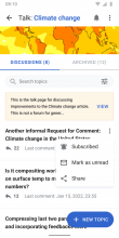
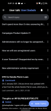
  • General: Updated visual designs and information hierarchy (Figma)
  • App bar:
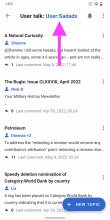
    • Added link to user talk page in app bar (blue)
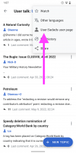
    • Overflow menu consists of
      • Language
      • Watch
      • Link to user profile
      • Edit history (link to native edit history T297759)
      • Share
  • Tabs: 'Discussions' and 'Archived' tab to distinguish active from archived conversations
  • Sort: Added 'Date updated' as a new sort option. Pushes newest subjects to the top ↑ (or bottom ↓, depending on sort preference). The default will still be 'Date published ↓'
  • List items
    • List items consist of:
      • Talk page title
      • Users: User icon, User name(s)
        • If multiple people are involved in a discussion, list them as following:
          • Username1, Username2, Username3 +2 (make sure to keep usernames on 1 line and truncate with +%number at the end if they don’t fit on 1 line)
      • A preview of the latest message in the thread, truncate at 2 lines
      • Amount of replies the subject has received
      • Last comment indicator (display in Android’s system time)
    • Tapping a list item leads to a detail of a conversation (1 tap target)
    • Overflow menu of a list item contains (06)
      • Subscribing to a topic (05, 06)
      • Mark messages as read/unread
      • Share a link to the subject
    • Swipe action to mark message as read/unread (similar to notifications)
  • Footer (01)
    • Contains link to the user talk’s native edit history
    • Contains link to user profile page

3.2. Updates to article talk pages (Figma)

Before

Talk pages redesign 2.png (1×720 px, 134 KB)

After
01020304
Talk pages redesign-1.png (3×720 px, 252 KB)
Talk pages redesign.png (1×720 px, 372 KB)
Talk pages redesign-2.png (1×720 px, 133 KB)
Talk pages redesign-3.png (1×720 px, 154 KB)

Changelog:

Disclaimer: Only lists differences from user talk page designs.

  • App bar:
    • Features link to article talk page in app bar (blue)
    • Overflow menu features link to article page
  • Header image
    • Uses the article’s header image (if available). Height: 84dp.
  • Template (yellow): previews contents of the template on three lines in plain text. Notice the updates to the designs.
  • List item differences to user talk pages
    • Don’t contain usernames
    • Don’t contain message previews
  • Footer
    • Contains link to the article’s native edit history
    • Contains a link to the article page

4.0. Test Instructions

QA to conduct usability testing based on design and change log above for the following language:

  • French
  • Arabic
  • Japanese

Please ensure the system level language of the phone match the wiki language

5.0 Release Notes

DO NOT MERGE UNTIL T304856 HAS BEEN RESOLVED


APK

https://github.com/wikimedia/apps-android-wikipedia/pull/3267

Event Timeline

LGoto triaged this task as High priority.Dec 13 2021, 5:09 PM
scblr added a subscriber: cooltey.
scblr renamed this task from Explorations around distinction between user and article talk pages to Distinct user and article talk pages.Mar 4 2022, 11:31 AM
scblr updated the task description. (Show Details)

Hey @SNowick_WMF based on the details of the task above, is there any new instrumentation needed?

As a reminder, once these treatments are released the metrics we will check against is (T294971):
The Android team is working to enhance the messaging interface. The OKRs we originally established are as follows:
Objective: Target users have a more intuitive and enhanced communication interface to reduce barriers for productively collaborating with other Wikipedians to increase confidence while improving wikiprojects
Key results (Overall increase in Talkpage edits): Talk Namespace edits made through Android app and not reverted within 48 hours increases by 10% 30 days after release of interventions
Key results( Penetration Increase amongst active editors): Of the people who publish an edit to a wiki, across namespaces, in a month, we see an 10% increase in the percentage of people who publish an edit to a talk page that is not reverted within 48 hours.
Key Result: 2% Decrease in abandonment rate amongst target users on talk pages

The questions we will also monitor is:

Do we see a change in time spent/session length
Are there improvements throughout the funnel and are there differences when compared to Mobile Web
Have our changes impacted user talk pages vs article talk pages in different ways?
Processing design review feedback from Feb 24 about threading for Android talk pages.

Thanks @iamjessklein @RHo @OTichonova @KieranMcCann @cmadeo for all the great feedback.

Below you’ll find a summary of what’s been updated, and here’s the latest design prototype.

The plan is to build a working (coded) version in the upcoming weeks to experiment further with the threading behavior.


Preference for variant A, B or C?

  • JK: I don’t think that the twitter version is intuitive - i lean towards the threading within minimized replying version (A)
  • RH: Preference: version A (toggle)
  • CLM: My preference is for the ‘YouTube’ version, version A
  • OT: I think the last one is a little bit unclear in my opinion I like the the first prototype.
  • SG: In variant C, I found it confusing how to enter to replies as tap wasn’t a natural gesture I thought.

RS: We decided to move forward with your preference (variant A with the toggle), which was also our preference! 🚀


Not enough visibility for the thread line

  • RH: I do like the line as literal thread, wonder if there is a way to make it a little bit more visible though
  • OT: Really exciting to see the variations! You mentioned it but the contrast of the line & background is super low, especially if it’s the only indicator which reply is a response to what text. It is easy to miss atm. (+1, CLM)

RS: The line’s contrast ratio and thickness has been increased. Check out the updates in the prototype.


More threading and toggle behavior

  • RH: Optimize Show/Hide replies behavior (toggle version A)
  • RH: I think an option where the control “show replies ៴” moves to the end of the thread when selected (and changes to “hide replies ៱”) would make it clearer when the thread starts and ends.
  • RH: Second and first level replies are hard to distinguish - it would be good to explore a visual treatment that helps “anchor” the start of a thread more (+1, CLM)
  • RH: Another consideration to show the start of a reply that I think Edit team is using is adding a literal indent character “ㄴ” to the start of the reply header. Would explore this as an added affordance to clearly show when it is a reply
  • CLM: Curious about the clarity of the levels of threading a bit, slight difference from web around highlighting how to reply to the main/original thread (like the use of color blue on web to separate, maybe that could be used here too?)
  • OT: Also how would it look with super crazy text in the replies? I am copying over some more difficult threads from the web now, I can share these with you next week.

RS: I made some updates to the designs based on your comments:

  • Added a horizontal rule element (line) to indicate the start and end of a thread better.
  • Added animation to guide users and convey what is happening after tapping the 'Show replies ▶' toggle. We are going to experiment with the animation and where to position 'Hide replies ▼' in the actual implementation.
  • Added additional affordance to indicate who replied to whom more clearly (e.g. 'ItsJazTanner to Hobomok'. Tapping the second username takes users to the initial message. Discussed the usage of using the word 'to' instead of the literal indent character 'ㄴ' with Kieran and we think it’s a clean approach. When this is hard to translate or otherwise problematic, we’d also see the reply icon as a possible alternative.

Other

  • CLM: Curious how search will work with multiple layers of disclosure stacked inside of each thread?

RS: We are likely going to expand all threads when searching and highlight the results, similar to how we’re doing it for 'Find in article' and notifications — like this.

Hi @scblr

By checking the design and the API that we are going to use, looks like there does not have an API that can show the list of archived talk topics. Is it possible to remove tabs from the talk page design since it is not feasible?

Hi @scblr

Should we have the same "watch/unwatch" behavior as we have on the article page? e.g. icon changes, snackbar, undo...etc.

By checking the design and the API that we are going to use, looks like there does not have an API that can show the list of archived talk topics. Is it possible to remove tabs from the talk page design since it is not feasible?

✅ Done: https://www.figma.com/file/Ky1oBd1bNezM0ovToBzDxB/Talk-pages-visual-distinction-T297617?node-id=423%3A18072

Should we have the same "watch/unwatch" behavior as we have on the article page? e.g. icon changes, snackbar, undo...etc.

Great observation, yes please!

Hi @scblr

The APK is ready for review, please download the latest APK from the link in the ticket description.

cooltey updated the task description. (Show Details)

Wow, this is great so far @cooltey 👏


Here are a few things that I spotted 👇

01) Username should not be displayed on article talk pages, it’s part of the “visual distinction” concept:

Design vs Implemention
Screenshot 2022-05-09 at 11.59.46.png (1×1 px, 443 KB)

02) Can we use a more hi-res image? The image looks blurry in a lot of articles. At least when there’s good internet connection speed.

Screenshot_20220509-115014 copy 3.png (2×1 px, 362 KB)

03) Increase the image’s height to 86dp (if that’s not the case already)

Screenshot_20220509-115014 copy 3.png (2×1 px, 362 KB)

04) Change to Search topics (not messages)

Screenshot_20220509-115014 copy 2.png (2×1 px, 363 KB)

05) Please update the search bar component to these specs:

Height: 36dp (6dp top and bottom margin to match 48dp tap area)
Font-size: 14dp (if that is not the case already)

image.png (246×2 px, 64 KB)

06) Reduce space below the search field (see specs on Figma)

Design vs Implemention
Screenshot 2022-05-09 at 12.03.57.png (1×1 px, 368 KB)

07) Watching / unwatching from a talk page does not work correctly yet, see this video:

https://www.dropbox.com/s/cx15yy7j038u20a/screen-20220509-120839.mp4?dl=0

There are issues with:

  • State changes
  • Updating the label in the overflow menu
  • Detecting if a talk page’s already on the list

08) Make sure to change all messages to de-emphasized state when they’re read:

Design vs Implementation
image.png (1×1 px, 259 KB)

09) Hide the reply icon and label completely when there are no replies yet

Screenshot_20220509-121916.png (2×1 px, 258 KB)

  1. Can we show the active usernames in this conversation like this: Scblr, Scblrdev, Heydimpz + 2. The maximum horizontal space should be 1 line though. The username that has posted the latest reply comes first (and in font-weight: bold), then the others (chronologically sorted, in font-weight: normal)

Screenshot_20220509-122045.png (2×1 px, 235 KB)

  1. Sometimes we are showing an ellipsis, even though there is a message. Can this be optimized?
  1. Remove User: from these strings:
Screenshot_20220509-130915.png (2×1 px, 249 KB)
Screenshot_20220509-130754.png (2×1 px, 273 KB)

Hi @scblr

Can we show the active usernames in this conversation like this: Scblr, Scblrdev, Heydimpz + 2. The maximum horizontal space should be 1 line though. The username that has posted the latest reply comes first (and in font-weight: bold), then the others (chronologically sorted, in font-weight: normal)

The is slightly tricky to achieve the behavior since not every username has a similar length. Would it be possible to keep one username (from the latest comment) and with the numbers?

Sure thing 👍

Hi @scblr:

! In T297617#7913326, @scblr wrote:

01) Username should not be displayed on article talk pages, it’s part of the “visual distinction” concept:

Done

02) Can we use a more hi-res image? The image looks blurry in a lot of articles. At least when there’s good internet connection speed.

Done

03) Increase the image’s height to 86dp (if that’s not the case already)

It is 86dp, please let me know if you need to increase the height.

04) Change to Search topics (not messages)

Done

05) Please update the search bar component to these specs:

Height: 36dp (6dp top and bottom margin to match 48dp tap area)
Font-size: 14dp (if that is not the case already)

If we change the height to 36dp, the button (filter/sort icon) will need to be smaller but at the same time, the touchable area should be the same (48dp), which is conflicting with each other.

06) Reduce space below the search field (see specs on Figma)

Done

07) Watching / unwatching from a talk page does not work correctly yet, see this video:

Done

08) Make sure to change all messages to de-emphasized state when they’re read:

Done

09) Hide the reply icon and label completely when there are no replies yet

Done

  1. Can we show the active usernames in this conversation like this: Scblr, Scblrdev, Heydimpz + 2. The maximum horizontal space should be 1 line though. The username that has posted the latest reply comes first (and in font-weight: bold), then the others (chronologically sorted, in font-weight: normal)

Done

  1. Sometimes we are showing an ellipsis, even though there is a message. Can this be optimized?

Done. I replace \n to

  1. Remove User: from these strings:

Done.

Thanks, @cooltey — almost good to go, a few things to optimize:

02) Can we use a more hi-res image? The image looks blurry in a lot of articles. At least when there’s good internet connection speed.

Done

❌ It still is pretty low res — what options do we have here?

Screenshot_20220517-145902.png (2×1 px, 269 KB)

03) Increase the image’s height to 86dp (if that’s not the case already)

It is 86dp, please let me know if you need to increase the height.

✅ Ok, looks good to me

05) Please update the search bar component to these specs:

Height: 36dp (6dp top and bottom margin to match 48dp tap area)
Font-size: 14dp (if that is not the case already)

If we change the height to 36dp, the button (filter/sort icon) will need to be smaller but at the same time, the touchable area should be the same (48dp), which is conflicting with each other.

✅ Ok, so let’s keep it as is, then

07) Watching / unwatching from a talk page does not work correctly yet, see this video:

Done

❌ Looks good, but can we move the snackbar above the FAB?

image.png (532×1 px, 266 KB)

See Material Guidelines

09) Hide the reply icon and label completely when there are no replies yet

Done

Screenshot_20220517-150800.png (2×1 px, 282 KB)

❌ Can you remove the gap completely when there are no replies? (display: none instead of visibility: hidden)

Hi @scblr

❌ It still is pretty low res — what options do we have here?

Done

❌ Looks good, but can we move the snackbar above the FAB?

Done

❌ Can you remove the gap completely when there are no replies? (display: none instead of visibility: hidden)

Done

Thanks @cooltey

01) To me it’s a bit unclear why certain topics are displayed when performing a search, see the example below where the search term toc is likely part of a reply in subjects listed as a search result:

Screenshot_20220520-153910.png (2×1 px, 194 KB)

To make this more clear: Can we highlight the term on the subject page after users tapped an item, e.g. with 'Find in page' enabled that you are building in T307378?

02) Can we add the talk page title/subject, to the view after tapping + NEW TOPIC and REPLY for context?

New topic:Add talk page name
Screenshot_20220520-153142.png (2×1 px, 219 KB)
Screenshot_20220520-152817.png (2×1 px, 158 KB)
ReplyAdd talk page subject
Screenshot_20220520-153013.png (2×1 px, 264 KB)
Screenshot_20220520-153021.png (2×1 px, 227 KB)

03) It’s subtle but I noticed that when marking an item as read/unread → the top border flashes (changes color) on the corresponding item. Can we remove that?

https://www.dropbox.com/s/7skhmswqlfom6kc/screen-20220520-152745.mp4?dl=0

Thanks @cooltey

01) To me it’s a bit unclear why certain topics are displayed when performing a search, see the example below where the search term toc is likely part of a reply in subjects listed as a search result:

Screenshot_20220520-153910.png (2×1 px, 194 KB)

To make this more clear: Can we highlight the term on the subject page after users tapped an item, e.g. with 'Find in page' enabled that you are building in T307378?

Per my Slack message, would it be possible to move this request to the T307378 since they are related?

02) Can we add the talk page title/subject, to the view after tapping + NEW TOPIC and REPLY for context?

Done

03) It’s subtle but I noticed that when marking an item as read/unread → the top border flashes (changes color) on the corresponding item. Can we remove that?

Done but this will remove the "return to position" animation after swiping the item, not sure which one you prefer.

thanks @cooltey

02) Can we add the talk page title/subject, to the view after tapping + NEW TOPIC and REPLY for context?

New topic:Add talk page name
Screenshot_20220520-153142.png (2×1 px, 219 KB)
Screenshot_20220520-152817.png (2×1 px, 158 KB)
ReplyAdd talk page subject
Screenshot_20220520-153013.png (2×1 px, 264 KB)
Screenshot_20220520-153021.png (2×1 px, 227 KB)
  • ✅ Talk page name when tapping + NEW TOPIC looks good to me
  • ❌ But please add the talk page subject to the header when tapping REPLY

03) It’s subtle but I noticed that when marking an item as read/unread → the top border flashes (changes color) on the corresponding item. Can we remove that?

Done but this will remove the "return to position" animation after swiping the item, not sure which one you prefer.

Not sure what you mean by remove the “return to position” animation but looks good to me now.

cooltey added a subscriber: Sharvaniharan.

Hi @scblr

But please add the talk page subject to the header when tapping REPLY

Done!

Per @Sharvaniharan's comment here: https://github.com/wikimedia/apps-android-wikipedia/pull/3267#issuecomment-1132134370

Could you please help to confirm that the color in dark mode is correct? Thanks!

All looks good to me now @cooltey — thanks!

There are issues here that we should fix.

  • There is inconsistency on the direction of the back button for RTL languages
    WhatsApp Image 2022-06-09 at 11.01.01 AM.jpeg (1×738 px, 123 KB)
    WhatsApp Image 2022-06-09 at 11.01.01 AM (1).jpeg (1×738 px, 93 KB)
    WhatsApp Image 2022-06-09 at 11.01.00 AM.jpeg (1×738 px, 82 KB)
  • There are topics that are greyed out but clickable, and when you click them it doesn't take you to the correct destination. See the example for the article of couscous on EN or Alex's User Talk Page
    Screenshot_20220608-174915.png (2×1 px, 183 KB)
    WhatsApp Image 2022-06-09 at 10.47.36 AM.jpeg (1×738 px, 74 KB)
  • The overflow menu should read: Edit History, Read Article, Watch and then Share. Additionally the icon for Read Article should be consistent with the coloring of the other icons
    Screenshot_20220608-174323.png (2×1 px, 231 KB)
    .
  • When there is only one active thread, there is a huge amount of space at the bottom. When there is <TBD by Robin> number of threads the about this article should be appended to the bottom with no scroll OR there should be some other solution to address the massive chunk of space at the bottom of the screen.
    Screenshot_20220608-174220.png (2×1 px, 276 KB)
    @scblr
  • There is inconsistency on the direction of the back button for RTL languages

[done]

  • There are topics that are greyed out but clickable, and when you click them it doesn't take you to the correct destination.

[done]

  • The overflow menu should read: Edit History, Read Article, Watch and then Share. Additionally the icon for Read Article should be consistent with the coloring of the other icons

[done]

ABorbaWMF subscribed.

Looks good to me on 2.7.50404-r-2022-06-07

Note - I did find one issue: I noticed that on article talk page entries that have no subject (topic title), the 3-dot menu does not work. It's the one that would show 'subscribe', 'mark as read', and 'share'. I found a few articles, but maybe the easiest is the Matthew Mcconaughy article, I just went to the article talk page and there's a "(no subject)" entry and I was tapping the 3-dot menu https://en.m.wikipedia.org/wiki/Talk:Matthew_McConaughey

Hi @ABorbaWMF

Thanks for the feedback. Looks like the discussion API updates now will show the coffee-roll (template) text in the API response, and @Dbrant created a PR of making it display correctly.

We will make another beta release next week and the issue will be resolved in the upcoming beta.