Location via proxy:   [ UP ]  
[Report a bug]   [Manage cookies]                
Page MenuHomePhabricator

Design the visual look for temp usernames
Closed, ResolvedPublic3 Estimated Story Points

Description

Motivation

We want temporary accounts to look different from other usernames so that they can be easily distinguished at a glance. This would be helpful for patrollers and admins.

Spec

image.png (374×1 px, 80 KB)

Details in the Figma file

Note 1: This task doesn't change the format of the temporary account username. That may be updated later in a different task. This task is only for adding the colored background box around the temp account name in all the places where temporary accounts would show up.

Related Objects

Event Timeline

Niharika set the point value for this task to 3.Dec 21 2022, 7:40 PM

Change 884895 had a related patch set uploaded (by Cyndywikime; author: Cyndywikime):

[mediawiki/core@master] Add a colored background box around a temporary account name

https://gerrit.wikimedia.org/r/884895

I have a couple of questions for @RHo or @Niharika:

  • The current patch appears to be working in all desktop skins, but not Minerva. Should it look the same in Minerva, or does that decision belong to the Web team?
  • In Figma, the background colour is #eaecf0. There are a couple of different .less variables with this value - which one should we use?

Thanks!

I have a couple of questions for @RHo or @Niharika:

  • The current patch appears to be working in all desktop skins, but not Minerva. Should it look the same in Minerva, or does that decision belong to the Web team?

The styling should ideally be more consistent everywhere, which is using the same style, but it's trickier in this case because sometimes Minerva (or different skins) styles usernames very differently in general, but sometimes using an avatar or 'incognito" icon to show the difference, sometimes not:

ExampleVector 2022Minerva
Icon to indicate Anon vs Registered (History page)
image.png (120×1 px, 56 KB)
image.png (506×748 px, 56 KB)
Recent Changes - name only
image.png (192×1 px, 90 KB)
image.png (458×716 px, 67 KB)

It feels like maybe the decision could be Web team to update the name + icon styling, whether to adjust the icon and/or background (or some other style).

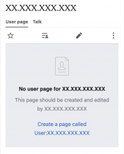
In addition, I wanted to check whether it will update the background colour everywhere with temp username, or only in pages where it is a link? See for example the page to create a Userpage for an IP editor at the moment, there are three differently styled IP addresses here

Vector 2022
image.png (92×1 px, 38 KB)
Minerva
image.png (930×754 px, 68 KB)
  • In Figma, the background colour is #eaecf0. There are a couple of different .less variables with this value - which one should we use?

Ahh I am not so sure on the less values. The colour in the DSG is @colorGray200, but perhaps you can also see background-color-interactive if the Codex colour tokens are available? This page may or may not be helpful to find the right value: https://doc.wikimedia.org/codex/main/design-tokens/color.html

I think there's an outstanding question from @RHo in this task.

In addition, I wanted to check whether it will update the background colour everywhere with temp username, or only in pages where it is a link? See for example the page to create a Userpage for an IP editor at the moment, there are three differently styled IP addresses here

Vector 2022
image.png (92×1 px, 38 KB)
Minerva
image.png (930×754 px, 68 KB)

Second, did we get clarity on the background color?

I think there's an outstanding question from @RHo in this task.

In addition, I wanted to check whether it will update the background colour everywhere with temp username, or only in pages where it is a link? See for example the page to create a Userpage for an IP editor at the moment, there are three differently styled IP addresses here

Vector 2022
image.png (92×1 px, 38 KB)
Minerva
image.png (930×754 px, 68 KB)

In terms of what the current patch does, it only updates the background where it's a link.

@Niharika What do you think should happen in those other places? A related question that has come up in code review - do we want this background to be added on potentially any page where a user link might be shown, or can we limit it to certain pages we know about, e.g. pages that have paginated lists of results?

See @Jdlrobson's comment: https://gerrit.wikimedia.org/r/c/mediawiki/core/+/884895/

Second, did we get clarity on the background color?

It looks as though there's still discussion about where this should go, so we can see what variables are available once that's decided.

I think there's an outstanding question from @RHo in this task.

In addition, I wanted to check whether it will update the background colour everywhere with temp username, or only in pages where it is a link? See for example the page to create a Userpage for an IP editor at the moment, there are three differently styled IP addresses here

Vector 2022
image.png (92×1 px, 38 KB)
Minerva
image.png (930×754 px, 68 KB)

In terms of what the current patch does, it only updates the background where it's a link.
@Niharika What do you think should happen in those other places? A related question that has come up in code review - do we want this background to be added on potentially any page where a user link might be shown, or can we limit it to certain pages we know about, e.g. pages that have paginated lists of results?
See @Jdlrobson's comment: https://gerrit.wikimedia.org/r/c/mediawiki/core/+/884895/

In discussion with @Tchanders about this item, my recommendation would be that it could start off with only styling when it's a link, since the reason for the background is to help patrollers and admins spot temp users in places where like RC and Edit history where it can appear in a big list, whereas the example like above being the user page it would be pretty obviously a temp account based on name format.

Second, did we get clarity on the background color?

It looks as though there's still discussion about where this should go, so we can see what variables are available once that's decided.

Thanks @RHo.

@Niharika What do you think should happen in those other places? A related question that has come up in code review - do we want this background to be added on potentially any page where a user link might be shown, or can we limit it to certain pages we know about, e.g. pages that have paginated lists of results?

See @Jdlrobson's comment: https://gerrit.wikimedia.org/r/c/mediawiki/core/+/884895/

@Niharika A related question would be whether we want the background on pages like Special: Permalink (T331008), page information (T331017) and credits (T331021)

Yes, I think it makes sense to add the background on temp usernames on those pages.

Discussed with @Niharika, and the aim is to have the grey background everywhere that a temporary user account link appears, including content pages (article, talk and others).

@Tchanders so would this also apply to the top right of the page UI too? (just confirming)

Screenshot 2023-03-17 at 8.35.39 AM.png (478×2 px, 183 KB)

@Tchanders so would this also apply to the top right of the page UI too? (just confirming)

Screenshot 2023-03-17 at 8.35.39 AM.png (478×2 px, 183 KB)

@Niharika What do you think?

@Tchanders so would this also apply to the top right of the page UI too? (just confirming)

Screenshot 2023-03-17 at 8.35.39 AM.png (478×2 px, 183 KB)

@Jdlrobson I can't see the screenshot (restricted access). Do you mean the personal bar? If so, @Prtksxna had some ideas about this.

The personal bar would only be seen by the temp user themselves and so it doesn't need to have a background. That is what we have in the mocks so far.

Thanks @Prtksxna! Could you confirm that we'd like this style everywhere apart from the personal bar? Just to help us understand where to load these styles

We'll do gray everywhere, but there will be exceptions like the personal bar. So, as we had discussed, lets use this task to put it everywhere and I'll file separate tasks for exceptions.

Change 902186 had a related patch set uploaded (by Jdlrobson; author: Jdlrobson):

[mediawiki/skins/MinervaNeue@master] Enable core interface styles on mobile

https://gerrit.wikimedia.org/r/902186

Change 902186 merged by jenkins-bot:

[mediawiki/skins/MinervaNeue@master] Enable core interface styles on mobile

https://gerrit.wikimedia.org/r/902186

Change 884895 merged by jenkins-bot:

[mediawiki/core@master] Add a colored background box around a temporary account name

https://gerrit.wikimedia.org/r/884895

@Cyndymediawiksim Please see the results below, thanks!

OS: macOS 13.2
Browsers: Safari 16.3, Chrome 111, Firefox 111
Environment: Local

Minerva Skin- In Recent Changes & Watchlist, grey spacing is off

T325768_IPMasking_VisualLook_Minvera1.png (1×1 px, 158 KB)
T325768_IPMasking_VisualLook_Minvera2.png (1×1 px, 160 KB)

Reverted- Wehn reverted did you want the temp user account to be still highlighted in the description? Also once you make a comparison from reverted, it's no longer highlighted in grey.

T325768_IPMasking_VisualLook_Revert1.png (690×2 px, 299 KB)
T325768_IPMasking_VisualLook_Revert2.png (593×2 px, 245 KB)

Personal Bar- Just showing that besides the one above, temp user account is highlighted except for the personal bar. This is as designed though.

T325768_IPMasking_VisualLook_PersonalBar.png (285×997 px, 56 KB)

@GMikesell-WMF , nice catch! Thanks! @Tchanders , thoughts on how we should go about a temporary user link on a reverted edit?

@Tchanders , thoughts on how we should go about a temporary user link on a reverted edit?

This would be tricky since the link comes from a row in the comment table, rather than being generated as a user link by Linker::userLink (which adds the data we need to display the correct IP address). Hopefully it's not needed since there would likely be other references to this user on the history page, and at worst an admin/patroller could click through to Special:Contributions and find the IP addresses there. Tagging @Niharika and @Prtksxna for visibility.

Minerva Skin- In Recent Changes & Watchlist, grey spacing is off

@GMikesell-WMF Would it be possible to raise a separate ticket for this? We have a few things to fix in Minerva.

@Tchanders , thoughts on how we should go about a temporary user link on a reverted edit?

This would be tricky since the link comes from a row in the comment table, rather than being generated as a user link by Linker::userLink (which adds the data we need to display the correct IP address). Hopefully it's not needed since there would likely be other references to this user on the history page, and at worst an admin/patroller could click through to Special:Contributions and find the IP addresses there. Tagging @Niharika and @Prtksxna for visibility.

Ok sounds good. We'll wait to see what they say.

Minerva Skin- In Recent Changes & Watchlist, grey spacing is off

@GMikesell-WMF Would it be possible to raise a separate ticket for this? We have a few things to fix in Minerva.

I created T333474: IP Masking: Minerva Skin- Grey spacing is off in Recent Changes & Watchlist

@Tchanders , thoughts on how we should go about a temporary user link on a reverted edit?

This would be tricky since the link comes from a row in the comment table, rather than being generated as a user link by Linker::userLink (which adds the data we need to display the correct IP address). Hopefully it's not needed since there would likely be other references to this user on the history page, and at worst an admin/patroller could click through to Special:Contributions and find the IP addresses there. Tagging @Niharika and @Prtksxna for visibility.

I think it's fine if we don't highlight usernames in the revert comments. @Prtksxna thoughts?

…since there would likely be other references to this user on the history page, and at worst an admin/patroller could click through to Special:Contributions and find the IP addresses there…

I think it's fine if we don't highlight usernames in the revert comments. @Prtksxna thoughts?

Agreed.

This was fixed, and the styles were moved to be with the other Linker::userLink styles. The background colour will be applied less widely now, but consistently with other user link styles. Let's file follow-up tasks if we think these styles are important to add elsewhere.

Here's a separate task for updating Minerva's user link styles: T334581

I find the background color annoying. The recent changes page is already complex with a lot of information, and the blobs with a different background color make the appearance even messier. There's no need to highlight the temporary accounts in particular. Before, there were usernames and IP addresses (numeric). Now there are usernames and the temporary accounts (also largely numeric). Thus, the change has not made the page harder to read and the background color is an unnecessary distraction. Please consider removing it again.

PS. My interest in this is that I am a user on dawiki, which introduced temporary accounts a few days ago, and among other roles is also a patroller on the wiki.

I find the background color annoying. The recent changes page is already complex with a lot of information, and the blobs with a different background color make the appearance even messier. There's no need to highlight the temporary accounts in particular. Before, there were usernames and IP addresses (numeric). Now there are usernames and the temporary accounts (also largely numeric). Thus, the change has not made the page harder to read and the background color is an unnecessary distraction. Please consider removing it again.

cc @KColeman-WMF @Niharika