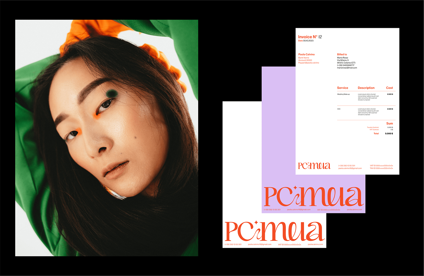
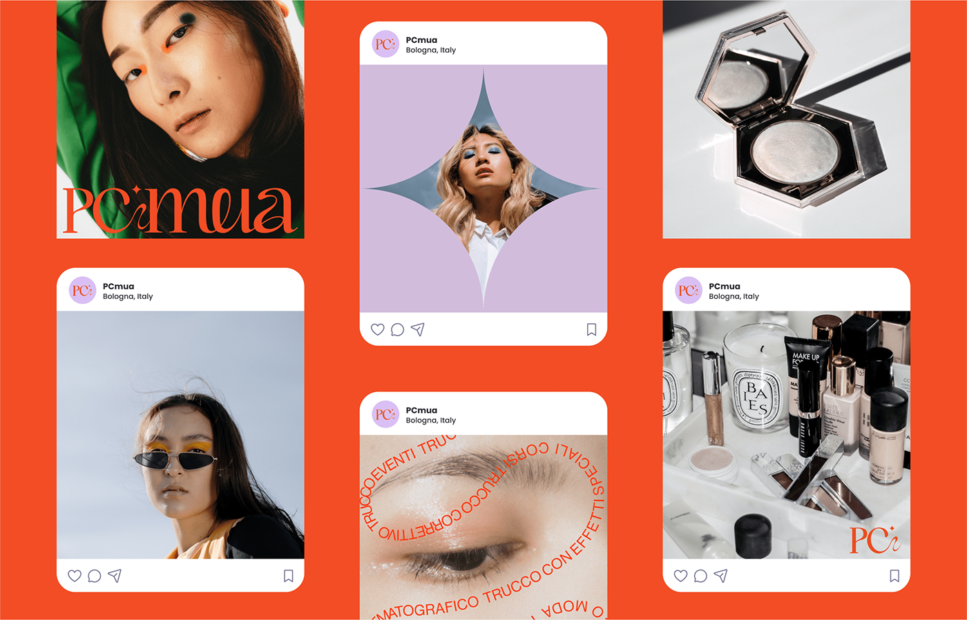
Introducing PCmua, a talented make-up artist based in Bologna, Italy.
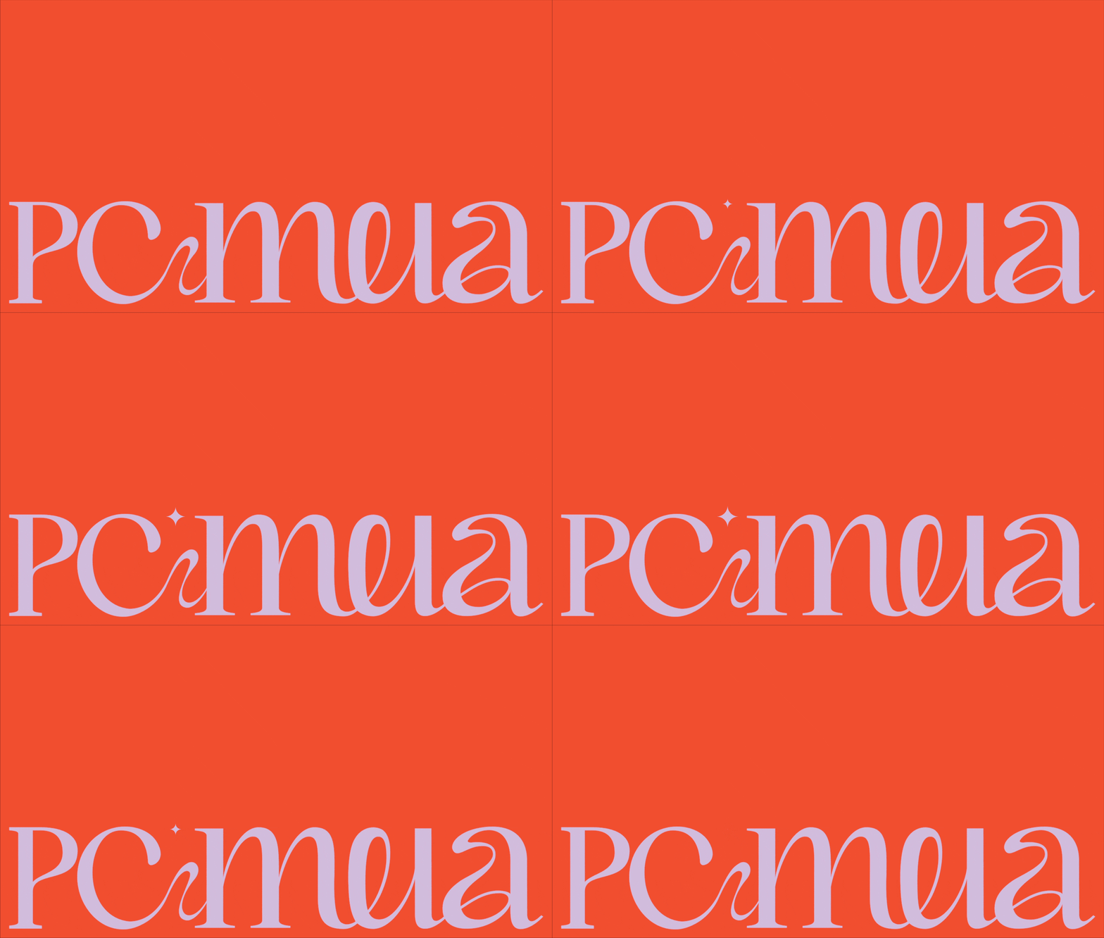
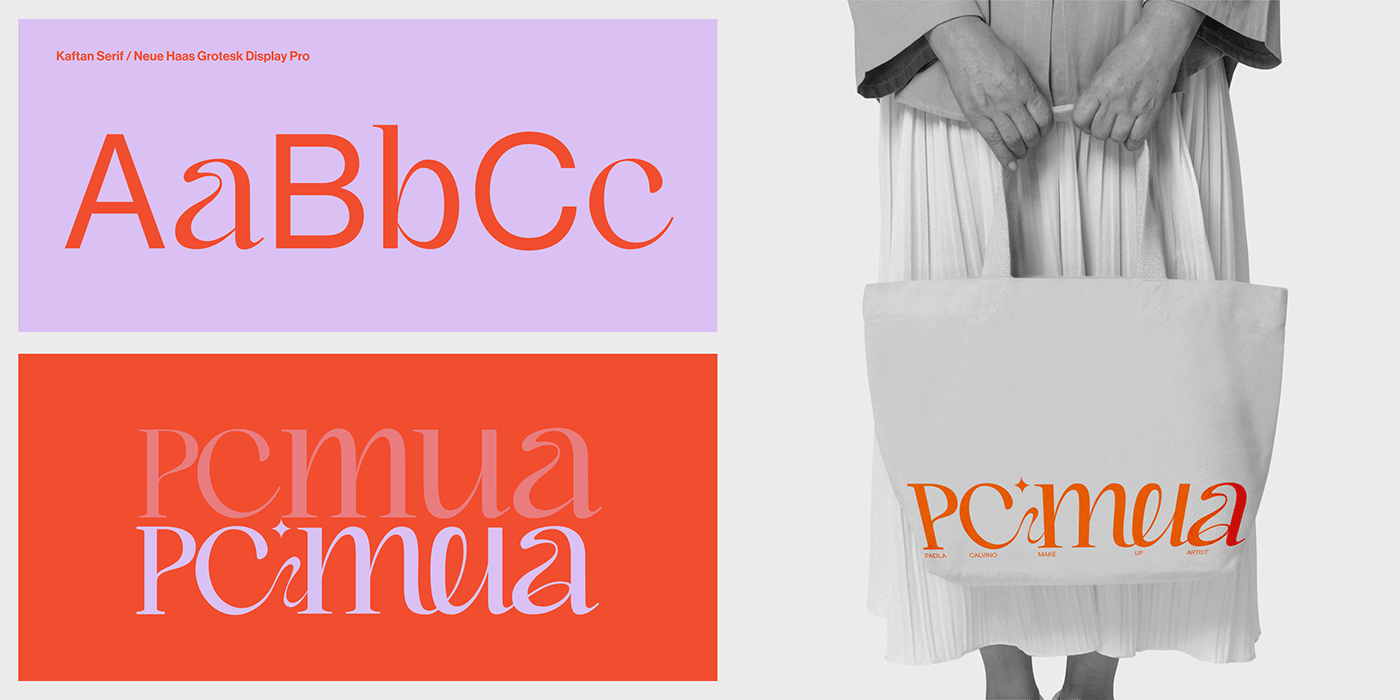
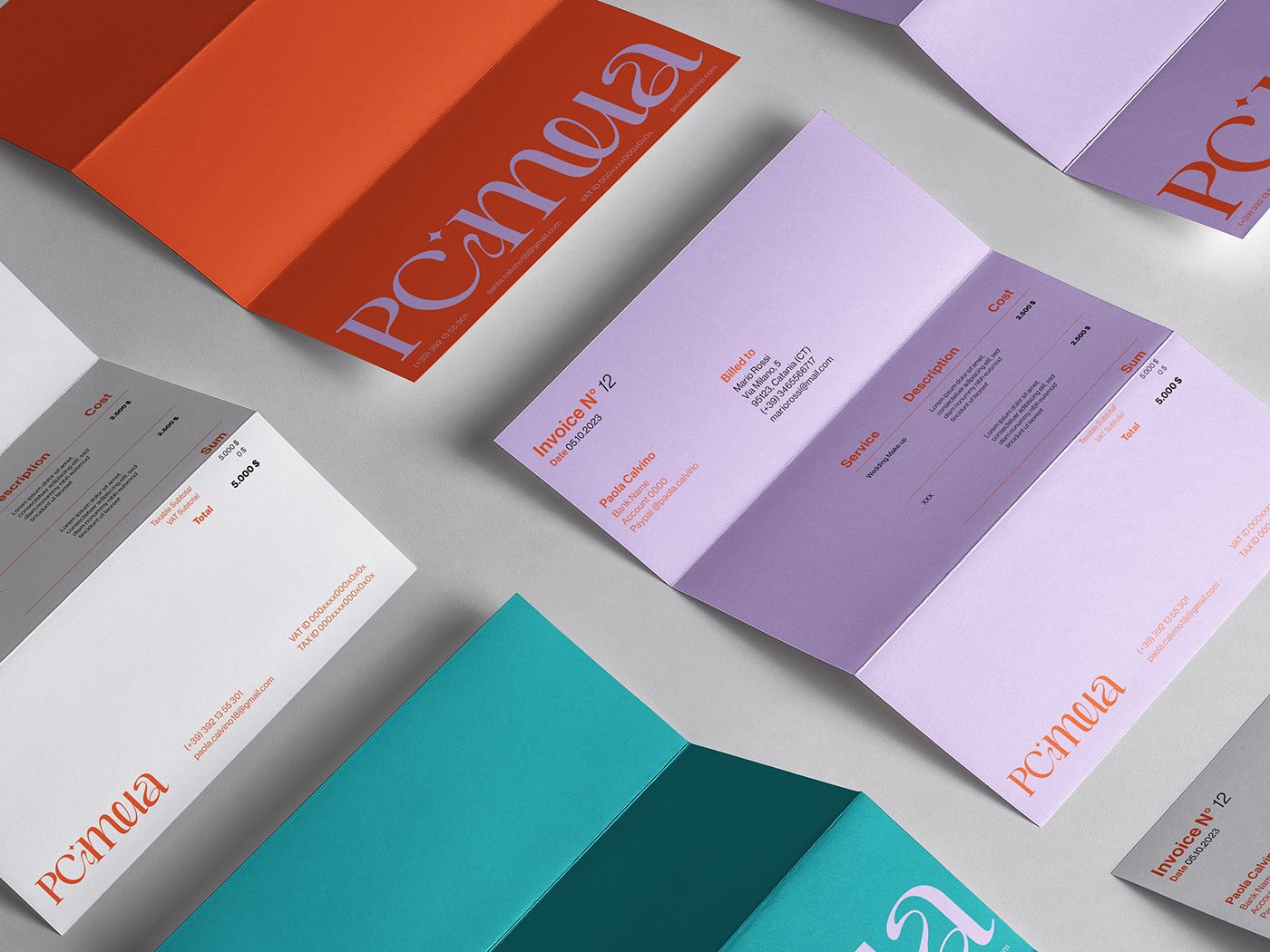
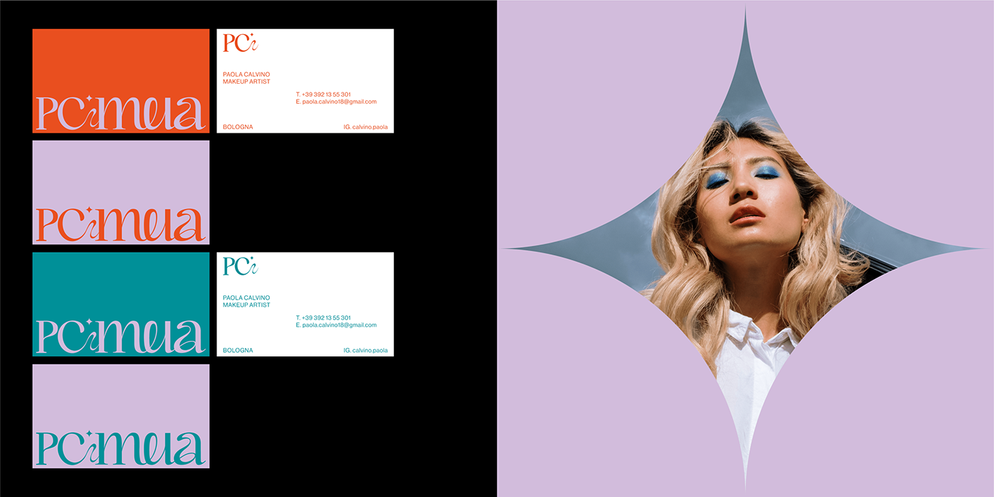
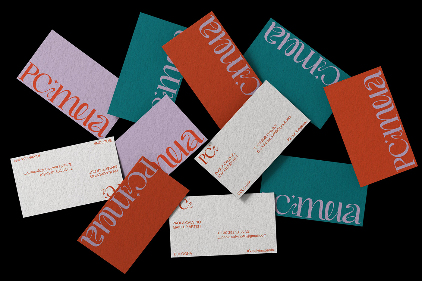
A customized logotype has been designed featuring sinuous shapes with a sparkle at the center that divide in nome. The sparkle symbol will also be used as a frame for some of her visual content on social media.
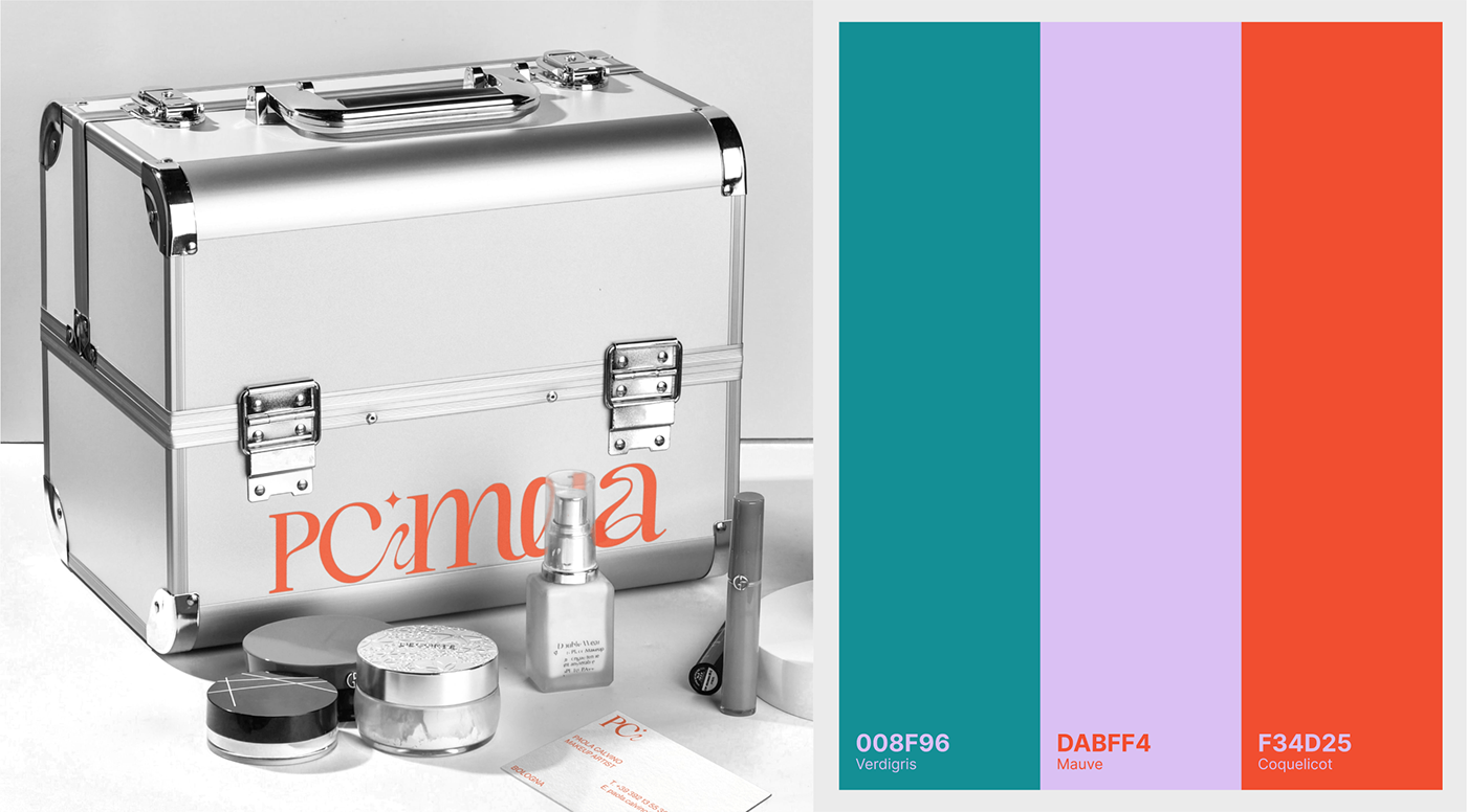
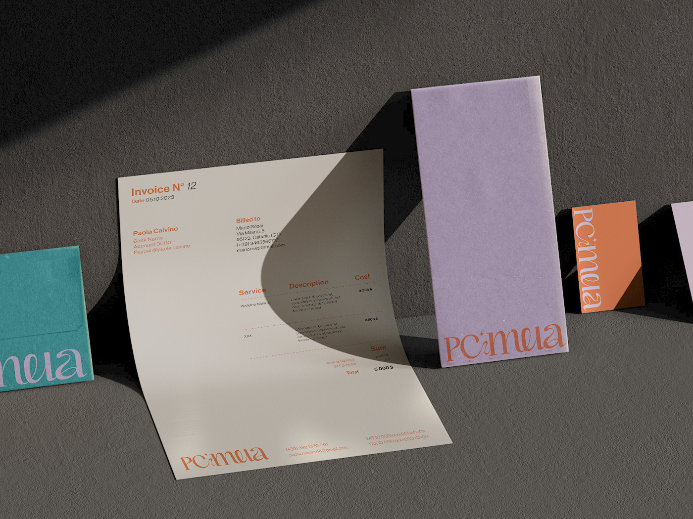
The color palette chosen is young and vibrant, featuring pink, red, and emerald green. These colors are interchanged in all stationery and visual materials, creating a dynamic and versatile identity.
To emphasize the strength of PCMUA's makeup services, has been decided to use black and white imagery and video in some cases, highlighting only specific areas with the color. This creates a powerful contrast and draws attention to the makeup itself.
The new brand identity perfectly encapsulates the essence of PCMUA, a young makeup artist that want stand out in the competitive beauty industry.


THANKS FOR WATCHING


