Ui design
•Download as PPTX, PDF•
4 likes•913 views

This document provides an overview of concepts related to natural user experience (NUX). It discusses topics like UX vs UI, common patterns and principles for interface design, visual language considerations, and popular design systems like flat design and material design. The document also lists various tools used for tasks like wireframing, prototyping, and visual design. Key sections include definitions of UX and UI, guidelines for consistency, and discussions of design patterns and affordances.
Report
Share


Ui design
- 1. natural user experience. natural user experience
- 2. natural user experience. Bart Van Hecke UI/UX Designer - Managing Partner
- 3. natural user experience. visual design Business Designer Project Manager Development Analyst Product Owner analysis wireframing & prototyping ux development Continuous
- 4. natural user experience. Development Product Owner Project Manager Analyst Business analysis wireframing & prototyping visual design ux development Continuous Continuous
- 5. natural user experience. lightweight task analysis wireframing & prototyping ui & interaction design ux development Continuous
- 6. natural user experience. Chapter 1 Getting Friendly
- 8. natural user experience. 09:15-09:30 UX / UI? 09:30-10:30 Discover: Conceptualize the app 10:30-12:00 Define: Wirefaming & Prototyping 13:00-17:00 Design: UI Design Programma
- 9. natural user experience. Episode 2 What is UX/UI?
- 12. natural user experience. UX is about analysing requirements, functionality and usability UI is about visualising the process in a user-friendly and attractive manner
- 13. natural user experience. From UX to UI listen to organisations help organisations understand their users by listening as a stupid user drink coffee Discover
- 14. natural user experience. translate all considerations into wireframes & prototypes advise on technological feasibility point to risks to look out for Define
- 15. natural user experience. visualise ideas into mockups translate business style guidelines assist developers Design help organisations envision the application to be
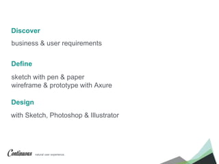
- 16. natural user experience. sketch with pen & paper wireframe & prototype with Axure with Sketch, Photoshop & Illustrator Define Design Discover business & user requirements
- 17. natural user experience. Step 1 Discover
- 18. natural user experience. Sales application for iPad (or laptop) + iPhone A sales app for sales people to showcase portfolio and book orders and for sales managers to consult sales figures
- 19. natural user experience. Step 2 Define
- 20. natural user experience. Sketch with pen & paper
- 21. natural user experience. wireframing & prototyping
- 22. natural user experience. show wireframe
- 23. natural user experience. General rules of good interface design - Understand your users, emphatize with them - for each feature, ask why, and ask why again - solve the right problem! Information Architecture
- 24. natural user experience. Read the requirements, Sketch the application
- 25. natural user experience. Create a detailed user task flow
- 26. natural user experience. Read the requirements, Sketch the application
- 27. natural user experience. Wireframe the application, make it interactive
- 28. natural user experience. Step 3 Design
- 29. natural user experience. UX is about analysing requirements, functionality and usability UI is about visualising the process in a user-friendly and attractive manner
- 30. natural user experience. Part 2 The Rules
- 31. natural user experience. patterns visual language consistency = usability The important rules of UI
- 32. natural user experience. Patterns solutions to recurring problems
- 33. natural user experience. People behave predictably!
- 34. natural user experience. Determine the problem that needs to be solved Explore competition: how did they solve it? Recreate it for your problem Go out and learn about the patterns How to use the right pattern
- 35. natural user experience. ui-patterns.com pttrns.com http://www.smileycat.com/design_elements/ patternry.com (€) http://uxporn.uxpin.com/ useyourinterface.com (animations & transitions) capptivate.com ux.stackexchange.com Useful Links
- 36. natural user experience. predict what the user will do first, make that task easy! Best practices
- 37. natural user experience. people don’t like to think more than they have to
- 38. natural user experience. Good read!
- 39. natural user experience. use visual hierarchy (the most important things go up front) & visual flow to lead them give your users direction (easy labels, call to action,…)
- 40. natural user experience. give your users direction (easy labels, call to action,…)
- 41. natural user experience. provide escape hatches
- 42. natural user experience. make choices available but not too many
- 43. natural user experience. hassle them with logins and forms when really necessary
- 44. natural user experience. use good defaults
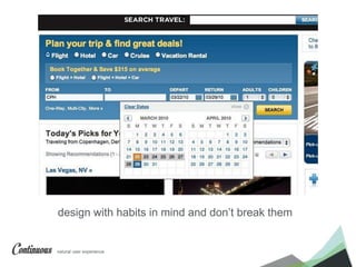
- 45. natural user experience. design with habits in mind and don’t break them
- 46. natural user experience. put elements on predictable places
- 47. natural user experience. use information where needed (tooltips, help, manual,…)
- 48. natural user experience. choose the right icons, graphics, charts…
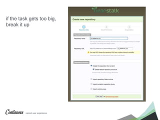
- 49. natural user experience. if the task gets too big, break it up
- 50. natural user experience. make application-wide settings findable and accesible
- 51. natural user experience. put only what you need on the screen
- 52. natural user experience. use animations and transitions to mimic physical reality
- 53. natural user experience. I have a lot of content that needs to be on one page I don’t have a lot of space available I want to separate it into sections I don’t want my page to reload on every section Problem Example
- 54. natural user experience. Users don’t like to view a crowded data page Users like pages in small digestible chunks Example Problem
- 55. natural user experience. module tabs Solution
- 56. natural user experience. Use when section names are relatively short Use when the content of each tab can be viewed separate from each other, and not in context of each other. Use when the content for each tab has similar structure Use when you need to show what tab is currently being viewed Do not use when the content inside each pane would function just as well in its own separate page. Beware
- 60. natural user experience. Lazy registration small step to register, late in process Other examples of viable patterns Progressive disclosure show only essential information in the first step, then invite users to take the next step. Forgiving format let users enter data in their own way, leave it to the system to parse the data Breadcrumbs always let users know where they are …
- 61. natural user experience. ui-patterns.com pttrns.com http://www.smileycat.com/design_elements/ patternry.com (€) http://uxporn.uxpin.com/ useyourinterface.com (animations & transitions) capptivate.com ux.stackexchange.com Again, those useful links
- 62. natural user experience. Visual Language affordances and signifiers natural user experience.
- 64. natural user experience. start with a minimal UI General rules for visual language
- 66. natural user experience. use consistent fonts, color, writing style, grammar
- 67. natural user experience. use white
- 68. natural user experience. create visual balance
- 69. natural user experience. think mobile first!
- 70. natural user experience. use contrast
- 71. natural user experience. Type treat text as design element - use sans-serif - make type big enough - avoid cursive, italic - use white
- 72. natural user experience. Images - set a mood - make them as small as possible with a quality as high as possible - use only when necessary
- 73. natural user experience. How does this translate to applications? but basically an application sets out a functionality, users need to get a task done. You could… - use a subtle background - use nice type - use nice colors with hues - round corners - design skins and themes and let users customize the application
- 74. natural user experience. for the love of god, avoid stock photos
- 75. natural user experience. Consistency My UI looks the same, feels the same natural user experience.
- 76. natural user experience. creates familiarity, and familiar interfaces are naturally more usable. Consistency…
- 77. natural user experience. is not always uniformity > look for best ux patterns in relation to context Consistency…
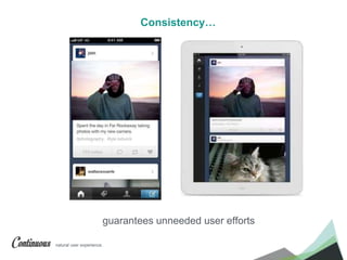
- 78. natural user experience. guarantees unneeded user efforts Consistency…
- 79. natural user experience. makes a product more predictable > more intuitive > more desirable Consistency…
- 80. natural user experience. - Balance between creativity and consistency - “Creativity involves breaking out of established patterns in order to look at things in a different way.” Consistency & Creativity
- 81. natural user experience. Going against proven UI patterns is possible if you know what you’re doing but will mostly damage your design
- 83. natural user experience. user expectations aren’t only preferences they’re more than that, they are habits
- 84. natural user experience. Internal Consistency all outgoing links are in blue all other links are underlined on hover MINIMAL EXPLANATION TO USER !
- 85. natural user experience. - keep colors consistent - keep same typography rules - keep terminology the same - keep icons consistent - consistent layout across pages - keep interactions and animations the same - keep consistent with other internal products General rules for consistency
- 87. natural user experience. Be inconsistent when you can
- 88. natural user experience. UX is about analysing requirements, functionality and usability UI is about visualising the process in a user-friendly and attractive manner
- 89. natural user experience. Part 3 Which Design Language?
- 90. natural user experience. Flat, Material, …?
- 91. natural user experience. imitates the real worldSkeuomorphism
- 92. natural user experience. focus on the interplay of icons, typography, and color.Flat Design
- 93. natural user experience. imitating the physical nature of elementsMaterial Design
- 94. natural user experience. Part 1 The Tools
- 95. natural user experience. Design with?
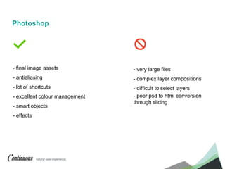
- 96. natural user experience. - final image assets - antialiasing - lot of shortcuts - excellent colour management - smart objects - effects - very large files - complex layer compositions - difficult to select layers - poor psd to html conversion through slicing Photoshop
- 97. natural user experience. Excellent but heavyweight tool for graphic design and photo editing Photoshop
- 98. natural user experience. - mockups - complex shapes with vector - multiple artboards - easy on selecting or duplicating layers - better manipulation, alignment of objects - symbol libraries - large support of file types - bitmap images (eg gradients get dithered) - antialiasing - masking Illustrator
- 99. natural user experience. Precise tool for vector graphics Illustrator
- 100. natural user experience. - completely vector-based - better at rendering for web - small files - built in grids - built in artboards - multiple artboards - symbols - fast - advanced measuring - cheaper! - automated file export - pixel aware! good for screen design - colour management - symbols all have the same size - a little buggy at times - only for mac Sketch
- 101. natural user experience. Excellent lightweight tool for web UI designers Sketch
- 102. natural user experience. http://blog.mengto.com/sketch-vs-photoshop/ Sketch vs Photoshop?
- 104. natural user experience. Conclusion It’s up to you!
- 105. natural user experience. Sketch App
- 106. natural user experience. Content Generator https://github.com/timuric/Content-generator-sketch-plugin Dynamic Button https://github.com/ddwht/sketch-dynamic-button Useful Plugins
- 107. natural user experience. Sketch Toolbox http://sketchtoolbox.com/ Sketch App Resources http://www.sketchappsources.com/ Useful Resources
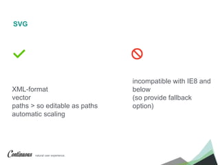
- 109. natural user experience. XML-format vector paths > so editable as paths automatic scaling incompatible with IE8 and below (so provide fallback option) SVG
- 110. natural user experience. Font icons! eg font awesome, icomoon Keep icons in one file to see if they harmonise Create in Illustrator, paste as shape layer into photoshop Use plugins like pngexpress to automatically export the scale factors or actions like retinize.it Tips
- 111. natural user experience. Making prototypes from mockups
- 112. natural user experience. Mobile UI
- 113. natural user experience. https://developer.apple.com/library/ios/documentation/UserExperience/Conceptu al/MobileHIG/ Follow the Guidelines https://developer.android.com/design/index.html
- 114. natural user experience. Difference between the 2 platforms http://www.diffen.com/difference/Android_vs_iOS http://readwrite.com/2013/05/15/the-developers-cheat-sheet-for-iphone-android-app- design-infographic http://elekslabs.com/2012/12/android-vs-ios-user-experience.html
- 115. natural user experience. How to design for iOS http://taybenlor.com/2013/05/21/designing-for-ios.html http://code.tutsplus.com/tutorials/iphone-and-ipad-design-templates-and-how-to-use- them--mobile-3418 http://bjango.com/articles/designingforretina2/ iOS design cheat sheet http://ivomynttinen.com/blog/the-ios-7-design-cheat-sheet/
- 116. natural user experience. How to design for Android http://blog.mengto.com/how-to-design-for-android-devices/ http://www.smashingmagazine.com/2011/06/30/designing-for-android/ iOS design cheat sheet http://petrnohejl.github.io/Android-Cheatsheet-For-Graphic-Designers/
- 117. natural user experience. What about Responsive Design?
- 118. natural user experience. Break for content not screens HTML wireframing Design for 1 or 2 screens What about Responsive Design?
- 119. natural user experience. The Noun Project Kuler Paletton Coolors Skala Preview or Adobe Preview CC Invision Flinto flaticons.com great link to see all tools: http://market.designmodo.com/tools/ Tools for the UI Designer
- 120. natural user experience. http://www.nngroup.com/ http://www.smashingmagazine.com/ http://www.uxbooth.com/ http://alistapart.com/ http://boxesandarrows.com/ http://usabilitygeek.com/ http://usabilitypost.com/ http://feltpresence.com/ http://www.inverra.com/category/blog (especially dashboard design) http://uxmag.com/ http://designmodo.com/design/ux-design/ Useful UX Links & Blogs
- 121. natural user experience. ui-patterns.com pttrns.com smileycat.com/design_elements/ patternry.com (€) uxporn.upxin.com useyourinterface.com capptivate.com ux.stackexchange.com UI Pattern Links
- 122. natural user experience. Good reads Designing Interfaces, O’Reilly Don’t Make Me Think Steve Krug A project guide to UX design Russ Under Consistency in UI Design UXPin (Free Ebook)
- 123. natural user experience. Good reads About Face Alan Cooper Prioritizing Web Usability Jakob Nielsen Designing The Obvious Robert Hoekman The Design of Everyday Things Donald Norman
- 124. natural user experience. Task Analysis & User Research Information Architecture Wireframing & Prototyping UI & Interaction Design UX Development & Optimalization natural user experience.
- 125. natural user experience. Continuous a future where all things merge into one seamless experience, consistent, complementary and continuous. @Continuous_UX
Editor's Notes
- wie zijn jullie en waarom zijn jullie hier? 9h20
- eerste 2 UX, 3de UI
- 9h30
- geef blad met uitleg (enkel catalogus) af 9h40
- wireframes zijn er al, maar maak nog één wireframe om azuren te leren gebruiken focus hier ligt op UI
- waarom gebruiken ze dit? Iedereen heeft hier een reden toe WAT IS ZIJN UITEINDELIJKE DOEL go out and meet them!
- 1. apart de catalogus - toon hoe jij dat doet (halve boxes) bespreken en schetsen op bord 10:00
- 2. in team de order pages in teams 10h30 -pauze 10h45
- 3. apart het dashboard 4. toon hoe de app opent
- Axure openen 12:00
- usability in UX maar ook in UI, bv. maak je knoppen niet te klein
- ik denk dat ik weet waarom jullie hier zitten, weet het zeker jullie hebben een product met veel data dat jullie willen visualiseren bedenk dit niet zelf, gebruik geteste patronen!
- Check patterns of competitor’s applications > users use other applications so they get acustomed with ux patterns. use them eg Google Docs > Microsoft Word eg volume slider
- visual flow > gestalt
- visual flow > gestalt
- visual flow > gestalt
- visual flow > gestalt
- visual flow > gestalt
- 80-20 regel animatie 300 ms
- 80-20 regel animatie 300 ms
- 80-20 regel animatie 300 ms
- 80-20 regel animatie 300 ms
- 80-20 regel animatie 300 ms
- 80-20 regel animatie 300 ms
- 80-20 regel animatie 300 ms
- Navigation tabs are derived from the idea of folders in a file-cabinet and are thus familiar to the end user > design semiotics old phone for telephone Content needs to be separated into sections and accessed via a single content area using a flat navigation structure that does not refresh the page when selected. Use when there is limited visual space and content needs to be separated into sections Use when there are between 2 – 9 sections of content that need a flat navigation mode. Use when you need to keep user attention by circumventing page refreshing. Use when section names are relatively short Use when the content of each tab can be viewed separate from each other, and not in context of each other. Use when the content for each tab has similar structure Use when you need to show what tab is currently being viewed Do not use when the content inside each pane would function just as well in its own separate page. Present the content of one tab inside a box (content area) Place a horizontal bar on top of the content area with links representing tabs Refrain from having more than one line of links in the top horizontal tab bar Use color coding or other visual support to indicate what tab is currently being viewed Present the content of each tab in the same content area Only one content area should be visible at a time Maintain the same structure of the top horizontal tab bar after a new tab has been clicked Only the content area of the tabs and the horizontal tab bar should be changed when a user clicks a new tab If possible, the page is not refreshed when a tab is clicked. A new page is not loaded when a tab is clicked
- When the user completes a step, you reveal the information in the next step, keeping all previous steps visible. By keeping previous steps visible, you allow users to change what they have entered. And the data they input in the current step can affect the behavior of the next step.
- EG favorites on Dribbble. The page affords being favorited. However, if there are no signifiers, the user will have no idea. Now, if the page does have a signifier – in this case, a heart icon – then the user visually understands the page can be favorited. The perceived affordance, therefore, is what users interpret based on the signifier. Of course, a perceived affordance should always sync with the actual affordance.
- voor boeken > serif
- images with smiling people work best
- eg envelope icon
- eg envelope icon
- eg envelope icon
- eg envelope icon
- and you know what happens when you mess with habits
- use animation to mimic natural laws it gives visual feedback and affordance to the user Your application needs to be consistent with external patterns
- when you want something to stand out, but be moderate about it
- 13:45
- users’ needs with simple buttons geared toward efficient finding, straightforward color schemes made for fast identification of elements
- PS 25 jaar verschil bitmap/vectorieel
- apple, google en facebook gebruiken dit! only what can be recreated with HTML and CSS3. > So, no unnecessary photo filters, 3D tools or other tools that would slow you down. > provides only what’s necessary to do web and UI work, making for a much faster design process. > if you do need more? > plugins
- Fireworks: Adobe announced they will discontinue
- 14u00
- grids artboards pages plugins export copy css attributes distance between 2 objects: select one, hold ALT and hover over the other one round to nearest pixel edge: when you scale down objects are off pixels > go to layer > round to…
- Plugins: reveal plugins folder sleep erin
- Amber Forms Lite v1.0 checkout-form Newspaper-Subscription_Android payment-ui-vanderzon Settings
- SVG xml formaat voor 2D
- schaalt mee met “container”
- pngexpress retinize.it