1. research (1)
•Download as PPTX, PDF•
0 likes•18 views
This magazine research document analyzes the front covers and spreads of 3 entertainment magazines - Entertainment Weekly, Empire Australasia, and Screen International. It examines elements like colors, fonts, images, text ratio and style to understand the target audiences and key features. The research found commonalities like bold text, images, and spoiler alerts. Elements from the research like color, graphics, fonts and balanced text/image ratio will be applied to the author's own magazine work.
Report
Share


1. research (1)
- 2. Existing Product Front cover Double Page Spread Audience Profile
- 3. Existing Product front page analysis Masthead Cover lines Bold text which makes the titles stand out, making it easy to read This is an entertainment magazine that’s aimed at teenage boys. This is because of the colours, fonts and images that are used. The front cover has an Image which attracts the audiences attention. It’s an action shot which makes it relevant to the readers of the magazine. The shot has been taken using a green screen and the background which looks like it’s been taken from an action film which is something identifiable to the target audience. The magazine has big bold text in yellow which stands out against the background colour. The colour jumps out at the audience. The 3D font on the ‘defenders’ text reminds me of marvel magazines because of it’s style which will appeal directly to the audience who like superheroes. The phrase ‘mash up’ is more likely to be something young people will say, which connects to the young audience. This makes it have an informal feel which will appeal to this audience. There is less text and more image although it doesn’t look like it because the text is big and bold. Young people may find large amounts of text unattractive and more likely to be drawn in with the use of images. Looking at the front cover, it makes me think that the magazine is about action/superhero films in general, because of the styles and the way it looks. This makes the audience want to read it because it says ‘Exclusive first look at marvel superheroes’ making the reader feel they have access to spoiler alerts/inside information. Action shot on the front cover
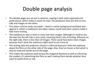
- 4. Double page analysisThe red bar at the top of the page links back to the red magazine title on the front cover, helping to link the magazine as one big unit. The photos are scenes from the films the article is about. The biggest image is an interesting close up of a female character. The text/picture ratio is fairly balanced. The images are large and are attracting the readers attention, whereas the text is very small because the producer wants to cover the different films. The colour and style of the font suggests the article is more factual. Some of the words create an informal style. The article has sub-headings to organise the text and ’chunks’ down the information, making it easier to read. The ‘Buzz Feed’ graphic indicates there is a big exclusive article grabbing the readers attention to get them to read it. This is a symbol that’s recognisable to younger people so they feel reassured it’s a magazine for them. Some of the words/language used in the articles may appeal to the younger audience because of its informality. (e.g. ’fest, trippy’).
- 5. Existing Product Front cover Double Page Spread Audience Profile
- 6. Existing Product front page analysis This magazine is aimed at male and female approximately age 18-30. The types of films mentioned on the front cover will appeal to this age group and the people mentioned are famous celebrities identifiable to this age group. Although the front cover makes it look like it’s aimed at teenagers/adults, it has a lot of images which are suitable for children to look at. The magazine has a wide range of films and informs the audience because it talks about what they’re about and which actors are in it. Types of content From looking at the front cover, it looks like the shot has been taken using a green screen, and the background has been merged together with two images from an action film. The orange and blue backgrounds are contrasting and they suggest heat versus cold/earth and fire. To me, the size of the text fills 2/3 of the page, which reaches out to the slightly older age group, while the image of wonder woman fills 1/3 of the page. The powerful image of wonder woman will appeal to both men and women because they might wonder how she got that look or they might be attracted to her. The world exclusive sub-heading tells the reader there is special information about the movie, which intrigues the audience to read it. The constant use of exclamation marks perhaps will appeal to the younger audience because it’s often recognisable in younger people
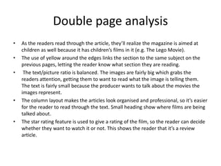
- 7. Double page analysis • As the readers read through the article, they’ll realize the magazine is aimed at children as well because it has children’s films in it (e.g. The Lego Movie). • The use of yellow around the edges links the section to the same subject on the previous pages, letting the reader know what section they are reading. • The text/picture ratio is balanced. The images are fairly big which grabs the readers attention, getting them to want to read what the image is telling them. The text is fairly small because the producer wants to talk about the movies the images represent. • The column layout makes the articles look organised and professional, so it’s easier for the reader to read through the text. Small heading show where films are being talked about. • The star rating feature is used to give a rating of the film, so the reader can decide whether they want to watch it or not. This shows the reader that it’s a review article.
- 8. Existing Product Front cover Double Page Spread Audience Profile
- 9. Existing Product front page analysis Looking at the front of the magazine, it looks like it’s aimed at men aged between 16-30 because of the colours, images and words it uses. The colours and the style of the font makes it look grown up and the image makes it look more masculine. text/picture ratio: There is a large image which fills ¾ of the page making the front cover stand out. Whereas the text fills the other ¼ . This grabs the audience’s attention because they want to know what the image represents. The colour scheme looks very plain. Although the font colour is red, the background colour could have been changed, making it stand out and look more interesting to look at. The font choice looks very boring, but it’s easy to read. It could be better by choosing another font that’s easy to read, but looks more interesting to look at and attracts the audience’s attention. The title of the magazine makes it sound like it talks about films all around the world because it’s called ‘SCREEN INTERNATIONAL’. The photo looks like it’s been shot out in a public area because there is mirroring in the binocular’s which has people in it. It looks like it’s been taken using a night-vision setting because it’s shining green on the binocular’s, making it interesting to look at. Looking at the image, it looks like it symbolizes war because the person in the shot looks like he’s wearing an army helmet and uniform. This gives me the impression that the producer wants to raise awareness of the wars and reach out to the audience with a sensible image.
- 10. Double page analysis • The double pages are set out in columns, making it look really organized and professional, which makes it easier to read. The producers have put text on one side and images on the other. • The colour scheme looks very plain – there’s a white background and black text against it, which is traditional, but other colours could have been used to make it look more inviting. • The text/picture ratio is there is more text than images. Although it’s hard to see, the text one the left side is very small, meaning there’s lots of writing. Whereas on the right side, there is less than 10 images. There could have been more images because that’s what the audience might want to see more of. • The writing style the producers chosen is informal because it tells the audience about the films on the other side of the page. Also, they’ve chosen a font which is easy to read and stands out on the page. • This makes the audience want to buy the magazine because as well as informing the readers, it’s advertising the films as well, making them decide whether they want to watch them or not.
- 11. Research Analysis • What common features do the researched products have? – The most common feature the magazines use is images and colour because it makes the front cover stand out. Other features the magazine has in common is bold text so it stands out and it’s easy to read. They all include spoiler alerts so it draws the readers attention in and makes them want to read the particular article in the magazine. • What aspects of the research will you include within your on work? Some of the features I will include in my magazine is colour to make it stand out and look modern and professional. I will include design text which has a link to the magazine theme – this will be used for the masthead. I will include images and graphics to show the subject of what each article is talking about. I will use different fonts and colours for each subject I talk about – this will make the double page spread stand out and look colourful, and I will use bold subheadings to let the audience know what subject they’re reading.
- 12. Bibliography
- 13. Bibliography 1. comics2017. (2017). Entertainment Weekly Defenders. Available: https://issuu.com/comics2017/docs/entertainment_weekly_january_20 _201. Last accessed 20/11/2018. 2. Xang Tung Le. (2017). Empire australasia march 2017 vk com stopthepress . Available: https://issuu.com/dong-ho-op-chinh- hang/docs/empire_australasia_march_2017_vk_co. Last accessed 20/11/2018. 3. Media Business Insight. (2016). Screen Cannes Product Guide 2016 . Available: https://issuu.com/mb- insight/docs/screen_cannes_product_guide_2016lr. Last accessed 20/11/2018.
Editor's Notes
- Choose a recent product similar to your own and annotate it- scan real magazines or use issuu.com Type of content- studio/location photography, articles, reviews, adverts Conventions – colour schemes, photography, writing style, text/picture ratio, font choices, mode of address Codes – Written, symbolic Audience appeal- how does it make its audience want to buy/read it?
- Choose a recent product similar to your own and annotate it- scan real magazines or use issuu.com Type of content- studio/location photography, articles, reviews, adverts Conventions – colour schemes, photography, writing style, text/picture ratio, font choices, mode of address Codes – Written, symbolic Audience appeal- how does it make its audience want to buy/read it?
- Choose a recent product similar to your own and annotate it- scan real magazines or use issuu.com Type of content- studio/location photography, articles, reviews, adverts Conventions – colour schemes, photography, writing style, text/picture ratio, font choices, mode of address Codes – Written, symbolic Audience appeal- how does it make its audience want to buy/read it?
- Choose a recent product similar to your own and annotate it- scan real magazines or use issuu.com Type of content- studio/location photography, articles, reviews, adverts Conventions – colour schemes, photography, writing style, text/picture ratio, font choices, mode of address Codes – Written, symbolic Audience appeal- how does it make its audience want to buy/read it?
- Choose a recent product similar to your own and annotate it- scan real magazines or use issuu.com Type of content- studio/location photography, articles, reviews, adverts Conventions – colour schemes, photography, writing style, text/picture ratio, font choices, mode of address Codes – Written, symbolic Audience appeal- how does it make its audience want to buy/read it?
- Choose a recent product similar to your own and annotate it- scan real magazines or use issuu.com Type of content- studio/location photography, articles, reviews, adverts Conventions – colour schemes, photography, writing style, text/picture ratio, font choices, mode of address Codes – Written, symbolic Audience appeal- how does it make its audience want to buy/read it?
- List all products researched in previous sections. Include anything additional you have watched/read in preparation for production. Alphabetise your list.