


Question 1
- 1. Q: In what ways does your media product use, develop or challenge forms and conventions of real media products?
- 2. Whilst researching existing magazines such as NME, Q and Kerrang, I was able to identify key features and conventions which are generic to both magazines in general, and music magazines of a particular genre. Recognisable masthead Tag line Cover line Puff Bar code Date and issue number Main cover line Direct mode of address Plug Cover line
- 3. The main convention of magazines is a large masthead in the biggest, boldest font at the top of the page, usually on the left hand side so that when they are stacked on shop shelves, the customer can clearly see the masthead and therefore identify the magazine brand. The masthead is the most important feature because it creates a brand identity and is what customers will use to identify the magazine. My magazine includes a predominant masthead of ‘Amplified’ which stands out because I made a creative font that has a music wave going through it to emphasis the theme of loud music and to make it distinguishable and stand out from other existing magazines. The creative, unique font also creates a brand identity and helps the target audience recognise the magazine.
- 4. A tag line is usually featured to create brand identity and I decided to include the tag line of ‘turn it up’ because it is short and concise and fits in again with the theme of loud music hence the magazine name ‘amplified’.
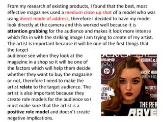
- 5. From my research of existing products, I found that the best, most effective magazines used a medium close up shot of a model who was using direct mode of address, therefore I decided to have my model look directly at the camera and this worked well because it is attention grabbing for the audience and makes it look more intense which fits in with the striking image I am trying to create of my artist. The artist is important because it will be one of the first things that the target audience see when they look at the magazine in a shop so it will be one of the factors which will help them decide whether they want to buy the magazine or not, therefore I need to make the artist relate to the target audience. The artist is also important because they create role models for the audience so I must make sure that the artist is a positive role model and doesn’t create negative implications.
- 6. All existing magazines include a bar code, date and issue number to make easier for the reader to see the price and when the magazine was published so this is a convention which was mandatory to include to make the magazine look realistic and so that if it was sold in a shop, it could be scanned through the checkout. This information usually appears at the bottom right hand corner of the front cover because it is not important information in terms of interesting the target audience therefore it doesn’t need to be in a predominant place on the page.
- 7. Another convention of music magazines is to have a main cover line which stands out and is larger than the other, less significant cover lines. My main cover line of ‘the real Raven Rose’ is easy to identify as the main cover line as it stands out and has a bolder font and I decided to do this because the audience’s attention will be instantly drawn to it which is the desired effect because it is the most exclusive article.
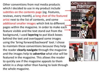
- 8. Other conventions from real media products which I decided to use in my product include subtitles on the contents page (eg. Features, reviews, every month), a long shot of the featured artist next to the list of contents, and some additional smaller images which link to different pages within the magazine. In order to make each feature visible and the text stand out from the background, I used layering to put black boxes behind the text and overlapped some images using the ‘bring forward/backward’ tool. I chose to maintain these conventions because they help the reader clearly navigate through the magazine and the images help to advertise what else will be featured in the magazine. This allows the reader to quickly see if the magazine appeals to them whilst in a shop rather than having to look through the whole magazine.
- 9. On the double page spread, I maintained certain conventions such as a bold title on the left hand top corner of the page which stands out to grab attention; a small paragraph introducing the topics of the interview to tempt the reader into reading the full interview; and a smaller version of the masthead along with page numbers and a website link to maintain branding and a house style throughout the magazine.
- 10. I chose to develop the convention of having one medium long shot of the artist next to the interview by creating a montage of 18 polaroid pictures of my artist. I chose to challenge this convention because I feel that the variation of images is more aesthetically pleasing by creating a balance between text and pictures and it gives the reader a more in depth representation of the artist.