


7 New QC Tools.ppt
- 1. 7 New QC Tools
- 2. 1. Affinity Diagram • A tool that gathers large amounts of language data (ideas, opinions, issues) and organizes them into groupings based on their natural Relationships. • The tool is commonly used within project management and allows large numbers of ideas to be sorted into groups for review and analysis. • The affinity diagram was devised by Jiro Kawakita in the 1960s and is sometimes referred to as the KJ Method.
- 3. When to Use the Affinity Process 1. Sift through large volumes of data. For example, a process owner who is identifying customers and their needs might compile a very large list of unsorted data. In such a case, creating an Affinity Diagram might be helpful for organizing the data into groups. 2. Encourage new patterns of thinking. An Affinity exercise is an excellent way to get a group of people to react on a "gut level" rather than mulling things over intellectually. Since Brainstorming is the first step in making an Affinity Diagram, the team considers all ideas from all members without criticism. This stimulus is often enough to break through traditional or entrenched thinking, enabling the team to develop a creative list of ideas.
- 4. Creating an Affinity Diagram Step 1 Generate ideas Step 2 Display ideas Step 3 Sort ideas into groups Step 4 Create header cards Step 5 Draw finished diagram
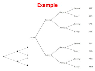
- 5. 2. Relations Diagram Relations Diagrams are drawn to show all the different relationships between factors, areas, or processes.
- 6. • Agree on the issue or question. • Add a symbol to the diagram for every element involved in the issue. • Compare each element to all others. Use an "influence" arrow to connect related elements. • The arrows should be drawn from the element that influences to the one influenced. • If two elements influence each other, the arrow should be drawn to reflect the stronger influence. • Count the arrows. • The elements with the most outgoing arrows will be root causes or drivers. • The ones with the most incoming arrows will be key outcomes or results. To create a Relations Diagram
- 7. Example
- 8. 3. Tree Diagram • A diagram used in strategic decision making, valuation or probability calculations. The diagram starts at a single node, with branches emanating to additional nodes, which represent mutually exclusive decisions or events. • In the diagram below, the analysis will begin at the first blank node. A decision or event will then lead to node A or B. From these secondary nodes, additional decisions or events will occur leading to the third level of nodes, until a final conclusion is reached.
- 9. The Tree is good for. . . 1) defining specific 'real-world' actions to support any given goal 2) Ensuring that all actions being pursued by a team are tied to the primary goal of the team 3) Training team members to come up with the appropriate steps to achieve a higher goal 4) Facilitating the monitoring of the progress of various activities since these are organized at different levels that have their own sub-goals 5) Revealing the 'true' complexity level of a goal by systematically presenting the actions and resources needed to attain that goal 6) Making the distribution of assignments or responsibilities to team members easier.
- 10. Example
- 11. The Matrix Diagram is an analysis tool that facilitates the systematic analysis of the strengths of relationships between two or more sets of elements. It consists of a table whose main rows and columns contain the elements being inter-related, with the rest of its cells containing symbols or numbers that denote the strengths of relationship between the elements. 4. Matrix Diagram
- 12. The Matrix is good for. . . 1) equal distribution of major and minor assignments among members of a given project 2) Selection of a process, equipment, or material for a given purpose 3) Identifying the most critical factors affecting a given problem area 4) Matching of tasks to objectives, etc. 5) The matrix diagram can be used in almost all types of decision making that involves several options or alternatives.
- 13. Types of Matrix Diagram
- 14. Examples
- 15. 5. Arrow Diagram • The arrow diagram shows the required order of tasks in a project or process, the best schedule for the entire project, and potential scheduling and resource problems and their solutions. • The arrow diagram lets you calculate the “critical path” of the project. This is the flow of critical steps where delays will affect the timing of the entire project and where addition of resources can speed up the project.
- 16. When to Use an Arrow Diagram • When scheduling and monitoring tasks within a complex project or process with interrelated tasks and resources. • When you know the steps of the project or process, their sequence and how long each step takes, and. • When project schedule is critical, with serious consequences for completing the project late or significant advantage to completing the project early.
- 17. Examples
- 18. The process decision program chart systematically identifies what might go wrong in a plan under development. Countermeasures are developed to prevent or offset those problems. By using PDPC, you can either revise the plan to avoid the problems or be ready with the best response when a problem occurs. 6. Plan Decision Program Chart
- 19. When to Use PDPC • Before implementing a plan, especially when the plan is large and complex. • When the plan must be completed on schedule. • When the price of failure is high.
- 20. Examples