


5. pre production(1)
- 2. Style sheet colours I’ve chosen these colours because I know they work really well together to make something stand out. I will these colours on my front cover. These are the colours I will use for the double page spread. One will be for the background and some will be for the text and shapes I might put in. The same colours used on the front cover and double page spread give the magazine a sense of cohesion making everything stick together and work well.
- 3. Style sheet fonts This is a font I might use for the title on my double page spread because it’s easy to read and it’s not to extreme. It looks very metallic and looks similar to a number plate which links to the theme of the magazine. I think this font looks more masculine than the others so I may avoid using it to make sure I reach both male and female audience. This is a font I’m more likely to use for the masthead because it stands out and looks attractive for the young audience. It looks fast like somethings happening quickly and making an impact like the text is exploding into something big and important. I might use this font for the masthead because it’s easier to read than the other font because it’s less blurry. I might use this font for the title of my double page spread because it’s bright which makes the font stand out and it’s easy to read. Also, it will stand out against which one of the five colours I chose for the page. It looks very zingy and ‘prize winning’ which might draw the reader into reading it because they think they’ll get something out of reading the magazine. Also, the shapes look like wheels which links it to the theme of the magazine. I might use this font for my double page spread because the style will draw the readers attention in. it’s stands out and looks modern, but it might be difficult for people to understand because some of the letters are shapes. This looks very robotic and sci-fi style. Some of the letters look like car logos which links to the theme of the magazine again.
- 4. Style sheet fonts • Subheadings: Bold Helvetica • Articles: Helvetica • I will use these fonts for the main articles because they’re easy to read even when they’re small. And it’s the most used font in print media.
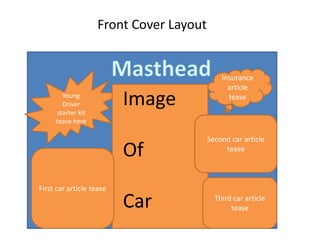
- 5. Front Cover Layout Young Driver starter kit tease here Image Of Car First car article tease Insurance article tease Second car article tease Third car article tease
- 6. Double Page Layout Title of double page spread Image of car here Heading of first car article Main article here. Include prices, engine size, type of fuel, mpg etc. Second car Article heading Part of main article here Place image of car here Continue main article here Image of car here Third car Article heading Main article here Heading of starter kit article Part of main article Graphic here Continue with main article Insurance article heading Main article Screens hots of insuranc e quotes
- 7. Content Content How You Could Get It Car Take a photo of one or get a copyright free one from the internet Design Text Get a copyright free one from the internet (e.g Flamingtext.com) Image of a road Take a photo of a road or use a copyright free one from the internet Graphics Design my own in Photoshop Text (Subheadings and article content) Use an easy to read font from In-Design Research text Look at car magazines either on the internet or from the library Insurance quotes Use a comparison website (e.g: Go compare) to get a list of insurance quotes for young age groups Starter kit for young drivers Make a list of things you need when you buy a car: Insurance, Tax, MOT. List of optional things you might want (e.g P Plates).
- 8. Contingency Planning Potential Issue Solution I’m not in college Do work at home or come into college on a day off or come in at lunchtime Computer crashes Save work regularly and save it in various places (e.g on a memory stick and create a backup folder on MAC) Lost image/image is corrupted Take another Photo or try to fix the issue with original image Unwanted objects in background of images Use Photoshop to distort the background or cut them out and replace with another background Losing all my work Save work regularly and save it in various places (e.g on a memory stick and create a backup folder on MAC)
- 9. Health and Safety Potential Issue How will the issue be avoided? Water spillage Don’t have water near a computer. If you have water, make sure it’s in a bottle with a tight lid. Wires in the way Tape them to the floor or make sure they’re well out the way. Other obstacles in the way (e.g Boxes) Make sure they’re put out the way so no one trips over them. Car is parked on a road Move it to a driveway or nearby car park. If car is needed on the road, take someone with me to look out for oncoming vehicles.
Editor's Notes
- Explore colours and pixel art styles similar to what you want to produce. Discuss these elements in relation to why you chose them and where you may use them in your project. Go over as many pages as you need to.
- Explore colours and pixel art styles similar to what you want to produce. Discuss these elements in relation to why you chose them and where you may use them in your project. Go over as many pages as you need to.
- Mock up of a potential design using the colours and sourced images. Alter this slide to make it appropriate for your planned product types. Use the content established in your style sheet to do this.
- Mock up of a potential design using the colours and sourced images. Alter this slide to make it appropriate for your planned product types. Use the content established in your style sheet to do this.
- What content might you need for your pages? Photographs, articles, cover lines, fonts….