Location via proxy:   [ UP ]  
[Report a bug]   [Manage cookies]                
SlideShare a Scribd company logo
UX.Frkln
Accessibility Primer

Nov 6, 2019
What is Accessibility?
Web accessibility is the inclusive practice of ensuring there are
no barriers that prevent interaction with, or access to, websites
on the World Wide Web by people with physical disabilities,
situational disabilities, and socio-economic restrictions on
bandwidth and speed. (from https://en.wikipedia.org/wiki/
Web_accessibility )

Plethora of knowledge at Web AIM

https://webaim.org/
Color Contrast
For proper legibility the contrast between foreground and
background should be 4.5:1 or higher.
https://webaim.org/resources/contrastchecker/
Color Blindness
There are MANY forms of color blindness. Do not use color
alone to indicate status (such as green for up/good and red for
down/bad). Use words and/or differentiating icons.
http://www.colourblindawareness.org/colour-blindness/types-of-
colour-blindness/
https://www.color-blindness.com/coblis-color-blindness-simulator/
Skip to Main Content
Users using assistive technology like a screen reader do not
always need to hear the navigation of a site before getting to the
page content. Give them an option to skip over listening to it go
straight to the main content
https://webaim.org/techniques/skipnav/
Test Your Website (few free trials)
Put your URL in and get a high level readout of accessibility
issues.
https://webaccessibility.com/
Screen Reader Samples
If you’ve never heard a screen reader (like Jaws) read content,
its enlightening (and fast!)
https://www.youtube.com/watch?v=dEbl5jvLKGQ
https://www.youtube.com/watch?v=q_ATY9gimOM
Information on Disabilities
• Attention Deficit Hyperactivity Disorder (ADHD)

• Learning Disabilities

• Mobility Disabilities

• Medical Disabilities

• Psychiatric Disabilities

• Traumatic Brain Injury (TBI) and Post-Traumatic Stress Disorder (PTSD)

• Visual Impairments

• Deaf and Hard of Hearing

• Concussion

• Autism Spectrum Disorders

https://www.mightybytes.com/blog/how-many-users-with-disabilities-on-
site/
https://www.rochester.edu/college/disability/faculty/common-
disabilities.html
Mobile Accessibility
https://developer.paciellogroup.com/blog/2017/11/mobile-
accessibility-testing-guide-for-android-and-ios-free/
https://www.digitala11y.com/free-mobile-accessibility-testing-
tools/
https://usabilitygeek.com/10-free-web-based-web-site-
accessibility-evaluation-tools/
Heading Tags
Headings communicate the organization of the content on the
page. Web browsers, plug-ins, and assistive technologies can
use them to provide in-page navigation.
https://www.w3.org/WAI/tutorials/page-structure/headings/
Alt Tags
ALT Tags are invisible descriptions of images which are read
aloud to blind users on a screen reader. Adding ALT text allows
authors to include images, but still provide the content in an
alternative text based format. See example below for what a
screen reader experiences when no ALT Text is used.
https://accessibility.psu.edu/images/alttext/
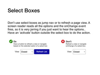
Select Boxes
Don’t use select boxes as jump nav or to refresh a page view. A
screen reader reads all the options and the onChange event
fires, so it is very jarring if you just want to hear the options..
Have an ‘activate’ button outside the select box to do the action.
Questions to Research…
Is there a way to implicitly know (from Google Analytics or
similar) how often a screen reader accesses your app/site? What
about keyboard only or other assistive technologies? Usually
they are not recorded in the browser User Agent data.
Thanks!
Accessibility Primer

UX.Frkln
For info on future meetups, contact:

UX.Frkln@gmail.com

More Related Content

Accessibility Primer - UXfrkln meetup

  • 2. What is Accessibility? Web accessibility is the inclusive practice of ensuring there are no barriers that prevent interaction with, or access to, websites on the World Wide Web by people with physical disabilities, situational disabilities, and socio-economic restrictions on bandwidth and speed. (from https://en.wikipedia.org/wiki/ Web_accessibility ) Plethora of knowledge at Web AIM https://webaim.org/
  • 3. Color Contrast For proper legibility the contrast between foreground and background should be 4.5:1 or higher. https://webaim.org/resources/contrastchecker/
  • 4. Color Blindness There are MANY forms of color blindness. Do not use color alone to indicate status (such as green for up/good and red for down/bad). Use words and/or differentiating icons. http://www.colourblindawareness.org/colour-blindness/types-of- colour-blindness/ https://www.color-blindness.com/coblis-color-blindness-simulator/
  • 5. Skip to Main Content Users using assistive technology like a screen reader do not always need to hear the navigation of a site before getting to the page content. Give them an option to skip over listening to it go straight to the main content https://webaim.org/techniques/skipnav/
  • 6. Test Your Website (few free trials) Put your URL in and get a high level readout of accessibility issues. https://webaccessibility.com/
  • 7. Screen Reader Samples If you’ve never heard a screen reader (like Jaws) read content, its enlightening (and fast!) https://www.youtube.com/watch?v=dEbl5jvLKGQ https://www.youtube.com/watch?v=q_ATY9gimOM
  • 8. Information on Disabilities • Attention Deficit Hyperactivity Disorder (ADHD) • Learning Disabilities • Mobility Disabilities • Medical Disabilities • Psychiatric Disabilities • Traumatic Brain Injury (TBI) and Post-Traumatic Stress Disorder (PTSD) • Visual Impairments • Deaf and Hard of Hearing • Concussion • Autism Spectrum Disorders https://www.mightybytes.com/blog/how-many-users-with-disabilities-on- site/ https://www.rochester.edu/college/disability/faculty/common- disabilities.html
  • 10. Heading Tags Headings communicate the organization of the content on the page. Web browsers, plug-ins, and assistive technologies can use them to provide in-page navigation. https://www.w3.org/WAI/tutorials/page-structure/headings/
  • 11. Alt Tags ALT Tags are invisible descriptions of images which are read aloud to blind users on a screen reader. Adding ALT text allows authors to include images, but still provide the content in an alternative text based format. See example below for what a screen reader experiences when no ALT Text is used. https://accessibility.psu.edu/images/alttext/
  • 12. Select Boxes Don’t use select boxes as jump nav or to refresh a page view. A screen reader reads all the options and the onChange event fires, so it is very jarring if you just want to hear the options.. Have an ‘activate’ button outside the select box to do the action.
  • 13. Questions to Research… Is there a way to implicitly know (from Google Analytics or similar) how often a screen reader accesses your app/site? What about keyboard only or other assistive technologies? Usually they are not recorded in the browser User Agent data.
  • 14. Thanks! Accessibility Primer UX.Frkln For info on future meetups, contact: UX.Frkln@gmail.com