Location via proxy:   [ UP ]  
[Report a bug]   [Manage cookies]                
SlideShare a Scribd company logo
Agency Utilizes UX Research to Balance
Form & Function
AnswerLab Multi-Platform UXamine™ Case Study
AnswerLab
2
Business Context
Business Context: Auto Purchase Research is Digital
3
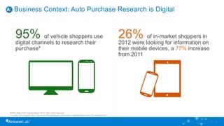
95% of vehicle shoppers use
digital channels to research their
purchase*
26% of in-market shoppers in
2012 were looking for information on
their mobile devices, a 77% increase
from 2011
*NADA State of the Industry Report 2012: https://www.nada.org/
** Google Think Insights, 2013: http://www.thinkwithgoogle.com/research-studies/digital-drives-auto-shopping.html
AKQA Tasked to Reimagine Digital Auto Experience for Luxury Car Brand
4
• Goal: implement minimalist, graphic-focused
website with a unique car configurator experience,
putting the vehicle front and center
• AKQA success metrics identified by end client:
– Increase in car configurations
– Increase in site interactions
• Challenge: Changing the automotive site
experience may confuse visitors used to the old
design, resulting in drop-off. AKQA needed to
reduce this risk.
• AKQA needed to:
– Validate web & mobile concepts in the prototype phase
– Test usability throughout development
• Three key research objectives:
1. Confirm the new site reinforces the luxury car brand
image
2. Identify and fix usability issues which may reduce key
task completions, such as car configuration
3. Ensure tasks can be completed quickly and easily
5
Agency Needed to Ensure Their New Design Was Usable
6
AnswerLab Research Solution
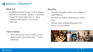
Solution: UXamine™
Benefits:
• Provides actionable insights at any stage of a
digital lifecycle
• Dynamic and flexible, allowing quick shifts in
focus
• Delivers deep understanding behind the
“why’s” of user behavior
What it is:
• Qualitative research to learn how to optimize
wireframes, prototypes, designs, or products
through first-hand observation of users’
interaction with stimuli in one-on-one
interviews
How it works:
• Users interact with a web, mobile, or other
digital product and provide input 1:1 with a
researcher
7
• A phased, iterative approach
– Two phase study with two rounds each
– Desktop & mobile user experience tested in all rounds
– Participants included current and prospective owners
8
Multi-Round Usability Research Design for AKQA
Round1
Stimuli:
Concept & IA
Framework
N=18
Iterate/Validate
Round2 Stimuli:
Concept & IA
Framework
N=12
Iterate/Validate
Round3
Stimuli:
Configurator
N=12
Iterate/Validate
Round4
Stimuli:
Configurator
N=18
Iterate/Validate
Phase 1: Validation of concept and IA framework Phase 2: Iterative Evaluation of the Configurator
9
Research Findings
10
“I have no more forward button where I was clicking.
I’m still looking for kind of a ‘done.’ Like a message
that says, ‘I’m done now.’ I don’t know what my next
step is right now. Other than saving, I don’t know
what else I can do.”
- Participant 9
• Visitors found the graphic-heavy interface beautiful, but struggled with the
non-linear nature of the design:
– Thought exploration was too open-ended
– Wanted cues to know what to do next
– Needed progress indicators to track areas they had and hadn’t visited
11
Visitors Didn’t Know Where to Start Within the Non-linear Design
Visitors Found the Site Beautiful But Had Trouble Navigating It
Some participants wanted to
be able to click on an image
and have that act as the
inventory filter
“It would be cool if I could just click on the
car instead of having to choose it from a
list.” - Richard
12
Initial Search Feature Design was a Usability Stumbling Block
Nobody interacted with, nor
did they realize, this was a
search field
Almost none of the participants took
note of the body copy/links below the
main image
13
14
Impact
Impact: Research-Driven Decisions
15
• Agency made adjustments to graphic heavy
design over the course of 4 rounds:
• Added progress indicators to guide users
through the car configuration process
• Added overlay upon initial entry into the
configurator to points out hotspots giving users
a better sense of their build options
• Visually differentiate hotspots in configurator
that the user has already interacted with
• Fixed search box confusion by providing a
familiar search icon and improving instruction
copy
• Overall design was validated
New Site Delivers Huge Increases in Interaction,
Contributes to Record Sales
16
227%
increase in car
configurations
Learn More About UXamine™ Results
17
UX Research Reveals How To Delight Mobile Users and Drive
Conversions
• Commissioned by Google
• 119 user interviews
• 100 mobile websites spanning a
variety of verticals & business sizes
• iOS and Android users
Access the full Principles of Mobile Site Design whitepaper
Your Trusted User Experience Research Partner
Thank You.
For follow-up questions about AnswerLab user experience
research services, contact:
info@answerlab.com

More Related Content

Agency Utilizes UX Research to Balance Form & Function

  • 1. Agency Utilizes UX Research to Balance Form & Function AnswerLab Multi-Platform UXamine™ Case Study AnswerLab
  • 3. Business Context: Auto Purchase Research is Digital 3 95% of vehicle shoppers use digital channels to research their purchase* 26% of in-market shoppers in 2012 were looking for information on their mobile devices, a 77% increase from 2011 *NADA State of the Industry Report 2012: https://www.nada.org/ ** Google Think Insights, 2013: http://www.thinkwithgoogle.com/research-studies/digital-drives-auto-shopping.html
  • 4. AKQA Tasked to Reimagine Digital Auto Experience for Luxury Car Brand 4 • Goal: implement minimalist, graphic-focused website with a unique car configurator experience, putting the vehicle front and center • AKQA success metrics identified by end client: – Increase in car configurations – Increase in site interactions • Challenge: Changing the automotive site experience may confuse visitors used to the old design, resulting in drop-off. AKQA needed to reduce this risk.
  • 5. • AKQA needed to: – Validate web & mobile concepts in the prototype phase – Test usability throughout development • Three key research objectives: 1. Confirm the new site reinforces the luxury car brand image 2. Identify and fix usability issues which may reduce key task completions, such as car configuration 3. Ensure tasks can be completed quickly and easily 5 Agency Needed to Ensure Their New Design Was Usable
  • 7. Solution: UXamine™ Benefits: • Provides actionable insights at any stage of a digital lifecycle • Dynamic and flexible, allowing quick shifts in focus • Delivers deep understanding behind the “why’s” of user behavior What it is: • Qualitative research to learn how to optimize wireframes, prototypes, designs, or products through first-hand observation of users’ interaction with stimuli in one-on-one interviews How it works: • Users interact with a web, mobile, or other digital product and provide input 1:1 with a researcher 7
  • 8. • A phased, iterative approach – Two phase study with two rounds each – Desktop & mobile user experience tested in all rounds – Participants included current and prospective owners 8 Multi-Round Usability Research Design for AKQA Round1 Stimuli: Concept & IA Framework N=18 Iterate/Validate Round2 Stimuli: Concept & IA Framework N=12 Iterate/Validate Round3 Stimuli: Configurator N=12 Iterate/Validate Round4 Stimuli: Configurator N=18 Iterate/Validate Phase 1: Validation of concept and IA framework Phase 2: Iterative Evaluation of the Configurator
  • 10. 10 “I have no more forward button where I was clicking. I’m still looking for kind of a ‘done.’ Like a message that says, ‘I’m done now.’ I don’t know what my next step is right now. Other than saving, I don’t know what else I can do.” - Participant 9
  • 11. • Visitors found the graphic-heavy interface beautiful, but struggled with the non-linear nature of the design: – Thought exploration was too open-ended – Wanted cues to know what to do next – Needed progress indicators to track areas they had and hadn’t visited 11 Visitors Didn’t Know Where to Start Within the Non-linear Design
  • 12. Visitors Found the Site Beautiful But Had Trouble Navigating It Some participants wanted to be able to click on an image and have that act as the inventory filter “It would be cool if I could just click on the car instead of having to choose it from a list.” - Richard 12
  • 13. Initial Search Feature Design was a Usability Stumbling Block Nobody interacted with, nor did they realize, this was a search field Almost none of the participants took note of the body copy/links below the main image 13
  • 15. Impact: Research-Driven Decisions 15 • Agency made adjustments to graphic heavy design over the course of 4 rounds: • Added progress indicators to guide users through the car configuration process • Added overlay upon initial entry into the configurator to points out hotspots giving users a better sense of their build options • Visually differentiate hotspots in configurator that the user has already interacted with • Fixed search box confusion by providing a familiar search icon and improving instruction copy • Overall design was validated
  • 16. New Site Delivers Huge Increases in Interaction, Contributes to Record Sales 16 227% increase in car configurations
  • 17. Learn More About UXamine™ Results 17 UX Research Reveals How To Delight Mobile Users and Drive Conversions • Commissioned by Google • 119 user interviews • 100 mobile websites spanning a variety of verticals & business sizes • iOS and Android users Access the full Principles of Mobile Site Design whitepaper
  • 18. Your Trusted User Experience Research Partner Thank You. For follow-up questions about AnswerLab user experience research services, contact: info@answerlab.com