Analysis of double page spreads
•Download as PPTX, PDF•
0 likes•39 views
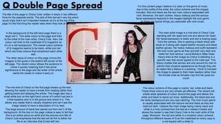
This double page spread from Vibe magazine features a full body shot of a female artist in a bright red dress as the main image. There are several smaller images of the artist in the same outfit in different poses in the background. The page lacks a title, has no bold text or subheadings, and the genre of music is unclear. The greyscale color scheme and modern clothing suggests the magazine covers popular culture beyond just music. The artist's poses are analyzed through the lens of Laura Mulvey's Male Gaze theory, implying the images are intended to please the male audience.
Report
Share


Analysis of double page spreads
- 1. Analysis of Double Page Spreads
- 2. Q Double Page Spread The title of this page is ‘Cheryl Cole’ written in black in two different fonts for the separate words. The size of this text isn’t very big which would imply that it isn’t important however as it’s at the top of the page it’s the first thing the reader sees when they look at the page. The main artist image is a mid shot of Cheryl Cole standing with her apart and one arm above her head. Her facial expression is blank and she is looking away from the camera. She is wearing a black dress with studs on it along with ripped leather trousers and black leather gloves. Her heavy makeup and outfit represent the rock music genre as they are both very dark and make her look serious. Laura Mulvey’s Male Gaze theory links to this image as Cheryl is standing in a specific way that would appeal to the male eye. This theory implies that women are only around for men to admire their physical appearance as though they are an object like a statue or a painting. I think Q included this image to appeal to their male readers rather than the female ones as females may find her pose too much. The mid-shot of Cheryl on the first page breaks up the text, allowing the reader to have a break from reading rather than getting bored and skipping the article. The image also has a small white box on the right hand corner of it which has text in it that explains who is in the picture and where it is. This allows any reader that is visually impaired and can’t see the image clearly to have a description of it to read. The large amount of black text stands out from red C of the background. All the text on the page makes is easy to tell that this is an article about an artist and the pictures and title of Cheryl Cole emphasise that the text will all link to either her life or an interview that Q had with her. The colour scheme of this page is mainly: red, white and black. These three colours are very simple yet effective. The vibrant red shade adds splashes of colour around the page and allows the white and black to stand out more. Additionally, the black text and the white background are very eye-catching. The rock music genre is usually associated with the colours red and black as they are bold but dark. I believe the main image being mainly black and white is a nice contrast from the text as it makes it bolder and allows the reader to see that Cheryl Cole is the main artist of this page. Moreover, the red and white is a constant colour scheme throughout different issues of Q as the masthead on every copy is a red square with a white Q. For this content page I believe it is clear on the genre of music due to the outfits of the artist, the colour scheme and the images included. Red and black are the two main colours associated with rock. Moreover, the dark clothes, heavy makeup and the serious facial expressions featured in the images highlight the rock genre as these are typical things you associate with rock music. In the background of the left hand page there is a large red C. This adds colour to the page and links to the initial of the main artist, Cheryl Cole. Also, the colour red links to the masthead of Q magazine as it’s on a red background. The overall colour scheme of Q magazine seems to be black, white and red which are three colours that compliment each other well. The other piece of colour on this page (minus the images) is the quote in the bottom left corner of the left page. The vibrant colour allows the audience to notice it quickly meaning that it has some significance to the page and the writer of the article wants the reader to notice it early on.
- 3. Kerrang! Double Page Spread The title of this page is ‘Wild Child’ which is located near the top of the right hand page. The word ‘Wild’ is written in a thin pink font that look like crayon writing whereas the word ‘Child’ is written in a bold white font that looks professional. The chosen fonts and colours contrast nicely from each other and link to the genre of music this magazine represents/ The main image of the artist is of Taylor Momsen who isn’t a very well known singer which highlights that this magazine is only for people that enjoy this genre of music. The image is very dark apart from her bright blonde hair which contrasts from her black leather jacket which implies this article is all about her. Her serious facial expression explains that this article isn’t going to include any aspects of comedy. At the bottom right hand side of the page there is a small box with a line of text on it which is a quote from the artist herself. I believe this makes this page seem more friendly to the reader as it adds a personal touch from the singer. The colour scheme of this page is mainly: pink, black and white. The colours both contrast and compliment one another and make the text and image stand out well from the background. The colour pink links to the female gender possibly implying that this articles primary audience is girls. The colours black and white make the page more sophisticated and make it clear for the reader what genre of music this page is about. One out of the many good things about this page is that the genre of music is clear. The colour scheme makes me think that it’s for the genre of rock and aimed at teenage girls due to the pink. Also, the black and white link to the rock genre which would consist with the normal style of Kerrang! magazine as it’s a music magazine for rock. The outfit of the singer in the main artist image is a black leather jacket along with a black chocker with a gold ring on the middle of it. Her heavy makeup and outfit both link to the title ‘Wild Child’ as this outfit would be associated with someone that is pretty rebellious or with a biker as they usually wear leather jackets. This reinforces the rock genre and how the girl isn’t the typical girly girl. The subheading is in the same font as the word ‘Child’ in the title. The 5 words that are in pink are ‘Taylor Momsen’ and ‘The Pretty Reckless.’ Because these words are in pink and not white like the rest of the paragraph it implies that these are the most important bits that link the artist and what the article is about. In the articles sub-heading you learn that this girl is only 17 which is shocking due to the heavy makeup and grown up clothes. Laura Mulvey’s Male Gaze theory is all about how women are only around to be viewed by men due to their physical appearance. I believe that this isn’t the correct way to represent a 17 year old girl as she should look her age not 20 years old. You can tell that this page is going to be an interview with the artist before you even read any of the information due to the layout. The pink sentence before each paragraph of white text implies that they are the questions the interviewer asks and the white text are the answers that Taylor Momsen responds with.
- 4. Vibe Double Page Spread The main artist image is a full body shot of a girl in a bright red/orange dress with purple shoes and a denim jacket over the top. Her legs are positioned inwards and her hands are on her hips. The way she is standing links to Laura Mulvey’s Male Gaze theory as she is using her physical appearance and stance to please the male readers. The page doesn’t have a title which is unique as in a magazine there would normally be a title located at the top of the page. This emphasises the originality of this magazine and how it will be good to read due to the individuality of it. Also, this allows the main artist image to be the first thing the readers see which relates to the article. In the background of the page there are seven more images of this girl in the same outfit just in different poses each time. These add more than just text to the article and makes it more interesting for the reader as the text is broken up and isn’t the only thing found on the page. The way in which she is standing in these images is more of a sexual manner to please the male audience however it slightly would annoy the feminist readers as she backs up the lie that women are just for men's pleasure. The massive black and white lines in the background adds some more pattern to the page. Even though the lines are half hidden by the main artist image you can still see them. Even though the lines are black and white they still add colour to the background and act as a separator between the information on the artist and the images of her at the top. The bold text located by the right leg of the main artist image is in a bold black font which contrasts from the rest of the grey or blue text featured on the page. This implies that this is meant to be an relevant quote/sentence that the main artist has once said due to it’s location and the colour we can tell it’s meant to be important. The clothing Kanye is wearing are fashionable in the modern world which leads me to believe that this magazine is very modern and is based on any popular artist that is big in the charts. Also, this implies that Vibe isn’t just about music but it’s about other things like fashion, culture and love. The writing on the page doesn’t have any subheadings which highlights that this isn’t going to be an interview with the artist it’ll just be about her career or life in general there won’t be any specific questions asked by fans or an interviewer. Therefore, this magazine is more of a general magazine rather than having any personal aspects in it. One problem with this page is that the genre of music is unclear. The greyscale coloured images make me think of old fashioned things whereas the singer looks young and her bright clothes connote more of a pop genre. Moreover, Vibe magazine usually features R&B artists which is why the outfit choice of the artist is an odd choice. As a person who doesn’t know the artist I would have to read the article to find out what genre of music it is. The page has a greyscale colour theme The page has a greyscale colour theme along with the main artist image being in colour and some of the text in blue and black. Seeing as her dress is the boldest colour on the page, our eyes are automatically drawn to it. The bright dress connotes girlyness implying that the article is about the girl aspects of the singers life.