


Anomaly detection
- 1. Location: Open Data Science Conference May 21st 2016 Anomaly Detection Techniques and Best Practices 2016 Copyright QuantUniversity LLC. Presented By: Sri Krishnamurthy, CFA, CAP www.QuantUniversity.com sri@quantuniversity.com
- 2. 2 Slides, code and questions about the full 2-day workshop on Anomaly detection to be held in Boston in July 2016, See here: http://www.analyticscertificate.com/Anomaly/
- 3. - Analytics Advisory services - Custom training programs - Architecture assessments, advice and audits
- 4. • Founder of QuantUniversity LLC. and www.analyticscertificate.com • Advisory and Consultancy for Financial Analytics • Prior Experience at MathWorks, Citigroup and Endeca and 25+ financial services and energy customers (Shell, Firstfuel Software etc.) • Regular Columnist for the Wilmott Magazine • Author of forthcoming book “Financial Modeling: A case study approach” published by Wiley • Charted Financial Analyst and Certified Analytics Professional • Teaches Analytics in the Babson College MBA program and at Northeastern University, Boston Sri Krishnamurthy Founder and CEO 4
- 5. 5 • Analytics advisory services • Expertise in R, Python, Tableau, Spotfire, Big Data, Hadoop, Apache Spark, Cloud computing • Technology and architecture advisory and assessment services • Building a platform leveraging R, Python, MATLAB and SPARK models on the cloud Analytics and Big Data Consulting
- 6. 6 Quantitative Analytics and Big Data Analytics Onboarding • Trained more than 500 students in Quantitative methods, Data Science and Big Data Technologies using MATLAB, Python and R • Launching the Analytics Certificate Program in 2016
- 7. (MATLAB version also available)
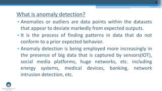
- 8. What is anomaly detection? • Anomalies or outliers are data points within the datasets that appear to deviate markedly from expected outputs. • It is the process of finding patterns in data that do not conform to a prior expected behavior. • Anomaly detection is being employed more increasingly in the presence of big data that is captured by sensors(IOT), social media platforms, huge networks, etc. including energy systems, medical devices, banking, network intrusion detection, etc. 8
- 9. 9 • Fraud Detection • E-commerce Examples
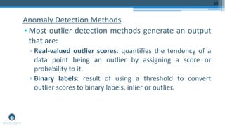
- 10. Anomaly Detection Methods • Most outlier detection methods generate an output that are: ▫ Real-valued outlier scores: quantifies the tendency of a data point being an outlier by assigning a score or probability to it. ▫ Binary labels: result of using a threshold to convert outlier scores to binary labels, inlier or outlier. 10
- 11. 11 1. Graphical approach 2. Statistical approach 3. Machine learning approach Three methodologies to Anomaly Detection
- 12. 12 Boxplot Scatter plot Adjusted quantile plot Symbol plot
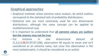
- 13. Graphical approaches • Graphical methods utilize extreme value analysis, by which outliers correspond to the statistical tails of probability distributions. • Statistical tails are most commonly used for one dimensional distributions, although the same concept can be applied to multidimensional case. • It is important to understand that all extreme values are outliers but the reverse may not be true. • For instance in one dimensional dataset of {1,3,3,3,50,97,97,97,100}, observation 50 equals to mean and isn’t considered as an extreme value, but since this observation is the most isolated point, it should be considered as an outlier. 13
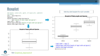
- 14. Box plot • A standardized way of displaying the variation of data based on the five number summary, which includes minimum, first quartile, median, third quartile, and maximum. • This plot does not make any assumptions of the underlying statistical distribution. • Any data not included between the minimum and maximum are considered as an outlier. 14
- 15. Boxplot 15 See Graphical_Approach.R Side-by-side boxplot for each variable
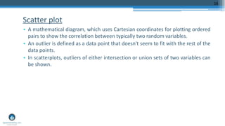
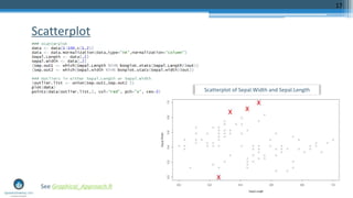
- 16. Scatter plot • A mathematical diagram, which uses Cartesian coordinates for plotting ordered pairs to show the correlation between typically two random variables. • An outlier is defined as a data point that doesn't seem to fit with the rest of the data points. • In scatterplots, outliers of either intersection or union sets of two variables can be shown. 16
- 17. Scatterplot 17 See Graphical_Approach.R Scatterplot of Sepal.Width and Sepal.Length
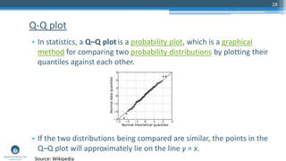
- 18. 18 • In statistics, a Q–Q plot is a probability plot, which is a graphical method for comparing two probability distributions by plotting their quantiles against each other. • If the two distributions being compared are similar, the points in the Q–Q plot will approximately lie on the line y = x. Q-Q plot Source: Wikipedia
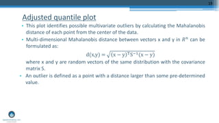
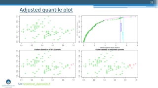
- 19. Adjusted quantile plot • This plot identifies possible multivariate outliers by calculating the Mahalanobis distance of each point from the center of the data. • Multi-dimensional Mahalanobis distance between vectors x and y in 𝑅 𝑛 can be formulated as: d(x,y) = x − y TS−1(x − y) where x and y are random vectors of the same distribution with the covariance matrix S. • An outlier is defined as a point with a distance larger than some pre-determined value. 19
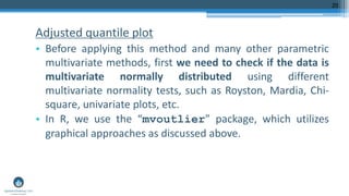
- 20. Adjusted quantile plot • Before applying this method and many other parametric multivariate methods, first we need to check if the data is multivariate normally distributed using different multivariate normality tests, such as Royston, Mardia, Chi- square, univariate plots, etc. • In R, we use the “mvoutlier” package, which utilizes graphical approaches as discussed above. 20
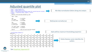
- 21. Adjusted quantile plot 21 Min-Max normalization before diving into analysis Multivariate normality test Outlier Boolean vector identifies the outliers Alpha defines maximum thresholding proportion See Graphical_Approach.R
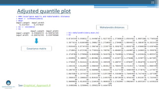
- 22. Adjusted quantile plot 22 See Graphical_Approach.R Mahalanobis distances Covariance matrix
- 23. Adjusted quantile plot 23 See Graphical_Approach.R
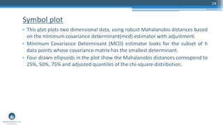
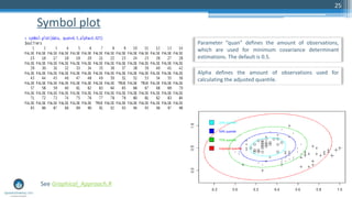
- 24. Symbol plot • This plot plots two dimensional data, using robust Mahalanobis distances based on the minimum covariance determinant(mcd) estimator with adjustment. • Minimum Covariance Determinant (MCD) estimator looks for the subset of h data points whose covariance matrix has the smallest determinant. • Four drawn ellipsoids in the plot show the Mahalanobis distances correspond to 25%, 50%, 75% and adjusted quantiles of the chi-square distribution. 24
- 25. Symbol plot 25 See Graphical_Approach.R Parameter “quan” defines the amount of observations, which are used for minimum covariance determinant estimations. The default is 0.5. Alpha defines the amount of observations used for calculating the adjusted quantile.
- 26. 26 Hypothesis testing ( Chi-square test, Grubb’s test) Scores
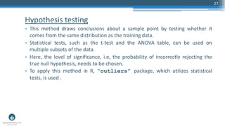
- 27. Hypothesis testing • This method draws conclusions about a sample point by testing whether it comes from the same distribution as the training data. • Statistical tests, such as the t-test and the ANOVA table, can be used on multiple subsets of the data. • Here, the level of significance, i.e, the probability of incorrectly rejecting the true null hypothesis, needs to be chosen. • To apply this method in R, “outliers” package, which utilizes statistical tests, is used . 27
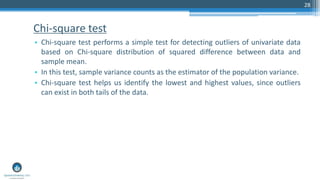
- 28. Chi-square test • Chi-square test performs a simple test for detecting outliers of univariate data based on Chi-square distribution of squared difference between data and sample mean. • In this test, sample variance counts as the estimator of the population variance. • Chi-square test helps us identify the lowest and highest values, since outliers can exist in both tails of the data. 28
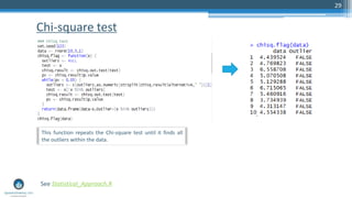
- 29. Chi-square test 29 See Statistical_Approach.R This function repeats the Chi-square test until it finds all the outliers within the data.
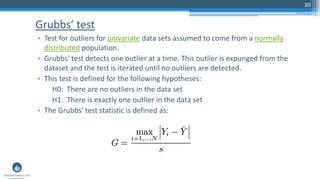
- 30. Grubbs’ test • Test for outliers for univariate data sets assumed to come from a normally distributed population. • Grubbs' test detects one outlier at a time. This outlier is expunged from the dataset and the test is iterated until no outliers are detected. • This test is defined for the following hypotheses: H0: There are no outliers in the data set H1: There is exactly one outlier in the data set • The Grubbs' test statistic is defined as: 30
- 31. Grubbs’ test 31 See Statistical_Approach.R The above function repeats the Grubbs’ test until it finds all the outliers within the data.
- 32. Grubbs’ test 32 See Statistical_Approach.R Histogram of normal observations vs outliers)
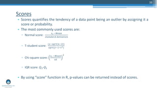
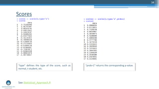
- 33. Scores • Scores quantifies the tendency of a data point being an outlier by assigning it a score or probability. • The most commonly used scores are: ▫ Normal score: 𝑥 𝑖 −𝑀𝑒𝑎𝑛 𝑠𝑡𝑎𝑛𝑑𝑎𝑟𝑑 𝑑𝑒𝑣𝑖𝑎𝑡𝑖𝑜𝑛 ▫ T-student score: (𝑧−𝑠𝑞𝑟𝑡 𝑛−2 ) 𝑠𝑞𝑟𝑡(𝑧−1−𝑡2) ▫ Chi-square score: 𝑥 𝑖 −𝑀𝑒𝑎𝑛 𝑠𝑑 2 ▫ IQR score: 𝑄3-𝑄1 • By using “score” function in R, p-values can be returned instead of scores. 33
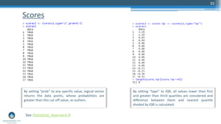
- 34. Scores 34 See Statistical_Approach.R “type” defines the type of the score, such as normal, t-student, etc. “prob=1” returns the corresponding p-value.
- 35. Scores 35 See Statistical_Approach.R By setting “prob” to any specific value, logical vector returns the data points, whose probabilities are greater than this cut-off value, as outliers. By setting “type” to IQR, all values lower than first and greater than third quartiles are considered and difference between them and nearest quartile divided by IQR is calculated.
- 36. 36 • Anomaly Detection ▫ Seasonal Hybrid ESD (S-H-ESD) builds upon the Generalized ESD test for detecting anomalies. ▫ Anomaly detection referring to point-in-time anomalous data points that could be global or local. A local anomaly is one that occurs inside a seasonal pattern; Could be +ve or –ve. ▫ More details here: https://github.com/twitter/AnomalyDetection • Breakout Detection ▫ A breakout is characterized in this package by two steady states and an intermediate transition period that could be sudden or gradual ▫ Uses the E-Divisive with Medians algorithm; Can detect one or multiple breakouts in a given time series and employs energy statistics to detect divergence in mean. More details here: (https://blog.twitter.com/2014/breakout-detection-in-the-wild ) Twitter packages
- 37. 37 • Twitter-R-Anomaly Detection tutorial.ipyb Demo
- 38. 38 Linear regression Piecewise/ segmented regression Clustering-based approaches
- 39. Linear regression • Linear regression investigates the linear relationships between variables and predict one variable based on one or more other variables and it can be formulated as: 𝑌 = 𝛽0 + 𝑖=1 𝑝 𝛽𝑖 𝑋𝑖 where Y and 𝑋𝑖 are random variables, 𝛽𝑖 is regression coefficient and 𝛽0 is a constant. • In this model, ordinary least squares estimator is usually used to minimize the difference between the dependent variable and independent variables. 39
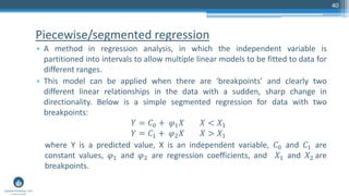
- 40. Piecewise/segmented regression • A method in regression analysis, in which the independent variable is partitioned into intervals to allow multiple linear models to be fitted to data for different ranges. • This model can be applied when there are ‘breakpoints’ and clearly two different linear relationships in the data with a sudden, sharp change in directionality. Below is a simple segmented regression for data with two breakpoints: 𝑌 = 𝐶0 + 𝜑1 𝑋 𝑋 < 𝑋1 𝑌 = 𝐶1 + 𝜑2 𝑋 𝑋 > 𝑋1 where Y is a predicted value, X is an independent variable, 𝐶0 and 𝐶1 are constant values, 𝜑1 and 𝜑2 are regression coefficients, and 𝑋1 and 𝑋2 are breakpoints. 40
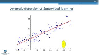
- 41. 41 Anomaly detection vs Supervised learning
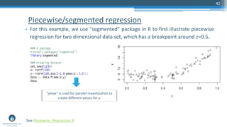
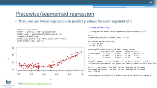
- 42. Piecewise/segmented regression • For this example, we use “segmented” package in R to first illustrate piecewise regression for two dimensional data set, which has a breakpoint around z=0.5. 42 See Piecewise_Regression.R “pmax” is used for parallel maximization to create different values for y.
- 43. Piecewise/segmented regression • Then, we use linear regression to predict y values for each segment of z. 43 See Piecewise_Regression.R
- 44. Piecewise/segmented regression • Finally, the outliers can be detected for each segment by setting some rules for residuals of model. 44 See Piecewise_Regression.R Here, we set the rule for the residuals corresponding to z less than 0.5, by which the outliers with residuals below 0.5 can be defined as outliers.
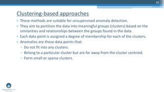
- 45. Clustering-based approaches • These methods are suitable for unsupervised anomaly detection. • They aim to partition the data into meaningful groups (clusters) based on the similarities and relationships between the groups found in the data. • Each data point is assigned a degree of membership for each of the clusters. • Anomalies are those data points that: ▫ Do not fit into any clusters. ▫ Belong to a particular cluster but are far away from the cluster centroid. ▫ Form small or sparse clusters. 45
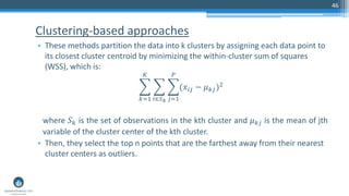
- 46. Clustering-based approaches • These methods partition the data into k clusters by assigning each data point to its closest cluster centroid by minimizing the within-cluster sum of squares (WSS), which is: 𝑘=1 𝐾 𝑖∈𝑆 𝑘 𝑗=1 𝑃 (𝑥𝑖𝑗 − 𝜇 𝑘𝑗)2 where 𝑆 𝑘 is the set of observations in the kth cluster and 𝜇 𝑘𝑗 is the mean of jth variable of the cluster center of the kth cluster. • Then, they select the top n points that are the farthest away from their nearest cluster centers as outliers. 46
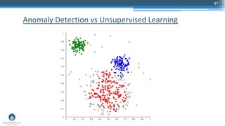
- 47. 47 Anomaly Detection vs Unsupervised Learning
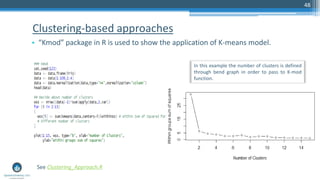
- 48. Clustering-based approaches • “Kmod” package in R is used to show the application of K-means model. 48 In this example the number of clusters is defined through bend graph in order to pass to K-mod function. See Clustering_Approach.R
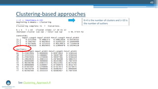
- 49. Clustering-based approaches 49 See Clustering_Approach.R K=4 is the number of clusters and L=10 is the number of outliers
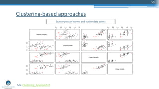
- 50. Clustering-based approaches 50 See Clustering_Approach.R Scatter plots of normal and outlier data points
- 51. 51 Local outlier factor
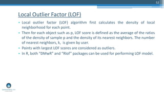
- 52. Local Outlier Factor (LOF) • Local outlier factor (LOF) algorithm first calculates the density of local neighborhood for each point. • Then for each object such as p, LOF score is defined as the average of the ratios of the density of sample p and the density of its nearest neighbors. The number of nearest neighbors, k, is given by user. • Points with largest LOF scores are considered as outliers. • In R, both “DMwR” and “Rlof” packages can be used for performing LOF model. 52
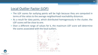
- 53. Local Outlier Factor (LOF) • The LOF scores for outlying points will be high because they are computed in terms of the ratios to the average neighborhood reachability distances. • As a result for data points, which distributed homogenously in the cluster, the LOF scores will be close to one. • Over a different range of values for k, the maximum LOF score will determine the scores associated with the local outliers. 53
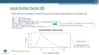
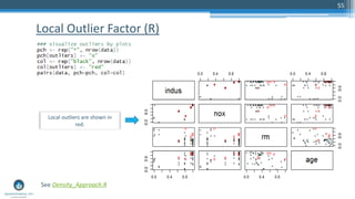
- 54. Local Outlier Factor (R) • LOF returns a numeric vector of scores for each observation in the data set. 54 k, is the number of neighbors that is used in calculation of local outlier scores. See Density_Approach.R Outlier indexes
- 55. Local Outlier Factor (R) 55 Local outliers are shown in red. See Density_Approach.R
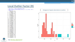
- 56. 56 Local Outlier Factor (R) Histogram of regular observations vs outliers See Density_Approach.R
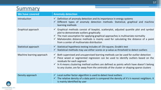
- 57. Summary 57 We have covered Anomaly detection Introduction Definition of anomaly detection and its importance in energy systems Different types of anomaly detection methods: Statistical, graphical and machine learning methods Graphical approach Graphical methods consist of boxplot, scatterplot, adjusted quantile plot and symbol plot to demonstrate outliers graphically The main assumption for applying graphical approaches is multivariate normality Mahalanobis distance methods is mainly used for calculating the distance of a point from a center of multivariate distribution Statistical approach Statistical hypothesis testing includes of: Chi-square, Grubb’s test Statistical methods may use either scores or p-value as threshold to detect outliers Machine learning approach Both supervised and unsupervised learning methods can be used for outlier detection Piece wised or segmented regression can be used to identify outliers based on the residuals for each segment In K-means clustering method outliers are defined as points which have doesn’t belong to any cluster, are far away from the centroids of the cluster or shaping sparse clusters Density approach Local outlier factor algorithm is used to detect local outliers The relative density of a data point is compared the density of it’s k nearest neighbors. K is mainly identified by user
- 58. (MATLAB version also available) www.analyticscertificate.com
- 59. 59 Q&A Slides, code and questions about the full 2-day workshop on Anomaly detection to be held in Boston in July 2016, See here: http://www.analyticscertificate.com/Anomaly/
- 60. Thank you! Sri Krishnamurthy, CFA, CAP Founder and CEO QuantUniversity LLC. srikrishnamurthy www.QuantUniversity.com Contact Information, data and drawings embodied in this presentation are strictly a property of QuantUniversity LLC. and shall not be distributed or used in any other publication without the prior written consent of QuantUniversity LLC. 60