Location via proxy:   [ UP ]  
[Report a bug]   [Manage cookies]                
SlideShare a Scribd company logo
Applying Progressive
Information
Disclosure:
User Interface Content Design
Presented by
Andrea L. Ames
IBM Senior Technical Staff Member and
Enterprise Content Experience
Strategist/Architect/Designer
(c) Andrea L. Ames, 2006-2013 2
About Andrea
 Technical communicator since 1983
 Areas of expertise
 Information architecture and design and interaction design for
products and interactive information
 Information and product usability—from analysis through
validation
 User-centered design and development process
 IBM Senior Technical Staff Member
 UCSC in Silicon Valley Extension Tech Comm and
Writing certificate coordinator and instructor
 STC Fellow, past president (2004-05), and past member
of Board of Directors (1998-2006)
 ACM Distinguished Engineer
2
(c) Andrea L. Ames, 2006-2013 3
Agenda
 Prerequisite: Think More, Write Less
 Progressive disclosure (PD)
 Traditional information PD
 Applying PD to the end-to-end
content experience
 Quick steps to PD
 Blockers to PD
 Resources
 Backup: Stages of use
3
(c) Andrea L. Ames, 2006-2013 4
According to Wikipedia…
progressive disclosure (PD):
 “To move complex and less frequently used options out of the main user interface
and into secondary screens“
 An interaction design technique
 Often used in human computer interaction
 Helps maintain the focus of a user's attention by reducing clutter, confusion, and
cognitive workload
 Improves usability by presenting only the minimum data required for the task at hand
 Sequences actions across several screens
 Reduces feelings of overwhelm for the user
 Reveals only the essentials and helps the user manage the complexity of feature-rich
sites or applications
 Moves from "abstract to specific" via “ramping up” the user from simple to more
complex actions
(c) Andrea L. Ames, 2006-2013 5
PD for interaction isn’t new
 Around since at least the early 1980s (Jack Carroll, IBM)
 Jakob Nielsen has been discussing it for ages
"Progressive disclosure is the best tool so far: show people
the basics first, and once they understand that, allow
them to get to the expert features. But don't show
everything all at once or you will only confuse people and
they will waste endless time messing with features that
they don't need yet".
 In information development, PD can be applied to
content, as well
(c) Andrea L. Ames, 2006-2013 6
What is progressive
information disclosure?
 In an information experience, enables you (the author) to
provide the right information in the right place at the right
time
 Assumes “competent performer” to “proficient performer”
is stage of use (backup) in which users will spend most
of their time when using the product–not novices; not
experts
 Defer display of novice information, background,
concepts, extended reference material and examples,
etc., until the user needs and requests it
 Reduces complexity by revealing only the essentials for
a current task and then reveals more as users advance
through tasks
(c) Andrea L. Ames, 2006-2013 7
What is progressive
information disclosure? (cont.)
 Reveals information in an ordered manner
 Each layer builds on the previous one in a flow that provides
progressively more information
 Provides only the details that are necessary at a given time, in a
specific context
 Provides assistance when necessary--not information created just to
cover an empty widget
 Do not repeat information; for example, do not repeat field labels in
hover text.
 “A guided journey, not a scavenger hunt” (J. Fell, former IBM IA)
 Designed around the ideal information experience–with no resource
or time constraints
 Implemented realistically with necessary constraints
(c) Andrea L. Ames, 2006-2013 8
A rose by any other name…
 Technical communicators have been
“doing” PD for a long time
 We might not call it PD
 The best example of traditional PD:
Well-architected, traditional, online help
Primary “layer”: Contextual and task topics
Secondary “layers”: prereqs, background,
related concepts and reference, etc.
(c) Andrea L. Ames, 2006-2013 9
Traditional, contextual help
(c) Andrea L. Ames, 2006-2013 10
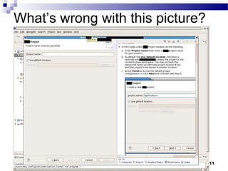
The problem with traditional assistance and
traditional information development methods
 Typical UI-text development process:
 Written by developers of the UI
 Edited by tech pubs (best case; often copy edit capturing only capitalization and punctuation
issues and typos)
 Typical help development process:
 Writers attend (some) design meetings, keeping track of the number of UI panels in the
product, which typically include one help button per panel
 Writers develop one help topic for each UI panel in the product
 Pop-up help/hover help provided for all, or no, controls
 Task help describes how to complete the fields in the UI panel:
 Pop-up/hover help content repeated in task help
 Writers cut and paste from specs
 Typical library design and development process:
 Deliverables developed based on development expectations and history vs. user needs
 Other (non-help) deliverable content identified without regard for task help also being created
 Extensive redundancy across UI text, help, and other deliverables (like books)
 Design process accomplished within resource and time constraints, not
according to ideal or customer needs
(c) Andrea L. Ames, 2006-2013 11
What’s wrong with this picture?
(c) Andrea L. Ames, 2006-2013 12
The next PD
evolution/revolution
The UI
 Add value
 Get even closer to the task than the help
 Influence the design of the task and task
ecosystem
 Drive reductions in words
 Prioritize resources around client value
(c) Andrea L. Ames, 2006-2013 13
Overview: Quick steps to PD
1. Consider your user (scenarios, goals, tasks) and their stages of
use (see backup for more on stages of use)
2. Start with the product: Is the UI as obvious and self-evident as
possible?
3. Can you improve “help,” or do you need it at all?
4. How are you supporting users’ successful goal
achievement (through use of the product) with
non-UI, task-oriented content?
? What issues will keep you from
implementing this kind of approach?
(c) Andrea L. Ames, 2006-2013 14
1. Consider your user (scenarios, goals, tasks) and
their stages of use
 Scenarios
 Use cases
 Task flows
 Personas
 User roles
 Goals, expectations, needs, environment
 Required to understand whether the product is as easy to explain as
possible without content, and to understand what information is
necessary and how, when, and where to deliver it.
(c) Andrea L. Ames, 2006-2013 15
2. Start with the product
 First: Is the UI as obvious and self-evident (as easy to explain) as possible?
 First view: “welcome”
 Task flow
 All assistance about the UI should be in the UI
 Persistent – absolutely necessary
 User controllable – useful, might be needed by some users (obvious to get to)
 Consider the types of content you need to provide
 Control assistance
 Panel assistance
 And the types of mechanisms available
 Persistent UI text that doesn’t require
a user gesture (widget labels, window titles,
inline hints & tips)
 Simple UI gestures your users will tolerate
(hover, one or two clicks)
 Imagine you are a consultant or advisor, looking over the user’s shoulder; what does
she need to know?
(c) Andrea L. Ames, 2006-2013 16
3. Can you improve “help,” or do you need it at all?
 Focused on UI tasks that absolutely cannot be
handled by “closer” delivery mechanisms
 Cross-panel tasks
 Stop yelling!
 Repeating the same thing, over and over, does
not make the message more valuable, useful, or
enhance users’ comprehension
(c) Andrea L. Ames, 2006-2013 17
4. How are you supporting users’ successful goal
achievement with non-UI, task-oriented content?
 Doc library
 Another form of “help?” No!
 User-task focused content: High-value, focused
on “job 1”
(c) Andrea L. Ames, 2006-2013 18
The biggest stumbling block(s)…
What keeps us from applying this approach?
 We didn’t know about it or how to do it
 We don’t think it’s the right thing to do
 Others (non-content people, like engineers)
don’t understand it and/or buy into it
 Processes and process artifacts don’t support it
 Tools don’t support it
 Other issues?
(c) Andrea L. Ames, 2006-2013 19
Resources
 Jakob Nielsen, Alertbox
 Demystifying Usability blog
 Time-Tripper UI patterns
 InteractionDesign.org
 “Layering as a ‘Safety Net’ for Minimalist Documentation,” in Minimalism Beyond the
Nurnberg Funnel, ed. J.M. Carroll, MIT Press, 1998, pp. 247-74.
 The QuickScan Project: http://www.quikscan.org/
This presentation on slideshare:
http://www.slideshare.net/aames/20130724-worlds-
collideimproveuxthrupidstcwebinaraames
STC proceedings paper on stages of use:
http://www.stc.org/images/proceedings/Documents/enablingprogressivei1.htm
19
(c) Andrea L. Ames, 2006-2013 20
Questions?
20
(c) Andrea L. Ames, 2006-2013 21
Contacting/following/connecting
with Andrea
E-mail: aames@pobox.com
Social: http://about.me/AndreaLAmes
21
Backup
Stages of Use
(c) Andrea L. Ames, 2006-2013 23
“Stages of use” in designing and writing
embedded assistance layers of PD
(c) Andrea L. Ames, 2006-2013 24
“Stages of use” in designing and writing
embedded assistance layers of PD, cont.
(c) Andrea L. Ames, 2006-2013 25
Cautionary note about stages of use in
EA design
 Stages of use apply to multiple user dimensions; for example:
 Domain knowledge
 Computer use
 Your tool
 Tools like your tool
 A user who is a novice in your tool and tools like your tool might be an
expert in the domain and the use of computers in general.
 The same user might be an expert with most parts of your UI and a novice
in some, or might be an expert in some parts of a task flow and a novice in
others.
 You must consider the many dimensions of your users before arbitrarily
applying a single “stage of use” label to them
 Consider the appropriate information for the point in time for which you are
designing: does the user need tool information, domain information, or
both?
 Thankfully, progressive disclosure enables you to support multiple levels of
users throughout their use of the various parts of the product and through
their growth in domain and tool knowledge and experience

More Related Content

Applying Progressive Information Disclosure: User Interface Content Design

  • 1. Applying Progressive Information Disclosure: User Interface Content Design Presented by Andrea L. Ames IBM Senior Technical Staff Member and Enterprise Content Experience Strategist/Architect/Designer
  • 2. (c) Andrea L. Ames, 2006-2013 2 About Andrea  Technical communicator since 1983  Areas of expertise  Information architecture and design and interaction design for products and interactive information  Information and product usability—from analysis through validation  User-centered design and development process  IBM Senior Technical Staff Member  UCSC in Silicon Valley Extension Tech Comm and Writing certificate coordinator and instructor  STC Fellow, past president (2004-05), and past member of Board of Directors (1998-2006)  ACM Distinguished Engineer 2
  • 3. (c) Andrea L. Ames, 2006-2013 3 Agenda  Prerequisite: Think More, Write Less  Progressive disclosure (PD)  Traditional information PD  Applying PD to the end-to-end content experience  Quick steps to PD  Blockers to PD  Resources  Backup: Stages of use 3
  • 4. (c) Andrea L. Ames, 2006-2013 4 According to Wikipedia… progressive disclosure (PD):  “To move complex and less frequently used options out of the main user interface and into secondary screens“  An interaction design technique  Often used in human computer interaction  Helps maintain the focus of a user's attention by reducing clutter, confusion, and cognitive workload  Improves usability by presenting only the minimum data required for the task at hand  Sequences actions across several screens  Reduces feelings of overwhelm for the user  Reveals only the essentials and helps the user manage the complexity of feature-rich sites or applications  Moves from "abstract to specific" via “ramping up” the user from simple to more complex actions
  • 5. (c) Andrea L. Ames, 2006-2013 5 PD for interaction isn’t new  Around since at least the early 1980s (Jack Carroll, IBM)  Jakob Nielsen has been discussing it for ages "Progressive disclosure is the best tool so far: show people the basics first, and once they understand that, allow them to get to the expert features. But don't show everything all at once or you will only confuse people and they will waste endless time messing with features that they don't need yet".  In information development, PD can be applied to content, as well
  • 6. (c) Andrea L. Ames, 2006-2013 6 What is progressive information disclosure?  In an information experience, enables you (the author) to provide the right information in the right place at the right time  Assumes “competent performer” to “proficient performer” is stage of use (backup) in which users will spend most of their time when using the product–not novices; not experts  Defer display of novice information, background, concepts, extended reference material and examples, etc., until the user needs and requests it  Reduces complexity by revealing only the essentials for a current task and then reveals more as users advance through tasks
  • 7. (c) Andrea L. Ames, 2006-2013 7 What is progressive information disclosure? (cont.)  Reveals information in an ordered manner  Each layer builds on the previous one in a flow that provides progressively more information  Provides only the details that are necessary at a given time, in a specific context  Provides assistance when necessary--not information created just to cover an empty widget  Do not repeat information; for example, do not repeat field labels in hover text.  “A guided journey, not a scavenger hunt” (J. Fell, former IBM IA)  Designed around the ideal information experience–with no resource or time constraints  Implemented realistically with necessary constraints
  • 8. (c) Andrea L. Ames, 2006-2013 8 A rose by any other name…  Technical communicators have been “doing” PD for a long time  We might not call it PD  The best example of traditional PD: Well-architected, traditional, online help Primary “layer”: Contextual and task topics Secondary “layers”: prereqs, background, related concepts and reference, etc.
  • 9. (c) Andrea L. Ames, 2006-2013 9 Traditional, contextual help
  • 10. (c) Andrea L. Ames, 2006-2013 10 The problem with traditional assistance and traditional information development methods  Typical UI-text development process:  Written by developers of the UI  Edited by tech pubs (best case; often copy edit capturing only capitalization and punctuation issues and typos)  Typical help development process:  Writers attend (some) design meetings, keeping track of the number of UI panels in the product, which typically include one help button per panel  Writers develop one help topic for each UI panel in the product  Pop-up help/hover help provided for all, or no, controls  Task help describes how to complete the fields in the UI panel:  Pop-up/hover help content repeated in task help  Writers cut and paste from specs  Typical library design and development process:  Deliverables developed based on development expectations and history vs. user needs  Other (non-help) deliverable content identified without regard for task help also being created  Extensive redundancy across UI text, help, and other deliverables (like books)  Design process accomplished within resource and time constraints, not according to ideal or customer needs
  • 11. (c) Andrea L. Ames, 2006-2013 11 What’s wrong with this picture?
  • 12. (c) Andrea L. Ames, 2006-2013 12 The next PD evolution/revolution The UI  Add value  Get even closer to the task than the help  Influence the design of the task and task ecosystem  Drive reductions in words  Prioritize resources around client value
  • 13. (c) Andrea L. Ames, 2006-2013 13 Overview: Quick steps to PD 1. Consider your user (scenarios, goals, tasks) and their stages of use (see backup for more on stages of use) 2. Start with the product: Is the UI as obvious and self-evident as possible? 3. Can you improve “help,” or do you need it at all? 4. How are you supporting users’ successful goal achievement (through use of the product) with non-UI, task-oriented content? ? What issues will keep you from implementing this kind of approach?
  • 14. (c) Andrea L. Ames, 2006-2013 14 1. Consider your user (scenarios, goals, tasks) and their stages of use  Scenarios  Use cases  Task flows  Personas  User roles  Goals, expectations, needs, environment  Required to understand whether the product is as easy to explain as possible without content, and to understand what information is necessary and how, when, and where to deliver it.
  • 15. (c) Andrea L. Ames, 2006-2013 15 2. Start with the product  First: Is the UI as obvious and self-evident (as easy to explain) as possible?  First view: “welcome”  Task flow  All assistance about the UI should be in the UI  Persistent – absolutely necessary  User controllable – useful, might be needed by some users (obvious to get to)  Consider the types of content you need to provide  Control assistance  Panel assistance  And the types of mechanisms available  Persistent UI text that doesn’t require a user gesture (widget labels, window titles, inline hints & tips)  Simple UI gestures your users will tolerate (hover, one or two clicks)  Imagine you are a consultant or advisor, looking over the user’s shoulder; what does she need to know?
  • 16. (c) Andrea L. Ames, 2006-2013 16 3. Can you improve “help,” or do you need it at all?  Focused on UI tasks that absolutely cannot be handled by “closer” delivery mechanisms  Cross-panel tasks  Stop yelling!  Repeating the same thing, over and over, does not make the message more valuable, useful, or enhance users’ comprehension
  • 17. (c) Andrea L. Ames, 2006-2013 17 4. How are you supporting users’ successful goal achievement with non-UI, task-oriented content?  Doc library  Another form of “help?” No!  User-task focused content: High-value, focused on “job 1”
  • 18. (c) Andrea L. Ames, 2006-2013 18 The biggest stumbling block(s)… What keeps us from applying this approach?  We didn’t know about it or how to do it  We don’t think it’s the right thing to do  Others (non-content people, like engineers) don’t understand it and/or buy into it  Processes and process artifacts don’t support it  Tools don’t support it  Other issues?
  • 19. (c) Andrea L. Ames, 2006-2013 19 Resources  Jakob Nielsen, Alertbox  Demystifying Usability blog  Time-Tripper UI patterns  InteractionDesign.org  “Layering as a ‘Safety Net’ for Minimalist Documentation,” in Minimalism Beyond the Nurnberg Funnel, ed. J.M. Carroll, MIT Press, 1998, pp. 247-74.  The QuickScan Project: http://www.quikscan.org/ This presentation on slideshare: http://www.slideshare.net/aames/20130724-worlds- collideimproveuxthrupidstcwebinaraames STC proceedings paper on stages of use: http://www.stc.org/images/proceedings/Documents/enablingprogressivei1.htm 19
  • 20. (c) Andrea L. Ames, 2006-2013 20 Questions? 20
  • 21. (c) Andrea L. Ames, 2006-2013 21 Contacting/following/connecting with Andrea E-mail: aames@pobox.com Social: http://about.me/AndreaLAmes 21
  • 23. (c) Andrea L. Ames, 2006-2013 23 “Stages of use” in designing and writing embedded assistance layers of PD
  • 24. (c) Andrea L. Ames, 2006-2013 24 “Stages of use” in designing and writing embedded assistance layers of PD, cont.
  • 25. (c) Andrea L. Ames, 2006-2013 25 Cautionary note about stages of use in EA design  Stages of use apply to multiple user dimensions; for example:  Domain knowledge  Computer use  Your tool  Tools like your tool  A user who is a novice in your tool and tools like your tool might be an expert in the domain and the use of computers in general.  The same user might be an expert with most parts of your UI and a novice in some, or might be an expert in some parts of a task flow and a novice in others.  You must consider the many dimensions of your users before arbitrarily applying a single “stage of use” label to them  Consider the appropriate information for the point in time for which you are designing: does the user need tool information, domain information, or both?  Thankfully, progressive disclosure enables you to support multiple levels of users throughout their use of the various parts of the product and through their growth in domain and tool knowledge and experience