Location via proxy:   [ UP ]  
[Report a bug]   [Manage cookies]                
SlideShare a Scribd company logo
Introducing Cascading Style Sheets
http://www.slideshare.net/chadmairn
@cmairn
Virtual Petting Zoo/Discussion
Want to
hangout?
gplus.to/chadmairn
anymeeting.com/chadmairn
How would you describe this?
Agenda
• Learn what CSS does and appreciate its
importance in Web design.
• Recognize and use general CSS grammar
(e.g., syntax, semantics, vocabulary)
• Understand how to link a CSS file to an HTML
document.
• Create a Web designers toolbox.
• Design a basic webpage using CSS.
Draw four lines the same length that
touch, two horizontal and two vertical.
We need to tell computers exactly what we mean!
Source: http://goo.gl/N0gvb
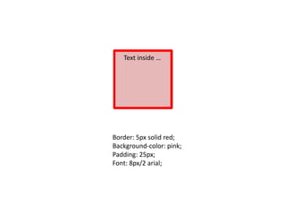
Text inside …
Border: 5px solid red;
Background-color: pink;
Padding: 25px;
Font: 8px/2 arial;
HTML = Content; defines tags etc.
CSS = Presentation; tells browser
how tags should appear.
CSS defines how to display HTML tags.
Styles are normally saved in external .css files. External style sheets
enable you to change the appearance and layout of all the pages in a
Web site, just by editing one single file!
Source: http://www.w3schools.com
Define
widths, heights, colors, marg
ins, padding, borders, backgr
ounds, and type styles with
CSS
Source: http://www.w3schools.com
/*This is a comment*/
p
{
text-align:center;
/*This is another comment*/
color:black;
font-family:arial;
}
CSS Comments
id selector
#para1
{
text-align:center;
color:red;
}
ResultCode
class selector
Result
Code
ColorZilla and other tools …
Adding CSS code to HTML pages
1. External Style Sheet
<head>
<link rel="stylesheet" type="text/css" href="mystyle.css">
</head>
2. Internal Style Sheet
<head>
<style>
hr {color:sienna;}
p {margin-left:20px;}
body {background-image:url("images/back40.gif");}
</style>
</head>
3. Inline Styles
<p style="color:sienna;margin-left:20px">This is a paragraph.</p>
Note: an inline style will override a style defined inside the <head> tag or in an external style
sheet. If the link to the external style sheet is placed after the internal style sheet in HTML
<head>, then the external style sheet will override the internal style sheet!
Source: http://goo.gl/RgDFa
http://www.w3schools.com/cssref/
live demonstration
~ Firebug
~ CSS Generating tools
~ CSS Examples
1. If you don't have an FTP application, then I recommend that you download
and install the following: http://filezilla-project.org/download.php
2. Upload files to your directory (e.g., email address username).
3. When you begin to work with the FTP client, you will need to enter the
following credentials:
•Host: via email
•Username: via email
•Password: via email
A quick screencast video demonstrating how to login using the FileZilla FTP
Client can be found at http://www.youtube.com/watch?v=9VaM_wv0aQ4.
4. You will need either a text editor (TextEdit on mac or Notepad on PC) or a
tool like Dreamweaver.
If you have problems, please contact Chad Mairn at (727) 537-6405 or
at chadmairn@gmail.com.
Uploading Files
Uploading Files via FTP
To test you work visit …
http://marcomponline.com/chadtest/Class/
email username
Homework …
• Create a basic HTML index page (index.html) and include an external style
sheet as well as some inline styles. Experiment with various properties and
values.
• Find an interesting site that uses CSS and modify it for your needs. {Note: try a
search for “CSS exercises” and use whatever interests you.
http://www.w3schools.com/css/css_examples.asp and
http://www.codecademy.com/tracks/htmlcss are great resources! Don’t forget
Firebug!}
• Test and validate your HTML file at http://validator.w3.org/
• Test and validate your CSS file at http://jigsaw.w3.org/css-validator/
• Please take good notes because I’d like to spend some time next week
discussing any issues you may have had using CSS.
Next Week …
• Share with the group good/bad experiences
(e.g., what worked, what didn’t etc.)
• Other coding examples
• Discuss the future of CSS3/Responsive Web Design
• Questions and answers …
How did it go?
Other examples
Styling an e-book with Calibre
RGB and Hex color values: http://cloford.com/resources/colours/500col.htm
CSS pseudo-classes
• used to add special effects to some selectors. Some
examples:
:link - add special style to an unvisited link.
:visited - add special style to a visited link.
:hover - add special style to an element when you mouse over it.
CSS3
• CSS3 is the latest standard for CSS.
• CSS3 is backwards compatible; browsers will support CSS2.
• Some of the most important CSS3 modules are:
– Selectors [HTML (e.g., h2); Class (e.g., .hilight);
– Box Model
– Backgrounds and Borders
– Text Effects
– 2D/3D Transformations
– Animations
– Multiple Column Layout
– User Interface
Source: http://goo.gl/eMQEC
• Try http://css3generator.com/ and http://css3please.com/
Code Result
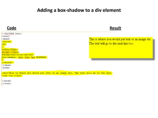
Adding a box-shadow to a div element
Responsive Web Design
• adapts to the webpage’s layout by using
fluid, proportion-based grids, flexible images, and
CSS3 media queries.
• Three concepts:
• Media queries and media query listeners
• A flexible grid-based layout that uses relative sizing
• Flexible images and media, through dynamic resizing or CSS
Source: http://goo.gl/UQ94d
Caveat: I am just learning RWD!
Media queries and media query listeners
• CSS3 Media queries enable you to style a page based on properties
of the media where the page is being displayed. For example:
@media screen and (max-width:400px)
{ div {border:none;}
}
• The above code limits the scope to viewports (i.e., virtual window;
screen display) which are 400px or less in width.
• Media Query Listeners enable you to execute a script in response to
a change in a media query.
• An example: http://goo.gl/G4fGb
Source: http://goo.gl/G4fGb
A flexible grid-based layout using relative sizing
• ‘non-responsive’ websites have a set width/ fixed
value (e.g., 900px)
• set a relative value as the width then the screen
size is mostly irrelevant. For example:
#content{width: 90%;}
This content area would respond to the screen
size.
Source: http://goo.gl/Sa5nG
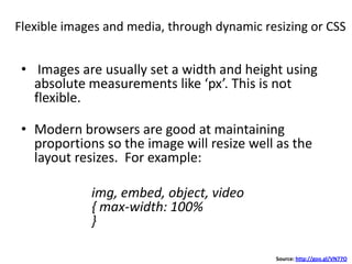
Flexible images and media, through dynamic resizing or CSS
• Images are usually set a width and height using
absolute measurements like ‘px’. This is not
flexible.
• Modern browsers are good at maintaining
proportions so the image will resize well as the
layout resizes. For example:
img, embed, object, video
{ max-width: 100%
}
Source: http://goo.gl/VN77O
http://marcomponline.com/chadtest/Class/jjack/
Desktop view
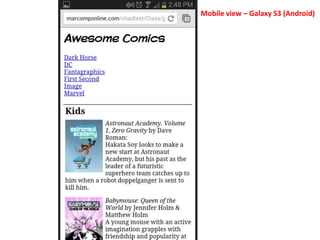
Mobile view – Galaxy S3 (Android)
http://jquerymobile.com/themeroller/
http://www.slideshare.net/chadmairn
@cmairn
Let’s
Hangout!
gplus.to/chadmairn

More Related Content

Introducing Cascading Style Sheets

  • 3. Virtual Petting Zoo/Discussion Want to hangout? gplus.to/chadmairn anymeeting.com/chadmairn
  • 4. How would you describe this?
  • 5. Agenda • Learn what CSS does and appreciate its importance in Web design. • Recognize and use general CSS grammar (e.g., syntax, semantics, vocabulary) • Understand how to link a CSS file to an HTML document. • Create a Web designers toolbox. • Design a basic webpage using CSS.
  • 6. Draw four lines the same length that touch, two horizontal and two vertical. We need to tell computers exactly what we mean! Source: http://goo.gl/N0gvb
  • 7. Text inside … Border: 5px solid red; Background-color: pink; Padding: 25px; Font: 8px/2 arial;
  • 8. HTML = Content; defines tags etc. CSS = Presentation; tells browser how tags should appear. CSS defines how to display HTML tags. Styles are normally saved in external .css files. External style sheets enable you to change the appearance and layout of all the pages in a Web site, just by editing one single file! Source: http://www.w3schools.com
  • 9. Define widths, heights, colors, marg ins, padding, borders, backgr ounds, and type styles with CSS
  • 11. /*This is a comment*/ p { text-align:center; /*This is another comment*/ color:black; font-family:arial; } CSS Comments
  • 14. ColorZilla and other tools …
  • 15. Adding CSS code to HTML pages 1. External Style Sheet <head> <link rel="stylesheet" type="text/css" href="mystyle.css"> </head> 2. Internal Style Sheet <head> <style> hr {color:sienna;} p {margin-left:20px;} body {background-image:url("images/back40.gif");} </style> </head> 3. Inline Styles <p style="color:sienna;margin-left:20px">This is a paragraph.</p> Note: an inline style will override a style defined inside the <head> tag or in an external style sheet. If the link to the external style sheet is placed after the internal style sheet in HTML <head>, then the external style sheet will override the internal style sheet! Source: http://goo.gl/RgDFa
  • 17. live demonstration ~ Firebug ~ CSS Generating tools ~ CSS Examples
  • 18. 1. If you don't have an FTP application, then I recommend that you download and install the following: http://filezilla-project.org/download.php 2. Upload files to your directory (e.g., email address username). 3. When you begin to work with the FTP client, you will need to enter the following credentials: •Host: via email •Username: via email •Password: via email A quick screencast video demonstrating how to login using the FileZilla FTP Client can be found at http://www.youtube.com/watch?v=9VaM_wv0aQ4. 4. You will need either a text editor (TextEdit on mac or Notepad on PC) or a tool like Dreamweaver. If you have problems, please contact Chad Mairn at (727) 537-6405 or at chadmairn@gmail.com. Uploading Files
  • 20. To test you work visit … http://marcomponline.com/chadtest/Class/ email username
  • 21. Homework … • Create a basic HTML index page (index.html) and include an external style sheet as well as some inline styles. Experiment with various properties and values. • Find an interesting site that uses CSS and modify it for your needs. {Note: try a search for “CSS exercises” and use whatever interests you. http://www.w3schools.com/css/css_examples.asp and http://www.codecademy.com/tracks/htmlcss are great resources! Don’t forget Firebug!} • Test and validate your HTML file at http://validator.w3.org/ • Test and validate your CSS file at http://jigsaw.w3.org/css-validator/ • Please take good notes because I’d like to spend some time next week discussing any issues you may have had using CSS.
  • 22. Next Week … • Share with the group good/bad experiences (e.g., what worked, what didn’t etc.) • Other coding examples • Discuss the future of CSS3/Responsive Web Design • Questions and answers …
  • 23. How did it go?
  • 25. Styling an e-book with Calibre RGB and Hex color values: http://cloford.com/resources/colours/500col.htm
  • 26. CSS pseudo-classes • used to add special effects to some selectors. Some examples: :link - add special style to an unvisited link. :visited - add special style to a visited link. :hover - add special style to an element when you mouse over it.
  • 27. CSS3 • CSS3 is the latest standard for CSS. • CSS3 is backwards compatible; browsers will support CSS2. • Some of the most important CSS3 modules are: – Selectors [HTML (e.g., h2); Class (e.g., .hilight); – Box Model – Backgrounds and Borders – Text Effects – 2D/3D Transformations – Animations – Multiple Column Layout – User Interface Source: http://goo.gl/eMQEC • Try http://css3generator.com/ and http://css3please.com/
  • 28. Code Result Adding a box-shadow to a div element
  • 29. Responsive Web Design • adapts to the webpage’s layout by using fluid, proportion-based grids, flexible images, and CSS3 media queries. • Three concepts: • Media queries and media query listeners • A flexible grid-based layout that uses relative sizing • Flexible images and media, through dynamic resizing or CSS Source: http://goo.gl/UQ94d Caveat: I am just learning RWD!
  • 30. Media queries and media query listeners • CSS3 Media queries enable you to style a page based on properties of the media where the page is being displayed. For example: @media screen and (max-width:400px) { div {border:none;} } • The above code limits the scope to viewports (i.e., virtual window; screen display) which are 400px or less in width. • Media Query Listeners enable you to execute a script in response to a change in a media query. • An example: http://goo.gl/G4fGb Source: http://goo.gl/G4fGb
  • 31. A flexible grid-based layout using relative sizing • ‘non-responsive’ websites have a set width/ fixed value (e.g., 900px) • set a relative value as the width then the screen size is mostly irrelevant. For example: #content{width: 90%;} This content area would respond to the screen size. Source: http://goo.gl/Sa5nG
  • 32. Flexible images and media, through dynamic resizing or CSS • Images are usually set a width and height using absolute measurements like ‘px’. This is not flexible. • Modern browsers are good at maintaining proportions so the image will resize well as the layout resizes. For example: img, embed, object, video { max-width: 100% } Source: http://goo.gl/VN77O
  • 34. Mobile view – Galaxy S3 (Android)