


CSS Basics (Cascading Style Sheet)
- 1. Ajay Khatri Senior Assistant Professor Acropolis Institute of Technology & Research www.ajaykhatri.in
- 2. Topics Covered Basic introduction to CSS syntax– Lecture 1 Font and Text properties – Lecture 2 Margins, borders, and padding – Lecture 3 Lists, links, and tables – Lecture 4 Floats, layouts, and positioning elements – Lecture 5 Working with color – Lecture 6 Responsive and mobile design – depending on interest CSS3 Effects – depending on interest
- 3. Introduction This is Lecture-1 of a basic introduction to CSS syntax This presentation is designed to be a starting point for learning CSS All you need to get started is a text editor and a browser
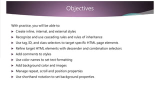
- 4. Objectives With practice, you will be able to: Create inline, internal, and external styles Recognize and use cascading rules and rules of inheritance Use tag, ID, and class selectors to target specific HTML page elements Refine target HTML elements with descender and combination selectors Add comments to styles Use color names to set text formatting Add background color and images Manage repeat, scroll and position properties Use shorthand notation to set background properties
- 5. Default Styles <!DOCTYPE html> <html> <head> Without CSS, this page renders with the browser default styles<title> Default Styles </title> Text is black on white and uses the</head> default font<body> <h1> is large and bold<h1> Default Styles </h1> Headings and paragraphs are separated<p> Without CSS, the default browser styles are used. </p> with extra whitespace </body> </html>
- 6. CSS Styles <!DOCTYPE html> <html> <head> CSS changes the browser default style where specific styles are applied<title> CSS Styles </title> </head> All other HTML styles are unchanged and continue to inherit browser styles<body style=“background:blue;” > <h1> Inline Styles </h1> Only the background changes from the default styles – from white to blue <p> CSS is used to change browser default styles. </p> <h1> and <p> tags will not change </body> </html>
- 7. Styles CSS styles can be written as inline, internal, or external styles Inline styles are written as quoted attributes within a specific tag element Inline styles are specific to the tag Internal styles use <style> </style> tags in the <head> section of a page Internal styles are specific to the page in which they are declared External styles are declared in an external .css stylesheet and uses a <link> tag in the <head> section to reference the .css file External styles can be applied site-wide and are recommended as best practice
- 8. Inline Styles <body style = “background : blue;” > Inline styles are added as a quoted attribute within the opening tag of the selected element<h1> Inline Style </h1> Inline styles are difficult to maintain and<p> Inline styles are declared generally not recommendedas an attribute of any tag. </p> They are specific to the tag/page </body>
- 9. Internal Styles <head> <style> body { Internal styles are declared using the <style> tag <style> tags are added within the <head> section of a web pagebackground : blue; } Internal styles share a common syntax with external styles (more later)</style> </head> Inline styles override external styles
- 10. External Styles External styles are declared in a separate, external .css file The .css file is linked to the current web page using a <link> tag within the <head> section <head> <link href=“styles.css” rel=“stylesheet” /> The href attribute declares the name (and path) of the external file </head> The rel=“stylesheet” attribute sets the relationship between the web page and the external .css file Link tags are self-closing
- 11. “Cascading" Style Sheets External, Internal, Inline, and default styles establish a hierarchy of styles CSS styles declared closest to the tag override previous styles Inline styles declared in the tag override all other styles Internal styles (declared on a page) override external styles All CSS styles override the browser default styles This is the “cascade” within the meaning of CSS (Cascading Style Sheets)
- 12. “Cascading" Style Sheets Multiple CSS files can be linked to a single web page The order of the <link> declarations affects which styles are applied fist/last If a conflict occurs, the last declared styles will be applied If a <link> tag is declared after an internal <style> declaration, then the external stylesheet becomes closer to the tag and will override the internal style!
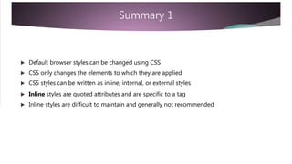
- 13. Summary 1 Default browser styles can be changed using CSS CSS only changes the elements to which they are applied CSS styles can be written as inline, internal, or external styles Inline styles are quoted attributes and are specific to a tag Inline styles are difficult to maintain and generally not recommended
- 14. Summary 1 Internal styles are declared within <style> tags in the <head> section of a page and are specific to that page External styles are declared in an external stylesheet and the <link> tag links the external stylesheet to the web page by referencing the location of the .css file External styles can be used site-wide CSS establish a hierarchy of styles where later style rules override previous ones This is the “cascade” in Cascading Style Sheets
- 15. Syntax Internal and external styles share a common syntax p { The <head> reference is different but the background: blue; color: white; text-align: center; declaration syntax is the same Learning CSS is all about learning the structure and syntax of the rules } As well as the property-value pairs that are available
- 16. Syntax External styles are declared in a plain text file and saved with a .css filename External files include only style declarations – and comments Spaces can be used to separate style declarations Internal styles are declared on each web page in the head section between <style> tags The advantage of using external files is the ease of maintenance There is only a single file to make any changes
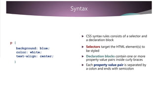
- 17. Syntax CSS syntax rules consists of a selector and a declaration block p { Selectors target the HTML element(s) tobackground: blue; color: white; text-align: center; be styled Declaration blocks contain one or more property value pairs inside curly braces } Each property value pair is separated by a colon and ends with semicolon
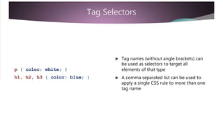
- 18. Tag Selectors Tag names (without angle brackets) can be used as selectors to target all elements of that typep { color: white; } A comma separated list can be used to apply a single CSS rule to more than one tag name h1, h2, h3 { color: blue; }
- 19. ID Selectors id attributes can be used as selectors #top { color: blue; } #main { color: blue; } A #sign is added to the id name in the CSS rule (no spaces) A comma separated list can be used to apply a single CSS rule to more than one id name #top, #main { color: blue; }
- 20. Class Selectors Class names can be used as selectors .note { color: blue; } A period is added to the class name in the CSS rule (no spaces).special { color: blue; } A comma separated list can be used to apply a single CSS rule to more than one class name .note, .special { color: blue; }
- 21. Descendant Selectors Tags nested within other tags form a parent-child relationship Use a space separated list to target nested tags – as “descendants” div p { color: blue; } ul li { color: red; } div p applies only to paragraphs that are nested within a div tag ul li applies only to list items that are in unordered lists Paragraphs not inside div tags and li tags in ordered lists are not affected
- 22. Combining Selectors A tag.class selector targets a specific subset of tags with the class name paragraphs with class .note will be red p.note { color: red; } span tags with class .note will be blue other elements with the class .note arespan.note { color: blue; } not affected Paragraphs and span tags without the class name are also not affected
- 23. Combining Selectors Combining descender and tag.class selectors refines the target even more p.note will be red only within a div tag div p.note { color: red; } span.note will be blue only within a list other elements with the class .note willli span.note { color: blue; } not be affected There is a lot more to selectors – but these will get you started
- 24. Comments /* This is a comment */ /* Comments begin with a slash star and end with its /* opposite */ Comments add useful information for stylesheet developersComments can be in a single line or on multiple lines They are ignored when processed by the browser*/
- 25. Summary 2 Internal styles are declared in the head section of a page External styles are declared in a plain text file with a .css file extension Internal and external styles share a common syntax Selectors identify the element to be styled Declaration blocks mark the beginning and end of a rule with curly braces Property and value pairs assign styles to specific attributes of the selector
- 26. Summary 2 A selector is used to target specific page element(s) Common selectors are tag names, class names, and id names Selectors can be used individually or in a comma separated list They can be made more specific using a space separated list This establishes a nested “descender” relationship by including a parent element A tag.class combination can also be used to target a more specific element Descender and tag.class can also be combined
- 27. Summary 2 Style rules are declared between opening and closing curly braces Rules consist of property and value pairs separated by a colon: Each property and value pair ends with a semicolon; Add /* comments */ for clarity Learning CSS is about learning the selectors, properties and values that are available in CSS – which we start to cover next
- 28. Text Color When used by itself, color refers to the text color – the foreground color There are over 100 color names that can be used in CSSp { color: white; } There are also HEX, RGB, and HSLh1, h2, h3 { color: blue; } notations for declaring color values This presentation will get you started with some common color names
- 29. Color Names black, white, silver, gray (grey) Here are 20 common color names to get red, pink, magenta, purple, green, yellow, lime, olive blue, navy, teal, aqua you started Light and dark can be used with some colors written as a single word A google search for css color names willyellow, gold, orange, tomato give you lots of choices Names are not case sensitive but it islightGrey, lightGreen, . . . darkRed, darkBlue, . . . usual for values to be lowercase
- 30. Background Color Color names can also be used to set the background property of a page or page element body { background: darkGray; } This example uses shorthand notation to declare the background property There is also a more specific notation using background-color: darkGray; Throughout this presentation, we use div { background: lightGray; } shorthand notation to get you started
- 31. Background Image body { background: url(“bkgnd.jpg”); Images can be used as backgrounds The url(“path”) notation is used to indicate the file name and location} There is also a more specific notation background-image: url(“path”);div { This example uses shorthand notation tobackground: url(“bkgnd.jpg”); set the background property }
- 32. Background Repeat Background images repeat in bothbody { background: url(“bkgnd.jpg”) repeat-x ; directions - horizontally and vertically Use repeat-x or repeat-y to specify a single direction} When using shorthand notation the closing semicolon is used only once at the end of a space separated listdiv { background: url(“bkgnd.jpg”) repeat-y ; When specific notation is used the semicolons are used in each case background-repeat : repeat-x ;}
- 33. No Repeat and Position A single image can appear in thebody { background: url(“bkgnd.jpg”) no-repeat top right ; background using no-repeat When no-repeat is used the image is placed top-left of its parent container} The position property can be used to place the image in one of 9 positions div { The more specific notation can also be used for both repeat and position background-repeat : no-repeat ; background-position : top right ; background: url(“bkgnd.jpg”) no-repeat top right ; }
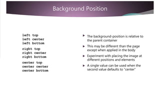
- 34. Background Position left top left center left bottom The background-position is relative to the parent container This may be different than the page right top right center right bottom except when applied in the body Experiment with placing the image at different positions and elements center top center center center bottom A single value can be used when the second value defaults to “center”
- 35. Fixed or Scroll body { background: url(“bkgnd.jpg”) no-repeat fixed top right ; Background images will scroll with the page by default To change this, add the fixed value to the background property} Notice the placement location of the fixed value – the order is importantdiv { However, the more specific notation can be used in any order background: url(“bkgnd.jpg”) no-repeat fixed top right ; background-attachment : fixed ;}
- 36. Shorthand Sequence When using shorthand notation the orderbackground: lightgrey url(“bkgnd.jpg”) of the values is important The order must be declared in thenorepeat fixed top right ; sequence shown opposite color image repeat fixed position background-color: lightgrey ; background-image: url(“bkgnd.jpg”); background-repeat: norepeat; background-attachment: fixed; background-position: top right; Individual values can be omitted but the sequence cannot be changed The more specific notation can be used in any order
- 37. Color and Image It is common to add a background color with a background imagebackground: lightgrey url(“bkgnd.jpg”) norepeat fixed top right ; This allows a complimentary color to show when a repeat restriction is used Also when images may be disabled
- 38. Summary 3 The color property refers to the text color There are over 100 color names that can be used in CSS Names are not case sensitive but common practice suggests lowercase Other notations include HEX, RGB, and HSL Color names can also be used with the background property A shorthand notation can be used – background: grey; Or the more specific notation – background-color: grey;
- 39. Summary 3 Images can be used as backgrounds using the url(“path”) notation The path should include the location, file name, and extension Background images repeat in both directions by default The background-repeat property can be used to repeat in a single direction or to display as a single image using repeat-x or repeat-y or no-repeat. The no-repeat value positions the image at the top-left of the container Use the position property to place the image in any of 9 positions The background is positioned relative to the parent container Add the fixed value to the background property to prevent default scrolling
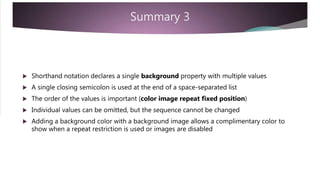
- 40. Summary 3 Shorthand notation declares a single background property with multiple values A single closing semicolon is used at the end of a space-separated list The order of the values is important (color image repeat fixed position) Individual values can be omitted, but the sequence cannot be changed Adding a background color with a background image allows a complimentary color to show when a repeat restriction is used or images are disabled
- 41. Summary 3 background: lightgrey url(“bkgnd.jpg”) no-repeat fixed top right ; Here is a summary of the shorthand and more specific notationbackground-color: lightgrey ; background-image: url(“bkgnd.jpg”); background-repeat: no-repeat; background-attachment: fixed; background-position: top right;
- 42. Inheritance Tags that are nested within other tags inherit the style of the parent tag All tags are nested within the body tag – so all tags inherit from the body tag CSS can target and change specific properties for specific elements But, again – only the specified styles are changed – all others continue to inherit from the parent – whether from inline, internal, external, or default browser styles
- 43. Review How did you do? Are you able to: Create inline, internal, and external styles Recognize and use cascading rules and rules of inheritance Use tag, ID, and class selectors to target specific HTML page elements Refine target HTML elements with descender and combination selectors Add comments to styles Use color names to set text formatting Add background color and images Manage repeat, scroll and position properties Use shorthand notation to set background properties
- 45. Ajay Khatri Senior Assistant Professor Acropolis Institute of Technology & Research www.ajaykhatri.in
- 46. Introduction This presentation covers Lecture -2 of a basic introduction to CSS syntax See “HTML Basic Tags” for an introduction to HTML markup See Part-1 to get started with CSS This presentation is designed to be a next step for learning CSS All you need to get started is a text editor and a browser
- 47. Objectives With practice, you will be able to: Declare font-family and font properties Recognize differences in serif and sans-serif fonts Identify font names for each major font-family Use different units of measurement for font-size Set font-weight, font-style, and font-variant values Set text properties for alignment, case, and line decoration Set line-height and text-indent properties Set word and letter spacing Create a drop shadow effect
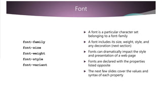
- 48. Font A font is a particular character set belonging to a font-family A font includes its size, weight, style, andfont-family font-size any decoration (next section) Fonts can dramatically impact the style font-weight font-style font-variant and presentation of a web page Fonts are declared with the properties listed opposite The next few slides cover the values and syntax of each property
- 49. Font Family A font family is a group of related fonts with similar characteristics Font families can be categorized as being with/without serifs Serifs are lines added at the ends of a character Serif fonts tend to be more emphatic – so useful in headings Sans-serif (without serif) fonts are easier to read on screen - so useful in body text Other font families include Monospace, Cursive, and Fantasy
- 50. Font Names Here are some specific font names for each font-family: Serif: Georgia, Times New Roman, Palatino Arial, Helvetica, Verdana Sans-Serif: Monospace: Courier New, Courier, Lucida Console Cursive: Fantasy Lucida Calligraphy, Lucida Handwriting, Segoe Script Chiller, Harrington, Papyrus
- 51. Font-Family Font-family values are declared in abody { comma-separated list font-family: Verdana, Arial, sans-serif ; } The generic font family name is listed at the end as a fall back default font Fonts should be listed in a preferred order as the browser will use only the first font found in the listh1, h2, h3 { Quotation marks are required if the fontfont-family: "Times New Roman", Times, serif ; } name contains spaces "Times New Roman"
- 52. Font Size Font size can be measured in pixels, percent, and em And with word sizes small, medium, large Or with relative word sizes smaller, larger Historically font size measures the width of a capital “M” Thus 1em (no space) references the current font size relative to the size of the “M” The default browser font size is 16 pixels – stated as 16px (no space) So 1em = 16px (unless the base font size is changed)
- 53. Pixels Pixels are easy to learn but are fixed and body { font-size: 16px; } lack flexibility/accessibility Browser default text is 16 pixels Headings have larger values h1 h2 h3 { font-size: 40px; } { font-size: 30px; } { font-size: 20px; } Headings and text can be inherited from browser defaults or set in CSS Font sizes can be changed to meet the design requirements of the page.small { font-size: 12px; } There is no space between the unit of measure and its value (16px)
- 54. “em” em units are more flexible than pixels andbody { font-size: 1em; } scale relative to the base font Here the base font is declared as 1em (which by default will equal 16px)h1 h2 h3 { font-size: 2.5em; } { font-size: 2em; } { font-size: 1.5em; } The other font sizes are measured as multiples of the base font Multiples are relative to the parent container (not necessarily the body) .small { font-size: 0.75em; } There is no space between the unit of measure and its value (1em)
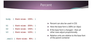
- 55. Percent body { font-size: 100%; } Percent can also be used in CSS h1 h2 h3 { font-size: 200%; } { font-size: 150%; } { font-size: 125%; } Here the base font is 100% (or 16px) If the base font is changed – then all other sizes adjust proportionally Relative units are relative to the base font of the parent container.small { font-size: 90%; }
- 56. Combinations Units can be mixedbody { font-size: 100%; } Here, the base font is set in the body tag as a percentage h1 h2 h3 { font-size: 2.5em; } { font-size: 2em; } { font-size: 1.5em; } Other tags are set using ems The body/base font can be set at any size to start with – depending on the page design requirements .small { font-size: 0.75em; } It does not have to be 100% or 16px
- 57. Font Weight A scale from 100 to 900 (in multiples of 100) can be used to specify font weight Normal is 400 Bold is 700 In between measures can be used to modify these benchmarks Keywords normal and bold correspond to 400 and 700 Keywords lighter and darker are relative to the current font weight
- 58. Font-Weight Font weight is simple and easy to set body { font-weight: normal; } bold is used most often The keyword h1, h2, h3 { font-weight: 900; } Other weights are subtle variations or relative adjustments Here, in these samples: Headings are darker than 700 The note class is made bold The light class is made lighter The dark class is made darker .note { font-weight: bold; } .light { font-weight: lighter; } .dark { font-weight: darker; }
- 59. Font-Style Font style can be normal, italic, orbody { font-style: normal; } oblique h1, h2, h3 { font-style: italic; } Oblique is often rendered as italic Normal is the default and can be used as a reset.note { font-style: oblique; }
- 60. Font-Variant Font variant can be normal or set to body { font-variant: normal; } small-caps h1, h2, h3 { font-variant: small-caps; } Normal is the default and can be used as a reset Text properties are used to set other case.smcap { font-style: small-caps; } settings (lower/upper case)
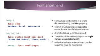
- 61. Font Shorthand body { Font values can be listed in a single declaration using the font propertyfont: 16px Verdana, Arial, sans-serif ; The list of values is space separated – except for the font family declaration} A single closing semicolon is used The order of the values is important: style h1, h2, h3 { font: italic small-caps bold "Times New Roman", Times, serif ; } variant weight size family Individual values can be omitted but the sequence must be maintained.smcap { font: small-caps; }
- 62. Summary 1 A font is a named character set belonging to a font-family There are five generic font families Serif fonts have extenders at the end of characters (serifs) Sans-serif (without serif) do not Other font families include Monospace, Cursive, and Fantasy Font-family values are declared in a comma-separated list with the generic font family name listed last Quotation marks are required if the font name contains spaces The browser uses only the first font found in the list
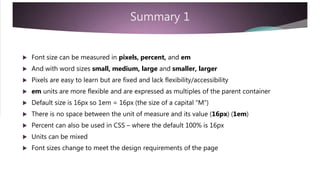
- 63. Summary 1 Font size can be measured in pixels, percent, and em And with word sizes small, medium, large and smaller, larger Pixels are easy to learn but are fixed and lack flexibility/accessibility em units are more flexible and are expressed as multiples of the parent container Default size is 16px so 1em = 16px (the size of a capital “M”) There is no space between the unit of measure and its value (16px) (1em) Percent can also be used in CSS – where the default 100% is 16px Units can be mixed Font sizes change to meet the design requirements of the page
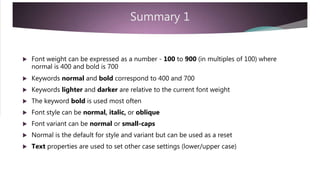
- 64. Summary 1 Font weight can be expressed as a number - 100 to 900 (in multiples of 100) where normal is 400 and bold is 700 Keywords normal and bold correspond to 400 and 700 Keywords lighter and darker are relative to the current font weight The keyword bold is used most often Font style can be normal, italic, or oblique Font variant can be normal or small-caps Normal is the default for style and variant but can be used as a reset Text properties are used to set other case settings (lower/upper case)
- 65. Summary 1 The shorthand notation uses a single declaration using the font property Values are space separated – except for the font family declaration The font family is in a comma separated list A single closing semicolon is used The order of the values is important: style variant weight size family Individual values can be omitted but the sequence must be maintained
- 66. Text Properties text-align vertical-align Here are some basic text properties to get you started They do what they indicate with sometext-decoration text-transform notable exceptions See the next slides for more details Color is also a related “text” property (seetext-indent line-height CSS Part-1) Fonts are also related to text but deal more specifically with character styleletter-spacing word-spacing
- 67. Text Align .search { text-align: right; } The text-align property aligns text horizontally within its container.special { text-align: justify; Horizontal alignment values include:} left, right, center, justify .footnote { text-align: center; }
- 68. Vertical Align td { vertical-align: top; } The vertical-align property has some limitations It is used to align text vertically within td.special { table cells – not in other containers vertical-align: middle; It is also used with inline elements such } as images to align them with text flow Vertical alignment values for table cells td.footnote { include: top, middle, bottom vertical-align: bottom; }
- 69. Text Decoration .note { text-decoration: underline ; } Text decoration refers to enhancing text with line decoration .totals { Text decoration values include:text-decoration: overline ; underline, overline, and line-through } Default is none – which can also be used.edit { as a resettext-decoration: line-through ; }
- 70. Text Transform .note { text-transform: uppercase; } The text-transform property sets the capitalization of text Values include:.alpha { uppercase, lowercase, capitalizetext-transform: lowercase; } Capitalize is used for names or titles where every first letter is capitalized.title { text-transform: capitalize; }
- 71. Text Indent and Line Height p.semi { text-indent: 50px; line-height: 1.5; The text-indent property indents only the first line of a paragraph Any measurement units can be used to} set the amount of indent p.full { text-indent: 10%; line-height: 2em; The line-height property can be used with measurement units or declared as a multiple – such as 1, 1.5, or 2 for single, one-and-half, or double line-spacing }
- 72. Letter and Word Spacing p.loose { letter-spacing: 2px; word-spacing: 2px; Letter an word spacing can be used to change default line/word spacing } Any of the measurement units can be used (pixels, percent, em)p.compressed { letter-spacing: -1px; word-spacing: -1px; } Units can be positive or negative
- 73. Summary 2 The text-align properties can be used to change the default top-left positioning of text – relative to its container – or as a reset The vertical-align properties only work on text in table cells – but can be used for inline elements such as images to align with text flow text-align vertical-align - left, right, center, justify - top, middle, bottom
- 74. Summary 2 The text-decoration property can be used to apply different line styles to text text-decoration - overline, underline, line-through, none The text-transform property can be use to set the capitalization of text text-transform - uppercase, lowercase, capitalize, none
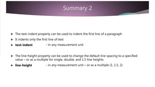
- 75. Summary 2 The text-indent property can be used to indent the first line of a paragraph It indents only the first line of text text-indent - in any measurement unit The line-height property can be used to change the default line spacing to a specified value – or as a multiple for single, double, and 1.5 line heights line-height - in any measurement unit – or as a multiple (1, 1.5, 2)
- 76. Summary 2 The letter-spacing and word-spacing properties adjust the spacing between letters and words depending on style requirements Units can be positive or negative in px, percent, or em letter-spacing word-spacing - in any measurement unit - in any measurement unit
- 77. Text Shadow A text-shadow adds a special effect to text – suitable for headings h1 { text-shadow: 2px, 2px, grey ; A comma-separated list of values is used to be apply the shadow to text The order is horizontal-shift, vertical-shift,} and color An optional blur value can be added
- 78. Review How did you do? Are you able to: Declare font-family and font properties Recognize differences in serif and sans-serif fonts Identify font names for each major font-family Use different units of measurement for font-size Set font-weight, font-style, and font-variant values Set text properties for alignment, case, and line decoration Set line-height and text-indent properties Set word and letter spacing Create a drop shadow effect
- 80. Ajay Khatri Senior Assistant Professor Acropolis Institute of Technology & Research www.ajaykhatri.in
- 81. Introduction This presentation covers Lecture-3 of a basic introduction to CSS syntax See “HTML Basic Tags” for an introduction to HTML markup See Part-1 to get started with CSS See Part-2 for Font and Text properties This presentation is designed to be a next step for learning CSS All you need to get started is a text editor and a browser So, enjoy!
- 82. Objectives With practice, you will be able to: Set an element’s height and width property Set border properties in a single declaration or with specific notation Set rounded corners using the border-radius property Set padding properties in a single declaration or with specific notation Set margin properties in a single declaration or with specific notation Center an element by setting margins Recognize when margin collapse may occur Calculate a container’s extended width and height using the box model Set outline properties in a single declaration or with specific notation
- 83. Template <!DOCTYPE html> <html> <head> Create this HTML template for use with<title> Container Text </title> <style> ... </style> the samples that follow </head> <body> A span tag is added to a paragraph tag wrapped in a div tag<div> <p> Add this <span> span tag </span> to a paragraph within a div tag </p> </div> A style tag is added for internal styles </body> </html>
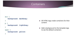
- 84. Containers div { background: darkGrey; } All HTML tags create containers for their contentp { background: lightGrey; } Add a background to the template tags to see the default containersspan { background: yellow; }
- 85. Containers div { background: darkGrey; } Change the paragraph font-size to 2em to see how the container size changesp { background: lightGrey; font-size: 2em; Change the span font-size to 16px to see how the container size follows the font size } span { background: yellow; font-size: 16px; }
- 86. Containers div { background: darkGrey; } For something interesting change the span font-size to 2em p { The em units are multiples relative to the parent’s font-size background: lightGrey; font-size: 2em; } span { background: yellow; font-size: 2em; The span font becomes 4x larger than the original because the paragraph font is also 2em – and 2 x 2 = 4 }
- 87. Containers div { background: darkGrey; Containers have a height and width property that wraps to the size of the container contents height: 500px; width: 500px; } p { background: lightGrey; font-size: 2em; height: 200px; width: 75%; The height and width can be set in CSS independently of the contents } span { background: yellow; font-size: 16em; Add the height and width properties to the CSS code as shown opposite }
- 88. Containers div { background: darkGrey; The height and width properties have some limitationsheight: 500px; width: 500px; } Add the height and width properties to the span tag and note how there is no change to this inline element p { background: lightGrey; font-size: 2em; height: 200px; width: 75%; } (The same is true for table rows)span { background: yellow; font-size: 16em; height: 2em; width: 100px; The height and width properties always work with block level elements }
- 89. Summary 1 All HTML tags create containers for their content Containers have a height and width property that wraps to the size of the container contents The height and width can be set in CSS independently of the contents The height and width properties have some limitations but always work with block level elements
- 90. Borders Borders can be added to any element Borders are added outside of the container dimensions Borders extend the visual size of the element and add to its overall dimensions The content (container) width and height remain unchanged and as declared The combined dimensions of border and container are the height and width of the contents plus the width of the border The top and bottom border adds to the height The left and right border adds to the width
- 91. Borders Borders can be declare using a singlediv { border: 2px solid red; } border property The values are declared in a space separated list as width, style and color This applies the same border style to allimg { four sides of the elementborder: 5px dashed blue; } The order is significant with shorthand notation – width style color
- 92. Borders div { border-width: 2px; The three border properties can beborder-style: solid; border-color: red; declared individually using the more specific notation} img { border-width: 5px; When specific properties are used, the order is not importantborder-style: double; border-color: blue; }
- 93. Borders div { border: 1px solid red; } Width can be any measurement unit or stated as thin, medium, thick Border color can be any of the CSS colorsimg { border-width: 5px; border-style: double; border-color: blue; A list of styles follows }
- 94. Border Style A style must be declared for the border to be displayed Any of the styles shown opposite can bedotted, dashed, solid double, groove, ridge inset, outset used Some of the 3D effects will vary with the border color and width none, hidden A hidden border still takes up space An image can also be used for the border – more later
- 95. Borders One reason to use the more specific notation is to vary the values per side div { border-width: If 4 values are used, they follow the order1px 2px 3px 4px; of Top, Right, Bottom, and Left border-style: dotted dashed; TRBL spells “trouble” border-color: red green blue; Here the border width is 1px across the top, 2px on the right, 3px across the bottom, and 4px on the left }
- 96. Borders If only 2 values are used the top anddiv { border-width: bottom are paired with the first value and the left and right are paired with the last value1px 2px 3px 4px; border-style: dotted dashed; border-color: Here, the border-style is dotted across the top and bottom and dashed on the left and right sides red green blue; }
- 97. Borders When 3 values are used the top anddiv { border-width: bottom are independent and use the first and last value and the left and right are paired with the middle value1px 2px 3px 4px; border-style: dotted dashed; border-color: Here, the border-color will be red on top and blue on the bottom with the green value used on each side red green blue; }
- 98. Borders The next slide lists all of the individualdiv { border: 1px solid red; } border property combinations There a lot of them which adds to the complexity of learning them at firstimg { border-width: 5px; border-style: double; border-color: blue; Stick with the simpler declarations at first and add variations when needed}
- 99. Border Properties border-top border-bottom border-top-width border-top-color border-top-style border-bottom-width border-bottom-color border-bottom-style border border-width border-color border-style border-right border-left border-right-color border-right-style border-right-width border-left-width border-left-color border-left-style
- 100. Summary 2 Borders are added outside of the container dimensions and extend the visual size of the element The combined dimensions of border and container are the height and width of the contents plus the width of the border – added for each border Borders can be declare using a single border property in a space separated list as width, style and color – the order is significant Or, the borders can be declared in a more specific notation using any of the border property declarations
- 101. Summary 2 Width can be any measurement unit or stated as thin, medium, thick Border color can be any of the CSS colors A style must be declared for the border to be displayed Values can be declared in a single declaration which applies to all sides Values can be declared with 4 individual values for Top, Right, Bottom, and Left If 2 values are declared the top and bottom are paired with the first value and the left and right are paired with the last value If 3 values are declared the top and bottom are independent and use the first and last value and the left and right are paired with the middle value
- 102. Border-Radius CSS3 provides for rounded corners using the border-radius property Browser support for CSS3 is limited to the newest of browsers The property can be applied to the background of an element even without a defined border For this presentation we assume it is declared with borders
- 103. Border Radius div { border: 1px solid red; border-radius: 25px ; The border-radius property can be applied to all corners in a single value Or they can be applied to individual} corners using a combination of valuesimg { border: 1px solid red; When 4 values are used they apply clockwise from the top-leftborder-radius: 15px 20px 25px 30px ; Values can be set to 0 to skip specific} corners (without a measurement unit)
- 104. Border Radius If 2 values are used the values are paireddiv { border: 1px solid red; border-radius: 25px 30px; to opposite corners Top-left and bottom-right } Top-right and bottom-left If 3 values are usedimg { border: 1px solid red; border-radius: 20px 25px 30px; the first and last value applies to the top-left and bottom-right } the middle value is paired with the top- right and bottom-left
- 105. Border-Radius border-radius The border-radius properties can be declared using shorthand notation border-top-left-radius border-top-right-radius Or using the more specific notation shown opposite Note how the position is interjected between border and radiusborder-bottom-right-radius border-bottom-left-radius
- 106. Summary 3 The border-radius property is new to CSS3 and limited to current browsers It creates rounded corners for borders (and backgrounds even without a defined border) The border-radius properties can be declared using shorthand notation Or using the more specific notation – per corner
- 107. Summary 3 The border-radius property can be declared as a single value to all corners Or to individual corners using a combination of values When 4 values are used they apply clockwise from the top-left 2 values are paired to opposite corners 3 values combine the middle value with the top-right and bottom-left
- 108. Padding Padding can be added to any element (with some exceptions) Padding is added between the content container and the border if any Or the content container and margin if no border
- 109. Padding Padding extends the visual dimensions of the element and adds to its overall size The visual dimensions of the element are the height and width of the contents plus the dimensions of the border and padding – on all four sides The top and bottom add to the height The left and right add to the width
- 110. Padding Padding requires only a dimension value in its declaration div { padding: 2em ; } Padding takes on the background color of the container and does not have any style attribute img { When declared as a single value it appliespadding: 1px 2px 3px 4px; to all 4 sides } Four values are applied clockwise from the top – top, right, bottom, left
- 111. Padding Two values pair the top-bottom and left- right p { } padding: 2em 4px; Three values apply the first and last value to the top and bottom with the middle value combine left-right sides.nav { padding: 2px 5px 1px; } The dimension can be any unit of measurement and even mixed units
- 112. Padding p { } padding: 1px 2px 3px 4px; Padding can be declared as a single property – or as individual properties p { padding-top: 1px; padding-right: 2px; padding-bottom: 3px; padding-left: 4px; }
- 113. Summary 4 Padding is added between the content container and border if any Or the content container and margin if no border Padding extends the visual dimensions of the element The top and bottom dimensions add to the height The left and right dimensions add to the width Padding requires only a dimension value and takes on the background color of the container and has no style attribute
- 114. Summary 4 When declared with a single value it applies to all 4 sides Four values are applied clockwise from the top – top, right, bottom, left Two values pair the top-bottom and left-right Three values pair the middle value with the left and right sides The dimension can be any unit of measurement and even mixed units Padding can be declared as a single property – or as individual properties
- 115. Margins Margins add visual separation between elements by adding space outside the border and padding areas Margins add to the visual dimension of an element without changing the height and width properties of the content container Margins aggregate when two elements are adjacent
- 116. Margins Margins require a dimension value in its declaration div { padding: 2em ; } Margins take on the color of the surrounding background and they do not have a style attribute img { When declared as a single value it appliespadding: 1px 2px 3px 4px; margins to all 4 sides } Four values are applied clockwise from the top – top, right, bottom, left
- 117. Margins Two values pair the top-bottom and left- right margins p { } padding: 2em 4px; Three values apply the first and last value to the top and bottom with the middle value combine left-right sides.nav { padding: 2px 5px 1px; } The dimension can be any unit of measurement and even mixed units
- 118. Margins p { } margin: 1px 2px 3px 4px; Margins can be declared as a single property – or as individual properties p { margin-top: 1px; margin-right: 2px; margin-bottom: 3px; margin-left: 4px; }
- 119. Margins To center an element horizontally set thediv { height: 500px; width: 500px; margin to “auto” border: 1px solid red; margin: auto; Some authors use the shorthand notation to set left and right margins} div { margin-left: auto; margin-right: auto; Others specifically set the margin-left and margin-right properties to assist documentation}
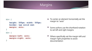
- 120. Margin Collapse Top and bottom margins sometimes combine with too much whitespace Browsers will collapse vertical margins into a single margin and assign the largest of the two margin values It the h1 and h2 headings opposite followed each other in html code the browsers would collapse the top and bottom margins into a single, vertical margin of 20px h1 { margin: 10px ; } h2 { margin: 20px ; }
- 121. Summary 5 Margins add space outside the border and padding areas Margins require only a dimension value in its declaration When declared with a single value all four margins are applied equally Four values apply to the top, right, bottom, and left Two values pair the top-bottom and left-right Three values pair the middle value with the left and right sides (width)
- 122. Summary 5 The dimension can be any unit of measurement and even mixed units Margins can be declared as a single property – or as individual properties Elements can be centered within a container by setting the margin to auto Margin collapse occurs to reduce the vertical whitespace between elements
- 123. The Box Model Throughout this presentation we have emphasized that borders, padding, and margins add to the visual dimensions of an element The height and width of the content does not include borders, padding, or margin The borders, padding, and margins form an extended box around the content This is referred to as the “box model” and is used by web designers to calculate the overall dimensions for positioning and layout This will be covered in more detail in a later presentation on layouts
- 124. Example The overall dimension of this div tag is 450px by 450px calculated as follows: div { height: 300px; The height and width of the contents is set to 300px by 300px width: 300px; Add the padding on all four sides: padding: 25px; border: 25px ; margin: 25px; 25 + 25 = 50px on height and width Add the border on all four sides: 25 + 25 = 50px on height and width } Add the margin on all four sides: 25 + 25 = 50px on height and width
- 125. Outline Unlike borders, an outline does not add to the overall box model dimensions It does not push the margin out like the border does The outline properties include width, style, and color – and offset It is declared similar to borders
- 126. div { outline: 1px solid red; } Use the same width and style values as bordersdiv { Use the same declaration options asoutline-width: 1px; outline-style: solid; outline-color: red; borders }
- 127. Summary 6 The box model is used for positioning and layout It aggregates all of the border, padding, and margin values with the content The outline property does not change the overall dimensions of the box model It uses the same property declarations and values as borders
- 128. Review How did you do? Are you able to: Set an element’s height and width property Set border properties in a single declaration or with specific notation Set rounded corners using the border-radius property Set padding properties in a single declaration or with specific notation Set margin properties in a single declaration or with specific notation Center an element by setting margins Recognize when margin collapse may occur Calculate a container’s extended width and height using the box model Set outline properties in a single declaration or with specific notation
- 129. Ajay Khatri Senior Assistant Professor Acropolis Institute of Technology & Research www.ajaykhatri.in
Editor's Notes
- https://play.google.com/store/apps/details?id=learn.apps.cssprogramming
- <link href="style.css" rel="stylesheet" /> <link rel="icon" href="favicon.ico"> <h1>This is heading</h1>
- <style> h1{ color:blue; } div{ color:red; } <style> <link href="style.css" rel="stylesheet" /><div> <h1>This is heading</h1> <p> This is demo paragraph</p> </div>
- https://play.google.com/store/apps/details?id=learn.apps.cssprogramming
- https://play.google.com/store/apps/details?id=learn.apps.cssprogramming
- https://play.google.com/store/apps/details?id=learn.apps.cssprogramming