Data Visualization dataviz superpower
•
1 like•279 views

Data Visualization dataviz superpower! Guidelines on using best practice data visualization principles for Power BI, Excel, SSRS, Tableau and other great tools!
Report
Share


Data Visualization dataviz superpower
- 1. Data Visualization Super Power Jen Stirrup Data Whisperer Data Relish Ltd Level: Novice
- 2. JenStirrup • Boutique Consultancy Owner of Data Relish • Postgraduate degrees in Artificial Intelligence and Cognitive Science • Twenty year career in industry • Author JenStirrup.com DataRelish.co m http://bit.ly/JenStirrupRD http://bit.ly/JenStirrupLinkedI n http://bit.ly/JenStirrupMVP http://bit.ly/JenStirrupTwitter
- 3. Jen Stirrup • Boutique Consultancy Owner of Data Relish • Postgraduate degrees in Artificial Intelligence and Cognitive Science • Twenty year career in industry • Author • http://bit.ly/JenStirrupRD • http://bit.ly/JenStirrupLinked In • http://bit.ly/JenStirrupMVP • http://bit.ly/JenStirrupTwitter
- 4. • As a general rule, the most successful man in life is the man who has the best information. (Disraeli, 19th Century)
- 5. Parkinson’s Law • ‘Whatever information capacity you give to humans, they will use up’ • Structured data grows by about 30% each year
- 7. Solutions
- 8. • The endless cycle of idea and action, Endless invention, endless experiment, Brings knowledge of motion, but not of stillness; Knowledge of speech, but not of silence; .. Where is the wisdom we have lost in knowledge? Where is the knowledge we have lost in information? Excerpt from The Rock by TS Eliot (1934)
- 11. Genius depends upon the data within its reach. Ernest Dimnet
- 12. You have to start with the truth. The truth is the only way that we can get anywhere. Because any decision- making that is based upon lies or ignorance can't lead to a good conclusion. Julian Assange, Wikileaks
- 13. You have to start with the truth. The truth is the only way that we can get anywhere. Because any decision- making that is based upon lies or ignorance can't lead to a good conclusion. Julian Assange, Wikileaks
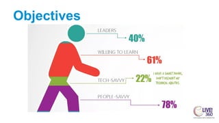
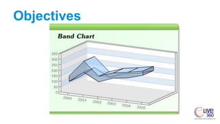
- 16. Objectives
- 18. Objectives
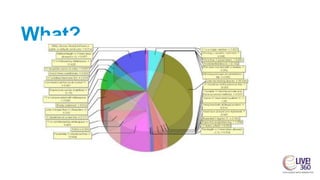
- 19. What?
- 20. Objectives
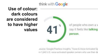
- 21. Use of colour: dark colours are considered to have higher values
- 22. What?
- 24. Objectives
- 25. Inaccurate
- 30. 3 0
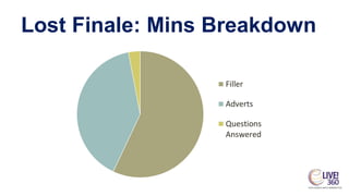
- 39. Lost Finale: Mins Breakdown Filler Adverts Questions Answered
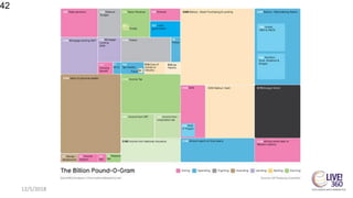
- 42. 12/5/2018 42
- 44. Designing visualizations that communicate clearly doesn’t have to be complicated.
- 45. Keep it simple.
- 46. 46 Data where you want it 46
- 47. Data Visualisation Background 47 We have the tools. All we’ve got to do is imagine what could be. We can reinvent the present; we can transform the world around us.
- 48. 48 Almost 50% of your brain is dedicated to visual processing. David van Essen About 70% of your sensory receptors are in your eyes. Researchers found that colour visuals increase the willingness to read by 80%
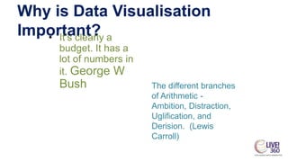
- 49. Why is Data Visualisation Important?• It’s clearly a budget. It has a lot of numbers in it. George W Bush The different branches of Arithmetic - Ambition, Distraction, Uglification, and Derision. (Lewis Carroll)
- 50. • The use of computer- supported, interactive, visual representations of data to amplify cognition. (Stu Card, Jock Mackinlay & Ben Shneiderman)
- 51. • Computer-based visualization systems provide visual representations of datasets intended to help people carry out some task more effectively. (Tamara Munzner)
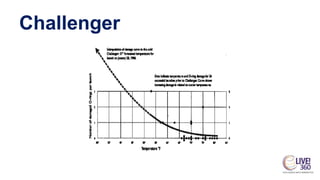
- 53. Challenger
- 54. Challenger
- 55. Challenger
- 56. Why are we doing this?
- 57. Anscombe’s Quartet mean(X) = 9, var(X) = 11, mean(Y) = 7.5, var(Y) = 4.12, cor(X,Y) = 0.816, linear regression line Y = 3 + 0.5*X
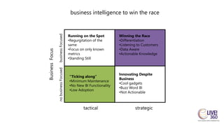
- 59. BusinessFocus business intelligence to win the race businessFocusednobusinessFocused strategictactical Innovating Despite Business •Cool gadgets •Buzz Word BI •Not Actionable Winning the Race •Differentiation •Listening to Customers •Data Aware •Actionable Knowledge “Ticking along” •Minimum Maintenance •No New BI Functionality •Low Adoption Running on the Spot •Regurgitation of the same •Focus on only known metrics •Standing Still
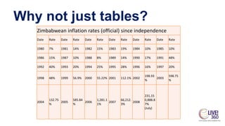
- 60. Why not just tables? Zimbabwean inflation rates (official) since independence Date Rate Date Rate Date Rate Date Rate Date Rate Date Rate 1980 7% 1981 14% 1982 15% 1983 19% 1984 10% 1985 10% 1986 15% 1987 10% 1988 8% 1989 14% 1990 17% 1991 48% 1992 40% 1993 20% 1994 25% 1995 28% 1996 16% 1997 20% 1998 48% 1999 56.9% 2000 55.22% 2001 112.1% 2002 198.93 % 2003 598.75 % 2004 132.75 % 2005 585.84 % 2006 1,281.1 1% 2007 66,212. 3% 2008 231,15 0,888.8 7% (July)
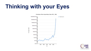
- 61. Thinking with your Eyes
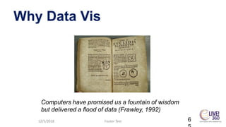
- 65. Why Data Vis 12/5/2018 Footer Text 6 Computers have promised us a fountain of wisdom but delivered a flood of data (Frawley, 1992)
- 66. Why is Data Visualisation Important? • Computers have promised us a fountain of wisdom but delivered a flood of data (Frawley, 1992) • Challenging to understand data on its own • Computers as anti-Faraday machines
- 67. Why is Data Visualisation Important? • Networks allow us unprecedented access to data • Creative Thinking about data • See relationships better • Visual literacy
- 70. Data First Data
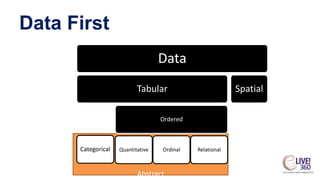
- 73. Abstract Data First Data Tabular Categorical Ordered Quantitative Ordinal Relational Spatial
- 75. Visual Building Blocks Points Lines Shapes
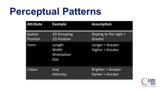
- 76. Perceptual Patterns Attribute Example Assumption Spatial Position 2D Grouping 2D Position Sloping to the right = Greater Form Length Width Orientation Size Longer = Greater Higher = Greater Colour Hue Intensity Brighter = Greater Darker = Greater
- 77. Perceptual Patterns Attribute Example Graph Type Spatial Position 2D Grouping 2D Position Line Graph Form Length Width Orientation Size Bar Chart Colour Hue Intensity Scatter Chart
- 79. Quantitative Ordinal Nominal Position Position Position Length Gray gradient Shape Angle Colour gradient Colour hue Area Colour hue Gray gradient Gray gradient Length Colour gradient Colour gradient Angle Length Colour hue Area Angle Shape Shape Area
- 81. Guidelines • white space • data/ink • chartjunk • Context e.g. titles etc
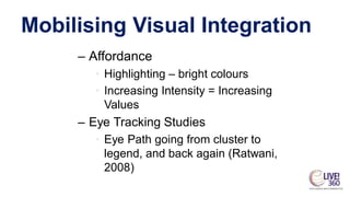
- 82. Mobilising Visual Integration – Affordance • Highlighting – bright colours • Increasing Intensity = Increasing Values – Eye Tracking Studies • Eye Path going from cluster to legend, and back again (Ratwani, 2008)
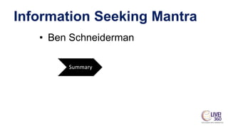
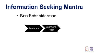
- 84. Information Seeking Mantra • Ben Schneiderman Summary Zoom and Filter Details on Demand
- 85. Information Seeking Mantra • Ben Schneiderman Summary Zoom and Filter Details on Demand
- 86. Information Seeking Mantra • Ben Schneiderman Summary Zoom and Filter Details on Demand
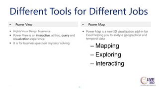
- 88. 88 Different Tools for Different Jobs 88 • Power View • Power Map ▪ Highly Visual Design Experience ▪ Power View is an interactive, ad hoc, query and visualization experience. ▪ It is for business question ‘mystery’ solving ▪ Power Map is a new 3D visualization add-in for Excel helping you to analyse geographical and temporal data – Mapping – Exploring – Interacting
- 89. 12/5/2018 Copper Blue Business Intelligence Ltd 89
- 91. Back to the Royal Road • Questions? 12/5/2018 Footer Text 91
- 92. Revealing Patterns • Patternicity – Finding meaningful patterns in noise – This can be seen as an error in cognition – Brain as belief systems
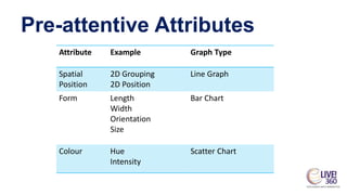
- 94. Pre-attentive Attributes Attribute Example Assumption Spatial Position 2D Grouping 2D Position Sloping to the right = Greater Form Length Width Orientation Size Longer = Greater Higher = Greater Colour Hue Intensity Brighter = Greater Darker = Greater
- 95. Pre-attentive Attributes Attribute Example Graph Type Spatial Position 2D Grouping 2D Position Line Graph Form Length Width Orientation Size Bar Chart Colour Hue Intensity Scatter Chart
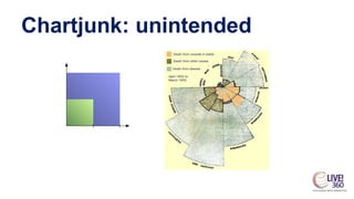
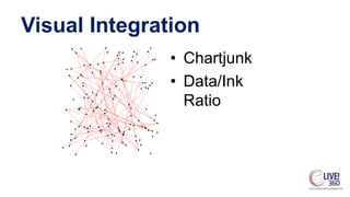
- 97. Visual Integration • Chartjunk • Data/Ink Ratio
- 98. Mobilising Visual Integration – Affordance • Highlighting – bright colours • Increasing Intensity = Increasing Values – Eye Tracking Studies • Eye Path going from cluster to legend, and back again (Ratwani, 2008)
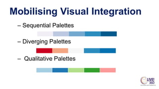
- 99. Mobilising Visual Integration – Sequential Palettes – Diverging Palettes – Qualitative Palettes
- 100. Visual Integration
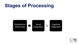
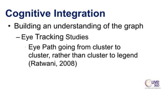
- 102. Cognitive Integration • Building an understanding of the graph • Eye Path going from cluster to cluster, rather than cluster to legend (Ratwani, 2008)
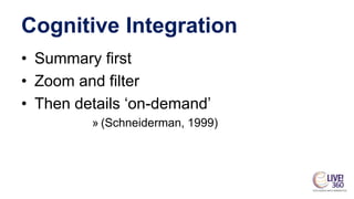
- 103. Cognitive Integration • Summary first • Zoom and filter • Then details ‘on-demand’ » (Schneiderman, 1999)
- 104. Cognitive Integration • Comparison • Sorting • Bookmarks – analytical view of browsing
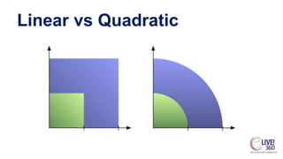
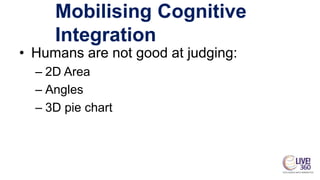
- 105. Mobilising Cognitive Integration • Humans are not good at judging: – 2D Area – Angles – 3D pie chart
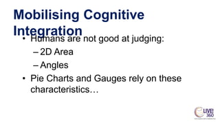
- 106. Mobilising Cognitive Integration • Humans are not good at judging: – 2D Area – Angles • Pie Charts and Gauges rely on these characteristics…
- 107. Find Patterns in your data • Demo – Sparklines • What did we learn? • Making patterns in small spaces Session Code | Session Title 107
- 108. Tables Tables work best when the data presentation: • Is used to look up individual values • Is used to compare individual values • Requires precise values • Values involve multiple units of measure.
- 109. – Sequential Palettes – Diverging Palettes – Qualitative Palettes
- 110. Moire Illusion
- 111. Mobilising Cognitive Integration• Humans are not good at judging: – 2D Area – Angles
- 112. Mobilising Cognitive Integration• Humans are not good at judging: – 2D Area – Angles • Pie Charts and Gauges rely on these characteristics…
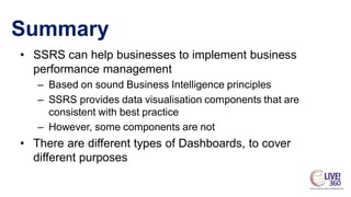
- 113. Summary • SSRS can help businesses to implement business performance management – Based on sound Business Intelligence principles – SSRS provides data visualisation components that are consistent with best practice – However, some components are not • There are different types of Dashboards, to cover different purposes
- 114. Reporting Services
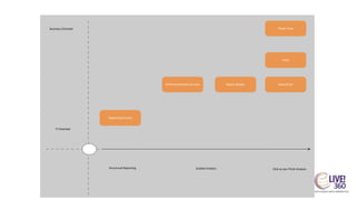
- 115. IT Oriented Structured Reporting Business Oriented Click as you Think AnalysisGuided Analysis Reporting Services PerformancePoint Services Report Builder Power View Excel PowerPivot
- 116. Colour • 2D representation is better (Few, 2009) • brighter and darker colours = higher values Colour usage: • to highlight • to encode quantity • grouping items as well
- 118. Cognitive Integration • Building an understanding of the graph – Eye Tracking Studies • Eye Path going from cluster to cluster, rather than cluster to legend (Ratwani, 2008)
- 120. 70% 30%
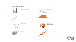
- 121. DATA RELATIONSHIPS NOMINAL COMPARISON DEVIATION . TIME-SERIES DISTRIBUTION CORRELATION PART-TO-WHOLE RELATIONSHIPS RANKING 4 RELATIONSHIPS
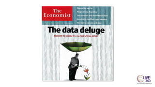
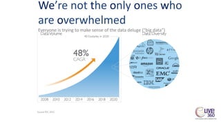
- 124. We’re not the only ones who are overwhelmed Everyone is trying to make sense of the data deluge (“big data”)
- 125. Choose your metrics wisely.
- 126. Make your Big Data Sing
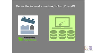
- 127. Demo: Hortonworks Sandbox,Tableau, PowerBI
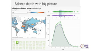
- 128. Balance depth with big picture
- 129. Balance depth with big picture
- 130. Balance depth with big picture
- 131. Balance depth with big picture
- 132. Q & A
- 133. Back to the Royal Road • Questions? 12/5/2018 Footer Text 133