Designing the user experience
- 1. Designing the User Experience
- 2. Todays Agenda • What is User Experience Design? • The Business Case for User Experience Design • What are the UX processes? • How can we measure its effectiveness? • Who needs to be involved?
- 4. What is user experience design? Consider the term: “User experience encompasses all aspects of the end user’s interaction with the company, its services and its products.” - Don Norman
- 7. User experience = customer Experience You are building more than a website. You are building a customer experience.
- 8. Fundamentals of designing for the end user experience • Project Management • User Research • Interaction Design • Information Architecture • Interaction Design • Visual Design • Human Factors / Cognition • Usability / Accessibility
- 10. People involved in website development projects 1. Project Manager 2. Marketing Manager 3. Copywriter / Editor 4. Graphic Designer 5. Interface designer 6. Database administrator 7. Network administrator 8. Information architect 9. Web developer (or multiple developers)
- 11. Factors that Influence UX
- 12. Factors that Influence UX 1. Useful: Your content should be original and fulfill a need 2. Usable: Site must be easy to use 3. Desirable: Image, identity, brand, and other design elements are used to evoke emotion and appreciation 4. Findable: Content needs to be navigable and locatable onsite and offsite 5. Accessible: Content needs to be accessible to people with disabilities 6. Credible: Users must trust and believe what you tell them
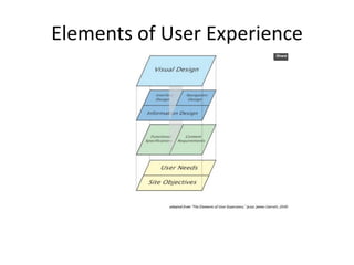
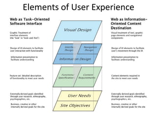
- 13. Elements of User Experience
- 14. Elements of User Experience
- 15. Elements of User Experience
- 16. Elements of User Experience
- 17. Information architecture • Structure and taxonomy • Card sorting exercises • How people will actually use your site • User flows (End use case scenarios) – Prepare flowcharts – Wireframe sketches – Wireframes / Paper protptypes – High fidelity wireframes and clickable prototypes (Get old slides)
- 18. Elements of User Experience
- 21. Business Case for User Experience Design
- 22. Reasons to embrace User - Experience 1. Good user experience delivers ROI by optimising conversion rates 2. User experience can be more important than brand and price 3. Identify competitor weaknesses 4. Gain competitive advantage 5. Focus on web standards 6. You are already spending on design 7. Manage costs – avoid errors (usability, findability, accessibility) 8. Manage people (influence of internal stakeholders)
- 27. Designing for the User Experience 1. Do user research. “The first requirement for an exemplary user experience is to meet the exact needs of the customer, without fuss or bother.” - Jakob Nielsen and Don Norman
- 28. User Research • User Centred Design = Involve users • Iterative process • ⇒ DESIGN • ⇒ EVALUATE • ⇒ PROTOTYPE
- 30. User Research • Who are the important users? • What is their purpose for accessing the site? • How frequently will they visit the site? • What experience and expertise do they have? • What nationality are they? Can they read your language? • What type of information are they looking for? • How will they want to use the information: read it on the screen, print it or download it? • What type of browsers will they use? How fast will their communication links be? • How large a screen or window will they use, with how many colours? Source: Bevan, 2009
- 31. User Research – Web design personas – Audience Types • Characteristics • Intents • Behaviours – Audience motivation and behaviour • Usability testing • Surveys • Observation etc.
- 32. User Research – Audience Types Source: eConsultancy, 2009
- 33. User Research – Web Design Personas
- 34. User Research – Web Design Personas • Archetypal users The design goal of personas is to develop customer-centric content and experiences for different • types of site visitor. • Name, gender, background • Motivations and goals • Think of your Facebook profile
- 35. User Research – Web Design Personas • Web design personas are not made up • Based on data collated about real users – Interviews – Observation sessions • Existing and potential users – Surveys – User testing sessions – Experience that project stakeholders have with customers • Goal is to identify patterns of behaviour • Each type of user goes to form a persona
- 36. User Research – Web Design Personas • Not quite the same as market segments
- 38. User Research Methods • Usability test competitor websites • Test participants should represent target audience • Usability test sketches and wireframes
- 39. User research methods – Behaviour Types • Identify different customer visitors or scenarious – First time visitors • Seeking new information or information about a supplier of a product – Repeat visitor • Comparing suppliers in more detail – Purchasing visitor • Has made decision to purchase
- 40. User research methods – Behaviour Types • Position in the buy-cycle • Their customer journeys • Their decision making process • Their intent • Their primary navigation mode – search or browse • Their trigger factors • How receptive they are to marketing messages
- 42. Dr. Mike Baxters Levels of Intent 1. Tracker. The findability features of the site must help the tracker hone in on what they want immediately. – Knows exactly what they want – Using site to check price, availability, delivery time, support etc. 2. Hunter. Knows approximately what they want. Site needs to help them choose any buy. – Doesn’t know specific product but know they want a digital camera for example. 3. Explorer. Unsure what they want. Just browsing. – They might know they want to buy something e.g. present but not the exact type of product. – Site needs to have excellent content and use engagement tactics to get the person to come bac,k 4. Mistake. Reason for high bounce rates on lots of sites.
- 45. Sketching and Wireframes • Blueprint of what a site could look like • Wireframe page categories – Home page – Category page – Product listing page – Product page – Shopping basket – Payment page
- 46. Grapihic Design • Make sure graphic designer viewed or was briefed on wireframe usability testing – Gives a feel for design rationale • Usability testing post graphic design – Good design will go unacknowledged in testing!
- 47. Build and Launch • Shared understanding between UX designers and developers – Developers should view usability testing – Understand rationale behind design decisions – Developers may not know anything about design guidelines • Conduct usability testing – separate session.
- 48. Google User Experience Guidelines http://www.google.com/corporate/ux.html 1. Focus on people – their lives, their work, their dreams. 2. Every millisecond counts. 3. Simplicity is powerful. 4. Engage beginners and attract experts. 5. Dare to innovate. 6. Design for the world. 7. Plan for today's and tomorrow's business. 8. Delight the eye without distracting the mind. 9. Be worthy of people's trust. 10. Add a human touch.
- 49. Design Guidelines • Common sense • Guidelines learned by experienced designers • Beware of developers! • Knowing how to create functionality versus • Knowing how to design • Usability Principles / Design Rules / Heuristics / Design Guidelines / Design Rules etc. • The basic ideas are the same as they all come from the same underlying concepts.
- 50. Guideline 1 – Be consistent • Predictable look & feel and behaviour • less effort to learn • coherently combining all elements of the interface together • layout, colour, font, capitalisation, menus, message, phrasing style, … everything
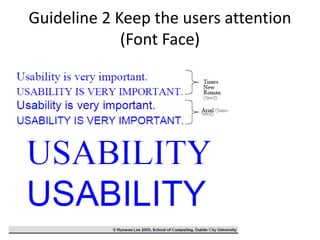
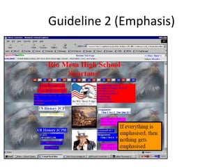
- 52. Guideline 2 – Keep the visitors attention • Use up to 4 font sizes • Grouping • Colour coding • Colour intensity / Emphasis • Consider the users level of domain knowledge • Beware Animation / Blinking / Playing sounds • Graphics– font choice (Sans serif vs. Serif)
- 53. Guideline 2 Keep the users attention (Font Face)
- 54. Guideline 2 (Colour) • Use conservatively (less than 5 in one display - but not a fixed rule!) • Don’t use glaring, awkward combinations • Use it for colour-coding • Consider colour-blind viewers
- 57. Guideline 3: Speak the Users Language • All messaging, labels, words, instruction etc. should be in the target users language • No system oriented information • Insert images of messaging from eCommerce sites • “We have sold you 1 item of the book XXX” • => “You have bought 1 item of the book XXX” • (user’s point of view) • “Action preference #327 initiated” • => “background setting ready” • (no system-oriented information)
- 58. Guideline 4: Reduce the users memory load • Users should not have to remember how to use the website
- 61. Guideline 5: Provide informative feedback • System feedback for every user action • Clicking sounds • Mouse cursor • Reversible • Avoid user-driven errors
- 62. Guideline 6: Provide shortcuts for frequent users • Short cut buttons (Ctrl-C/Ctrl-V/Ctrl-X, etc.) • Action history • Recently purchased items • Recently-opened file list
- 63. Guideline 7: Use proper error messages • Be self explanatory • Be specific • Be polite • Be constructive • And most importantly, don’t assign blame • A better approach is to pre-empt errors and build affordance into the system.
- 64. Guideline 7 – Use proper error messages
- 65. Guideline 7 – Use proper error messages
- 66. Guideline 7 – Use proper error messages
- 67. Guideline 7 – Use proper error messages
- 68. Guideline 8: Provide easy reversal of actions • Make users feel safe • Users should not feel afraid to explore unknown features • As simple as a back button!
- 69. Guideline 9: Write for the web
- 72. All pages should contain clear calls to action
- 73. Guideline 10 – Each page should have a clear objective • The home page may not be the landing page • Clear calls to action • Grab the visitors attention – not garner irritation
- 75. Great design isn’t as simple as following guidelines
- 76. “Attractive things work better” – Don Norman, Norman Nielsen Group
- 82. Next lecture • Introduction to usability and usability testing


