Digital design workshop
- 1. t t DIGITAL DESIGN KATHERINE BARROW | DESIGN ASSEMBLY | PIXEL FUSION #DADigitalDesign | @KatBarrow | @PixelFusion_NZ | @DsgnAssemblyNZ
- 2. WHO AM I?
- 3. WHO ARE YOU?
- 4. 9:15 THE DEFINITION 9:30 THE MINDSET 10:00 THE PROCESS 11:00 THE BREAK 11:15 THE PROCESS II 12:00 THE FUTURE
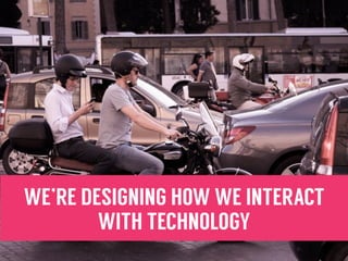
- 6. WE’RE DESIGNING HOW WE INTERACT WITH TECHNOLOGY
- 7. WE’RE DESIGNING INTERACTIVE TOOLS
- 8. WE ARE DESIGNING SYSTEMS
- 9. WE ARE DESIGNING EXPERIENCES
- 10. Digital design is the process of conceptualising, designing and styling interactive digital products such as websites and mobile applications.
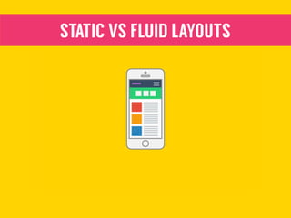
- 13. STATIC VS FLUID LAYOUTS
- 14. STATIC VS DYNAMIC CONTENT
- 15. IT HAS TO BE BUILT
- 16. IT HAS TO PERFORM
- 17. IT’S A LIVING MEDIUM - IT HAS TO EVOLVE
- 19. USABILITY
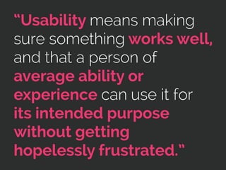
- 20. “Usability means making sure something works well, and that a person of average ability or experience can use it for its intended purpose without getting hopelessly frustrated.”
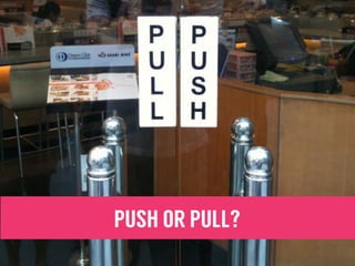
- 21. PUSH OR PULL?
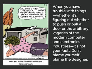
- 23. When you have trouble with things —whether it's figuring out whether to push or pull a door or the arbitrary vagaries of the modern computer and electronics industries—it's not your fault. Don't blame yourself: blame the designer.
- 24. WHY DOES USABILITY MATTER?
- 26. 1. DON’T MAKE ME THINK 2. PROVIDE VISUAL FEEDBACK 3. BE CONSISTENT 4. DON’T WASTE MY TIME 5. FORM FOLLOWS FUNCTION
- 27. 6. RECOGNITION VS RECALL 7. HELP ME FIND MY WAY 8. BE HUMAN 9. BE ACCESSIBLE 10. BE RESPONSIVE
- 28. USABILITY REVIEWS & TESTING
- 30. • Have a look at the event cinemas website (https:// www.eventcinemas.co.nz) • Pretend that you want to book tickets for a movie on Sunday. Walk through the site and make note of any usability issues. • Remember to refer back to the 10 commandments! • Present your top 5 observations to the group as you would present them to a client. TASK 1.
- 31. BREAK
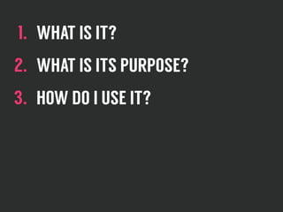
- 33. 1. WHAT IS IT? 2. WHAT IS ITS PURPOSE? 3. HOW DO I USE IT?
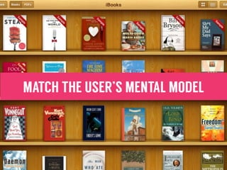
- 34. MENTAL MODELS
- 35. “Mental models are deeply ingrained assumptions, generalisations, or even pictures, that influence how we understand the world and how we take action.” -Peter Senge
- 36. MATCH THE USER’S MENTAL MODEL
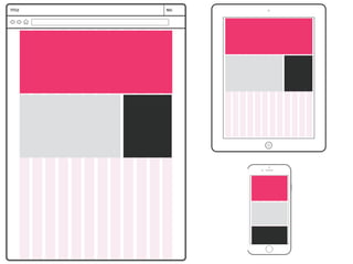
- 37. WIREFRAMING
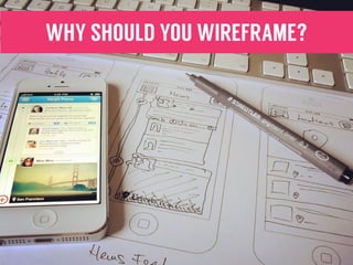
- 39. WHY SHOULD YOU WIREFRAME?
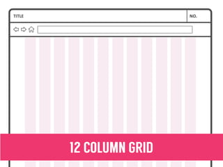
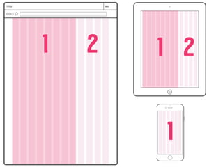
- 40. 12 COLUMN GRID
- 41. 1 2 1 2 1
- 44. SHARING WIREFRAMES WITH CLIENTS
- 45. • I’m going to put an Event cinemas page up on the screen. Your task is to re-imagine and wireframe this screen. • Individually, create a few rough sketches and high level- just get some ideas. • In your groups- share your sketches and discuss what you like or don’t like. Remember, it’s not just what looks good- think about why you’re making choices and how they will affect the user. • As a group, create a single wireframe for the mobile and desktop views of your page. Remember to think about your responsive grid! • Present to the group. TASK 2.
- 46. VISUAL DESIGN
- 47. FINALLY… GET THE COLOURS OUT
- 48. 1. BRANDING & CONSISTENCY 2. VISUAL HIERARCHY 3. USABILITY & AFFORDANCE 4. STYLE 5. DESIGN SPECIFICATIONS
- 49. UI KITS & ATOMIC DESIGN
- 50. SKETCH DEMO
- 51. • In your groups, examine the website that I have given you. The focus here should be on their visual design and UI. For each of the following statements, decide whether or not you agree, out of 5, with 5 being I strongly agree, and 1 being I strongly disagree. Note down your reasons! • This website uses a consistent style guide. • This website uses visual design to enhance usability and help users achieve their goals. • This website does a good job of selling the brand. • This website feels modern. TASK 3.
- 53. DESIGN TRENDS - SKEUOMORPHISM
- 54. DESIGN TRENDS - FLAT DESIGN
- 55. DESIGN TRENDS - MATERIAL DESIGN
- 56. DESIGN TRENDS - WHAT’S NEXT?
- 57. WHAT’S THE BIG DEAL ABOUT BIG DATA?
- 58. ENGAGEMENT & HABIT BUILDING
- 59. THANK YOU. #DADigitalDesign | @KatBarrow | @PixelFusion_NZ | @DsgnAssemblyNZ Further reading: “Don’t Make Me Think”- Steve Krug “Rocket Surgery Made Easy” - Steve Krug “The Design of Everyday Things”- Don Norman Atomic Design- Brad Frost

