Digital graphics pro forma
- 2. File Formats
- 3. Raster Graphics A Raster graphic is a dot matrix data structure meaning it is made up of many different dots of colour called bitmaps. Bitmaps are made up of pixels and each pixel records the colour of their section of an image. Bitmapped images have a set resolution meaning that resizing can cause distortion and affect the quality of the image. Because of this they are not often used for things like billboard images that will be blown up in size many times. Raster graphics are more commonly used on computer displays on computers.
- 4. Vector Graphics Vector graphics are made up of vectors. These vectors are defined by a start and end point with curves and angles between them. From this information the line can become a curve, a triangle or any shape. All the information resides in the structure of the document and this describes how the graphic should be drawn. This changes when the graphic is magnified and so a vector graphic can be scaled as big or as small as desired with no loss of definition. Because vector graphics are made up of a series of mathematical curves it is perfect for printing and will produce very crisp images even when re-sized. An image such as a logo could be put on a small business card and then the same file could be scaled up for a large poster with no loss of quality. For this reason Vector graphics are good for graphic designers who will need top create a small publication as well as a very large publication as it allows them to use the same file with the same high quality.
- 5. JPEG Stands For Joint photographic experts group Used For Photographs in a web format Is well suited to photographs and paintings with smooth variations of tone and colour. Advantage Compatible with all computers as well as DVD and mobile phones so is a good general file to use. Compresses images so that not much memory is needed to save them, ideal for web and email use so would work well for a photographer showcasing their images on their website. Disadvantage Lossy compression is a problem and as the file is compressed to save data it loses detail. Can reduce files to around 5% of their normal size losing detail of them. Further editing a JPEG image can reduce quality more. Only works on smaller prints, on a larger print noise and distortion would be visible because of the file being compressed.
- 6. TIFF Stands For Tagged image file format Used For Storing raster graphics Desktop publishing Photographs Advantage Allows multi-page documents to be saved as a single file. Can be compressed with no loss of quality using algorithms. Can also be compressed with lossy compression using JPEG algorithms if file size needs to be reduced. Standard format for printing and so would work well for a designer printing off different posters or leaflets. Disadvantage Is not as compatible with many software programmes as a JPEG file is. Very large file sizes so larger storage devices may be needed and the file type may not work as well to email or on the web. Some online galleries that do not support TIFF files.
- 7. PSD Stands For Photoshop Document Used For Front covers of magazines Designing in Photoshop Advantage Can save layers, page formatting information and supports transparency. Ideal for graphic designers as the files progress can be saved and worked on at a later date. Disadvantage Is only compatible with Photoshop. Photoshop is difficult to learn to use. Unlike InDesign files multiple page documents can not be saved. Not very good at dealing with a lot of text, PSD files containing a lot of text are very large.
- 8. AI Stands For Adobe Illustrator Art Used For Logos and graphics to represent a company. Creating, editing and printing vector artwork. Advantage Makes vector graphics so the work can be scaled as big or small as desired. It is the most advanced vector format available. Disadvantage Newer versions of the file type often have compatibility issues. It isn't a standard file type.
- 9. 3DS Stands For 3D Studio Used For 3d modelling, animation and rendering Advantage Industry standard format for using and saving 3D files on different software programmes. Allows designing in 3D, good for architects or designers of furniture etc. 3DS models can be exported and edited for using in external editors. Disadvantage Can only be used on software that supports 3D designs. Directional light sources are not supported. Does not support vertex skinning which is important when animating characters.
- 11. Shape Task
- 12. Evaluation What did you like about your image? I like how simple the image looks. It was easy and quick to achieve a good result and this means that many shape images can be made quickly and it would be good for a large scale production. What would you improve if you did it again? If I was to do this task again I may try and use more shaped to add some detail in the image. I do like the simplicity of the current image however and I believe adding more detail would create an entirely different look.
- 13. Rotoscope
- 14. Evaluation What did you like about your image? Much like the shape image I really liked the simple look the image has and how quick and easy it is to create. It is much easier to add detail to the image however and this gives it a much more realistic and sophisticated look. What would you improve if you did it again? If I were to do this again I would add more detail in the image by adding highlights into the hair and different tones on the skin etc. I would also like to experiment with the different fills such as the pattern fill and gradients rather than the standard block colour fill.
- 15. Text Based
- 16. Evaluation What did you like about your image? I like the way the image contains only typographical elements and translates the meaning of the word through its appearance. The simplicity of the image I also find attractive. What would you improve if you did it again? If to do the image again I would maybe try and make it more complicated. I don’t know if this would necessarily improve the image but would instead change the whole look of it and make it completely different. Nevertheless if doing this again I would like to explore the design possibilities from a more graphical and complicated angle.
- 17. Logo Creation
- 18. Evaluation What did you like about your image? I like the simplicity of the logo and believe the colours work well drawing the eye, as does the bright yellow spark graphic I have included in the centre of the design. The newspaper graphic fits in well for the purpose of the logo as it is strongly linked to Print Based Media. What would you improve if you did it again? I think some of the spacing of the different elements could be improved next time I do this. The newspaper and pen is slightly off centre but I don’t think they look too good, I don’t know if that’s because they are not enough off centre to look like a deliberate design decision or what, but I would play about with the positioning of different elements if creating a logo again.
- 19. T-Shirt Designs
- 22. Second idea
- 23. Second idea
- 24. Second idea
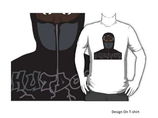
- 26. Proposal Dimensions 2400 by 3200 pixels Content I have decided to create a T-shirt with the Grime artist Skepta on the front. Grime is very popular currently and Skepta is the biggest artist out recently releasing two singles and having an album to be released soon. I will Rota-scope him with quite a simple style that will be visually striking and aesthetically pleasing to the wearer. I may include a graffiti style type with a word such as “Skepta” or “Shutdown” the title of his newest release. Nike caps are something that Skepta is known to wear and so I will make the swoosh quite a large feature of the design. Export Format PNG file Advantages; Compatible with Redbubble, Supports transparency Disadvantages; Very large file size
- 27. Proposal Deadline Monday Tuesday Wednesday Find a suitable image to use as a guide for my Rota-scoping and begin designing. Continue to rota-scope adding detail and ensuring I include the Nike cap. Complete the design and search for a suitable font if I wish to include the word. When one has been found incorporate into the design. Upload to Redbubble. Schedule Audience Males and females around 15-25 years of age.
- 28. Comparison
- 31. Does your final product reflect your original intentions? Yes I do believe the final product reflects my original intentions. It depicts a recognisable image of Skepta and I think it looks visually striking and cool. For this reason I believe that it would also be attractive to my target audience who will like the sort of design I have created and may like Skepta’s music. The only thing that has not ended up exactly as I envisioned is that I was not sure if I would add in the word to my design but once I had completed the rota-scoping I believed that it looked as though the image ended too abruptly at the bottom. To solve this I added in the word in the graffiti style I said I would and this worked well to give the image some more interesting content at the bottom rather than just stopping..
- 32. Is your product suitable for your audience? Yes, I believe the product is suited to the target audience I have proposed of males and females from 15-25 years of age. This audience group are the most fashion conscious of any other and so will most likely appreciate the content of the t-shirt design, this is also around the age range of listeners of Skepta’s music. Skepta is definitely a fashionable person to listen to at the moment and so many young people will be a fan, people even dress the same as him and so having a t-shirt with him on it would be popular. Nike is a popular brand with people of this age and so the swoosh is a good symbol to include in the design. The song “Shutdown” was also incredibly popular and so the decision to add the title into the t-shirt I believe was a good one and one that suits my target audience. Both males and females listen to his music and so I think the t-shirt would be popular with both genders.
- 33. What do you like/dislike about the techniques you have used? I think that the technique I used looks very good and I am pleased with the outcome. Rota-scoping allowed me to pick out important shapes from the photograph I had of Skepta and build an image up by using the lasso tool to draw round these shapes and make a layer out of them. By using the colour finding tool to select for example Skepta’s skin colour I could then colour these shapes realistically and ensure that the image I created looked good. The rota-scoping allowed me to add in certain parts that were not in the photograph very easily and this is another thing I liked about it. It allowed me to add in the Nike cap and make the two panels on the front of the coat a completely different colour and I feel this gave the image a more cartoony appearance that I think worked very well. One thing I disliked about the rota-scoping is that it is sometimes difficult to get a perfect straight line or a perfect curve. For example on the coat panels the curve on the outside is slightly jagged and although it does not look terrible I believe a perfect curve would have looked better. Similarly I struggled with the lines on the cap and instead after a few failed attempts just used the paintbrush tool to draw them.
- 34. Evidence of Progress with Rota-scoping As you can see The panels are much More of a feature than in the photograph Slightly jagged angles on the curve rather than a smooth line The Nike cap that is not in the photograph
- 35. What do you like/dislike about how your final product looks? I think that my final product looks very good. It is easily recognisable as Skepta and the simplistic, cartoony style is very cool. I like the inclusion of the Nike cap and I think this makes him even more recognisable. The text works well and I think that using a graffiti font is good as grime music and graffiti often go together. I like the colours I have used, I think they all go together well and the different dark shades of colour are cool to look at. I think that the lines dribbling out from the text could have been done better. I drew them with a paintbrush to look like the lines that come from when you hold a spray paint can too close to what you're painting but I think that they could have been done better. I could have found an image of paint dribble on the internet and rota- scoped this or even just taken more time on ensuring they looked better. At the moment I believe they just look a bit messy and it is not immediately clear what they are.
- 36. Why did you include the content you used? I included the content I included because I have been a fan of grime music for a long while and Skepta is one of my favourite grime artists. Recently he has become more and more popular and has started to branch out into fashion and other such things. As more and more people have started to like him I thought that he would be the perfect person to use for my design and as he is relatively new to a lot of people I think the design would be popular. I included the Nike cap as it is an iconic piece of clothing that Skepta is often seen wearing and one that makes the cartoon more recognisable as him. The coat is a jacket he made in a collaboration with designer Nasir Mazhar and one that was incredibly popular when it came out. This means that many people may recognise it and it will add to the coolness and recognisability of the design. The word “Shutdown” has been included as it is the name of a recent hit single from Skepta and one that was incredibly popular. Having the title of his song again increases recognisability and adds to the design.
- 37. What style have you employed in your products? I have employed a relatively cartoony and simplistic style with my design using the rota-scoping technique. I think that because of this I had to add in as much iconic imagery as possible to ensure that it was clear that the cartoon was Skepta but I believe I have achieved this well. Rota-scoping allowed me to create the simple design I wanted out of blocks of colour and minimal detail while still creating a visually striking image. This style is popular with people of my target age range and I think that it was a good design choice to make.


