


Discovery on a budget: Improved searching without a Web-scale discovery product
- 1. DISCOVERY ON A BUDGET Improved searching without a Web-scale discovery product Chris Bulock, Electronic Resources Librarian cbulock@siue.edu Lynn Fields, Director of Technical Services lfields@siue.edu
- 2. Who we are • Southern Illinois University Edwardsville (SIUE) • Master’s level with several professional programs • Approximately 14,000 students • 11,000 undergraduates • 3,000 graduate and professional school students
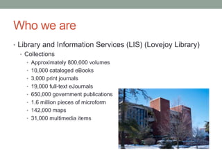
- 3. Who we are • Library and Information Services (LIS) (Lovejoy Library) • Collections • Approximately 800,000 volumes • 10,000 cataloged eBooks • 3,000 print journals • 19,000 full-text eJournals • 650,000 government publications • 1.6 million pieces of microform • 142,000 maps • 31,000 multimedia items
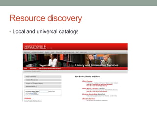
- 4. Resource discovery • Local and universal catalogs
- 5. Resource discovery • Local catalog – UFind
- 6. Resource discovery • Consortial catalog – I-Share
- 7. Resource discovery • Universal catalog – WorldCat Local Quick Start
- 8. Resource discovery • Journals and general and subject-specific database lists
- 9. Resource discovery • eJournal list - SFX
- 10. Resource discovery • Database list by subject
- 11. Resource discovery • All databases and eResources
- 12. User Studies • LIS Web Task Force formed in 2009 • Charged with considering the future of the website • Decided to approach website redesign from the bottom up
- 13. Paper Study One • Paper worksheet that simulated navigating the library website • Seven navigational questions of varying complexity • Two additional questionnaires: • Demographic information • Wrap up questions soliciting input on ways to improve the website
- 14. Paper Study One - Results • 109 participants • 79 undergraduates, 11 graduate students, 14 faculty and staff, 5 other • Data revealed confusion regarding the website both in terms of organization and use of library jargon • Comments included: • “Too many links” • “Not meaningful. Find better labels for sections.”
- 15. Paper Study One - Action • Central section of the website was reduced to three broad sections • No more than four links under each section • Left column of the page reserved for quick links to specific resource discovery tools • Right column links reserved for public relations items such as New Books, Featured Resources and Trials, etc. • Planned a second paper study using the redesigned website
- 16. Paper Study Two • Survey instrument identical to first, but with images from new website
- 17. Paper Study Two - Results • 75 participants • 65 undergraduates, 6 graduate students, 4 faculty and staff • Participants did a better job of completing the discovery tasks, but: • still confusion about possible overlap between links • terminology not always clear • Comments more positive • “The division of links into concise sections was helpful.” • “I like the new layout, thanks for your dedication.”
- 18. Paper Study Two - Action • Because so much had been moved to secondary pages, the Task Force decided a paper study was no longer telling the whole story • Decided an observational study would provide more data
- 19. Observational Study One • Limited to two tasks performed on live website • Investigators notated each link clicked, and the time taken to complete the task • Same demographic and wrap up questions as paper study
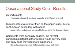
- 20. Observational Study One - Results • 25 participants • 18 undergraduates, 5 graduate students, and 2 faculty and staff • Success rates were lower than on the paper study, due to confusion on secondary web pages • About half of participants were unable to complete the discovery tasks • Comments were generally positive, but several participants noted that the website would be very clear and easy once they had more experience. • Several participants noted that instruction would be helpful
- 21. Observational Study One - Action • Study showed more improvements were necessary • Modified the order of links and the language used on secondary pages • Goal was to help clarify the difference between the journal list, the list of all eResources (databases) and eResources (databases) arranged by subject • Second observational study was planned
- 22. Observational Study Two • Same survey instrument as Observational Study One • Participants were divided into two groups and shown two different versions of the main page, but the same secondary pages
- 23. Observational Study Two - Results • 50 participants • 32 undergraduates, 16 graduate students, and 2 others • Participants were much more successful with both tasks than Observation Study One • The different versions of the main page did not seem to affect the results • Comments were mostly positive • “Very easy to navigate.” • “Once you know where everything is, it is easy.”
- 25. Overall - Finding a Journal by Title
- 26. Overall - Finding an Article by Subject
- 27. Outcomes • Website redesign was guided by user input • Observational Study Two showed that more improvements were still needed • Studies emphasized the importance of regularly surveying users and using those results to aid in website redesign
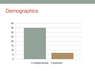
- 29. Catalog User Study • Three separate surveys • eBooks • Searching and facets • Shared catalog (I-Share) • Short – 4 questions plus demographics and wrap up • Observational – “talk out loud” • 42 participants • 35 undergraduates, 7 graduate students
- 30. Demographics 40 35 30 25 20 15 10 5 0 undergraduate graduate
- 32. Frequency of Library Visits
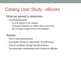
- 33. Catalog User Study - eBooks • What we wanted to determine: • Could participants: • Find an eBook in our catalog • Distinguish between an eBook and a print book • Sort through a large hit-list to find eBooks • Results • Hit or miss performance • Narrowed results to “electronic” 9 of 60 times • Lots of scrolling through results screens • Occasionally misidentified print books as eBooks
- 34. Catalog User Study – Lovejoy Searching • What we wanted to determine: • Could participants: • Decipher our catalog displays • Limit by using facets • Results • Participants could generally navigate catalog • Used facets in some cases, but usually not • Again, often favored scrolling over limiting • Had difficulty dealing with uncertainty
- 35. Catalog User Study – I-Share Searching • What we wanted to determine: • Could participants: • Decipher the I-Share display • Limit by using facets • Did participants understand the difference between the local catalog and I-Share • Results • Students could navigate I-Share • Some had trouble finding local holdings in I-Share • 7 of 12 students narrowed by language on appropriate question • 8 of 12 narrowed by format or region on appropriate question
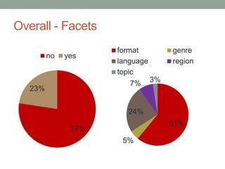
- 37. Overall - Facets
- 38. Participated in Library Instruction 20 18 16 14 12 10 8 6 4 2 0 no intro major other
- 39. Impact of Instruction • Students with instruction used average of • 1.62 non-keyword searches • 1.04 facets • Students without instruction used average of • 1.38 non-keyword searches • 0.69 facets • Not statistically significant
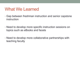
- 40. What We Learned • Gap between freshman instruction and senior capstone instruction • Need to develop more specific instruction sessions on topics such as eBooks and facets • Need to develop more collaborative partnerships with teaching faculty
- 41. What is Discovery? • More than journey from search box to full text • Many factors affect end result • Research question, search terms • Organization of library website • Place of search/browse tool • Description/name of tool • Terminology and labels • Look of database/catalog • First page of results • Ease of getting to full text • Technical problems Space shuttle discovery, NASA http://spaceflight.nasa.gov/gallery/images/station/crew-13/html/iss013e48788.html
- 42. Core Lessons 1. Names and Language 2. Order Matters 3. Be Familiar 4. Let Users Help You 5. Search Boxes 6. Work Together
- 43. 1. Names and Language • Define the following: • Database • Research • Periodical • E-resource • Will students know what these are?
- 44. 1. Names and Language • Action-based language • Get, find, search, ask • Cut down on vendor branding • Meaningful service names (not SFX) • User needs to know what they can do
- 45. 2. Order Matters • First impressions are important • Front page • First page of results • First link • Arrange for prominence • Services listed on page • Sources in resolver menu • DBs in subject guide Jason Molenda http://molenda.us/photos/alameda-criterium-2006-03-05/_DSC8458-r.html
- 46. 2. Order Matters •Minimize reading
- 47. 3. Be Familiar
- 48. 3. Be Familiar • Doesn’t have to mirror Google, but certain conventions are worth noting • What do you see in different parts of the screen?
- 49. 4. Let Users Help You • Surveys, focus groups, observation studies • Get more than just the vocal minority • Feedback forms • Blogs
- 50. 4. Let Users Help You • Automate whenever you can • Link resolver • Proxy server • Use language users will understand • Google forms
- 51. 5. Search Boxes • No box can search everything • But people will use it for anything • NCSU single search analysis • Used for articles, catalog, website, more • http://crl.acrl.org/content/early/2012/01/09/crl-321.full.pdf+html • If search box is limited, make that clear • Searches of database titles (not db content) problematic
- 52. 5. Search Boxes • You can already bring article searching to the front page • Do you already have a starting point for article searching? • WorldCat Local quick start • Multi-subject databases • Do they have an API you could use?
- 53. 6. Work Together • Discovery doesn’t respect department divisions • Web design • Electronic Resources • Cataloging • Collections and Metadata • Instruction • Teaching faculty • Work together from the beginning
- 54. Wrap up • Don’t just think like a user, get them involved • Keep changing • Remember that discovery process has many steps “Fostering Discovery through Web Interface Design: Perpetual Beta as the New Norm” in Planning and Implementing Resource Discovery Tools in Academic Libraries Mary Pagliero Popp and Diane Dallis http://www.igi-global.com/book/planning- implementing-resource-discovery-tools/62623
- 55. Questions?
Editor's Notes
- SIUE is a medium sized university in the St. Louis Metropolitan area
- As you can see on the slide we have ca. 800,000 volumes, and like many academic libraries we are increasingly moving more and more into electronic resources
- We implemented our current OPAC in June of 2010 We have a Voyager ILS, with a VuFind discovery interfaceStudies have shown that users in the internet environment respond better to direct active language that describes what a tool can do, as will as what it its. With that in mind, we branded our catalog - UFInd
- We are a member of the CARLI consortium - Academic Libraries in IllinoisThe logo is different, but it basically works the same as our Ufind catalog
- We have access to WorldCat Local Quick Start, service free to all institutions that subscribe to WorldCat on FirstSearchOffers the ability to search only OCLC databases, and users can not connect directly to external full text
- Talk about the reason for the study was to enhance instruction – noticed that our patrons were having problems with eBooks and searching
- You may not be able to change the
- Terms that are perfectly clear to librarians may be meaningless to researchers. Students are new to the academic world; they may know the term “journal article” but may not know they’ll need to go to a “database” or “e-resource.”This severely affects students’ ability to get to the right resource.
- We found that, even with a short list of links, users gravitated toward the topWhen we moved SFX link from bottom to top, the percentage of users that clicked it doubled.Next project: in subject guides, list databases in meaningful order, rather than A-Z
- Doesn’t have to look like Google. Doesn’t have to be single search boxBut certain conventions are worth notingCatalog study participants rarely narrowed their search. Right vs. left bar?
- You find problems, correct your assumptions, and inspire confidenceOf course, you need to actually respond to all this.Reduce friction in problem reporting: don’t require them to open email client, don’t use confusing language. Include a send mechanism.
- Had never received an ezproxy problem report except from staff. Put up a google form with clear language, received 8 reports in first month.
- User studies: students used site search for anything, catalog for articlesOccidental: set up multi-tabbed search box, but used in strange waysHow Users Search the Library from a Single Search Box (Lown, Sierra, Boyer) CRL preprint
- Our students already use Academic Search Complete as starting point