Location via proxy:   [ UP ]  
[Report a bug]   [Manage cookies]                
SlideShare a Scribd company logo
DJNF 2015
Mobile First
 200 Word Minimum, 300 Word Maximum Article
 6 Photo Minimum, 12 Photo Maximum Gallery (Gallery Tile and Captions Requires)
 1 Minimum Hero Shot (The leading visual representation of your project or story)
 1 Minimum Social Aspect (IE Like/Share/Tweet Button – Twitter Widget - a hashtag call to
action)
 1:00 Minimum, 2:00 Maximum Video (Exception may be made for exceptional content)
 1 Minimum Form of Data Visualization
 App Icon
A Functioning Well Designed App Including:
Project Requirements
DJNF 2015 Mobile Presentation
UX Design
DJNF 2015 Mobile Presentation
Create a layout that fits the screen of an iOS device. Users should see primary content
without zooming or scrolling horizontally.
Formating Content
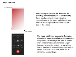
Layout Elements
Make it easy to focus on the main task by
elevating important content or functionality.
Some good ways to do this are to place
principal items in the upper half of the screen
and—in left-to-right cultures—near the left
side of the screen.
Use visual weight and balance to show users
the relative importance of onscreen elements.
Large items catch the eye and tend to appear
more important than smaller ones. Larger
items are also easier for users to tap, which
makes them especially useful in apps—such as
Phone and Clock—that users often use in
distracting surroundings.
Make sure that users can understand primary content at its default size. For example,
users shouldn’t have to scroll horizontally to read important text, or zoom to see primary
images.
Be prepared for changes in text size. Users expect most apps to respond appropriately
when they choose a different text size in Settings. To accommodate some text-size
changes, you might need to adjust the layout. Text should always be legible!
Text should always be legible!
As much as possible, avoid inconsistent appearances in your UI. In general, elements
that have similar functions should also look similar. People often assume that there must
be a reason for the inconsistencies they notice, and they’re apt to spend time trying to
figure it out.
Layout Best Practices
DJNF 2015 Mobile Presentation
Don't let text overlap. Improve legibility by increasing line height (leading) or
letter spacing (kerning.)
Spaceing
DJNF 2015 Mobile Presentation
Text should be at least 11 points (I recommend 14-16 points for a broader audience) so it's
legible at a typical viewing distance without zooming. Title, subtitle, byline and body
content need to be distinguishable. NOTE: Points and pixels are equivalent)
Text Size
DJNF 2015 Mobile Presentation
Make sure there is ample contrast between the font color and the background so
text is legible.
Contrast, Damn it!
DJNF 2015 Mobile Presentation
Use alignment to ease scanning and communicate groupings or hierarchy. Alignment
tends to make an app look neat and organized and it gives users places to focus while they
scroll through screenfuls of information. Indentation and alignment of different
information groups indicate how the groups are related and make it easier for users to find
specific items.
Alignment
DJNF 2015 Mobile Presentation
Always display images at their intended aspect ratio to avoid distortion.
Distortion
DJNF 2015 Mobile Presentation
Only Use high resolution images. Blurry images are difficult to understand,
and unprofessional.
High Resolution Image
Branding and
Designing Apps
DJNF 2015 Mobile Presentation
The Key to ROI on apps for the newsroom is to create and a maintain at least a minimum
viable product.
Considering App ROI
Deliver a product that makes a users lives easier be delivering easy to access
content that does not drain recourses or take time away from creating the content
itself. The app is just another extension of how you deliver the news.
Keep it simple and relevant and track able to see what features of your app your
customers need, want, and use.
The app can be a gateway to your site, paper, or channel and can be used as
another way to bring users closer into your platform. Bringing eyes and clicks to
advertisements across your other platforms.
Just like with a website, and app can make money from pre roll advertisement,
banner ads, headers, popups, related imbedded advertisements within or around
content.
The key to remember is content comes first, bring readers in with relative,
accessible content, the better you do this, the more users consume content along
with advertisement.

More Related Content

DJNF 2015 Mobile Presentation

  • 2.  200 Word Minimum, 300 Word Maximum Article  6 Photo Minimum, 12 Photo Maximum Gallery (Gallery Tile and Captions Requires)  1 Minimum Hero Shot (The leading visual representation of your project or story)  1 Minimum Social Aspect (IE Like/Share/Tweet Button – Twitter Widget - a hashtag call to action)  1:00 Minimum, 2:00 Maximum Video (Exception may be made for exceptional content)  1 Minimum Form of Data Visualization  App Icon A Functioning Well Designed App Including: Project Requirements
  • 9. Create a layout that fits the screen of an iOS device. Users should see primary content without zooming or scrolling horizontally. Formating Content
  • 10. Layout Elements Make it easy to focus on the main task by elevating important content or functionality. Some good ways to do this are to place principal items in the upper half of the screen and—in left-to-right cultures—near the left side of the screen. Use visual weight and balance to show users the relative importance of onscreen elements. Large items catch the eye and tend to appear more important than smaller ones. Larger items are also easier for users to tap, which makes them especially useful in apps—such as Phone and Clock—that users often use in distracting surroundings.
  • 11. Make sure that users can understand primary content at its default size. For example, users shouldn’t have to scroll horizontally to read important text, or zoom to see primary images. Be prepared for changes in text size. Users expect most apps to respond appropriately when they choose a different text size in Settings. To accommodate some text-size changes, you might need to adjust the layout. Text should always be legible! Text should always be legible! As much as possible, avoid inconsistent appearances in your UI. In general, elements that have similar functions should also look similar. People often assume that there must be a reason for the inconsistencies they notice, and they’re apt to spend time trying to figure it out. Layout Best Practices
  • 13. Don't let text overlap. Improve legibility by increasing line height (leading) or letter spacing (kerning.) Spaceing
  • 15. Text should be at least 11 points (I recommend 14-16 points for a broader audience) so it's legible at a typical viewing distance without zooming. Title, subtitle, byline and body content need to be distinguishable. NOTE: Points and pixels are equivalent) Text Size
  • 17. Make sure there is ample contrast between the font color and the background so text is legible. Contrast, Damn it!
  • 19. Use alignment to ease scanning and communicate groupings or hierarchy. Alignment tends to make an app look neat and organized and it gives users places to focus while they scroll through screenfuls of information. Indentation and alignment of different information groups indicate how the groups are related and make it easier for users to find specific items. Alignment
  • 21. Always display images at their intended aspect ratio to avoid distortion. Distortion
  • 23. Only Use high resolution images. Blurry images are difficult to understand, and unprofessional. High Resolution Image
  • 32. The Key to ROI on apps for the newsroom is to create and a maintain at least a minimum viable product. Considering App ROI
  • 33. Deliver a product that makes a users lives easier be delivering easy to access content that does not drain recourses or take time away from creating the content itself. The app is just another extension of how you deliver the news. Keep it simple and relevant and track able to see what features of your app your customers need, want, and use. The app can be a gateway to your site, paper, or channel and can be used as another way to bring users closer into your platform. Bringing eyes and clicks to advertisements across your other platforms. Just like with a website, and app can make money from pre roll advertisement, banner ads, headers, popups, related imbedded advertisements within or around content. The key to remember is content comes first, bring readers in with relative, accessible content, the better you do this, the more users consume content along with advertisement.