Examples of the worst data visualization ever
•
1 like•787 views

This document summarizes an event called SQL Saturday Cork where Jen Stirrup gave a presentation on data visualizations. The document includes objectives for the presentation such as discussing inaccurate data sources and the use of dark colors to represent higher values. It also includes examples of Zimbabwean inflation rates from 1980 to 2008 shown in a table and chart to illustrate how data can be visualized.
Report
Share


Examples of the worst data visualization ever
- 1. SQL Saturday Cork Welcome to Cork Data Visualizations that are just horrible by Jen Stirrup
- 3. Every American should have above average income, and my Administration is going to see they get it.(Bill Clinton during his campaign)
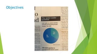
- 4. Objectives
- 6. Objectives
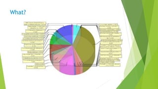
- 7. What?
- 8. Objectives
- 9. Use of colour: dark colours are considered to have higher values
- 10. What?
- 12. Objectives
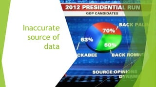
- 14. Inaccurate
- 19. Challenger
- 20. Challenger
- 21. Challenger
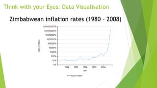
- 22. Why visualise? Zimbabwean inflation rates (official) since independence Date Rate Date Rate Date Rate Date Rate Date Rate Date Rate 1980 7% 1981 14% 1982 15% 1983 19% 1984 10% 1985 10% 1986 15% 1987 10% 1988 8% 1989 14% 1990 17% 1991 48% 1992 40% 1993 20% 1994 25% 1995 28% 1996 16% 1997 20% 1998 48% 1999 56.9% 2000 55.22% 2001 112.1% 2002 198% 2003 598% 2004 132% 2005 585.84% 2006 1,281% 2007 66,212% 2008 231,150, 888% (July)
- 23. Think with your Eyes: Data Visualisation Zimbabwean inflation rates (1980 – 2008)
- 25. Questions?
- 26. Thank You!
- 27. Thanks to our Sponsors