Location via proxy:   [ UP ]  
[Report a bug]   [Manage cookies]                
SlideShare a Scribd company logo
Final peice hand into mr jones
Mast Head
Barcode
Header Bar
Side pictures
Pull quote
Main image
Side pictures
Final peice hand into mr jones
Masthead
I think that the name of the magazine is appropriate because
rumours is what fuels friendships and is what teenagers do most,
rumours also consist of important information that goes around
the school.
I think that the colour scheme of the Masthead is appropriate
because our main home style colours (Home style means the main
colour scheme) as a school are BLACK, GOLD and
I think that the masthead is a suitable size because its clear that it
is the main part of the magazine amongst other pieces of text on
the page.
WHITE
Final peice hand into mr jones
Images
This image was personally taken by me. I asked Mrs Lewis the head teacher to stand
against a white background, by asking her to do this it enabled me to edit the
background easier using the software of Photoshop.
I think that this is a good picture because the background has been easily removed
and the picture is clear which shows that I have taken time and effort in order to
make my magazine cover as successful as possible.
My main image on my magazine is a picture of the Head teacher, I think the main
image is an appropriate size because it shows that it is the most important picture
and its what is the main focus of this magazine, The main focus on the magazine is
the school results, The main picture doesn’t necessarily show what the main story
focusses on but it does focus on the person who is talking about the story.
Subsidiary images
Altogether there are 4 subsidiary images, They are all
suitable sizes as the subsidiary images are not meant to be
larger or more bolder that the main image on the front cover.
I think that the subsidiary images have been placed in an
appropriate place on the page because they don't overlap
any text and they don't lead off the page. When looking at the
magazine I think that the subsidiary images indicate on what
will be inside the magazine e.g. the picture of the tablet (I
PAD) shows what can be won inside and the pictures of the
children singing and acting suggest certain clubs that pupils
can participate in.
Final peice hand into mr jones
Strap Lines
Altogether on my front cover I have 4 strap lines. Each strap line
clearly gives a clear indication about the contents of the magazine.
This strap line quotes ‘NEW MUSIC CLUB!’
this indicates that there is a new music club
taking part in our school, this may intrigue
the more musical type of person.
Underneath there is an ‘A*’ and ‘20%’ strap line,
this shows the results from last year, this may
intrigue the older age range so this explains that the
magazine is made for all age ranges
Strap Lines
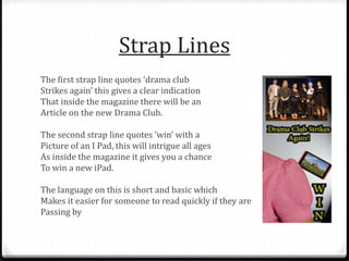
The first strap line quotes ‘drama club
Strikes again’ this gives a clear indication
That inside the magazine there will be an
Article on the new Drama Club.
The second strap line quotes ‘win’ with a
Picture of an I Pad, this will intrigue all ages
As inside the magazine it gives you a chance
To win a new iPad.
The language on this is short and basic which
Makes it easier for someone to read quickly if they are
Passing by
Spelling and Punctuation
When finalising my magazine cover I checked spelling
using the spell check tool, by doing this it shows that I
am a committed student because I am determined to
achieve good marks and not lose marks on basic
spelling and punctuation.
Fonts
On the front of my magazine cover I have used two different fonts
(different styles of text)
The first text I used was for the masthead:
Font size: 20 Font name: Times New Roman
The second text was used for the pull quote:
Font size: 10 Font name: Abode Fan Heiti STD B
I think that both of these texts were a suitable size as it differentiates
the Mast Head which is the more important part of the magazine to the
pull quote which comes underneath the Mast Head showing that it will
change every week according to the topic of the magazine whilst the
Mast Head permanently stays the same.
Consistently of the colour
scheme and strap lines
The colour
scheme for my
magazine has
stayed
consistent of
the colours
Black, Gold and
white. This
makes the
magazine look
successful and
professional.
My strap lines are
appropriate for
the magazine as
they explain what
will be in the
issue. This makes
it look
professional and
also makes it
easier for the
viewer to learn
about what's in
the magazine
without having to
flick through all of
the pages.
Final peice hand into mr jones
Layout of the front page
I think that the layout of the
front page is clear and well
organised. My main story is
larger than the rest of the text and
all of my pictures don’t overlap
one another and neither does
any of the text.
There is not too much dead space
(space that isn’t filled) on my front
cover but there is room for
improvement where the small
gaps could be filled.
Is my front page appealing?
I think that my front page is appealing because of the
content that is on the front of the magazine. As an
individual the drama and music clubs would interest me
but for those who do not like drama and music they
may find that the competition to win an IPad would
interest them instead.
I think that the magazine is suitable for both genders
and all age groups which interprets that it would be
successful in a secondary school.
Is my School Magazine Cover
recognisable?
Home style:
The colours of BLACK, GOLD and WHITE all represent
the school colours which means that it should be
automatically linked to King Henry VIII School.
Pictures:
The Head teacher (Mrs Lewis) should be recognisable
to both the pupils and the teachers at KHS which should
encourage them to look at the magazine covers.
Final peice hand into mr jones
Three aspects that I think are
successful
1. The title of my school magazine – the reason I have
chosen this as one of my three key aspects is because the
title is what should grab the attention of the person
passing by.
2. The front picture of Elspeth Lewis- the reason I have
chosen the main image is because this was the picture
that I had edited on my own using the software of
Photoshop.
3. The colour Scheme- the colour scheme is individual and
the reason I chose the colours is because they are the
main colours of the school KHS, This makes the magazine
even more recognisable to the students who study there.
Final peice hand into mr jones
Three aspects that I think I
could improve on
1. Making sure my pictures stay on the page - on the front
of my magazine cover my image of the speech bubble
hangs off the page, this makes it look unprofessional and
its something that I need to improve on to make my
magazine cover look more successful.
2. Think of some more intriguing topics to go on the front of
my magazine cover - Rugby, Sports, School Clubs that are
different, News of the week, Quizzes, Birthdays this
week!.
3. Less dead space on the magazine cover so it looks more
full and more exciting for someone to pick up and read.
Final peice hand into mr jones
What I need to include next
time:
0Price
0More images to show less dead space
0More topics that interest different
audiences
0A variety of different pictures on the
front of my cover
0Make sure all of the images stay on the
page and don’t hang over the side

More Related Content

Final peice hand into mr jones

  • 3. Mast Head Barcode Header Bar Side pictures Pull quote Main image Side pictures
  • 6. Masthead I think that the name of the magazine is appropriate because rumours is what fuels friendships and is what teenagers do most, rumours also consist of important information that goes around the school. I think that the colour scheme of the Masthead is appropriate because our main home style colours (Home style means the main colour scheme) as a school are BLACK, GOLD and I think that the masthead is a suitable size because its clear that it is the main part of the magazine amongst other pieces of text on the page. WHITE
  • 8. Images This image was personally taken by me. I asked Mrs Lewis the head teacher to stand against a white background, by asking her to do this it enabled me to edit the background easier using the software of Photoshop. I think that this is a good picture because the background has been easily removed and the picture is clear which shows that I have taken time and effort in order to make my magazine cover as successful as possible. My main image on my magazine is a picture of the Head teacher, I think the main image is an appropriate size because it shows that it is the most important picture and its what is the main focus of this magazine, The main focus on the magazine is the school results, The main picture doesn’t necessarily show what the main story focusses on but it does focus on the person who is talking about the story.
  • 9. Subsidiary images Altogether there are 4 subsidiary images, They are all suitable sizes as the subsidiary images are not meant to be larger or more bolder that the main image on the front cover. I think that the subsidiary images have been placed in an appropriate place on the page because they don't overlap any text and they don't lead off the page. When looking at the magazine I think that the subsidiary images indicate on what will be inside the magazine e.g. the picture of the tablet (I PAD) shows what can be won inside and the pictures of the children singing and acting suggest certain clubs that pupils can participate in.
  • 11. Strap Lines Altogether on my front cover I have 4 strap lines. Each strap line clearly gives a clear indication about the contents of the magazine. This strap line quotes ‘NEW MUSIC CLUB!’ this indicates that there is a new music club taking part in our school, this may intrigue the more musical type of person. Underneath there is an ‘A*’ and ‘20%’ strap line, this shows the results from last year, this may intrigue the older age range so this explains that the magazine is made for all age ranges
  • 12. Strap Lines The first strap line quotes ‘drama club Strikes again’ this gives a clear indication That inside the magazine there will be an Article on the new Drama Club. The second strap line quotes ‘win’ with a Picture of an I Pad, this will intrigue all ages As inside the magazine it gives you a chance To win a new iPad. The language on this is short and basic which Makes it easier for someone to read quickly if they are Passing by
  • 13. Spelling and Punctuation When finalising my magazine cover I checked spelling using the spell check tool, by doing this it shows that I am a committed student because I am determined to achieve good marks and not lose marks on basic spelling and punctuation.
  • 14. Fonts On the front of my magazine cover I have used two different fonts (different styles of text) The first text I used was for the masthead: Font size: 20 Font name: Times New Roman The second text was used for the pull quote: Font size: 10 Font name: Abode Fan Heiti STD B I think that both of these texts were a suitable size as it differentiates the Mast Head which is the more important part of the magazine to the pull quote which comes underneath the Mast Head showing that it will change every week according to the topic of the magazine whilst the Mast Head permanently stays the same.
  • 15. Consistently of the colour scheme and strap lines The colour scheme for my magazine has stayed consistent of the colours Black, Gold and white. This makes the magazine look successful and professional. My strap lines are appropriate for the magazine as they explain what will be in the issue. This makes it look professional and also makes it easier for the viewer to learn about what's in the magazine without having to flick through all of the pages.
  • 17. Layout of the front page I think that the layout of the front page is clear and well organised. My main story is larger than the rest of the text and all of my pictures don’t overlap one another and neither does any of the text. There is not too much dead space (space that isn’t filled) on my front cover but there is room for improvement where the small gaps could be filled.
  • 18. Is my front page appealing? I think that my front page is appealing because of the content that is on the front of the magazine. As an individual the drama and music clubs would interest me but for those who do not like drama and music they may find that the competition to win an IPad would interest them instead. I think that the magazine is suitable for both genders and all age groups which interprets that it would be successful in a secondary school.
  • 19. Is my School Magazine Cover recognisable? Home style: The colours of BLACK, GOLD and WHITE all represent the school colours which means that it should be automatically linked to King Henry VIII School. Pictures: The Head teacher (Mrs Lewis) should be recognisable to both the pupils and the teachers at KHS which should encourage them to look at the magazine covers.
  • 21. Three aspects that I think are successful 1. The title of my school magazine – the reason I have chosen this as one of my three key aspects is because the title is what should grab the attention of the person passing by. 2. The front picture of Elspeth Lewis- the reason I have chosen the main image is because this was the picture that I had edited on my own using the software of Photoshop. 3. The colour Scheme- the colour scheme is individual and the reason I chose the colours is because they are the main colours of the school KHS, This makes the magazine even more recognisable to the students who study there.
  • 23. Three aspects that I think I could improve on 1. Making sure my pictures stay on the page - on the front of my magazine cover my image of the speech bubble hangs off the page, this makes it look unprofessional and its something that I need to improve on to make my magazine cover look more successful. 2. Think of some more intriguing topics to go on the front of my magazine cover - Rugby, Sports, School Clubs that are different, News of the week, Quizzes, Birthdays this week!. 3. Less dead space on the magazine cover so it looks more full and more exciting for someone to pick up and read.
  • 25. What I need to include next time: 0Price 0More images to show less dead space 0More topics that interest different audiences 0A variety of different pictures on the front of my cover 0Make sure all of the images stay on the page and don’t hang over the side