Front Cover Overview
- Pop magazines like We Love Pop and Top of the Pops target young girls ages 8-14 and feature popular artists and celebrities to promote fashion, beauty, and lifestyle topics relevant to their audience. - The magazine covers follow conventions like prominent images and mastheads in bright colors complementing the main image to draw readers' eyes and sell lines to intrigue readers to purchase. Language is simplified and uses terms like "omg" to connect with readers. - Features typically include fashion advice, celebrity gossip, competitions, and free gifts like posters to attract young readers and decorate their rooms, following the interests of their target audience. The magazines aim to inspire girls through the lifestyles of celebrities and support identification with
Related slideshows


Front Cover Overview
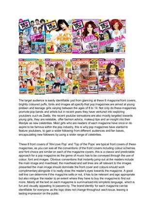
- 1. The target audience is easily identifiable just from glancing at these 8 magazine front covers, brightly coloured puffs, fonts and images all specify that pop magazines are aimed at young preteen and teenage girls varying between the ages of 8 to 14. Not only do these magazines promote pop bands and artists but in recent years they have ventured into exploring youtubers such as Zoella, the recent youtube sensations are also mostly targeted towards young girls, they are relatable, offer fashion advice, makeup tips and an insight into their lifestyle as new celebrities. Most girls who are readers of each magazine have once or do aspire to be famous within the pop industry, this is why pop magazines have started to feature youtubers, to gain a wider following from different audiences and fan bases, encapsulating new followers by using a wider range of celebrities. These 8 front covers of ‘We Love Pop’ and ‘Top of the Pops’ are typical front covers of these magazines, as you can see all the conventions of the front covers including colour schemes and font choice are similar on each of the magazine covers, this is a classic and predictable approach for a pop magazine as the genre of music has to be conveyed through the use of colour, font and images. Obvious conventions that instantly jump out at the readers include the main image and masthead, the masthead and sell lines are all relevant to the images presented the main image should dominate the front cover and colours should work complimentary alongside it to really draw the reader's eyes towards the magazine. A good sell line can determine if the magazine sells or not, it has to be relevant and age appropriate but also intrigue the reader to an extent where they have to buy the magazine to find out more. Mostly all the text on each magazine is summarised into simplistic language, which is fun and visually appealing to passers by. The brand identity for each magazine can be identifiable for everyone as the logo does not change throughout each issue, leaving a lasting impression on the public.
- 2. On each of the front covers you can see that the artists are placed mostly to the right hand side of the cover (this predominantly applies to ‘We Love Pop’) this is to avoid interfering with the layout of the masthead, defining it to be what you notice first and highlighting the magazine's brand. Gender specific magazines are very common and while pop music magazines are primarily aimed at young teenage girls, the colours used such as orange identify it as gender neutral leaving it open for all genders to read, the celebrities used to be featured artist can also be seen promoting the magazine as gender neutral, they display that there is not a single gender who dominates the pop industry, women can be seen dressing provocatively which the majority of female readers have no interest in and men are shown topless aimed towards a female audience. The mode of address and use of language is very particular in terms of the target audience, the mode of address is direct and informal, allowing the audience to connect with the magazine and feel comfortable reading it. Language use is equally as important in a pop magazine, small phrases and words are used such as ‘omg’ are used which represent the age group being spoken to. Young girls generally look up to successful female artists, but they also are attracted to male artists, this is why each gender is always featured as the cover star. Conventionally a famous male or female pop star will always be used to convey their celebrity status, the audience are most likely to be drawn in by a famous pop star rather than a YouTube star as the audience is greater. On each pop magazine there is a slightly differing layout due to positioning of the celebrity. Their positioning and body language is very important, the image is usually taken as a long shot, mostly for bands and a medium close up when individual artists are featured. The lighting is very high key, this efficiently reflects mise en scene and connotes the happy environment being illustrated by the artists featured. There are many similarities in mise en scene such as outfit choice and background, female artists are always wearing something that is considered fashionable in today's society, this is mainly for the young girls who will be viewing these images so they can attempt to mimic their icons clothing choice and be up to date on the latest fashion trends. When the magazine's main image is a girl band such as Little Mix, they will each wear outfits that compliment one another, this makes them seem ‘close’ and conveys friendship within their group which younger girls idolise. Usually boys clothing is more laid back but when examining costume you can pick out small details which add to their aesthetics and the overall pop theme, One Direction can be seen wearing a lot of blue, white and red in their photoshoots and as seen on the ‘We Love Pop’ magazine above, this emphasises that they are a British boy band and illustrates the theme of friendship to a further extent. We are able to see repeated patterns in the two magazines and depict similarities between featured articles, they both stick to the same topics including fashion, boys and celebrity gossip. ‘We Love Pop’ are enthusiastic about competitions and giveaways offering posters and also having free gifts. ‘Top of the Pops’ often have skylines and banners promoting offers and competitions which is one of the many distinguished conventions of the magazine, on the other hand ‘We Love Pop’ noticeably has more than one puff featured on each issue of their magazine, this is one of their fun ways to create a more youthful vibe by using many shapes and block colours. Posters are advertised in pop magazines and there is often more than one pull out poster for the readers, The majority of posters and large colourful images
- 3. are for the younger side of the audience as they prefer to visually take in information rather than reading lengthy articles which the older age ranges would enjoy. General codes and conventions used by magazines include the basic conventions which feature across various genres of magazines. The usual placement of conventions is slightly altered in pop, a traditional puff could be located in any third on the front cover, there is also not a limit on size, shape and number. Whilst analysing different variations of the two pop magazines I have developed some ideas for my own creation, I have been able to entirely analyse structure of a general magazine and notice different patterns that emerge generally between the two, for example the masthead and sell lines are all located in similar areas abiding to conventions, I have picked up on this throughout each magazine analysed and plan to use a similar structure for my own magazine. Although I have gained a new understanding of how magazines are presented, my existing knowledge has been supported by the research that I have conducted into different magazines, therefore expanding on my knowledge and helping me to progress when creating my magazine. ‘We Love Pop’ is a rather generic name for a pop magazine, it conveys the word ‘love’ through the use of a heart icon. the font is bubble writing which connotes a friendly vibe for the young audience. Top of the Pops magazine on the other hand also includes the word ‘pop’ in their masthead, this is obviously stylised to depict the pop genre to a further extent The lifestyle promoted through each magazine is enlightening and promotes a typical young girls lifestyle, on most issues of the magazines there are topics relating to boys or dating tips, this encourages young teenage girls to mature and contribute to discovering who they are. The target audience are interested in the lifestyles of celebrities such as Zoella, they are inspired by their beauty, celebrity friendships, success and their romantic life. Magazines are brilliant for providing updates on all of this information, allowing fans to find out all the details of their favourite celebrities lives. The mention of free pull-out posters is appealing to the female audience who live and home and love to decorate their room with images of celebrities, they will enjoy decorating their bedroom with posters of their favourite artists, especially as they are their icons. Free gifts are a running theme throughout the two pop magazines, they lure in young readers who see the word ‘free’ and are instantly drawn towards purchasing the magazine, some free gifts include cosmetic and hair products, posters, stationery and sweets, this type of advertisement is evidently for the younger target audience as they make quick purchases and tend not to consider the contents of the magazine. The use of a puff on pop magazines can help to inform readers of any special offers but also add dimension to the front cover. The overall layout and language used is noticeably aimed towards a younger audience, phrases and words used on the front covers such as “cringe”, “crushes”, “blab” and “awks” all convey to the audience the modern and youthful vibe, this language indicates how the magazine considers the language used amongst younger generations and uses it to their advantage when drawing in new customers. The layout of the magazine clearly represents the pop industry, it is bright with colour and does not follow any specific guidelines regarding structure, unlike for example an R&B magazine which follows a clear simplistic structure indicating that its only about the music and not fun too.