Location via proxy:   [ UP ]  
[Report a bug]   [Manage cookies]                
SlideShare a Scribd company logo
1
10SIMPLE
TIPS FOR A
BETTERP O W E R P O I N T
PRESENTATION
2
PowerPoint slides
should enhance
your presentation,
not detract from it.
3
People who know what they’re talking
about don’t need PowerPoint
Steve Jobs
“
1
TIP #1COPY AND PASTE
When copying and pasting information from another
presentation, you can keep the formatting of the
original PowerPoint by selecting “Use Destination
Theme” in the Paste Options Box.
How-To-Link
2
TIP#2COMPRESS IT GOOD
Compress your pictures in your
presentation. This can greatly
reduce the overall file size,
sometimes by almost half. This
will make your PowerPoint easier
to open and won’t clog emails.
How-To-Link
3
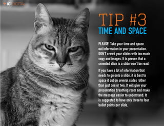
TIP #3TIME AND SPACE
PLEASE! Take your time and space
out information in your presentation.
DON’T crowd your slides with too much
copy and images. It is proven that a
crowded slide is a slide won’t be read.
If you have a lot of information that
needs to go onto a slide, it is best to
space it out on several slides rather
than just one or two. It will give your
presentation breathing room and make
the message easier to understand. It
is suggested to have only three to four
bullet points per slide.
4
TIP#4
JUSTCROPIT
When placing images of people in a
presentation, it is important to crop the
image down to the person’s head and
shoulders. It will remove unnecessary
backgrounds, and make it easier to
focus on the person.
How-To-Link
5
TIP#5ARIAL IS YOUR FRIEND
It is a best practice to use only one font per
presentation. Arial is iCiDIGITAL’s brand font
for use in PowerPoint presentations. It is a
standard font that is loaded on all computers.
6
TIP#6BRAND MUFFINS
Always keep to the brand identity guidelines. All the slides in
your presentation should use the color, fonts, and imagery that
are associated with the iCiDIGITAL Visual Brand Guidelines.
How-To-Link
7
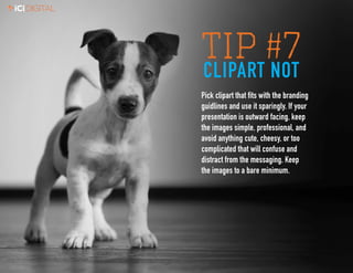
TIP #7CLIPART NOT
Pick clipart that fits with the branding
guidlines and use it sparingly. If your
presentation is outward facing, keep
the images simple, professional, and
avoid anything cute, cheesy, or too
complicated that will confuse and
distract from the messaging. Keep
the images to a bare minimum.
8
TIP#8
DON’T GET
CRAZY
Don’t get crazy adding a lot of animation to
your presentation. Too much animation can
be a distraction and make your presentation
confusing to look at for the viewer.
9
TIP#9
SIZE MATTERS
Font size really does matter. If you
want your presentation to be readable,
do not use copy under 14pt. Anything
below that size begins to be hard to
read. Body copy is recommended to
be 16-18pt. and headlines around 20pt.
10
TIP#10
BE CONSISTENT
To deliver a presentation that looks
professional and consistent, it is
important to make sure all of your
elements (bullets, headers, body
copy, font and font size, etc...)
are aligned and spaced the same
throughout the presentation.
How-To-Link
11
SHORTCUTS TO DO THIS PRESS
Make selected text bold. Ctrl+B
Change the font size for selected text. Alt+H, F, and then S
Change the zoom for the slide. Alt+W, Q
Cut selected text, object, or slide. Ctrl+X
Copy selected text, object, or slide. Ctrl+C
Paste cut or copied text, object, or slide. Ctrl+V
Undo the last action. Ctrl+Z
Save the presentation. Ctrl+S
Insert a picture. Alt+N, P
Insert a shape. Alt+H, S, and then H
Select a slide layout. Alt+H, L
Go to the next slide. Page Down
Go to the previous slide. Page Up
Go to the Home tab. Alt+H
Move to the Insert tab. Alt+N
Start the slide show. Alt+S,B
End the slide show. Esc
Close PowerPoint. Alt+F, X
iCiDIGITAL PowerPoint Templates:
	Widescreen	 Link
	 Print 	 Link
If you have any questions regarding PowerPoints,
please contact Richard at richard.lund@icidigital.
com, or stop by his desk on the second floor!

More Related Content

IcIDIGITAL 10 SIMPLE TIPS FOR A BETTER POWERPOINT PRESENTATION

  • 1. 1 10SIMPLE TIPS FOR A BETTERP O W E R P O I N T PRESENTATION
  • 2. 2 PowerPoint slides should enhance your presentation, not detract from it.
  • 3. 3 People who know what they’re talking about don’t need PowerPoint Steve Jobs “
  • 4. 1 TIP #1COPY AND PASTE When copying and pasting information from another presentation, you can keep the formatting of the original PowerPoint by selecting “Use Destination Theme” in the Paste Options Box. How-To-Link
  • 5. 2 TIP#2COMPRESS IT GOOD Compress your pictures in your presentation. This can greatly reduce the overall file size, sometimes by almost half. This will make your PowerPoint easier to open and won’t clog emails. How-To-Link
  • 6. 3 TIP #3TIME AND SPACE PLEASE! Take your time and space out information in your presentation. DON’T crowd your slides with too much copy and images. It is proven that a crowded slide is a slide won’t be read. If you have a lot of information that needs to go onto a slide, it is best to space it out on several slides rather than just one or two. It will give your presentation breathing room and make the message easier to understand. It is suggested to have only three to four bullet points per slide.
  • 7. 4 TIP#4 JUSTCROPIT When placing images of people in a presentation, it is important to crop the image down to the person’s head and shoulders. It will remove unnecessary backgrounds, and make it easier to focus on the person. How-To-Link
  • 8. 5 TIP#5ARIAL IS YOUR FRIEND It is a best practice to use only one font per presentation. Arial is iCiDIGITAL’s brand font for use in PowerPoint presentations. It is a standard font that is loaded on all computers.
  • 9. 6 TIP#6BRAND MUFFINS Always keep to the brand identity guidelines. All the slides in your presentation should use the color, fonts, and imagery that are associated with the iCiDIGITAL Visual Brand Guidelines. How-To-Link
  • 10. 7 TIP #7CLIPART NOT Pick clipart that fits with the branding guidlines and use it sparingly. If your presentation is outward facing, keep the images simple, professional, and avoid anything cute, cheesy, or too complicated that will confuse and distract from the messaging. Keep the images to a bare minimum.
  • 11. 8 TIP#8 DON’T GET CRAZY Don’t get crazy adding a lot of animation to your presentation. Too much animation can be a distraction and make your presentation confusing to look at for the viewer.
  • 12. 9 TIP#9 SIZE MATTERS Font size really does matter. If you want your presentation to be readable, do not use copy under 14pt. Anything below that size begins to be hard to read. Body copy is recommended to be 16-18pt. and headlines around 20pt.
  • 13. 10 TIP#10 BE CONSISTENT To deliver a presentation that looks professional and consistent, it is important to make sure all of your elements (bullets, headers, body copy, font and font size, etc...) are aligned and spaced the same throughout the presentation. How-To-Link
  • 14. 11 SHORTCUTS TO DO THIS PRESS Make selected text bold. Ctrl+B Change the font size for selected text. Alt+H, F, and then S Change the zoom for the slide. Alt+W, Q Cut selected text, object, or slide. Ctrl+X Copy selected text, object, or slide. Ctrl+C Paste cut or copied text, object, or slide. Ctrl+V Undo the last action. Ctrl+Z Save the presentation. Ctrl+S Insert a picture. Alt+N, P Insert a shape. Alt+H, S, and then H Select a slide layout. Alt+H, L Go to the next slide. Page Down Go to the previous slide. Page Up Go to the Home tab. Alt+H Move to the Insert tab. Alt+N Start the slide show. Alt+S,B End the slide show. Esc Close PowerPoint. Alt+F, X iCiDIGITAL PowerPoint Templates: Widescreen Link Print Link If you have any questions regarding PowerPoints, please contact Richard at richard.lund@icidigital. com, or stop by his desk on the second floor!