Location via proxy:   [ UP ]  
[Report a bug]   [Manage cookies]                
SlideShare a Scribd company logo

1

the POWER
of the
INFOGRAPH!
Content Marketing:

2

in·fo·graph·ic — simpley Defined as:
- a visual image such as a chart or diagram
used to represent information or data.

3

““ a good
Infographic
is worth
a thousand
Words”

4

A DEEPER LOOK
Graphic visual representations of information, data or knowledge
intended to present information quickly and clearly. They can improve
cognition by utilizing graphics to enhance the human visual system’s
ability to see patterns and trends. Similar pursuits are information
visualization, data visualization, statistical graphics, information design,
or information architecture. Infographics have evolved in recent years
to be for mass communication, and thus are designed with fewer
assumptions about the readers knowledge base than other types
of visualizations. Isotypes are an early example of infographics
conveying information quickly and easily to the masses.

5

✘ Get your message out quickly, tell your story efficiently, increase reader response.
✘Express complex data in a simple visual way, i.e., use data visualization to present
complicated ideas and issues to layperson/public.
✘Engage your audience, motivate and inspire informed, intelligent dialogue.
✘Effectively communicate issues and ideas for change; raise awareness for
a cause; educate, empower the audience to speak or act.
✘Challenge or alter reader’s perceptions, thoughts, assumptions;
cause them to ask questions, re-evaluate their beliefs.
✘Achieve specific goals, e.g., gain followers, raise money.
✘Infographics are shared more than most other produced
content, they will help build links and page views.
✘Magnify and clarify information, leave an impression,
create a memorable experience.

6

Is this more
appealing than
the previous slide?

7

As with all design and content creation,
there are best practices, essential elements
and effective techniques:

8

1. Clear, strategic concept or idea.
2. Know your audience, use appropriate imagery (and data) to engage them with well
thought-out symbols within their visual vocabulary.
3. Tell a cohesive story that is important, compelling, timely and relevant.
4. Keep things simple, use only essential content to tell the story, practice good editing.
5. Well-organized, accurate, valid data or statistics from focused research.
6. Keep text short—remember, the graphics are telling the story.
7. Have a strong title, clear layout, well-managed content space, good eyepath, clean
consistent typeface use.
8. Appealing visual style rich in creativity, imagination, use of color, unique imagery—
beautiful and interesting enough to print, display and share.
9. Emotional appeal is essential. Use humor if appropriate.

9

How About
This One?

10

Target DemO:
Homeowners who are
• Older Professionals
• Well Educated
• Busy Schedule
• Savvy Consumers
• Not Their First
Rodeo!

11

So Many Styles …
which one is Best?!

12

1. Visualized article: Take a lengthy piece of writing and make it visual.
2. Process or Flow Chart: Visually show the separate stages of completing a task, or display
the steps of a process. Answer specific questions, give options. Can be humorous.
3.Timeline: Take the reader on a chronological journey using visuals.
4. Location: Use a map or some geographic visual with location points and relevant data.
5. Numbers, Research Results and Data Visualization: Use impressive numbers and
visualized data to display specific research findings, demographics, and statistics.
6. Useful How To Info: Explain something or answer a question by visually showing how
to do it. Demonstrate expertise, competence, experience.
7. Compare and Contrast: Compare two or more things, in an “A versus B” style,
so we can visually see their differences.
8. Did You Know? Show collection of interesting related facts using visuals. Sometimes
humorous, as in hip cultural icon posters.
9. Photo Infographic : Use beautiful or compelling photos to tell a story.
10. Advocacy or Activist : Educate/inform/raise awareness on problem or issue.
11. Venn Diagram : Illustrate logical relations between sets of data using intersecting shapes.

13

Infograph Power!

14

They Look Cool …
Do they Work?

15

“The best info graphics
tell a story that you can’t
tell as well in any other
format (good
infographics are not stats
that are simply listed in
one looonng graphic).”
Michele Linn
Content Marketing Institute

16

Tools to get
INFOGRAPH
CRAZY!
✘http://piktochart.com/
✘http://piktochart.com/pricing/piktochart-packages/
✘https://www.youtube.com/user/Piktochart
✘https://infogr.am/
✘https://venngage.com/

More Related Content

Infograph Power!

  • 2. in·fo·graph·ic — simpley Defined as: - a visual image such as a chart or diagram used to represent information or data.
  • 3. ““ a good Infographic is worth a thousand Words”
  • 4. A DEEPER LOOK Graphic visual representations of information, data or knowledge intended to present information quickly and clearly. They can improve cognition by utilizing graphics to enhance the human visual system’s ability to see patterns and trends. Similar pursuits are information visualization, data visualization, statistical graphics, information design, or information architecture. Infographics have evolved in recent years to be for mass communication, and thus are designed with fewer assumptions about the readers knowledge base than other types of visualizations. Isotypes are an early example of infographics conveying information quickly and easily to the masses.
  • 5. ✘ Get your message out quickly, tell your story efficiently, increase reader response. ✘Express complex data in a simple visual way, i.e., use data visualization to present complicated ideas and issues to layperson/public. ✘Engage your audience, motivate and inspire informed, intelligent dialogue. ✘Effectively communicate issues and ideas for change; raise awareness for a cause; educate, empower the audience to speak or act. ✘Challenge or alter reader’s perceptions, thoughts, assumptions; cause them to ask questions, re-evaluate their beliefs. ✘Achieve specific goals, e.g., gain followers, raise money. ✘Infographics are shared more than most other produced content, they will help build links and page views. ✘Magnify and clarify information, leave an impression, create a memorable experience.
  • 6. Is this more appealing than the previous slide?
  • 7. As with all design and content creation, there are best practices, essential elements and effective techniques:
  • 8. 1. Clear, strategic concept or idea. 2. Know your audience, use appropriate imagery (and data) to engage them with well thought-out symbols within their visual vocabulary. 3. Tell a cohesive story that is important, compelling, timely and relevant. 4. Keep things simple, use only essential content to tell the story, practice good editing. 5. Well-organized, accurate, valid data or statistics from focused research. 6. Keep text short—remember, the graphics are telling the story. 7. Have a strong title, clear layout, well-managed content space, good eyepath, clean consistent typeface use. 8. Appealing visual style rich in creativity, imagination, use of color, unique imagery— beautiful and interesting enough to print, display and share. 9. Emotional appeal is essential. Use humor if appropriate.
  • 10. Target DemO: Homeowners who are • Older Professionals • Well Educated • Busy Schedule • Savvy Consumers • Not Their First Rodeo!
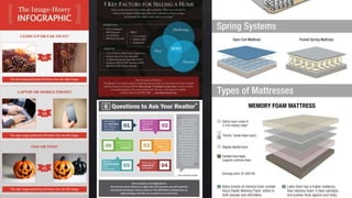
  • 11. So Many Styles … which one is Best?!
  • 12. 1. Visualized article: Take a lengthy piece of writing and make it visual. 2. Process or Flow Chart: Visually show the separate stages of completing a task, or display the steps of a process. Answer specific questions, give options. Can be humorous. 3.Timeline: Take the reader on a chronological journey using visuals. 4. Location: Use a map or some geographic visual with location points and relevant data. 5. Numbers, Research Results and Data Visualization: Use impressive numbers and visualized data to display specific research findings, demographics, and statistics. 6. Useful How To Info: Explain something or answer a question by visually showing how to do it. Demonstrate expertise, competence, experience. 7. Compare and Contrast: Compare two or more things, in an “A versus B” style, so we can visually see their differences. 8. Did You Know? Show collection of interesting related facts using visuals. Sometimes humorous, as in hip cultural icon posters. 9. Photo Infographic : Use beautiful or compelling photos to tell a story. 10. Advocacy or Activist : Educate/inform/raise awareness on problem or issue. 11. Venn Diagram : Illustrate logical relations between sets of data using intersecting shapes.
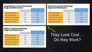
  • 14. They Look Cool … Do they Work?
  • 15. “The best info graphics tell a story that you can’t tell as well in any other format (good infographics are not stats that are simply listed in one looonng graphic).” Michele Linn Content Marketing Institute