
Kerrang! 2
- 2. Audience Profile • • • • The circulation of Kerrang! In the UKIS 38,556. Which adds to the overall readership of 345,000. Socio-economic status is 48% ABC1. This shows me that their socio economic status is made up of 52% C2DE. Although it is a small difference (2%), it could cause difficulty when the magazine is trying to get advertising. They claim, however, that their audience are heavy music consumers (this meaning that they purchase it often). There is a clear correlation between the purchase of music & the purchase of this magazine. This would make a sense as Kerrang! Is a music magazine. The kind of music Kerrang! reports on is the kind of music the readers purchase and listen to. The mean age for Kerrang! Magazine is 25. They claim that they reach more younger readers than any other music magazine e.g. Q & NME. Kerrang! have a 74% solus readership (meaning the consumer reads the magazine individually/purchases the magazine for themselves). This could mean that the consumers that access this magazines are individuals & do not fit into a mainstream genre. This links in with the kind of music they listen to & what the magazine is about because the genre (rock & heavy metal) are not main stream genres.
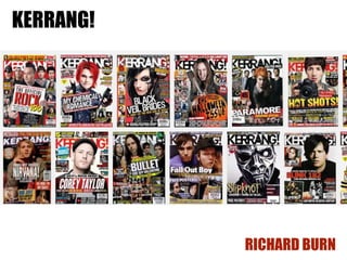
- 3. Images • The images in Kerrang! magazine usually feature a band or artist posing. The focus is usually on the lead singer (main person) in the band e.g. Hayley Williams on the cover in the left top. The front covers are usually less stylized images, with the artist’s usually imposed onto a simple background e.g. both covers on the right-hand side. Reasons for this include: allowing the artist to stand out, represents that they only care about the music, no risqué photographs as the covers can be accessed by more audiences than just the target & leaves the artistic opportunities for inside the magazine. As you can see from the two images below, the images become stylized image which push boundaries that could not be used on the front cover. Below you can see All Time Low are posing with bloody hearts & Leathermouth show someone dead in a refrigerator. This could then be linked in with the genre of music that the magazine is about because the music is quite angry & dark. The photographs connote this feeling. Because of the reasons stated above, the audience likes the magazine. The photographs work with the text and usually cover around 50% of the page.
- 4. Words • • • • The language that the writers use in Kerrang! is informal, it is almost like you were chatting to a friend. This could be due to the 51% C2DE socio-economic status. That is linked to a lower level of education. Some of the words they have used are uncommon words. It seems that the writers include these words just to fool the reader into thinking their writing is of a high lever by including these words. The words in Kerrang! magazine can also push the boundaries. An example of this would be when Guns N’ Roses did an interview and said “KNOW WHAT I want to do? Really want to do? Go over to Japan and pollute it. I'm not talking about drugs, I'm talking about teenage sex, bring over some crazy porn magazines and drop them from the tops of tall buildings. There's no beaver shots in Japan...”. You would not find a quote like this in a magazine like vogue. This shows what the audience expect from this kind of genre of music & this resonates in a magazine about the genre. A lot of text is featured in the magazine. This varies depending on what the subject matter is. Overall, I would say that the magazine was 50% text & 50% images. During the interviews, the interviewer will treat the interviewee like a friend e.g. joking around. This gives the impression, again, that the writing staff at Kerrang! Are relaxed & informal. It also puts a positive spin on the artist, as the fans will want to see there favorite artists as intelligent or witty (another reason why the audience likes the magazine & how the magazine style works with the music style.
- 5. Colours • • • • The colours used in Kerrang! magazine are a usually black & white, mixed with a main colour. The black & white allows subtle differences. The black connotes darkness & darkness is linked to music & magazine genre. The main colour allows certain part of the cover to be at the forefront e.g. the colour red is used in on the magazine colour to the right. Another colour is also used to make certain parts contrast against the background. The cover on the left uses yellow to make certain parts contrast. The colours used allow a certain feeling to to be put across e.g. uses red to connote evil – which links to the front man who has devil horns in his head. The colour of the clothing links with the colour black used in the some of the text. It gives the whole front cover a clear housestyle.
- 6. Layout • • The layout of Kerrang! Magazine is simple & follows typical codes and conventions of magazine layouts. Inside the magazine, you will find photographs are used with each article (and are linked to who the article is about). The photographs will usually be part of the layout as one photograph will be the background to the whole page e.g. the article in the left top corner. Other photographs are also used on the page. This could be because the audience do not want to read a lot of text. As the text to image ratio is around 1:1, this alters what the overall layout will be for the magazine. The cover of the magazine has a different layout than the inside of the cover. On the cover in the top right looks like ordered ciaos in a way as everything e.g. the text is slightly tilted. This makes the cover look rough and edgy, which fits into the genre of the magazine & music it is about. This would also be another reason why the audience would access the magazine. The cover follows typical codes and conventions as it previews what is inside the magazine.
- 7. Captions • • • Captions are used on some of the smaller images in Kerrang! They are used to help describe what is going on in the photographs. Just like in the articles, there is slight humour to what they write e.g. the image in the bottom left has the caption ‘ Roddy Bottum about to punch his keyboard right into its big dumb face’. Anchoring has been used in these photographs to give more of a meaning to photographs. Linking to the genre of music, the caption uses violence as a reference, which is usually linked to the idea of rock music being hard hitting & angry. This also links to the audience as the clearly like this kind of genre.
- 8. Audience Feedback • • • • • • Kerrang! Can get audience feedback a number of ways, with pros & cons. Focus groups – this is a group of people that will be shown a product e.g. a magazine and then will be asked their opinion. Honesty is key in this as you will wish to improve from their comments. They won’t be able to improve if the people in the focus group are not honest. Audience panels – this is a regular, usually large group of people that will be contacted about a service or a product. Because these groups are regular you can trust their opinion and gain how they like/dislike the changes you have made. They should still also give you constructive criticism. Trialing – trialing & testing a product before it is released is an effective way to make changes to a product before it is fully available to the public. This can be done by using things like groups and panels. All of the above work together to produce a, hopefully, successful, product. Once the product is released there is still one way to still get feedback for your product: Complaints – complaints are useful for when your product has done something that an audience member did not like. This is useful so you can act upon it, but you will not find out the positives about the product.