Location via proxy:   [ UP ]  
[Report a bug]   [Manage cookies]                
SlideShare a Scribd company logo
HELLO,
           Website Intensive Week Three
             Professor Cathline Marshall
         nyuwebintensive.wordpress.com
              c.marshall.nyu@gmail.com
PLEASE MAKE A NAME CARD.
NAME CARD
WHAT USABILITY CONSIDERATIONS DID YOU TAKE IN MAKING
YOUR NAME CARD?
COURSE OBJECTIVE:
“If you are proficient in Web design and would like to
explore ways to build your portfolio and explore the
business practices of Web design, enroll in this one week
intensive. Week Three of the Web Design Intensive
covers usability assessment, producing designs for
portfolio, careers, and the business aspects of Web
design. Prerequisites: Photoshop, Illustrator, and
Dreamweaver.”
OPENING SURVEY
PLEASE FILL OUT THE SURVEY:
http://ow.ly/92AZn
WORKSHOP #1
  Please divide into three groups.

  GROUP #1: realbusiness.com
  GROUP #2: boreshacoffee.com
  GROUP #3: getharvest.com
  Answer:

  What is the purpose of the site?
  What can you do on the site?
  What do you think the main goal of the site is?
  Can you find the contact info?
WHAT IS USABILITY?
NYU Web Intensive - Week 3 Class 1
WHAT IS USABILITY?
Usability is “the extent to which a product can be used by
specified users to achieve specified goals with effectiveness,
efficiency and satisfaction in a specified context of use.”

                                                    (ISO 9241-11)
“In human-computer interaction and computer science,
usability usually refers to the elegance and clarity with
which the user interface of a computer program or a web
site is designed.”

                                                   (Wikipedia)
“...the measure of the quality of a user’s experience when
interacting with a product or system,” whether a Web site, a
software application, mobile technology, or any user-
operated device.”

                                                  (Usability.gov)
“Usability really just means making sure that something
works well: that a person of average (or even below average)
ability and experience can use the thing - whether it's a Web
site, a fighter jet, or a revolving door - for its intended
purpose without getting hopelessly frustrated.”

                                                     (Steve Krug)
DON’T MAKE ME THINK.
THINGS THAT MAKE US THINK:
  Where do I start?
  What do they do?
  Clever names/Marketing induced names
  Links that are not self evident
  Navigation in non traditional places
  Where’s the contact info?
  Where do I sign in?
WHAT USERS LOOK FOR:
  Ease of use
  Speed
  Practicality
  Credibility
  Consistency
  Simplicity, simplicity, simplicity
HUMAN FACTORS
HUMAN FACTORS
Forms the basis of usability testing.
Has its roots in military research.
Understanding how people think and interact with their
environment.
THE HISTORY OF USABILITY
The study of human factors dates back to World War II,
when the growing complexity of fighter planes created a
need for more user friendly designs.
HUMAN FACTORS INCORPORATES:
  Psychology
  Engineering
  Industrial design
  Graphic design
  Statistics
HUMAN FACTORS SPECIALISTS:
  Design products for improved safety & ease of use
  Design systems to accommodate specific user groups
  Raise productivity by improving human performance
  Improve information displays to reduce human error
THREE MILE ISLAND
A control panel status made engineers think that a valve had
been engaged, while the status simply meant that the valve
had been attempted to be engaged.
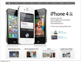
THE WEB HAS CHANGED.
NYU Web Intensive - Week 3 Class 1
WORKSHOP #2
  Scenario:

  You’ve just rented a new apartment and your landlord told you
  to open an account with ConEd (coned.com) to get your
  electricity turned on.
  Go for it.
  Share your thoughts.
HOW PEOPLE USE SITES.
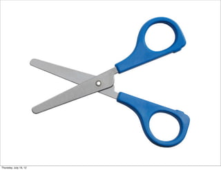
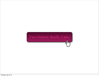
AFFORDANCE
The perceived ability of an object to behave in a certain
•

way, by nature of its design.
•The quality of an object which allows one to perform an
action.
NYU Web Intensive - Week 3 Class 1
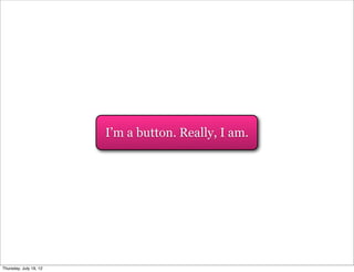
I’m a button. Really, I am.
What does this thing do?
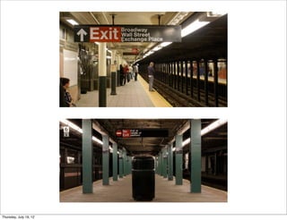
SIGNIFIERS
People search for clues to help them understand context.
Photo: CelticSong22
NYU Web Intensive - Week 3 Class 1
PUT IT IN CONTEXT
People need some way of understanding the product
or service.
Forget affordances: what people need are signifiers.
  They are broader and richer.
  They provide valuable clues to sift information.
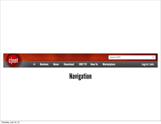
DESIGN ELEMENTS
 Websites rely on pictures and icons to convey messages.

 Design elements that give the user context:

 Navigation
 Buttons
 Icons
Navigation
Buttons
Icons
MENTAL MODELS
Our ideas of how things work.
Are an explanation of our thought process about how
something works.
Includes what we think is true, not necessarily what is
actually true.
Why, oh why, do people search for a website if
        they already know its name?


 www.bing.com
www.bing.com
USER ACTIONS
Users plan actions based on their models.
People expect websites to act alike.
Goal is to create interfaces that match how people think
something should work.
WHY DOESN’T THIS IPAD WORK?
       (because it’s a magazine)
DIAGNOSING PROBLEMS
Understanding the concept of mental models can help you
make sense of usability problems.
Users expect to know which elements on a page are clickable.
On e-commerce sites they expect to see photos.
Headings, labels and categories will differ depending on
target audience.
HOW PEOPLE USE SITES.
YOU HAVE LESS THAN TWO MINUTES TO
COMMUNICATE THE FIRST TIME A PROSPECTIVE
CUSTOMER VISITS YOUR WEBSITE.

Every page must justify its claim on their time. If a page
doesn’t do that immediately and clearly, users go
elsewhere. Most people don’t even bother scrolling to see
what’s farther down the page.
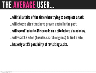
THE AVERAGE USER...
  ...will fail a third of the time when trying to complete a task.
  ...will choose sites that have proven useful in the past.
  ...will spend 1 minute 49 seconds on a site before abandoning.
  ...will visit 3.2 sites (besides search engines) to find a site.
  ...has only a 12% possibility of revisiting a site.
MORE ABOUT USERS...
  Users don’t read they scan.
  Users don’t make optimal choices.
  Users don’t figure out how things work.
  Users don’t always come through the homepage.
GUIDELINES
 Let users know where they are and how to proceed.

 Company name or logo in upper left corner
 Direct, one click link to home page
 Search (ideally in upper right corner)
 Consider using breadcrumbs to orient user
WHY PEOPLE LEAVE SITES.
BACKGROUND MUSIC
   why is this playing?!
POP UPS
LONG WAIT TIME
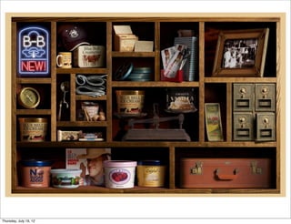
CAN’T FIND SOMETHING
NYU Web Intensive - Week 3 Class 1
CAN’T TELL WHAT IT’S ABOUT
       (rentmychest.com)
PAGINATION
INTERSTITIAL ADS
BAD NAVIGATION
NYU Web Intensive - Week 3 Class 1
POOR INFORMATION SCENT
      - dictates maximum benefit for minimum effort
      - users access if their paths show cues related to
                      desired outcome
- progress must seem rapid to be worth the effort required to
                   reach the destination
                 - don’t use made up words
NYU Web Intensive - Week 3 Class 1
REQUIRED TO REGISTER
TOO MUCH MOVEMENT
     one exception.
TYPOS & POOR GRAMMAR
   My suns is cutting wood with
   a acts but they ain’t aloud to
   drink ail in front of there ant.
LAME FONTS
COBWEBS
LACK OF CLARITY
NYU Web Intensive - Week 3 Class 1
FLASH BASED
NO ABOUT OR CONTACT PAGE
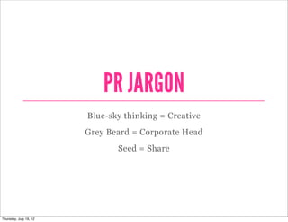
PR JARGON
Blue-sky thinking = Creative
Grey Beard = Corporate Head
       Seed = Share
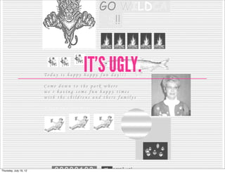
IT’S UGLY.
USER CENTERED DESIGN
WHAT IS USER CENTERED DESIGN?
  Design philosophy that focuses on the end user through:

  Planning Phase
  Design Phase
  Development Phase

  Requires research on end user.
ISO 9241-210 (formerly 13407)
International standard for human-centered process.
ISO 9241-210 (formerly 13407)
6 key principles that will ensure your design is user centered:

1. The design is based upon an explicit understanding of
users, tasks and environments.

2. Users are involved throughout design and development.

3. The design is driven and refined by user-centered
evaluation.
ISO 9241-210 (formerly 13407)
The process is iterative.

The design addresses the whole user experience.

The design team includes multidisciplinary skills and
perspectives.
STEP #1:
Identify your users.
Who are they?
What are their tasks and goals?
What is their experience level?
KNOW YOUR USERS
 Who are the users?
 What do they need to do, their tasks?
 What do they currently do?
 How satisfied are they with their current routines?
 What is their experience level?
 What kind of environment are they working in?
 What are their preferences, and their goals?
STEP #2:
What functions are required?
What information do they need?
What form should it be?
How do users think it should work?
STEP #3:
Create design solutions.
(Think simplicity, simplicity, simplicity.)
STEP #4:
Evaluate designs by testing usability.
IDENTIFY NEED
   FOR HUMAN
CENTERED DESIGN
                       SPECIFY CONTEXT OF USE


                              SYSTEM
   EVALUATE DESIGNS      SATISFIES SPECIFIED     SPECIFY REQUIREMENTS
                           REQUIREMENTS


                      PRODUCE DESIGN SOLUTIONS
enlarge
THE TEN USABILITY HEURISTICS
These are ten general principles for user interface design. They
are called “heuristics” because they are more in the nature of
rules of thumb than specific usability guidelines.
                                            -Jacob Nielsen, 1994
THE TEN USABILITY HEURISTICS
  #1 VISIBILITY OF SYSTEM STATUS
  #2 MATCH BETWEEN SYSTEM AND THE REAL WORLD
  #3 USER CONTROL AND FREEDOM
  #4 CONSISTENCY AND STANDARDS
  #5 ERROR PREVENTION
  #6 RECOGNITION RATHER THAN RECALL
  #7 FLEXIBILITY AND EFFICIENCY OF USE
  #8 AESTHETIC AND MINIMALIST DESIGN
  #9 HELP USERS RECOGNIZE, DIAGNOSE, & RECOVER FROM ERRORS
  #10 HELP AND DOCUMENTATION
#1 VISIBILITY OF SYSTEM STATUS
The system should always keep users informed about what is
going on, through appropriate feedback within reasonable time.
DO
NYU Web Intensive - Week 3 Class 1
DON’T
NYU Web Intensive - Week 3 Class 1
#2 MATCH BETWEEN SYSTEM AND THE REAL WORLD
The system should speak the users' language, with words,
phrases and concepts familiar to the user, rather than system-
oriented terms. Follow real-world conventions, making
information appear in a natural and logical order.
DO
NYU Web Intensive - Week 3 Class 1
DON’T
NYU Web Intensive - Week 3 Class 1
#3 USER CONTROL AND FREEDOM
Users often choose system functions by mistake and will need a
clearly marked "emergency exit" to leave the unwanted state
without having to go through an extended dialogue. Support
undo and redo.
DO
NYU Web Intensive - Week 3 Class 1
DON’T
NYU Web Intensive - Week 3 Class 1
#4 CONSISTENCY AND STANDARDS
Users should not have to wonder whether different words,
situations, or actions mean the same thing. Follow platform
conventions.
DO
NYU Web Intensive - Week 3 Class 1
DON’T
NYU Web Intensive - Week 3 Class 1
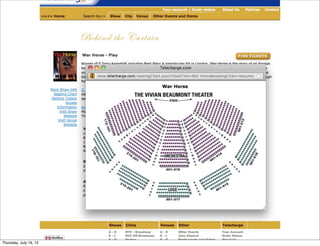
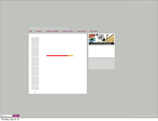
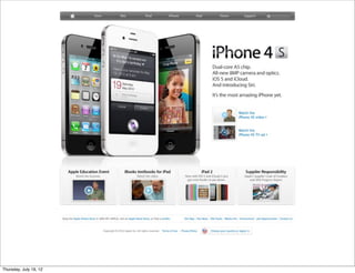
#5 ERROR PREVENTION
Even better than good error messages is a careful design which
prevents a problem from occurring in the first place. Either
eliminate error-prone conditions or check for them and present
users with a confirmation option before they commit to the
action.
DO
NYU Web Intensive - Week 3 Class 1
DON’T
NYU Web Intensive - Week 3 Class 1
#6 RECOGNITION RATHER THAN RECALL
Minimize the user's memory load by making objects, actions,
and options visible. The user should not have to remember
information from one part of the dialogue to another.
Instructions for use of the system should be visible or easily
retrievable whenever appropriate.
DO
NYU Web Intensive - Week 3 Class 1
DON’T
NYU Web Intensive - Week 3 Class 1
#7 FLEXIBILITY AND EFFICIENCY OF USE
Accelerators -- unseen by the novice user -- may often speed up
the interaction for the expert user such that the system can cater
to both inexperienced and experienced users. Allow users to
tailor frequent actions.
DO
NYU Web Intensive - Week 3 Class 1
DON’T
NYU Web Intensive - Week 3 Class 1
#8 AESTHETIC AND MINIMALIST DESIGN
Dialogues should not contain information which is irrelevant or
rarely needed. Every extra unit of information in a dialogue
competes with the relevant units of information and diminishes
their relative visibility.
DO
NYU Web Intensive - Week 3 Class 1
DON’T
NYU Web Intensive - Week 3 Class 1
#9 HELP USERS RECOGNIZE, DIAGNOSE, & RECOVER FROM ERRORS
Error messages should be expressed in plain language (no
codes), precisely indicate the problem, and constructively
suggest a solution.
DO
NYU Web Intensive - Week 3 Class 1
DON’T
NYU Web Intensive - Week 3 Class 1
#10 HELP AND DOCUMENTATION
Even though it is better if the system can be used without
documentation, it may be necessary to provide help and
documentation. Any such information should be easy to search,
focused on the user's task, list concrete steps to be carried out,
and not be too large.
DO
NYU Web Intensive - Week 3 Class 1
DON’T
NYU Web Intensive - Week 3 Class 1
USABILITY REVIEWS
Your blog name is too long, it doesn’t      A search box is a great thing to have,
sound like a website name. It also          and this is the perfect place to put it.
sounds like it’s referring to a specific
discovery. A shorter blog name will
allow people to remember your site
and URL more easily.

                                            You don’t need a comment feed..
                                            Unless you know for a fact that your
                                            users are using this feature, just having a
This small square should not be there, it   post feed is fine enough. Then you don’t
links to different version of the about     even need to have all that text, the
page with no title.You can delete that      orange icon is an industry standard.
page to get rid of the square.


This title is too long. People get
confused by page titles that do not         Though aesthetically pleasing, this image
describe the page intuitively and           just doesn’t say “science”. It speaks
concisely. It should read “About” or        more to travel and history, and the
“About The Blog”                            discovery of ancient worlds as opposed
                                            to new studies in science.


Who are you? How are you associated
with science? I can’t even find your full
name on this page! It is important that     There is too little typographic hierarchy
you include an “About the Author” page      on your site. Not even the site’s name
to establish your credibility and put a     or the post titles really come out and
face to the site.                           grab your attention. It all looks like a
                                            wall of text, which makes it harder for a
                                            user to navigate.

You should not display the full blog post
on the homepage. Show the title and an
excerpt, and allow the user to “read
                                            As the eye can only comfortably track 7
more” if they’re interested. This keeps
                                            to 10 words a line, your sentences are a
users from having to scroll down
                                            tad too long.
through articles that they have no
interest in.


Your blog posts could benefit from the       Though the design (layout/color palette/
addition of relevant images that            fonts) of your website isn’t necessarily
summarize what the content is about.        bad, we don’t feel that it communicates
Right they appear as just a big, gray box   to your target audience effectively. If
of text intimidating text.                  you are looking to make science
                                            accessible and understandable to
                                            laymen, the design should reflect that.
  HOMEPAGE                                  The current design seems too
                                            scholarly, clinical, and outdated.
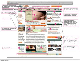
These questions (links) would make
 for excellent callouts, but not necessarily
 navigational links.
                                               Because this is green, I am assuming
 Too many navigation options!                  this is the page that I am on, but it is
                                               not.

Too much movement.Very distracting.
                                               This block could be confused with
                                               advertising and may be ignored.


  Unappealing image.
                                               Most Popular Topics (is this
                                               different than the blog topics?),
                                               Today’s News, Popular Links, Latest
                                               News. SO MUCH TO CHOOSE
                                               FROM! I don’t know where to
                                               start? What is most important?

This opens in a new window, with new
colors.Very disorienting.


                                               These buttons are totally lost
                                               among all the options on this page.

                                               Seeing Fans is nice, but just adds to
                                               the clutter and creates further
                                               distraction on this very busy page.


                                               I need a little hint as to what
  Is this advertising?                         attainivf is before I click. This is
                                               too vague.
This can move to the bottom of the page.
Clean this area up. Remove the image of
                                           Everyone takes these credit cards.
Las Vegas, Make it a clean and simple
logo like all your competition does.       Remove all this. Replace with: Register for
                                           Free with a link to register.
                                           And have Log In button.

 This appears to be an ad! Why would
 you encourage users to LEAVE your
                                          This whole area takes up valuable real estate. On
 site to play Fantasy Football? Doesn’t
                                          Sport’s Advisors, the ads are smaller allowing the
 even open in another window.
                                          left side bar to come up. Also, the content of the
                                          ads are much more compelling. I would
                                          reconsider what if anything you want to put here.


                                                       I would remove everything in
                                                       this green block and replace
                                                       with this.
This is a wonderful service, but it
pushed down the menu of
handicappers which is what people
are going to be looking for. They can
get the scores via your top navigation.
You may want to consider saying “Live
Scores”


 Remove the word Menu. Not needed.
 Move this whole block up.


      HOMEPAGE
This blur looks like it is a mistake.


                                                                                                  The logo on the homepage is customarily larger and more
                                                                                                  prominent. It is getting lost on this page because of lack of
                                                                                                  contrast and the blurring of the image.

                                                                                                  Navigation is too light in color. No contrast. Needs to be
                                                                                                  more obvious.
                                                                                                  This Giving aid link is too passive. No one will see it.

                                                                                                  This extranet link may be confusing if it refers to the CLUB..


                                                                                                  The site map link should be more prominent.

                                                                                                  While you can have news bites on the homepage, that is not the
                                                                                                  role of the homepage.The role of the homepage is to
                                                                                                  communicate what the company is, the value the site
                                                                                                  offers over the competition and the product or
                                                                                                  services offered. Presently, it does NONE of those things.

                                                                                                  The novice user can feel overwhelmed by homepages that do not
                                                                                                  help them understand their options. They may become embarrassed
                                                                                                  and blame themselves. They will just leave the site and go to a more
                                                                                                  welcoming site.

                                                                                                  The challenge is to design a homepage that gives the user access to
                                                                                                  important features without cramming them onto the page itself.
                                                                                                  Focus and clarity are most important, as are the users' goals.
                                                                                                  They need to be identified early. I question if they have been.

                                                           Search box is not obvious. It needs to be moved to the                    Who is IAAATA and SNA?
The word “HOT” does not belong on a site of this nature.   upper right as that is now standard practice and where                    Partners? Agencies?
It cheapens the work and seems inappropriate.              most users will look for it. Plus it is buried in with the                Memberships? Should at the
                                                           contact information and not self evident.                                 very least have a link so the
                                                                                                                                     uninformed user can
                                                                                                                                     research what they are.
WORKSHOP #3
  Please break into groups.

  Find a site to do a “heuristic” (usability) review.
  Be prepared to share your observations with the class.
USER AND BUSINESS GOALS
BUSINESS GOALS
“Customer experience is the defining success factor in
business for the next twenty years. Learning from
customers, creating the experience they want, measuring
the success of what you do, continually fine-tuning the
service and returning to customers to learn more--this now
must be the primary mission of any business that has
customers. If you create a great customer experience, you’ll
almost certainly win.” Mark Hurst
USER AND BUSINESS GOALS
...should be aligned.
KNOW THE BUSINESS
Having a satisfied user doesn't necessarily build a satisfied
company.

Interview the stakeholders, get to understand their strategy
and business goals.

Ultimately usability must serve the bottom line.
HERE’S WHAT HAPPENS:
  Suits decide on business goals
  Convert to strategy
  Brings in design team
     Do it cheap
     Put everything on the homepage
     Put my division on the top of the hierarchy
     Hide the contact info
     Get to market asap
NYU Web Intensive - Week 3 Class 1
WHAT’S THE RESULT?
Bad user experience.
BUSINESS GOALS ARE UNIVERSAL
Increase traffic to the site.
Retain users.
Improve conversion rates.
CONVERSION
When a prospective customer takes the marketer's
intended action.
                                              -Wikipedia
SALES
Sign ups
Contact form submissions
HOW TO RETAIN USERS:
  Timely, relevant content
  Engage them
  Provide an experience

  SERVE THEIR NEEDS.
HOW TO IMPROVE CONVERSION:
  Easy to use site
  Clear hierarchy
  Calls to action
  Communicate value
  Study analytics
  A/B testing

  SERVE THEIR NEEDS.
HOW TO INCREASE TRAFFIC:
  Interesting, original copy
  In-bound links
  Search Engine Optimization (SEO)
  E-blasts/Newsletters
  Social Media

  SERVE THEIR NEEDS.
DESIRABILITY
DESIRABILITY
Delight comes not from the latest widget but from helping
uses accomplish their goals.
DESIRABILITY
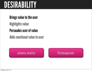
  Brings value to the user
  Highlights value
  Persuades user of value
  Adds emotional value to user


        piano stairs             Pentagram
NYU Web Intensive - Week 3 Class 1
HOMEWORK WEEK #1
  1. Surf the web. Find one site that is easy to use. One that isn’t.
  Tell why.
  2. If you had to do a comprehensive usability plan for the Coca
  Cola website or Microsoft Web site, which would you chose and
  why? Type your answers and submit next week.
  3. Download “Research Based Web Design & Usability
  Guidelines.”  Read chapter one and two.
  4. Look at the site you reviewed at the start of the class. Write
  down what changes you would make to make the site more user-
  friendly. Type your answers and submit next week.
INFORMATION ARCHITECTURE
The structure or organization of your website.
Shows how different pages relate to one another.
Involves content analysis, page organization, labels, cues,
search techniques and navigation.
Can help people find their way through the information, &
ignore what isn’t relevant.
IA IS ORGANIZATION
All about creating groups that make sense to the people who
use them.
Supermarkets don’t organize Swiss cheese with Swiss
chocolate, Belgian chocolate with Belgian beer.
IA ON THE WEB
In supermarkets it’s done with layout, sign age and visual
guides.
On websites we use navigation bars button and links.
NYU Web Intensive - Week 3 Class 1
IA IS ALL ABOUT:
  1. Organizing content or objects
  2. Describing them clearly
  3. Providing ways for people to get to them
WHERE DO YOU FIND IA?
  1. Wherever you need to organize information or objects
  2. Websites, intranets
  3. File system at work or home, movies, music, or even groceries
  on a shelf!
WHAT YOU NEED TO UNDERSTAND
     ...in order to develop a successful IA
PEOPLE
What they need do to, how they think & what they already
know.
CONTENT
What you have, what you should have & what you need.
CONTEXT
The business or personal goals for the site, who else will be
involved & what your constraints are.
PEOPLE


CONTENT        CONTEXT
IA STARTS WITH
 Defining the project & its goals
 Researching end users
 Reviewing all content
 Understanding technological & design constraints
IA WILL DESCRIBE
  Overall structure of the site
  Groups & sub groups (to be used in navigation – includes what
  they will be called)
  Metadata: what you’ll use to describe products
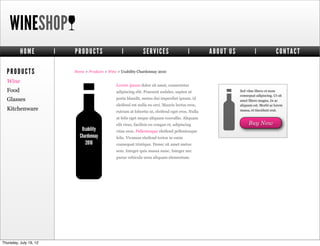
WINESHOP
       HOME   |   PRODUCTS                 |            SERVICES                    |      ABOUT US            |             CONTACT

PRODUCTS          Home > Products > Wine > Usability Chardonnay 2010

Wine
                                        Lorem ipsum dolor sit amet, consectetur
Food                                    adipiscing elit. Praesent sodales, sapien ut                  Sed vitae libero et nunc
                                                                                                      consequat adipiscing. Ut sit
Glasses                                 porta blandit, metus dui imperdiet ipsum, id                  amet libero magna. In ac
                                        eleifend est nulla eu orci. Mauris lectus eros,               aliquam est. Morbi ac lorem
Kitchenware                             rutrum at lobortis ut, eleifend eget eros. Nulla              massa, et tincidunt erat.

                                        at felis eget neque aliquam convallis. Aliquam
                                        elit risus, facilisis eu congue et, adipiscing                     Buy Now
                     Usability          vitae eros. Pellentesque eleifend pellentesque
                    Chardonnay          felis. Vivamus eleifend tortor in enim
                       2010             consequat tristique. Donec sit amet metus
                                        sem. Integer quis massa nunc. Integer nec
                                        purus vehicula urna aliquam elementum.


                                                                                            THIS IS IA.
NAVIGATION
 Dependent on the IA
 Done after IA is drafted
 Includes:
   Navigation bars
   Related links
   In page navigation (hyperlinks)
   Aids like A-Z indexes & site maps
WINESHOP
       HOME   |   PRODUCTS                 |            SERVICES                    |      ABOUT US            |             CONTACT

PRODUCTS          Home > Products > Wine > Usability Chardonnay 2010

Wine
                                        Lorem ipsum dolor sit amet, consectetur
Food                                    adipiscing elit. Praesent sodales, sapien ut                  Sed vitae libero et nunc
                                                                                                      consequat adipiscing. Ut sit
Glasses                                 porta blandit, metus dui imperdiet ipsum, id                  amet libero magna. In ac
                                        eleifend est nulla eu orci. Mauris lectus eros,               aliquam est. Morbi ac lorem
Kitchenware                             rutrum at lobortis ut, eleifend eget eros. Nulla              massa, et tincidunt erat.

                                        at felis eget neque aliquam convallis. Aliquam
                                        elit risus, facilisis eu congue et, adipiscing                     Buy Now
                     Usability          vitae eros. Pellentesque eleifend pellentesque
                    Chardonnay          felis. Vivamus eleifend tortor in enim
                       2010             consequat tristique. Donec sit amet metus
                                        sem. Integer quis massa nunc. Integer nec
                                        purus vehicula urna aliquam elementum.


                                                                                           THIS IS
                                                                                           NAVIGATION.
DEVELOPING AN ARCHITECTURE
REVIEW:
 Results of your requirements & task analyses
 Earlier versions of site
 Competitors’ sites
THIS DEVELOPS LIST OF:
  Content pieces
  Candidate labels
  Organization schemes
EVALUATE CONTENT FOR:
 Quality
 Completeness
 Add & design that’s needed
 Create content inventory
content inventory
content inventory
CREATE & EVALUATE STRUCTURE:
 Brainstorm content categories & site structures
 Decide which content belongs together on a page
 User test & refine
MAP THE PAGES:
 Create a sitemap starting with highest priorities
 Add short cuts & redundant links
 Add necessary support tools, such as Help, Site Map, Search
DEVELOP NAVIGATION BAR:
 Refine layout & orienting of information i.e., headers, page titles
 Establish final labels & graphics
 Remember users’ mental models
 Do user testing
IMPLEMENT:
 Build the site & update specs as needed
 Test the site
 Train maintenance staff
ORGANIZATION SCHEMES
ALPHABETICAL
 Primary scheme for dictionaries, encyclopedias
 Non-fiction indices
 Phone books
 On the web: directories
 Last name
 Products
 Departments
 Services
CHRONOLOGICAL
 Press Releases
 Blog Posts
 News
GEOGRAPHICAL
 Weather
 Store Locators
 News sites
NYU Web Intensive - Week 3 Class 1
TOPICAL
 Provides topical access to content


         Pinterest
TASK ORIENTED
 Organized into process, function or tasks
NYU Web Intensive - Week 3 Class 1
ORGANIZATIONAL STRUCTURES
How the information is structured.
How one relates to it.
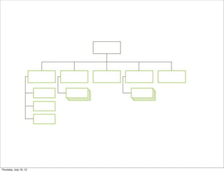
HIERARCHY
Relationship between items:
> parent & child; broader & narrower
NYU Web Intensive - Week 3 Class 1
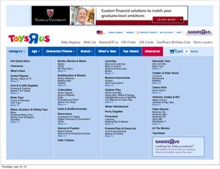
DATABASE
A planned structure – all information fits into that structure
Pieces may have no relationship to each other
This has nothing to do with...
this!
But they share the same pieces that make up the listing:
       • title               • payment methods
       • description         • date added

       • tags                • photograph

       • materials           • category

       • location
NYU Web Intensive - Week 3 Class 1
METADATA
“data about data”or,
“information about information”
all of the information that describes or relates to a piece of
content. this is what the database is all about.
THREE KINDS OF METADATA:
 Intrinsic: What the object actually is
 Administrative: How it is used
 Descriptive: Description of the item
EXAMPLES OF METADATA:
 Blog post (intrinsic)
 Author (administrative)
 Date posted (administrative)
 URL (administrative)
 Status: published (administrative)
 Title (descriptive)
 Category (descriptive)
 Tags (descriptive)
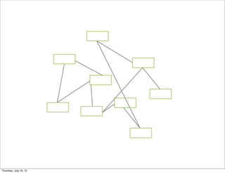
HYPERTEXT:
 Almost an anti-structure pattern
 Pieces are connected according to the relationship between them
 No database
 No hierarchy
NYU Web Intensive - Week 3 Class 1
LINEAR
 Just as it sounds –one thing follows another
 Not common on the web
 Don’t use unless users need to read things in order to avoid
 frustration
NYU Web Intensive - Week 3 Class 1
COMBINED PATTERNS
 Simple hierarchy + simple database
 Good for small, medium & large sites
 Create hierarchical sections for basic content
 Power of a database to assemble detailed information within
 a section
NYU Web Intensive - Week 3 Class 1
CATALOGUE
 Second most common
 Basically a database pattern
 Bottom level is content!
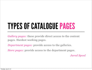
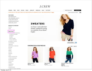
TYPES OF CATALOGUE PAGES
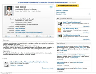
Gallery pages: these provide direct access to the content
pages. Hardest working pages.
Department pages: provide access to the galleries.
Store pages: provide access to the department pages.
                                                 Jared Spool
NYU Web Intensive - Week 3 Class 1
HUB AND SPOKE
 Users move down one level into something more detailed
 Return to starting point (the hub)
 Then to another detailed page
 Back to hub and so on
NYU Web Intensive - Week 3 Class 1
SUB-SITES
 LARGE sites
 Government
 Universities
 Large intranets
 Site is a series of sub-sites
 Held together by homepage or top level pages
NYU Web Intensive - Week 3 Class 1
LABELS
LABELS
The words you use in navigation.
Words that describe chunks of content.
THE BEST LABELS...
CALL THINGS
...by the correct name
ARE CONSISTENT
USE TERMINOLOGY
...that your audience uses
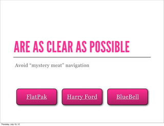
ARE AS CLEAR AS POSSIBLE
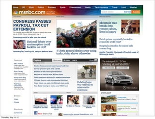
Avoid “mystery meat” navigation


    FlatPak          Harry Ford   BlueBell
WHERE TO GET IDEAS FOR LABELS
CONTENT
Look at the words used in your content.
USER RESEARCH
Your research will contain hundreds of words that describe
how your audience phrase ideas and concepts.
CARD SORTING
Have people provide a label describing what the group of
cards is about.
WHAT EVERYONE ELSE DOES
Look around at competitors!
WORKSHOP # 1
  CARD SORTING EXERCISE
  Divide into three groups. Write one word per card.
  Skin care           Hair care               Finance tips
  Does cutting salt   Is fruit juice really   For vegetarians
  increase heart      your friend.            Could your water
  attacks?            Workout plans           bottle be making
  Recipes             Meal plans              you fat?
  Disease risks       Breakfast foods, the    Workouts
  Lowering stress     good the bad and        Ask the experts
  Nutrition           the ugly..              Weight loss
  Life style          Living green
WORKSHOP # 1
  CARD SORTING EXERCISE
  Create categories for the words, then group and find
  appropriate labels.
WORKSHOP # 2
  CREATE A HIERARCHICAL SITE
  MAP FOR SITE YOU DID IN CARD
  SORTING EXERCISE.
NAVIGATION
NAVIGATION
Refers to the methods we design that let people move
around information.
More than a single bar at the top of a page.
NAVIGATION CAN ALSO...
  Let people browse to the content or functionality they need
  Show the context of the information
  Show what is related and relevant
  Help people find information they didn’t know about
NAVIGATION INCLUDES:
 Navigation bars
 Hyperlinks
 Buttons
 Other clickable things
TYPES OF NAVIGATION:
  Global
  Local
  Supplementary
  Utility
  Contextual
GLOBAL
Defined as links to a site’s top-level categories
Found on every page of the site
NYU Web Intensive - Week 3 Class 1
LOCAL
Picks up where global navigation leaves off
Found on inner pages - specific site section
Gives users tools to move around & accomplish tasks
NYU Web Intensive - Week 3 Class 1
SUPPLEMENTARY
Supplements main navigation
Sitemaps, site tour videos, search bars, site index
NYU Web Intensive - Week 3 Class 1
UTILITY
Things users need on a regular basis
About, Contact, Privacy
NYU Web Intensive - Week 3 Class 1
CONTEXTUAL
Embedded in the content of the page
Hyperlinks
NYU Web Intensive - Week 3 Class 1
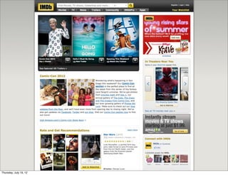
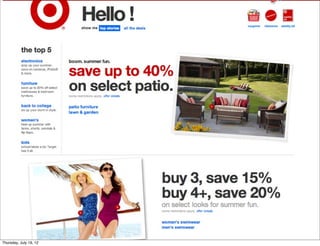
TYPES OF NAVIGATION 02:
  Navigation bars
  Horizontal or vertical bar
  Shows the categories – usually 1-2 levels
USE HORIZONTAL NAVIGATION IF:
  you have a small number of top-level items that can fit across
  the screen
  you aren’t likely to be adding new top-level items
  your labels are short enough to fit into the horizontal space
  you aren’t likely to translate the site into a language that uses
  long, compound words (which take up more space)
  you want to maximize the amount of page available for content
USE HORIZONTAL NAVIGATION IF:
  you have more top level groups than would easily fit across
  a screen
  you may add or change groups over time
  some groups may have long labels
  you may want to translate the website


          Showcase
USE VERTICAL NAVIGATION IF:
  you have more top level groups than would easily fit across a
  screen
  you may add or change groups over time
  some groups may have long labels
  you may want to translate the site


          Showcase
INVERTED L
Horizontal & Vertical
NYU Web Intensive - Week 3 Class 1
TABS
Variation of horizontal navigation
Always has 2nd level that need to be connected
NYU Web Intensive - Week 3 Class 1
DROP DOWN
Allows user to see second level navigation
NYU Web Intensive - Week 3 Class 1
WORKSHOP # 3
  CREATE NAVIGATION FOR SITE
  YOU DID IN CARD SORTING
  EXERCISE.
  Landing page
  A secondary page
SKETCHING
USER FLOWS
Simple diagrams that follow a user down a path of activity
Can be storyboards or flow charts
Similar to scenarios


       Storyboard                    Donald Graham
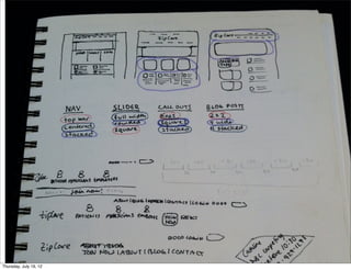
THUMBNAIL SKETCHES
Simple sketches that then go into wireframes
Small representation of design
Scribble lines
Use text captions to describe what happens
NYU Web Intensive - Week 3 Class 1
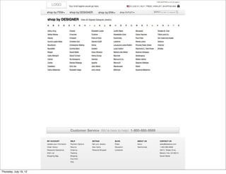
WIREFRAMES
First step in design process
Design drawings without visual treatment
Simple lines, few colors
Purpose is to show what will be on a page
No graphic design
No interaction
CREATING WIREFRAMES
 Easy to draw
 Straight lines and text
 Plenty of drawing packages available:
    Visio
    Illustrator
    Keynote

   MockFlow              Balsamiq        OmniGroup
WHO USES WIREFRAMES?
Project team – to discuss different ideas & approaches
Content authors – how will their content fit? What pages do
they have?
Managers – are business needs met? (Where’s my stuff?!)
Developers – shows how things need to work, how to
implement
WHAT TO INCLUDE
ABSOLUTE ESSENTIALS
Logo placement
Navigation
Content
Hierarchies
EXPLANATIONS
Annotations
Background information
Important things to pay attention to
EXPLANATIONS
Better visual approaches so people can easily understand
what you’re communicating.
NYU Web Intensive - Week 3 Class 1
EXTRAS: TOOLS & TEMPLATES
EIGHTSHAPES UNIFY
This is an InDesign-based documentation system. It
contains templates, common page layouts and symbol
libraries to get you started.


      Download
KONIGI WIREFRAME STENCILS
For OmniGraffle, this contains a broad set of components to
use in wireframes.


       Download
NICK FINCK’S STENCILS
This is similar to the Konigi stencil set, but for Microsoft
Visio:


       Download
BALSAMIQ
This prototyping tool is currently the most popular,
allowing you to create simple sketchy prototypes online.


       Visit Site
AXURE
Very established software for creating clickable prototypes:


       Download
MICROSOFT SKETCHFLOW
At the far end of the prototyping spectrum is Sketchflow,
which lets you create everything from quick sketch-style-
prototypes through to quite complex interactive prototypes
with re-usable code.


       Download
WORKSHOP # 4
  CREATE WIREFRAMES FOR SITE
  YOU DID IN CARD SORTING
  EXERCISE.
  One wireframe for landing page
  One wireframe for a secondary page
PROTOTYPES
PAPER PROTOTYPES
Hand drawn images of a site
Usually rough, but great for early testing
Can make changes while testing
Not good for heavy interaction
Can get new ideas for links from user

                                         Paper Prototyping
INTERACTIVE PROTOTYPES
Usually HTML or Flash
Graphic images with hotspots
Can do in Dreamweaver, Powerpoint
NYU Web Intensive - Week 3 Class 1
COMPETITION AS PROTOTYPE
See what works and what doesn’t
Quick route to get results
PERSONAS
WHAT IS A PERSONA?
Hypothetical “stand-ins” for actual users.
Not real people but represent real people.
Created from user research - not a set demographics.
Represent a segment of your users.
Helps build consensus.
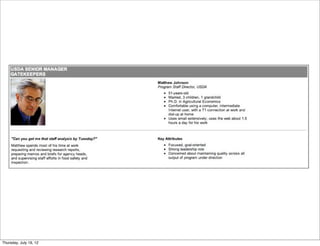
PERSONAS DESCRIBE:
 Who this person is
 How they use the site
 What interests they have
 What behaviors they have
PERSONAS ELEMENTS:
 Goals
 Attitudes
 Behaviors & Tasks
 Frustrations & Pain Points
 Name, photo, demographic info, skill level, environment
 Narrative (scenario)
RESEARCH INVOLVES:
 Key stakeholders
 Web analytics
 Customer support
 Customer
NYU Web Intensive - Week 3 Class 1
THEY REPRESENT YOUR USERS
Websites should be designed to meet the goals & needs of
personas.
USE CASES
WHAT IS A USE CASE?
Description of a user type in a scenario.
Gives a context for designing features.
Develops scope for the site.
A USE CASE
Should mirror your site strategy and business goals.
Can be like a story or scenario:
SCENARIO
Emma visits Craig's List homepage, and selects “Chicago” as
her location. She does not have anything in particular that
she is looking to buy right now. She then browses available
categories in the “for sale” area and finds a “toys” category.

She sees a posting for a “Groovy Kitchen,” which she thinks
would be great for her daughter. She contacts the seller to
arrange further details.
BENEFITS INCLUDE:
  Understanding the user helps design for them.
  Clarifying assumptions - scenarios help the team formalize
  assumptions.
  Fully exploring the design - scenarios serve to explore all the
  important aspects of the design.
  Provides context - for understanding the features
  Helping other project tasks - scenarios represent the important
  tasks.
WORKSHOP #5
  Please break into three groups.
  Create 2 personas. Segment people based on behaviors,
  go.als and needs
  (2 people can be in different demographic group but have
  same underlying goals and behaviors)


  Name, age, interests       Internet/Computing profile
  Personal characteristics   Computing/technical likes and dislikes
  Goals and motivations      Quotes
  Photos                     Work/Home computing environment
  Job/profession             Frequency of computer use

  ...and anything else you think is important.
WORKSHOP #5
  GROUP #1:
  Site is to provide info for people starting own business; some of them
  have experience in he business world; others this is their first
  exposure to issues running a business.
  GROUP #2:
  Site is to provide info for people looking to place parents in assisted
  living.
  GROUP #3:
  Site is to provide information about Connecticut; site seeing, lodging,
  historical information etc...

More Related Content

NYU Web Intensive - Week 3 Class 1

  • 1. HELLO, Website Intensive Week Three Professor Cathline Marshall nyuwebintensive.wordpress.com c.marshall.nyu@gmail.com
  • 2. PLEASE MAKE A NAME CARD.
  • 3. NAME CARD WHAT USABILITY CONSIDERATIONS DID YOU TAKE IN MAKING YOUR NAME CARD?
  • 4. COURSE OBJECTIVE: “If you are proficient in Web design and would like to explore ways to build your portfolio and explore the business practices of Web design, enroll in this one week intensive. Week Three of the Web Design Intensive covers usability assessment, producing designs for portfolio, careers, and the business aspects of Web design. Prerequisites: Photoshop, Illustrator, and Dreamweaver.”
  • 5. OPENING SURVEY PLEASE FILL OUT THE SURVEY: http://ow.ly/92AZn
  • 6. WORKSHOP #1 Please divide into three groups. GROUP #1: realbusiness.com GROUP #2: boreshacoffee.com GROUP #3: getharvest.com Answer: What is the purpose of the site? What can you do on the site? What do you think the main goal of the site is? Can you find the contact info?
  • 14. Usability is “the extent to which a product can be used by specified users to achieve specified goals with effectiveness, efficiency and satisfaction in a specified context of use.” (ISO 9241-11)
  • 15. “In human-computer interaction and computer science, usability usually refers to the elegance and clarity with which the user interface of a computer program or a web site is designed.” (Wikipedia)
  • 16. “...the measure of the quality of a user’s experience when interacting with a product or system,” whether a Web site, a software application, mobile technology, or any user- operated device.” (Usability.gov)
  • 17. “Usability really just means making sure that something works well: that a person of average (or even below average) ability and experience can use the thing - whether it's a Web site, a fighter jet, or a revolving door - for its intended purpose without getting hopelessly frustrated.” (Steve Krug)
  • 18. DON’T MAKE ME THINK.
  • 19. THINGS THAT MAKE US THINK: Where do I start? What do they do? Clever names/Marketing induced names Links that are not self evident Navigation in non traditional places Where’s the contact info? Where do I sign in?
  • 20. WHAT USERS LOOK FOR: Ease of use Speed Practicality Credibility Consistency Simplicity, simplicity, simplicity
  • 22. HUMAN FACTORS Forms the basis of usability testing. Has its roots in military research. Understanding how people think and interact with their environment.
  • 23. THE HISTORY OF USABILITY The study of human factors dates back to World War II, when the growing complexity of fighter planes created a need for more user friendly designs.
  • 24. HUMAN FACTORS INCORPORATES: Psychology Engineering Industrial design Graphic design Statistics
  • 25. HUMAN FACTORS SPECIALISTS: Design products for improved safety & ease of use Design systems to accommodate specific user groups Raise productivity by improving human performance Improve information displays to reduce human error
  • 26. THREE MILE ISLAND A control panel status made engineers think that a valve had been engaged, while the status simply meant that the valve had been attempted to be engaged.
  • 27. THE WEB HAS CHANGED.
  • 32. WORKSHOP #2 Scenario: You’ve just rented a new apartment and your landlord told you to open an account with ConEd (coned.com) to get your electricity turned on. Go for it. Share your thoughts.
  • 33. HOW PEOPLE USE SITES.
  • 34. AFFORDANCE The perceived ability of an object to behave in a certain • way, by nature of its design. •The quality of an object which allows one to perform an action.
  • 40. I’m a button. Really, I am.
  • 41. I’m a button. Really, I am.
  • 42. I’m a button. Really, I am.
  • 43. I’m a button. Really, I am.
  • 44. I’m a button. Really, I am.
  • 45. What does this thing do?
  • 46. What does this thing do?
  • 47. SIGNIFIERS People search for clues to help them understand context.
  • 51. PUT IT IN CONTEXT People need some way of understanding the product or service. Forget affordances: what people need are signifiers. They are broader and richer. They provide valuable clues to sift information.
  • 52. DESIGN ELEMENTS Websites rely on pictures and icons to convey messages. Design elements that give the user context: Navigation Buttons Icons
  • 55. Icons
  • 56. MENTAL MODELS Our ideas of how things work. Are an explanation of our thought process about how something works. Includes what we think is true, not necessarily what is actually true.
  • 57. Why, oh why, do people search for a website if they already know its name? www.bing.com
  • 59. USER ACTIONS Users plan actions based on their models. People expect websites to act alike. Goal is to create interfaces that match how people think something should work.
  • 60. WHY DOESN’T THIS IPAD WORK? (because it’s a magazine)
  • 61. DIAGNOSING PROBLEMS Understanding the concept of mental models can help you make sense of usability problems. Users expect to know which elements on a page are clickable. On e-commerce sites they expect to see photos. Headings, labels and categories will differ depending on target audience.
  • 62. HOW PEOPLE USE SITES.
  • 63. YOU HAVE LESS THAN TWO MINUTES TO COMMUNICATE THE FIRST TIME A PROSPECTIVE CUSTOMER VISITS YOUR WEBSITE. Every page must justify its claim on their time. If a page doesn’t do that immediately and clearly, users go elsewhere. Most people don’t even bother scrolling to see what’s farther down the page.
  • 64. THE AVERAGE USER... ...will fail a third of the time when trying to complete a task. ...will choose sites that have proven useful in the past. ...will spend 1 minute 49 seconds on a site before abandoning. ...will visit 3.2 sites (besides search engines) to find a site. ...has only a 12% possibility of revisiting a site.
  • 65. MORE ABOUT USERS... Users don’t read they scan. Users don’t make optimal choices. Users don’t figure out how things work. Users don’t always come through the homepage.
  • 66. GUIDELINES Let users know where they are and how to proceed. Company name or logo in upper left corner Direct, one click link to home page Search (ideally in upper right corner) Consider using breadcrumbs to orient user
  • 68. BACKGROUND MUSIC why is this playing?!
  • 73. CAN’T TELL WHAT IT’S ABOUT (rentmychest.com)
  • 78. POOR INFORMATION SCENT - dictates maximum benefit for minimum effort - users access if their paths show cues related to desired outcome - progress must seem rapid to be worth the effort required to reach the destination - don’t use made up words
  • 81. TOO MUCH MOVEMENT one exception.
  • 82. TYPOS & POOR GRAMMAR My suns is cutting wood with a acts but they ain’t aloud to drink ail in front of there ant.
  • 88. NO ABOUT OR CONTACT PAGE
  • 89. PR JARGON Blue-sky thinking = Creative Grey Beard = Corporate Head Seed = Share
  • 92. WHAT IS USER CENTERED DESIGN? Design philosophy that focuses on the end user through: Planning Phase Design Phase Development Phase Requires research on end user.
  • 93. ISO 9241-210 (formerly 13407) International standard for human-centered process.
  • 94. ISO 9241-210 (formerly 13407) 6 key principles that will ensure your design is user centered: 1. The design is based upon an explicit understanding of users, tasks and environments. 2. Users are involved throughout design and development. 3. The design is driven and refined by user-centered evaluation.
  • 95. ISO 9241-210 (formerly 13407) The process is iterative. The design addresses the whole user experience. The design team includes multidisciplinary skills and perspectives.
  • 96. STEP #1: Identify your users. Who are they? What are their tasks and goals? What is their experience level?
  • 97. KNOW YOUR USERS Who are the users? What do they need to do, their tasks? What do they currently do? How satisfied are they with their current routines? What is their experience level? What kind of environment are they working in? What are their preferences, and their goals?
  • 98. STEP #2: What functions are required? What information do they need? What form should it be? How do users think it should work?
  • 99. STEP #3: Create design solutions. (Think simplicity, simplicity, simplicity.)
  • 100. STEP #4: Evaluate designs by testing usability.
  • 101. IDENTIFY NEED FOR HUMAN CENTERED DESIGN SPECIFY CONTEXT OF USE SYSTEM EVALUATE DESIGNS SATISFIES SPECIFIED SPECIFY REQUIREMENTS REQUIREMENTS PRODUCE DESIGN SOLUTIONS
  • 103. THE TEN USABILITY HEURISTICS
  • 104. THE TEN USABILITY HEURISTICS These are ten general principles for user interface design. They are called “heuristics” because they are more in the nature of rules of thumb than specific usability guidelines. -Jacob Nielsen, 1994
  • 105. THE TEN USABILITY HEURISTICS #1 VISIBILITY OF SYSTEM STATUS #2 MATCH BETWEEN SYSTEM AND THE REAL WORLD #3 USER CONTROL AND FREEDOM #4 CONSISTENCY AND STANDARDS #5 ERROR PREVENTION #6 RECOGNITION RATHER THAN RECALL #7 FLEXIBILITY AND EFFICIENCY OF USE #8 AESTHETIC AND MINIMALIST DESIGN #9 HELP USERS RECOGNIZE, DIAGNOSE, & RECOVER FROM ERRORS #10 HELP AND DOCUMENTATION
  • 106. #1 VISIBILITY OF SYSTEM STATUS The system should always keep users informed about what is going on, through appropriate feedback within reasonable time.
  • 107. DO
  • 111. #2 MATCH BETWEEN SYSTEM AND THE REAL WORLD The system should speak the users' language, with words, phrases and concepts familiar to the user, rather than system- oriented terms. Follow real-world conventions, making information appear in a natural and logical order.
  • 112. DO
  • 116. #3 USER CONTROL AND FREEDOM Users often choose system functions by mistake and will need a clearly marked "emergency exit" to leave the unwanted state without having to go through an extended dialogue. Support undo and redo.
  • 117. DO
  • 121. #4 CONSISTENCY AND STANDARDS Users should not have to wonder whether different words, situations, or actions mean the same thing. Follow platform conventions.
  • 122. DO
  • 126. #5 ERROR PREVENTION Even better than good error messages is a careful design which prevents a problem from occurring in the first place. Either eliminate error-prone conditions or check for them and present users with a confirmation option before they commit to the action.
  • 127. DO
  • 131. #6 RECOGNITION RATHER THAN RECALL Minimize the user's memory load by making objects, actions, and options visible. The user should not have to remember information from one part of the dialogue to another. Instructions for use of the system should be visible or easily retrievable whenever appropriate.
  • 132. DO
  • 136. #7 FLEXIBILITY AND EFFICIENCY OF USE Accelerators -- unseen by the novice user -- may often speed up the interaction for the expert user such that the system can cater to both inexperienced and experienced users. Allow users to tailor frequent actions.
  • 137. DO
  • 141. #8 AESTHETIC AND MINIMALIST DESIGN Dialogues should not contain information which is irrelevant or rarely needed. Every extra unit of information in a dialogue competes with the relevant units of information and diminishes their relative visibility.
  • 142. DO
  • 146. #9 HELP USERS RECOGNIZE, DIAGNOSE, & RECOVER FROM ERRORS Error messages should be expressed in plain language (no codes), precisely indicate the problem, and constructively suggest a solution.
  • 147. DO
  • 151. #10 HELP AND DOCUMENTATION Even though it is better if the system can be used without documentation, it may be necessary to provide help and documentation. Any such information should be easy to search, focused on the user's task, list concrete steps to be carried out, and not be too large.
  • 152. DO
  • 157. Your blog name is too long, it doesn’t A search box is a great thing to have, sound like a website name. It also and this is the perfect place to put it. sounds like it’s referring to a specific discovery. A shorter blog name will allow people to remember your site and URL more easily. You don’t need a comment feed.. Unless you know for a fact that your users are using this feature, just having a This small square should not be there, it post feed is fine enough. Then you don’t links to different version of the about even need to have all that text, the page with no title.You can delete that orange icon is an industry standard. page to get rid of the square. This title is too long. People get confused by page titles that do not Though aesthetically pleasing, this image describe the page intuitively and just doesn’t say “science”. It speaks concisely. It should read “About” or more to travel and history, and the “About The Blog” discovery of ancient worlds as opposed to new studies in science. Who are you? How are you associated with science? I can’t even find your full name on this page! It is important that There is too little typographic hierarchy you include an “About the Author” page on your site. Not even the site’s name to establish your credibility and put a or the post titles really come out and face to the site. grab your attention. It all looks like a wall of text, which makes it harder for a user to navigate. You should not display the full blog post on the homepage. Show the title and an excerpt, and allow the user to “read As the eye can only comfortably track 7 more” if they’re interested. This keeps to 10 words a line, your sentences are a users from having to scroll down tad too long. through articles that they have no interest in. Your blog posts could benefit from the Though the design (layout/color palette/ addition of relevant images that fonts) of your website isn’t necessarily summarize what the content is about. bad, we don’t feel that it communicates Right they appear as just a big, gray box to your target audience effectively. If of text intimidating text. you are looking to make science accessible and understandable to laymen, the design should reflect that. HOMEPAGE The current design seems too scholarly, clinical, and outdated.
  • 158. These questions (links) would make for excellent callouts, but not necessarily navigational links. Because this is green, I am assuming Too many navigation options! this is the page that I am on, but it is not. Too much movement.Very distracting. This block could be confused with advertising and may be ignored. Unappealing image. Most Popular Topics (is this different than the blog topics?), Today’s News, Popular Links, Latest News. SO MUCH TO CHOOSE FROM! I don’t know where to start? What is most important? This opens in a new window, with new colors.Very disorienting. These buttons are totally lost among all the options on this page. Seeing Fans is nice, but just adds to the clutter and creates further distraction on this very busy page. I need a little hint as to what Is this advertising? attainivf is before I click. This is too vague.
  • 159. This can move to the bottom of the page. Clean this area up. Remove the image of Everyone takes these credit cards. Las Vegas, Make it a clean and simple logo like all your competition does. Remove all this. Replace with: Register for Free with a link to register. And have Log In button. This appears to be an ad! Why would you encourage users to LEAVE your This whole area takes up valuable real estate. On site to play Fantasy Football? Doesn’t Sport’s Advisors, the ads are smaller allowing the even open in another window. left side bar to come up. Also, the content of the ads are much more compelling. I would reconsider what if anything you want to put here. I would remove everything in this green block and replace with this. This is a wonderful service, but it pushed down the menu of handicappers which is what people are going to be looking for. They can get the scores via your top navigation. You may want to consider saying “Live Scores” Remove the word Menu. Not needed. Move this whole block up. HOMEPAGE
  • 160. This blur looks like it is a mistake. The logo on the homepage is customarily larger and more prominent. It is getting lost on this page because of lack of contrast and the blurring of the image. Navigation is too light in color. No contrast. Needs to be more obvious. This Giving aid link is too passive. No one will see it. This extranet link may be confusing if it refers to the CLUB.. The site map link should be more prominent. While you can have news bites on the homepage, that is not the role of the homepage.The role of the homepage is to communicate what the company is, the value the site offers over the competition and the product or services offered. Presently, it does NONE of those things. The novice user can feel overwhelmed by homepages that do not help them understand their options. They may become embarrassed and blame themselves. They will just leave the site and go to a more welcoming site. The challenge is to design a homepage that gives the user access to important features without cramming them onto the page itself. Focus and clarity are most important, as are the users' goals. They need to be identified early. I question if they have been. Search box is not obvious. It needs to be moved to the Who is IAAATA and SNA? The word “HOT” does not belong on a site of this nature. upper right as that is now standard practice and where Partners? Agencies? It cheapens the work and seems inappropriate. most users will look for it. Plus it is buried in with the Memberships? Should at the contact information and not self evident. very least have a link so the uninformed user can research what they are.
  • 161. WORKSHOP #3 Please break into groups. Find a site to do a “heuristic” (usability) review. Be prepared to share your observations with the class.
  • 163. BUSINESS GOALS “Customer experience is the defining success factor in business for the next twenty years. Learning from customers, creating the experience they want, measuring the success of what you do, continually fine-tuning the service and returning to customers to learn more--this now must be the primary mission of any business that has customers. If you create a great customer experience, you’ll almost certainly win.” Mark Hurst
  • 164. USER AND BUSINESS GOALS ...should be aligned.
  • 165. KNOW THE BUSINESS Having a satisfied user doesn't necessarily build a satisfied company. Interview the stakeholders, get to understand their strategy and business goals. Ultimately usability must serve the bottom line.
  • 166. HERE’S WHAT HAPPENS: Suits decide on business goals Convert to strategy Brings in design team Do it cheap Put everything on the homepage Put my division on the top of the hierarchy Hide the contact info Get to market asap
  • 168. WHAT’S THE RESULT? Bad user experience.
  • 169. BUSINESS GOALS ARE UNIVERSAL Increase traffic to the site. Retain users. Improve conversion rates.
  • 170. CONVERSION When a prospective customer takes the marketer's intended action. -Wikipedia
  • 172. HOW TO RETAIN USERS: Timely, relevant content Engage them Provide an experience SERVE THEIR NEEDS.
  • 173. HOW TO IMPROVE CONVERSION: Easy to use site Clear hierarchy Calls to action Communicate value Study analytics A/B testing SERVE THEIR NEEDS.
  • 174. HOW TO INCREASE TRAFFIC: Interesting, original copy In-bound links Search Engine Optimization (SEO) E-blasts/Newsletters Social Media SERVE THEIR NEEDS.
  • 176. DESIRABILITY Delight comes not from the latest widget but from helping uses accomplish their goals.
  • 177. DESIRABILITY Brings value to the user Highlights value Persuades user of value Adds emotional value to user piano stairs Pentagram
  • 182. HOMEWORK WEEK #1 1. Surf the web. Find one site that is easy to use. One that isn’t. Tell why. 2. If you had to do a comprehensive usability plan for the Coca Cola website or Microsoft Web site, which would you chose and why? Type your answers and submit next week. 3. Download “Research Based Web Design & Usability Guidelines.”  Read chapter one and two. 4. Look at the site you reviewed at the start of the class. Write down what changes you would make to make the site more user- friendly. Type your answers and submit next week.
  • 184. INFORMATION ARCHITECTURE The structure or organization of your website. Shows how different pages relate to one another. Involves content analysis, page organization, labels, cues, search techniques and navigation. Can help people find their way through the information, & ignore what isn’t relevant.
  • 185. IA IS ORGANIZATION All about creating groups that make sense to the people who use them. Supermarkets don’t organize Swiss cheese with Swiss chocolate, Belgian chocolate with Belgian beer.
  • 186. IA ON THE WEB In supermarkets it’s done with layout, sign age and visual guides. On websites we use navigation bars button and links.
  • 188. IA IS ALL ABOUT: 1. Organizing content or objects 2. Describing them clearly 3. Providing ways for people to get to them
  • 189. WHERE DO YOU FIND IA? 1. Wherever you need to organize information or objects 2. Websites, intranets 3. File system at work or home, movies, music, or even groceries on a shelf!
  • 190. WHAT YOU NEED TO UNDERSTAND ...in order to develop a successful IA
  • 191. PEOPLE What they need do to, how they think & what they already know.
  • 192. CONTENT What you have, what you should have & what you need.
  • 193. CONTEXT The business or personal goals for the site, who else will be involved & what your constraints are.
  • 194. PEOPLE CONTENT CONTEXT
  • 195. IA STARTS WITH Defining the project & its goals Researching end users Reviewing all content Understanding technological & design constraints
  • 196. IA WILL DESCRIBE Overall structure of the site Groups & sub groups (to be used in navigation – includes what they will be called) Metadata: what you’ll use to describe products
  • 197. WINESHOP HOME | PRODUCTS | SERVICES | ABOUT US | CONTACT PRODUCTS Home > Products > Wine > Usability Chardonnay 2010 Wine Lorem ipsum dolor sit amet, consectetur Food adipiscing elit. Praesent sodales, sapien ut Sed vitae libero et nunc consequat adipiscing. Ut sit Glasses porta blandit, metus dui imperdiet ipsum, id amet libero magna. In ac eleifend est nulla eu orci. Mauris lectus eros, aliquam est. Morbi ac lorem Kitchenware rutrum at lobortis ut, eleifend eget eros. Nulla massa, et tincidunt erat. at felis eget neque aliquam convallis. Aliquam elit risus, facilisis eu congue et, adipiscing Buy Now Usability vitae eros. Pellentesque eleifend pellentesque Chardonnay felis. Vivamus eleifend tortor in enim 2010 consequat tristique. Donec sit amet metus sem. Integer quis massa nunc. Integer nec purus vehicula urna aliquam elementum.
  • 198. WINESHOP HOME | PRODUCTS | SERVICES | ABOUT US | CONTACT PRODUCTS Home > Products > Wine > Usability Chardonnay 2010 Wine Lorem ipsum dolor sit amet, consectetur Food adipiscing elit. Praesent sodales, sapien ut Sed vitae libero et nunc consequat adipiscing. Ut sit Glasses porta blandit, metus dui imperdiet ipsum, id amet libero magna. In ac eleifend est nulla eu orci. Mauris lectus eros, aliquam est. Morbi ac lorem Kitchenware rutrum at lobortis ut, eleifend eget eros. Nulla massa, et tincidunt erat. at felis eget neque aliquam convallis. Aliquam elit risus, facilisis eu congue et, adipiscing Buy Now Usability vitae eros. Pellentesque eleifend pellentesque Chardonnay felis. Vivamus eleifend tortor in enim 2010 consequat tristique. Donec sit amet metus sem. Integer quis massa nunc. Integer nec purus vehicula urna aliquam elementum. THIS IS IA.
  • 199. NAVIGATION Dependent on the IA Done after IA is drafted Includes: Navigation bars Related links In page navigation (hyperlinks) Aids like A-Z indexes & site maps
  • 200. WINESHOP HOME | PRODUCTS | SERVICES | ABOUT US | CONTACT PRODUCTS Home > Products > Wine > Usability Chardonnay 2010 Wine Lorem ipsum dolor sit amet, consectetur Food adipiscing elit. Praesent sodales, sapien ut Sed vitae libero et nunc consequat adipiscing. Ut sit Glasses porta blandit, metus dui imperdiet ipsum, id amet libero magna. In ac eleifend est nulla eu orci. Mauris lectus eros, aliquam est. Morbi ac lorem Kitchenware rutrum at lobortis ut, eleifend eget eros. Nulla massa, et tincidunt erat. at felis eget neque aliquam convallis. Aliquam elit risus, facilisis eu congue et, adipiscing Buy Now Usability vitae eros. Pellentesque eleifend pellentesque Chardonnay felis. Vivamus eleifend tortor in enim 2010 consequat tristique. Donec sit amet metus sem. Integer quis massa nunc. Integer nec purus vehicula urna aliquam elementum. THIS IS NAVIGATION.
  • 202. REVIEW: Results of your requirements & task analyses Earlier versions of site Competitors’ sites
  • 203. THIS DEVELOPS LIST OF: Content pieces Candidate labels Organization schemes
  • 204. EVALUATE CONTENT FOR: Quality Completeness Add & design that’s needed Create content inventory
  • 207. CREATE & EVALUATE STRUCTURE: Brainstorm content categories & site structures Decide which content belongs together on a page User test & refine
  • 208. MAP THE PAGES: Create a sitemap starting with highest priorities Add short cuts & redundant links Add necessary support tools, such as Help, Site Map, Search
  • 209. DEVELOP NAVIGATION BAR: Refine layout & orienting of information i.e., headers, page titles Establish final labels & graphics Remember users’ mental models Do user testing
  • 210. IMPLEMENT: Build the site & update specs as needed Test the site Train maintenance staff
  • 212. ALPHABETICAL Primary scheme for dictionaries, encyclopedias Non-fiction indices Phone books On the web: directories Last name Products Departments Services
  • 213. CHRONOLOGICAL Press Releases Blog Posts News
  • 214. GEOGRAPHICAL Weather Store Locators News sites
  • 216. TOPICAL Provides topical access to content Pinterest
  • 217. TASK ORIENTED Organized into process, function or tasks
  • 221. ORGANIZATIONAL STRUCTURES How the information is structured. How one relates to it.
  • 222. HIERARCHY Relationship between items: > parent & child; broader & narrower
  • 225. DATABASE A planned structure – all information fits into that structure Pieces may have no relationship to each other
  • 226. This has nothing to do with...
  • 227. this!
  • 228. But they share the same pieces that make up the listing: • title • payment methods • description • date added • tags • photograph • materials • category • location
  • 231. METADATA “data about data”or, “information about information” all of the information that describes or relates to a piece of content. this is what the database is all about.
  • 232. THREE KINDS OF METADATA: Intrinsic: What the object actually is Administrative: How it is used Descriptive: Description of the item
  • 233. EXAMPLES OF METADATA: Blog post (intrinsic) Author (administrative) Date posted (administrative) URL (administrative) Status: published (administrative) Title (descriptive) Category (descriptive) Tags (descriptive)
  • 234. HYPERTEXT: Almost an anti-structure pattern Pieces are connected according to the relationship between them No database No hierarchy
  • 238. LINEAR Just as it sounds –one thing follows another Not common on the web Don’t use unless users need to read things in order to avoid frustration
  • 240. COMBINED PATTERNS Simple hierarchy + simple database Good for small, medium & large sites Create hierarchical sections for basic content Power of a database to assemble detailed information within a section
  • 244. CATALOGUE Second most common Basically a database pattern Bottom level is content!
  • 245. TYPES OF CATALOGUE PAGES Gallery pages: these provide direct access to the content pages. Hardest working pages. Department pages: provide access to the galleries. Store pages: provide access to the department pages. Jared Spool
  • 252. HUB AND SPOKE Users move down one level into something more detailed Return to starting point (the hub) Then to another detailed page Back to hub and so on
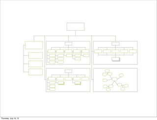
  • 255. SUB-SITES LARGE sites Government Universities Large intranets Site is a series of sub-sites Held together by homepage or top level pages
  • 260. LABELS
  • 261. LABELS The words you use in navigation. Words that describe chunks of content.
  • 263. CALL THINGS ...by the correct name
  • 266. ARE AS CLEAR AS POSSIBLE Avoid “mystery meat” navigation FlatPak Harry Ford BlueBell
  • 267. WHERE TO GET IDEAS FOR LABELS
  • 268. CONTENT Look at the words used in your content.
  • 269. USER RESEARCH Your research will contain hundreds of words that describe how your audience phrase ideas and concepts.
  • 270. CARD SORTING Have people provide a label describing what the group of cards is about.
  • 271. WHAT EVERYONE ELSE DOES Look around at competitors!
  • 272. WORKSHOP # 1 CARD SORTING EXERCISE Divide into three groups. Write one word per card. Skin care Hair care Finance tips Does cutting salt Is fruit juice really For vegetarians increase heart your friend. Could your water attacks? Workout plans bottle be making Recipes Meal plans you fat? Disease risks Breakfast foods, the Workouts Lowering stress good the bad and Ask the experts Nutrition the ugly.. Weight loss Life style Living green
  • 273. WORKSHOP # 1 CARD SORTING EXERCISE Create categories for the words, then group and find appropriate labels.
  • 274. WORKSHOP # 2 CREATE A HIERARCHICAL SITE MAP FOR SITE YOU DID IN CARD SORTING EXERCISE.
  • 276. NAVIGATION Refers to the methods we design that let people move around information. More than a single bar at the top of a page.
  • 277. NAVIGATION CAN ALSO... Let people browse to the content or functionality they need Show the context of the information Show what is related and relevant Help people find information they didn’t know about
  • 278. NAVIGATION INCLUDES: Navigation bars Hyperlinks Buttons Other clickable things
  • 279. TYPES OF NAVIGATION: Global Local Supplementary Utility Contextual
  • 280. GLOBAL Defined as links to a site’s top-level categories Found on every page of the site
  • 282. LOCAL Picks up where global navigation leaves off Found on inner pages - specific site section Gives users tools to move around & accomplish tasks
  • 284. SUPPLEMENTARY Supplements main navigation Sitemaps, site tour videos, search bars, site index
  • 286. UTILITY Things users need on a regular basis About, Contact, Privacy
  • 288. CONTEXTUAL Embedded in the content of the page Hyperlinks
  • 290. TYPES OF NAVIGATION 02: Navigation bars Horizontal or vertical bar Shows the categories – usually 1-2 levels
  • 291. USE HORIZONTAL NAVIGATION IF: you have a small number of top-level items that can fit across the screen you aren’t likely to be adding new top-level items your labels are short enough to fit into the horizontal space you aren’t likely to translate the site into a language that uses long, compound words (which take up more space) you want to maximize the amount of page available for content
  • 292. USE HORIZONTAL NAVIGATION IF: you have more top level groups than would easily fit across a screen you may add or change groups over time some groups may have long labels you may want to translate the website Showcase
  • 293. USE VERTICAL NAVIGATION IF: you have more top level groups than would easily fit across a screen you may add or change groups over time some groups may have long labels you may want to translate the site Showcase
  • 296. TABS Variation of horizontal navigation Always has 2nd level that need to be connected
  • 298. DROP DOWN Allows user to see second level navigation
  • 300. WORKSHOP # 3 CREATE NAVIGATION FOR SITE YOU DID IN CARD SORTING EXERCISE. Landing page A secondary page
  • 302. USER FLOWS Simple diagrams that follow a user down a path of activity Can be storyboards or flow charts Similar to scenarios Storyboard Donald Graham
  • 303. THUMBNAIL SKETCHES Simple sketches that then go into wireframes Small representation of design Scribble lines Use text captions to describe what happens
  • 308. WIREFRAMES First step in design process Design drawings without visual treatment Simple lines, few colors Purpose is to show what will be on a page No graphic design No interaction
  • 309. CREATING WIREFRAMES Easy to draw Straight lines and text Plenty of drawing packages available: Visio Illustrator Keynote MockFlow Balsamiq OmniGroup
  • 310. WHO USES WIREFRAMES? Project team – to discuss different ideas & approaches Content authors – how will their content fit? What pages do they have? Managers – are business needs met? (Where’s my stuff?!) Developers – shows how things need to work, how to implement
  • 314. EXPLANATIONS Better visual approaches so people can easily understand what you’re communicating.
  • 339. EXTRAS: TOOLS & TEMPLATES
  • 340. EIGHTSHAPES UNIFY This is an InDesign-based documentation system. It contains templates, common page layouts and symbol libraries to get you started. Download
  • 341. KONIGI WIREFRAME STENCILS For OmniGraffle, this contains a broad set of components to use in wireframes. Download
  • 342. NICK FINCK’S STENCILS This is similar to the Konigi stencil set, but for Microsoft Visio: Download
  • 343. BALSAMIQ This prototyping tool is currently the most popular, allowing you to create simple sketchy prototypes online. Visit Site
  • 344. AXURE Very established software for creating clickable prototypes: Download
  • 345. MICROSOFT SKETCHFLOW At the far end of the prototyping spectrum is Sketchflow, which lets you create everything from quick sketch-style- prototypes through to quite complex interactive prototypes with re-usable code. Download
  • 346. WORKSHOP # 4 CREATE WIREFRAMES FOR SITE YOU DID IN CARD SORTING EXERCISE. One wireframe for landing page One wireframe for a secondary page
  • 348. PAPER PROTOTYPES Hand drawn images of a site Usually rough, but great for early testing Can make changes while testing Not good for heavy interaction Can get new ideas for links from user Paper Prototyping
  • 349. INTERACTIVE PROTOTYPES Usually HTML or Flash Graphic images with hotspots Can do in Dreamweaver, Powerpoint
  • 351. COMPETITION AS PROTOTYPE See what works and what doesn’t Quick route to get results
  • 353. WHAT IS A PERSONA? Hypothetical “stand-ins” for actual users. Not real people but represent real people. Created from user research - not a set demographics. Represent a segment of your users. Helps build consensus.
  • 354. PERSONAS DESCRIBE: Who this person is How they use the site What interests they have What behaviors they have
  • 355. PERSONAS ELEMENTS: Goals Attitudes Behaviors & Tasks Frustrations & Pain Points Name, photo, demographic info, skill level, environment Narrative (scenario)
  • 356. RESEARCH INVOLVES: Key stakeholders Web analytics Customer support Customer
  • 359. THEY REPRESENT YOUR USERS Websites should be designed to meet the goals & needs of personas.
  • 361. WHAT IS A USE CASE? Description of a user type in a scenario. Gives a context for designing features. Develops scope for the site.
  • 362. A USE CASE Should mirror your site strategy and business goals. Can be like a story or scenario:
  • 363. SCENARIO Emma visits Craig's List homepage, and selects “Chicago” as her location. She does not have anything in particular that she is looking to buy right now. She then browses available categories in the “for sale” area and finds a “toys” category. She sees a posting for a “Groovy Kitchen,” which she thinks would be great for her daughter. She contacts the seller to arrange further details.
  • 364. BENEFITS INCLUDE: Understanding the user helps design for them. Clarifying assumptions - scenarios help the team formalize assumptions. Fully exploring the design - scenarios serve to explore all the important aspects of the design. Provides context - for understanding the features Helping other project tasks - scenarios represent the important tasks.
  • 365. WORKSHOP #5 Please break into three groups. Create 2 personas. Segment people based on behaviors, go.als and needs (2 people can be in different demographic group but have same underlying goals and behaviors) Name, age, interests Internet/Computing profile Personal characteristics Computing/technical likes and dislikes Goals and motivations Quotes Photos Work/Home computing environment Job/profession Frequency of computer use ...and anything else you think is important.
  • 366. WORKSHOP #5 GROUP #1: Site is to provide info for people starting own business; some of them have experience in he business world; others this is their first exposure to issues running a business. GROUP #2: Site is to provide info for people looking to place parents in assisted living. GROUP #3: Site is to provide information about Connecticut; site seeing, lodging, historical information etc...