Play evaluation
•Download as PPT, PDF•
0 likes•145 views
The document describes the process of creating a music magazine cover and contents page. References were made to real magazines like VIBe, NME, and Kerrang to incorporate conventions like provocative poses and prominent images. Gender stereotypes were conformed to by portraying the female model in a sexy way and male model as cool and casual. Techniques like airbrushing, positioning images, and blending text were learned and applied to make the magazine look professional and attract its target young audience.
Report
Share
Related slideshows


Play evaluation
- 1. I used the ‘VIBe’ magazines to help me to produce my front cover music magazine. I adhered to some of the conventions that this real media product used for example: On the Keri Hilson cover, I used the idea of using a different colours for some words. Also, the fact the Keri Hilson and my image are doing the same body language, it’s to show the audience that they’re sexy. Also, the fact that both images are showing a lot of flesh can suggest a provocative pose. This is effective because, it makes the target audience think that they want to look like the artist and be that artist. I also followed some of the forms from the ‘Drake’ VIBe magazine such as: writing some of the artists at the top of the page. Also, the magazine has a tag on the ‘V’ on the VIBe that says ‘new’ and I used that idea to put it on my title. Both of the magazines used the exclusive box on the front covers to show that it should be read. I used that idea, however, I made my fill of the box look contrasting to the existing music magazines.
- 2. I used ‘NME’ AND Kerrang music magazines to help me produce my contents page. I adhered to some of the conventions that this real media product used for example: I made the most important image bigger than the additional images. Also , I filled colours into my subtitles and put a small symbol (play sign) to say its on the cover. Moreover, like ‘NME’ I put a subscription at the bottom of the page, I also did the same with my contents page. I made my contents page different than the real media because of the use of colours. Kerrang and NME used a white background, whereas I used four different colours (black, blue, gold and red) On the list of features located on the right of the page, I used a yellow fill with black writing in the middle of the fill. The gold fill contrasted against the black writing make the words stand out, this makes the layout of the contents page effective. On the NME magazine they did theirs in a similar way, but, the writing is on the side of the fill making the fill having a lot of space. On the Kerrang magazine, the writing that is written in the fill, is very cramped making it seem like the writing has been highlighted instead of being against the fill.
- 3. I used ‘VIBe’ music magazine to help me produce my double page article. I adhered to some of the conventions that this real media product used for example: the image is used on the left side of the double page, and Usher is looking to his left as if he is looking at the article. My image is also doing the same. Also, there’s a subtitle about the singer next to his head. For my double page article, I have a subtitle next to the image’s head as well. Most music magazines conform to gender stereotypes of both female and male R&B singers. Female singers are usually portrayed in a provocative way showing some flesh, as my image is doing so as she is wearing a mini dress. In addition, she is wearing high heels to show sophistication and her stature. Whereas, male singers are seen as being very casual, cool and tough, as the audience can see that Usher is wearing a denim jacket and smoking a cigar to symbolise that he has a lot of power. By conforming to the gender stereotypes, both of the double page spreads successfully pull in their target audience by using clothes, poses and props to give them stature and sophistication.
- 4. The publisher that instantly caught my attention is ‘Time inc’. The publisher works with over 115 magazines including ‘VIBe’ which has a similar genre to my music magazine.. They would be ideal, as they would know how to deal with the conventions and audience that I am targeting to a great extent, meaning a successful distribution of ‘Play’ magazine to be made. Model’s pose- Its provocative , makes the model look sexy. Clothing- Her hat is the only clothing that is visible, the hat is used to make her look cool as well as pretty. Model in contents page is wearing a hat too. High heels gives the model stature. Font- Freehanded aiming at R&B listeners. Jewellery- Model wearing earrings, this makes look subtle as she is not wearing masses of bling. Colour- I used cool colours (mainly primary colours), they’re simple colours but used them effectively. Gender- Appealing to male and female target audience as I used a male on the contents page. Logo- Simple, appeals to young people. Q & A- Cuts down chunks of writing, as young people would not want to read lots of writing.
- 5. The target audience for my media product would be aimed at young people, male and female from the age of 14+. Their hobbies would include listening to music, possibly puzzles and fashion, although that may imply to females. There are many ways that I attracted my target audience such as: the use of colour. The colours I used are limited so the magazine looks simple but effective. Using too many colours can be distracting to the audience. Another example that I used to attract young people is the clothing. The clothing looks cool and sophisticated so then the audience (mainly females) can think that ‘her clothes are amazing’, she looks very pretty, I want to be like her’. Also, I used the type of font to appeal my target audience, like this font, it looks freestyle and relates to R&B. The language used in the magazine, has a bit of slang, ‘What you know bout me’ and some are not really slang, I made the language simple so it appeals to a certain age group. Furthermore, the poses of the models attract the audience because it gives the models more stature which could make the audience think that the model is their idol.
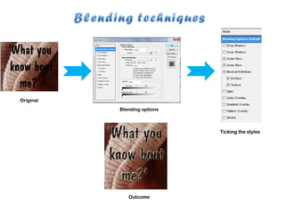
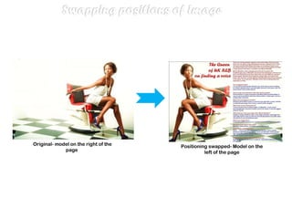
- 6. There are many techniques that I have learnt from the process of constructing my product for example: using blending techniques to the text to make the words stand out to the audience. I also learnt how to airbrush my models, so the models have a smooth look without the unattractive marks on their face. I also learnt to swap positions of the images. Like my double page spread, originally, the model was on the right of the page, but on Photoshop, I swapped the image to make the model on the left of the page. I did this because, I wanted the audience to open the page and see the model first so it stands out so it makes the reader want to read about the model. I also learnt how to edit my interviews by using ‘Adobe Audition’. I used divShare to upload my interviews and change the file from ‘Adobe Audition’ into MP3 file. Making a blog is my first time, I have learnt that I can edit my work even when its been displayed on my blog.
- 7. Original Blending options Ticking the styles Outcome
- 8. Before- Original image After- Airbrushed model
- 9. Original- model on the right of the page Positioning swapped- Model on the left of the page
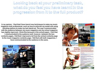
- 10. In my opinion, I feel that I have learnt new techniques to make my music magazine look professional, such as how to airbrush my model and using blending options to make my text stand out. The way I communicated with the audience between my music magazine and my school magazine has slightly improved. I think this because in the school paper, I feel that I communicated to the audience well, however, between the two contents pages, I felt that I improved a lot from the school contents page to the music magazine contents page. I felt that with both magazines, I have communicated to the audience is the same.