Qt
•Download as PPTX, PDF•
0 likes•629 views

This document discusses Pareto charts and how to construct them. It explains that Pareto charts can be used to identify the factors that have the greatest cumulative effect on a system. The steps provided to construct a Pareto chart manually include: 1) Recording raw data and categorizing it, 2) Calculating the frequency of each category, 3) Calculating the percentage and cumulative percentage of each category, and 4) Creating a bar chart with the categories arranged in descending order of frequency from left to right with the percentages shown. Pareto charts are useful for breaking down large problems, prioritizing areas of focus, and making efficient use of limited resources.
Report
Share


Qt
- 1. 1
- 2. TABULATING AND GRAPHING DATA 2
- 3. “Graphical excellence consists of the efficient communication of complex quantitative ideas.” 3
- 4. TABULATION According to Connor, "Tabulation involves the orderly and systematic presentation of numerical data in a form designed to elucidate the problem under consideration.“ 4
- 5. PARETO DIAGRAMS 45 120% 40 100% 35 30 80% Frequency 25 60% Frequency 20 Cumulative % 15 40% 10 20% 5 0 0% No Signature Illegible Current Customer No Address Other 5
- 6. CONTENTS • What Is A Pareto Chart? • Why A Pareto Chart Be Used? • When Should A Pareto Chart Be Used? • How Is A Pareto Chart Constructed? • Steps To Construct A Pareto Chart Manually 6
- 7. PARETO DIAGRAMS WHAT IS A PARETO CHART? The Pareto Chart is named after Vilfredo Pareto, a 19th century economist who postulated that a large share of wealth is owned by a small percentage of the population. 7
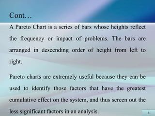
- 8. Cont… A Pareto Chart is a series of bars whose heights reflect the frequency or impact of problems. The bars are arranged in descending order of height from left to right. Pareto charts are extremely useful because they can be used to identify those factors that have the greatest cumulative effect on the system, and thus screen out the less significant factors in an analysis. 8
- 9. WHY A PARETO CHART BE USED? • In most systems, quality related problems are owing to numerous factors, the Pareto Principle which states that 80% of the problems come from 20% of the Causes. • A Pareto Chart breaks a big problem down into smaller pieces, identifies the most significant factors, shows where to focus efforts, and allows better use of limited resources. 9
- 10. WHEN SHOULD A PARETO CHART BE USED? A Pareto Chart is a good tool to use when the process you are investigating produces data that are broken down into categories and you can count the number of times each category occurs. A Pareto diagram puts data in a hierarchical order, which allows the most significant problems to be corrected first. 10
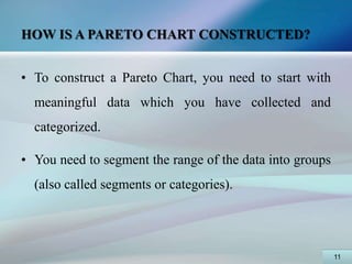
- 11. HOW IS A PARETO CHART CONSTRUCTED? • To construct a Pareto Chart, you need to start with meaningful data which you have collected and categorized. • You need to segment the range of the data into groups (also called segments or categories). 11
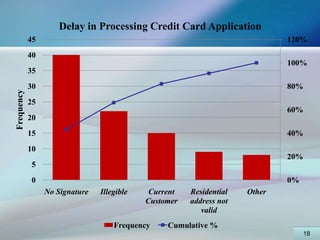
- 12. Cont… For example, if your business was investigating the delay associated with processing credit card applications, you could group the data into the following categories: No signature, Residential address not valid, Non-legible handwriting, Current customer, and Other. You may either construct a Pareto Chart manually or with Excel. 12
- 13. STEPS TO CONSTRUCT A PARETO CHART MANUALLY Record the raw data. List each category (i.e., No signature, Residential address not valid, Non-legible handwriting, Current customer, and Other) and its associated data count (how many times each category occurred) and the place data in descending order. 13
- 14. Delay in Processing Credit Card Application Category Frequency Percentage Cumulative % No Signature Non-legible handwriting Current Customer Residential address not valid Other 14
- 15. Delay in Processing Credit Card Application Category Frequency Percentage Cumulative % No Signature 40 Non-legible 22 handwriting Current Customer 15 Residential address 9 not valid Other 8 94 15
- 16. Delay in Processing Credit Card Application Category Frequency Percentage Cumulative % No Signature 40 43% Non-legible 22 23% handwriting Current Customer 15 16% Residential address 9 10% not valid Other 8 9% 94 100 16
- 17. Delay in Processing Credit Card Application Category Frequency Percentage Cumulative % No Signature 40 43% 43% Non-legible 22 23% 66% handwriting Current Customer 15 16% 82% Residential address 9 10% 91% not valid Other 8 9% 100% 94 100 17
- 18. Delay in Processing Credit Card Application 45 120% 40 100% 35 30 80% Frequency 25 60% 20 15 40% 10 20% 5 0 0% No Signature Illegible Current Residential Other Customer address not valid Frequency Cumulative % 18
- 19. CONCLUSION • No matter how may data are categorized, they can be ranked and made into a Pareto diagram. Sometimes, no single bar is dramatically different from the others, and the Pareto Chart looks flat or gently sloping. • To attack the tall bar in that situation is no help. You need to look for another way to categorize the data. 19
- 20. 20
- 21. • “There remain, however, many other considerations in the design of statistical graphics – not only of efficiency, but also of complexity, structure, density, and even beauty.” 21
- 22. 22