Location via proxy:   [ UP ]  
[Report a bug]   [Manage cookies]                
SlideShare a Scribd company logo
Question 1 - In what ways does your media product use, develop or
challenge forms and conventions of real media products?
Colour
• I designed a front cover, contents page and a double
page spread for a music magazine. The genre for my
music magazine is R&B and Rap. In my research of
existing R&B magazine such as VIBE, I found out that
they all consist of darker colours in comparison to
pop music magazines. To make my magazine seem
much more professional, I also followed this pattern.
I used a gradient background, which fades from black
to dark blue on my front cover. Using blue as my
background, suggests that I am targeting young men,
as the colour blue is stereotypically associated with
males
Image
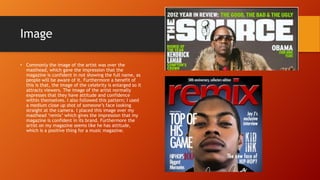
• Commonly the image of the artist was over the
masthead, which gave the impression that the
magazine is confident in not showing the full name, as
people will be aware of it. Furthermore a benefit of
this is that, the image of the celebrity is enlarged so it
attracts viewers. The image of the artist normally
expresses that they have attitude and confidence
within themselves. I also followed this pattern; I used
a medium close up shot of someone’s face looking
straight at the camera. I placed this image over my
masthead ‘remix’ which gives the impression that my
magazine is confident in its brand. Furthermore the
artist on my magazine seems like he has attitude,
which is a positive thing for a music magazine.
General conventions
• General conventions such as the
barcode cover lines, and
straplines were all used on my
front cover to make it seem
more professional. The main
cover line on existing music
magazines were generally the
largest in size compared to the
other cover lines, I also followed
the pattern. My main cover line
was ‘top of his game’ and this
was the largest text on the page
after the masthead.
Colour
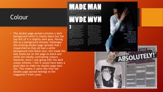
• The double page spread contains a dark
background which is mostly black but the
top left of it is slightly dark grey. Having
this as a background already challenges
the existing double page spreads that I
researched as they all had a white
background with black text; this made the
test stand out on the page as black and
white are totally contrasting colours.
However, since I was going with the dark
colour scheme, I felt it would have been a
good idea to make my double page dark
too. This makes it seem like that the
double page spread belongs to the
magazine’s front cover.
Text
• The text was white so it stood out on the page, and
made it easier to read. By doing this I wanted to
appeal to my target audience which are young
men, they stereotypically will be associated with
darker colours such as black. However, one
convention that I did use was that I included a
quote on my double page spread. By doing this I
wanted to achieve professionalism in my DPS, and I
felt that I did achieve it.
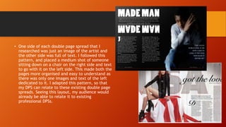
• One side of each double page spread that I
researched was just an image of the artist and
the other side was full of text. I followed this
pattern, and placed a medium shot of someone
sitting down on a chair on the right side and text
to go with it on the left side. This made both the
pages more organised and easy to understand as
there was only one images and text of the left
dedicated to it. I adapted this pattern, so that
my DPS can relate to these existing double page
spreads. Seeing this layout, my audience would
already be able to relate it to existing
professional DPSs.
Image
• The contents pages I researched
consisted of just one image (which was
generally a medium shot) of an artist
looking straight at the camera
expressing their confidence. I took a
medium shot someone standing,
wearing sun glasses. The sunglasses
express his confidence and make him
look cooler which is a positive thing for
my music magazine. I followed this
convention of a content page, as it
would contribute to the professionalism
in my contents page.
Conventions
• I kept same colour scheme with my contents page too. I
made the image of the artist black and white with the
background being black and white too. This can relate
to my front cover and double page spread as they also
consist of darker colours. Not many of the existing
contents pages did this, so I challenged his convention.
By doing this I was hoping to achieve my audience’s
attention by making it unique and not like other
contents pages out there. To make my contents page
seem professional, like existing contents pages I wrote
out the heading of the page and developed it a little
right under it. This gives the reader a little more
information on what is on that particular.

More Related Content

Question 1

  • 1. Question 1 - In what ways does your media product use, develop or challenge forms and conventions of real media products?
  • 2. Colour • I designed a front cover, contents page and a double page spread for a music magazine. The genre for my music magazine is R&B and Rap. In my research of existing R&B magazine such as VIBE, I found out that they all consist of darker colours in comparison to pop music magazines. To make my magazine seem much more professional, I also followed this pattern. I used a gradient background, which fades from black to dark blue on my front cover. Using blue as my background, suggests that I am targeting young men, as the colour blue is stereotypically associated with males
  • 3. Image • Commonly the image of the artist was over the masthead, which gave the impression that the magazine is confident in not showing the full name, as people will be aware of it. Furthermore a benefit of this is that, the image of the celebrity is enlarged so it attracts viewers. The image of the artist normally expresses that they have attitude and confidence within themselves. I also followed this pattern; I used a medium close up shot of someone’s face looking straight at the camera. I placed this image over my masthead ‘remix’ which gives the impression that my magazine is confident in its brand. Furthermore the artist on my magazine seems like he has attitude, which is a positive thing for a music magazine.
  • 4. General conventions • General conventions such as the barcode cover lines, and straplines were all used on my front cover to make it seem more professional. The main cover line on existing music magazines were generally the largest in size compared to the other cover lines, I also followed the pattern. My main cover line was ‘top of his game’ and this was the largest text on the page after the masthead.
  • 5. Colour • The double page spread contains a dark background which is mostly black but the top left of it is slightly dark grey. Having this as a background already challenges the existing double page spreads that I researched as they all had a white background with black text; this made the test stand out on the page as black and white are totally contrasting colours. However, since I was going with the dark colour scheme, I felt it would have been a good idea to make my double page dark too. This makes it seem like that the double page spread belongs to the magazine’s front cover.
  • 6. Text • The text was white so it stood out on the page, and made it easier to read. By doing this I wanted to appeal to my target audience which are young men, they stereotypically will be associated with darker colours such as black. However, one convention that I did use was that I included a quote on my double page spread. By doing this I wanted to achieve professionalism in my DPS, and I felt that I did achieve it.
  • 7. • One side of each double page spread that I researched was just an image of the artist and the other side was full of text. I followed this pattern, and placed a medium shot of someone sitting down on a chair on the right side and text to go with it on the left side. This made both the pages more organised and easy to understand as there was only one images and text of the left dedicated to it. I adapted this pattern, so that my DPS can relate to these existing double page spreads. Seeing this layout, my audience would already be able to relate it to existing professional DPSs.
  • 8. Image • The contents pages I researched consisted of just one image (which was generally a medium shot) of an artist looking straight at the camera expressing their confidence. I took a medium shot someone standing, wearing sun glasses. The sunglasses express his confidence and make him look cooler which is a positive thing for my music magazine. I followed this convention of a content page, as it would contribute to the professionalism in my contents page.
  • 9. Conventions • I kept same colour scheme with my contents page too. I made the image of the artist black and white with the background being black and white too. This can relate to my front cover and double page spread as they also consist of darker colours. Not many of the existing contents pages did this, so I challenged his convention. By doing this I was hoping to achieve my audience’s attention by making it unique and not like other contents pages out there. To make my contents page seem professional, like existing contents pages I wrote out the heading of the page and developed it a little right under it. This gives the reader a little more information on what is on that particular.