


Question 1 - Redo
- 1. My Evaluation for my Hip Hop magazine Charlie Barwick
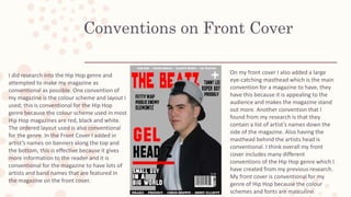
- 2. Conventions on Front Cover I did research into the Hip Hop genre and attempted to make my magazine as conventional as possible. One convention of my magazine is the colour scheme and layout I used; this is conventional for the Hip Hop genre because the colour scheme used in most Hip Hop magazines are red, black and white. The ordered layout used is also conventional for the genre. In the Front Cover I added in artist’s names on banners along the top and the bottom, this is effective because it gives more information to the reader and it is conventional for the magazine to have lots of artists and band names that are featured in the magazine on the front cover. On my front cover I also added a large eye-catching masthead which is the main convention for a magazine to have, they have this because it is appealing to the audience and makes the magazine stand out more. Another convention that I found from my research is that they contain a list of artist’s names down the side of the magazine. Also having the masthead behind the artists head is conventional. I think overall my front cover includes many different conventions of the Hip Hop genre which I have created from my previous research. My front cover is conventional for my genre of Hip Hop because the colour schemes and fonts are masculine.
- 3. Conventions of Contents Page One convention for the Contents Page is the title ‘Contents’. The way I have laid the word out, not all magazines in that genre have the title laid out like this but they do make them stand out more than the rest of the text on the page. The sub-title ‘Features’ is also conventional because on all the of the research I saw on contents page they have these sub- titles separating the contents listing. Another convention of my contents page is the plain background only showing an artist featured in the magazine and also the way I have made the font on the contents listing different sizes to show what the page is actually about and a little description about the page. Also the page numbers being in a different colour is conventional for the genre because it stands out and makes sure the reader see’s exactly what is on each page. This contents page is conventional for the Hip Hop genre because my artist is wearing the stereotypical costumes for my genre, also the red and black colour scheme is conventional because they are often used within the Hip Hop genre.
- 4. Conventions of Double Page Spread One convention of my Double Page Spread is the ‘drop capital’ used at the beginning of the article. This is conventional to not just the Hip Hop genre, or even just magazines but most articles have a drop capital at the start because they catch the reader and without looking to much into detail they can see where the article begins. I have also used a ‘pull-quote’ which is also conventional. Having the artist’s name big and bold at the top of the page is also conventional because the audience can easily tell the content of the page even if they haven’t looked at the contents page. The page numbers on the bottom of the page is different colours are also conventional so they stand out to the reader. This double page spread is conventional because I have used the right photography skills in the picture of my artist because I have taken a close-up which allows the audience to see the facial expression of my artist.
- 5. Comparing conventions of the Front Cover One convention that I used was the colour scheme. Both my magazine and the actual magazine have the same conventional colour scheme of red, black and white. Another convention of the genre is the large masthead and eye catching artist’s name of the image on the cover, these make my magazine conventional and help to make it look like an actual magazine of that genre. I also used a plain background for the front cover which is conventional because they usually do not have a background to make the text and the image of the artist appeal more to the audience of the magazine. By having a close-up picture shot of the artist in the centre of the magazine cover also makes it conventional because this is the main detail the audience look at first on the cover so they make the mage eye-catching and big.
- 6. Comparing conventions of the Contents Page One convention of the genre that is shown in both my page and the actual page of a magazine is ‘The Beatz’ logo added onto this page as well, also including the date of the magazine which is continuous throughout my magazine. I have only included one featured artist on my contents page because even though other genre’s, such as the Rock genre, have a cluttered layout of their contents page the Hip Hop genre don’t. by doing this I have made this artist stand out from the writing and let the audience know she is the main spotlight f the contents page. Also the subheading of the titles of each page are in bold capital letters in order to make the magazine more readable, I have done this because this is a convention of the genre and it makes my magazine more appealing.
- 7. Comparing conventions of the Double Page Spread I have attempted to make my double page spread conventional by; making the image of the artist look as interesting and as conventional for the genre as possible. The image of the artist on this page has a conventional facial expression of the genre; looking like a rapper with a fierce look. I also made the image conventional by the costume I had my artist wear, these types f clothes are often promoted in the Hip Hop genre which then makes the image conventional. One thing I could of made more conventional in this page is having the background all one colour, most double page spreads of this genre don’t contain a background of anything just a plain solid colour.