


Responsive Design
- 2. SARA CANNON Artist, Designer, & WordPress Developer In Birmingham, AL Co-founder / Creative Director Range sara-cannon.com @saracannon
- 3. THE FUTURE OF MOBILE
- 4. THE FUTURE OF MOBILE THE WEB
- 5. IN THE YEAR 2015 2015
- 6. The total number of people using the web on mobile devices is set to surpass desktops by 2015. INTERNATIONAL DATA CORPORATION (IDC) http://www.idc.com/getdoc.jsp?containerId=prUS23028711
- 7. 2007 2009 2011 2013 2015 DESKTOP MOBILE
- 8. 2007 2009 2011 2013 2015 DESKTOP MOBILE
- 10. THE WEB
- 11. WHAT IS THE MOBILE WEB?
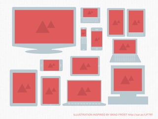
- 12. ILLUSTRATION INSPIRED BY BRAD FROST http://sar.ac/IJF7Rf
- 13. MOBILE SHOULD NEVER BE AN AFTERTHOUGHT
- 15. CONTENT
- 16. WHAT ABOUT SEPARATE MOBILE SITES?
- 17. m.facebook.com
- 18. WHAT ABOUT MOBILE APPS?
- 20. WHAT ABOUT MOBILE THEMES?
- 22. “ Rather than tailoring disconnected designs to each of an ever-increasing number of web devices, we can treat them as facets of the same experience. - ETHAN MARCOTTE alistapart.com/articles/responsive-web-design
- 29. bostonglobe.com
- 30. bostonglobe.com
- 31. bostonglobe.com
- 32. bostonglobe.com
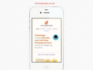
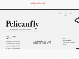
- 33. pelicanfly.co.uk
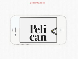
- 34. pelicanfly.co.uk
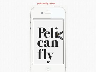
- 35. pelicanfly.co.uk
- 36. pelicanfly.co.uk
- 37. morehazards.com
- 38. morehazards.com
- 39. morehazards.com
- 40. morehazards.com
- 41. foodsense.is
- 42. foodsense.is
- 43. foodsense.is
- 44. foodsense.is
- 45. HOW DO WE BECOME RESPONSIVE?
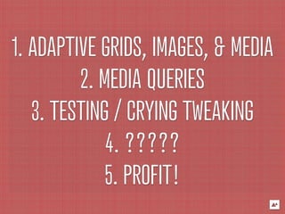
- 46. 1. ADAPTIVE GRIDS, IMAGES, & MEDIA 2. MEDIA QUERIES 3. TESTING / CRYING TWEAKING 4. ????? 5. PROFIT!
- 47. 1. ADAPTIVE GRIDS, IMAGES, & MEDIA
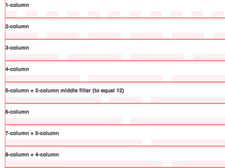
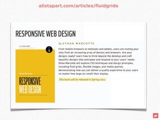
- 48. FLEXIBLE GRIDS alistapart.com/articlesfluidgrids by Ethan Marcotte
- 49. GRID FRAMEWORKS lessframework.com columnal.com
- 50. GRID FRAMEWORKS cssgrid.net getskeleton.com
- 52. %
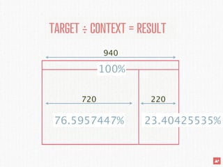
- 55. TARGET ÷ CONTEXT = RESULT 940 720 220
- 56. TARGET ÷ CONTEXT = RESULT 940 100% 720 220 76.5957447% 23.40425535%
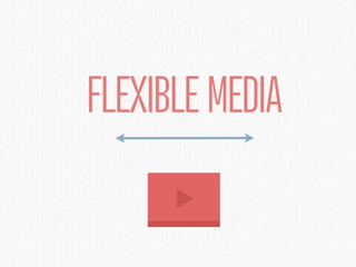
- 59. FLEXIBLE MEDIA
- 61. “ The toughest challenge in implementing the responsive bits was fluid media. - LANCE WILLETT, WORDPRESS.COM
- 62. MEDIA SOLUTIONS netmagazine.com/tutorials/ fitvidjs.com create-fluid-width-videos by Chris Coyier
- 63. MEDIA SOLUTIONS flex.madebymufffin.com fittext.js
- 64. FLEXIBLE IMAGES
- 65. MAX WIDTH: 100%
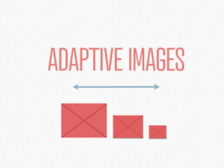
- 67. ADAPTIVE IMAGES
- 68. filamentgroup.com/lab/responsive_images_experimenting _with_context_aware_image_sizing
- 71. 2G IS THE NEW DIAL-UP
- 72. 2007 2009 2011 2013 2015 DESKTOP MOBILE
- 73. THE MOBILE WEB
- 76. image by Geoff Teehan
- 77. EVERYTHING IS A TRADEOFF
- 78. retina.js
- 80. 2. MEDIA QUERIES
- 82. CSS3-MEDIAQUERIES.JS code.google.com/p/css3-mediaqueries-js css3-mediaqueries.js is a JavaScript library to make IE 5+, Firefox 1+ and Safari 2 transparently parse, test and apply CSS3 Media Queries
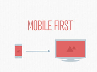
- 83. MOBILE FIRST
- 84. 3. TESTING / CRYING / TWEAKING
- 91. EVERYTHING IS A TRADEOFF
- 92. RESOURCES
- 97. mediaqueri.es
- 98. smashingmagazine.com/2011/07/22/responsive-web-design- techniques-tools-and-design-strategies
- 99. zomigi.com/blog/essential-considerations-for-crafting- quality-media-queries/
- 100. palantir.net/blog/scalable-navigation-patterns- responsive-web-design
- 101. designshack.net/articles/css/sass-and-media-queries- what-you-can-and-cant-do
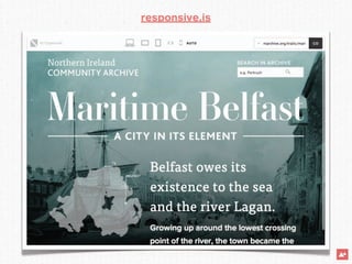
- 102. responsive.is
- 103. ILLUSTRATION INSPIRED BY BRAD FROST http://sar.ac/IJF7Rf
- 104. “ Our work is never over. - DAFT PUNK