Revealing Interfaces
- 1. ling inter faceS... revea (aka. Progress ive Disc u losure 2.0) ction A quick introd http://flickr.com/photos/knowprose/103650244/
- 2. Q. What is a revealing interface? http://www.janchipchase.com/blog/archives/2007/12/hiding_complexi_1.html
- 3. A. An interface that hides complexity until initiated. http://www.janchipchase.com/blog/archives/2007/12/hiding_complexi_1.html
- 4. Revealing Interfaces... » can be initiated with a click or a hover. » lead people to explore the site and uncover “power” features. » can reveal more information without leaving the page. » create a certain joy when exposing just what someone is looking for. » can be used for site navigation or single elements/actions. Amazon.com “Your Lists” interactive element
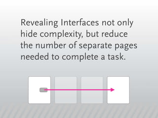
- 5. Revealing Interfaces not only hide complexity, but reduce the number of separate pages needed to complete a task.
- 6. “Hiding complexity through ingenious mechanical doors or tiny display screens is an overt form of deception. If the deceit feels less like malevolence, more like magic, then hidden complexities become more of a treat than a nuisance.” - John Maeda http://lawsofsimplicity.com/
- 7. “Progressive disclosure is the best tool so far: show people the basics first, and once they understand that, allow them to get to the expert features. But don't show everything all at once or you will only confuse people and they will waste endless time messing with features that they don't need yet” - Jakob Nielsen (2000) http://developers.slashdot.org/article.pl?sid=00/03/03/096223&mode=thread
- 8. Revealing Interfaces are similar but not equal to Progressive Disclosure (which has been around for many, many years)
- 9. The main difference is: The main difference is between Progressive Disclosure and a Revealing Interface is that PD is used mostly for step-by-step processes, where RI can be more fluid – it may reveal an action, a list, site navigation, some photos or just more information for a product or area. But the underlining theme: “removing initial complexity” stays the same! Want to know more about Progressive Disclosure? http://www.useit.com/alertbox/progressive-disclosure.html http://www.time-tripper.com/uipatterns/Progressive_Disclosure http://experiencedynamics.blogs.com/site_search_usability/2004/03/progressive_dis.html
- 10. Examples of Re vealing Interfaces
- 11. Target.com
- 16. Yahoo / flickr
- 20. Microsoft
- 24. Google
- 28. Text
- 29. Amazon.com
- 33. Netflix.com
- 36. songza.com
- 40. Apple.com
- 43. tripadvisor.com
- 47. linkedin.com
- 50. More Examples
- 63. So next time you’re creating an interface, conceal complexity and create a simpler experience for your audience.
- 64. Jeremy Johnson Hello! I’m an interaction designer (among other things) living and Designing in the Dallas, TX area. By day I create interfaces, evangelize user experience, paint with pixels, as well as try to create change within my organization. At night I consume video games, movies, TV and other electronic media - while saving a little time to take a photo here and there. Learn More: http://www.jeremyjohnsononline.com/


