Location via proxy:   [ UP ]  
[Report a bug]   [Manage cookies]                
SlideShare a Scribd company logo
Plans and Peer responses
Names-For magazine
I drew up a preliminary list of magazine names, which included:
-Tempo
-Buzz
-Drum and Base
-Tune
I then asked peers both in and outside the class of a similar age and music taste
of my magazine.

The vast majority of peers I asked said they thought Tune was: “much more
suitable for a magazine” and “matches the pop genre better than the others” as
well as sounding “cooler”.
I also think it is better as it can be applicable for much wider bands’ genres and
more appealing with the target audience.
Therefore I have decided that my pop magazine should be called TUNE
Names-For Bands
I again drew up a list of names for the leading band article in the magazine. They
had to sound similar to pop music magazines so would fit in well with the target
audience:
-H&R Connection
-Pillage the city
-Forty Fy
-High Existence
Again I asked my peers which of these names they preferred I got a mixed
response from them where almost all names where equally picked, however less
people liked ‘Pillage the City’ than the others. “High Existence was a somewhat
popular choice and is one I like, my peers said it “sound like a modern pop name”.
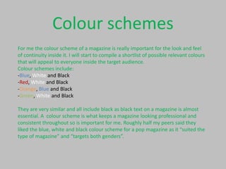
Colour schemes
For me the colour scheme of a magazine is really important for the look and feel
of continuity inside it. I will start to compile a shortlist of possible relevant colours
that will appeal to everyone inside the target audience.
Colour schemes include:
-Blue, White and Black
-Red, White and Black
-Orange, Blue and Black
-Green, White and Black

They are very similar and all include black as black text on a magazine is almost
essential. A colour scheme is what keeps a magazine looking professional and
consistent throughout so is important for me. Roughly half my peers said they
liked the blue, white and black colour scheme for a pop magazine as it “suited the
type of magazine” and “targets both genders”.
Ideas for articles
I also have listed some possible ideas for articles to display on the front cover and
on the contents page these included:
-Exclusive interviews with my new band and John Newman
-Reviews of albums e.g. Rudimental, example etc.
-Puff of free posters
-Exclusive information on bands
-News on concerts and festivals
-New albums and releases
-Up and coming
These articles when in context, may correspond with pictures on my contents
page and front cover. They may have headers and then more text under it to
describe the headline, these headlines will mainly be blue to keep within the
colour scheme whereas the text under will be black on a white background
keeping the look professional.
How this affects my
magazine
These responses from my potential target audience has helped me with the
decisions to take about my magazine. I will call my magazine Tune and keep to a
blue, white and black rough colour scheme to keep it looking professional and
appealing to both genders of the target audience.
My band will be a male duo who will feature on the cover of my magazine in a
medium long shot. They will be called ‘High Existence’ which was a popular name
with the peers I asked.
These peer responses have really helped change my magazine for the best whilst
the other layout decisions I will choose personally and make sure it matches my
ideas of professionalism and appeals to the target audience, although I am
helped by the fact I am in my own target audience bracket.

More Related Content

Some mock up

  • 1. Plans and Peer responses
  • 2. Names-For magazine I drew up a preliminary list of magazine names, which included: -Tempo -Buzz -Drum and Base -Tune I then asked peers both in and outside the class of a similar age and music taste of my magazine. The vast majority of peers I asked said they thought Tune was: “much more suitable for a magazine” and “matches the pop genre better than the others” as well as sounding “cooler”. I also think it is better as it can be applicable for much wider bands’ genres and more appealing with the target audience. Therefore I have decided that my pop magazine should be called TUNE
  • 3. Names-For Bands I again drew up a list of names for the leading band article in the magazine. They had to sound similar to pop music magazines so would fit in well with the target audience: -H&R Connection -Pillage the city -Forty Fy -High Existence Again I asked my peers which of these names they preferred I got a mixed response from them where almost all names where equally picked, however less people liked ‘Pillage the City’ than the others. “High Existence was a somewhat popular choice and is one I like, my peers said it “sound like a modern pop name”.
  • 4. Colour schemes For me the colour scheme of a magazine is really important for the look and feel of continuity inside it. I will start to compile a shortlist of possible relevant colours that will appeal to everyone inside the target audience. Colour schemes include: -Blue, White and Black -Red, White and Black -Orange, Blue and Black -Green, White and Black They are very similar and all include black as black text on a magazine is almost essential. A colour scheme is what keeps a magazine looking professional and consistent throughout so is important for me. Roughly half my peers said they liked the blue, white and black colour scheme for a pop magazine as it “suited the type of magazine” and “targets both genders”.
  • 5. Ideas for articles I also have listed some possible ideas for articles to display on the front cover and on the contents page these included: -Exclusive interviews with my new band and John Newman -Reviews of albums e.g. Rudimental, example etc. -Puff of free posters -Exclusive information on bands -News on concerts and festivals -New albums and releases -Up and coming These articles when in context, may correspond with pictures on my contents page and front cover. They may have headers and then more text under it to describe the headline, these headlines will mainly be blue to keep within the colour scheme whereas the text under will be black on a white background keeping the look professional.
  • 6. How this affects my magazine These responses from my potential target audience has helped me with the decisions to take about my magazine. I will call my magazine Tune and keep to a blue, white and black rough colour scheme to keep it looking professional and appealing to both genders of the target audience. My band will be a male duo who will feature on the cover of my magazine in a medium long shot. They will be called ‘High Existence’ which was a popular name with the peers I asked. These peer responses have really helped change my magazine for the best whilst the other layout decisions I will choose personally and make sure it matches my ideas of professionalism and appeals to the target audience, although I am helped by the fact I am in my own target audience bracket.