Tampa Bay UX - Scary UI 2
- 1. SCARY UI 2 AHH!!! NO! Anything but that!! KEEP AWAY!!! MORE CHILLING UX TALES FROM AROUND THE INTERWEBS
- 2. AND….GO! 2
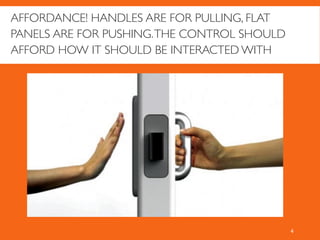
- 4. 4 AFFORDANCE! HANDLES ARE FOR PULLING, FLAT PANELS ARE FOR PUSHING.THE CONTROL SHOULD AFFORD HOW IT SHOULD BE INTERACTED WITH
- 5. UH, DO WHAT NOW?! PLEASE DON’T MAKE ME USE THIS! 5
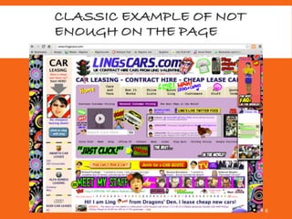
- 6. CLASSIC EXAMPLE OF NOT ENOUGH ON THE PAGE 6
- 7. SCARY MOBILE UI Many images from a blog post by Theresa Neil - https://theresaneil.wordpress.com/2011/08/22/bad-mobile-apps-ui-design-gone-wrong/ 7 The screen is small.Your fingers are big.You are constantly distracted. Its quite easy to provide UI that is extremely scary (and unusable)
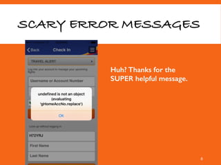
- 8. SCARY ERROR MESSAGES 8 Huh? Thanks for the SUPER helpful message.
- 9. AIRPORT WIFI LOGINS. LOTS OF TEXT AND SMALL LINKS! YAY! 9
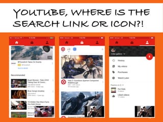
- 10. YOUTUBE, WHERE IS THE SEARCH LINK OR ICON?! 10
- 11. OH. I HAD TO RE-DOWNLOAD THE APP TO GET IT. 11
- 12. INTERACTION SHOULD MATCH BEHAVIOR! 12 Typical swipe left gesture on a list is the card (or list item) moves left to reveal options underneath it. Here, Google broke that and on left swipe has a little button appear. It feels very awkward.
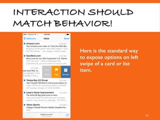
- 13. INTERACTION SHOULD MATCH BEHAVIOR! 13 Here is the standard way to expose options on left swipe of a card or list item.
- 14. YOWZA! 14 I think my icon library threw up on the screen.
- 15. UHH…{SHRUG} NEXT APP! 15 Don’t make me think. please. If a user wants to solve puzzles, they will get a puzzle app. * See Steve Krug’s book
- 16. ALL THE OPTIONS! 16 Why group things? A long list is fine.
- 17. 1. COMIC SANS FTW. 2. SEE LUKEW FOR FORM DESIGN 17
- 18. DON’T ALWAYS COPY APPLE. CONTEXT IS VERY IMPORTANT 18 Google introduced, for just one day, a totally crazy Apple OS X style dock above the search bar. Ugly icons, architectural mess, lack of connection to any use case. Dropped in less than 24 hours.
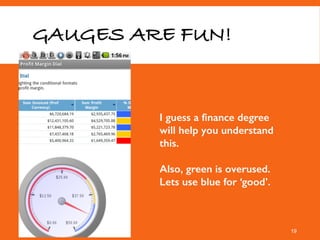
- 19. GAUGES ARE FUN! 19 I guess a finance degree will help you understand this. Also, green is overused. Lets use blue for ‘good’.
- 20. MOTIONX SICKNESS 20 ooh, it reminds me of the old iPod! Standard controls decrease cognitive load and allow for faster task time.
- 21. EXEC SAID HE WANTED BAR CHARTS… 21
- 22. AHH, SPACE FOR THE EYE TO REST… 22 And time for the brain to sit and wonder what to do next. If the point of this view is to log in, where is the form?? why a big blank sky??
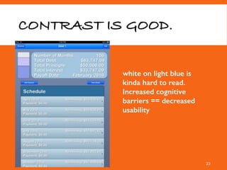
- 23. CONTRAST IS GOOD. 23 white on light blue is kinda hard to read. Increased cognitive barriers == decreased usability
- 24. A BIT OVERDESIGNED 24 skeuomorphism at its finest. or worst. On/off switches need figuring out. do they relate to the lights next to them?
- 25. FLAG ON THE PLAY! BACKGROUND IMAGE INTERFERENCE. 25
- 26. WHAT ARE THOSE ICONS? 26 do they need to be shown on every row?
- 27. SMALL, MEDIUM, LARGE ARE DETAILS? 27 Sometimes you need details vs subjective relative labels.
- 28. SCARY MOBILE UI Many of the app images from a blog post by Theresa Neil - https://theresaneil.wordpress.com/2011/08/22/bad-mobile-apps-ui-design-gone-wrong/ 28 The screen is small.Your fingers are big.You are busy and distracted. Spend EXTRA time on usability research and testing
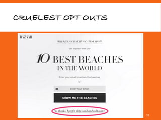
- 29. CRUELEST OPT OUTS 29 Why make your user feel good when you can shame them into behaving how you want?!
- 35. 10 WORST DESIGN FAILURES OF ALL TIME http://studio.uxpin.com/blog/10-worst-design-failures-of-all-times/ 35
- 36. BEWARE OF GOBLINS IN PRINCESS DRESSES 36
- 38. 38 “Hey! That looks cool!” Be cautious about following a trend.
- 39. 39 “Hey! That looks cool!” Be cautious about following a trend. Favourite Website Awards gomacro.com
- 40. 40 “Hey! That looks cool!” Be cautious about following a trend. 5 seconds: Wow! I love the colors here and this background! 10 seconds: Woah - this slider is moving away to fast - I can’t read it. 40 seconds: This navigation makes no sense. It is color coded but I am looking for a coconut bar and thought that would be under the brown tab - I had to check each tab and found it under the blue tab. 90 seconds: When I put the bar in the cart it takes me to the general shopping page so I have to locate the bar all over again. ARGH! This isn’t worth it….
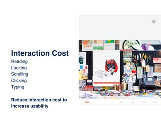
- 41. 41 Interaction Cost Reading Looking Scrolling Clicking Typing Reduce interaction cost to increase usability
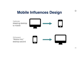
- 42. 42 Mobile’s Influence on Design.
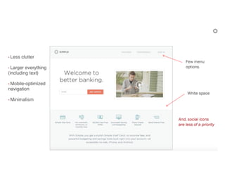
- 44. 44 • Less clutter • Larger everything (including text) • Mobile-optimized navigation • Minimalism
- 45. 45 BIG Hero.
- 46. BIG Hero Don’t forget to welcome your visitors and tell them who you are
- 47. BIG Hero Don’t forget to welcome your visitors and tell them who you are “There is a pretty girl so….is it a fashion website?”
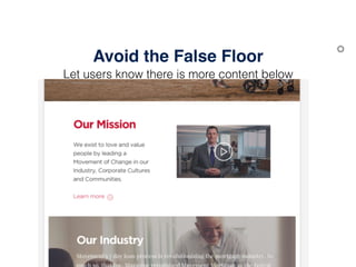
- 48. Avoid the False Floor Let users know there is more content below
- 49. Avoid the False Floor Let users know there is more content below
- 50. Avoid the False Floor Let users know there is more content below
- 51. Avoid the False Floor Let users know there is more content below
- 52. Avoid the False Floor Let users know there is more content below
- 53. Avoid the False Floor Let users know there is more content below
- 54. Avoid the False Floor Let users know there is more content below
- 63. 63 Polygons, Angles & Circles.
- 64. Polygons are HOT! Use them regularly
- 65. Polygons are HOT! Use them regularly
- 66. Polygons are HOT! Use them regularly
- 67. Use Angles to break the false floor Irregular angles and shallow angles cause motion sickness
- 68. Use Angles to break the false floor Irregular angles and shallow angles cause motion sickness
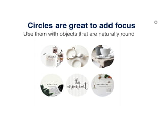
- 69. Circles are great to add focus Use them with objects that are naturally round
- 70. Circles are great to add focus Use them with objects that are naturally round
- 71. Circles are great to add focus Use them with objects that are naturally round
- 72. 72 Ghost Buttons
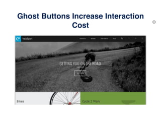
- 73. Ghost Buttons Increase Interaction Cost
- 74. Ghost Buttons Increase Interaction Cost
- 75. Ghost Buttons Increase Interaction Cost
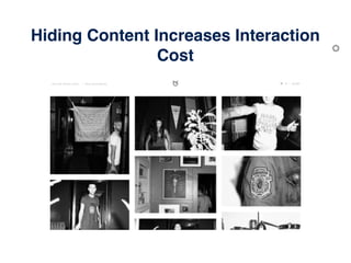
- 77. Hiding Content Increases Interaction Cost
- 78. Hiding Content Increases Interaction Cost
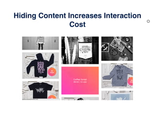
- 79. Hiding Content Increases Interaction Cost
- 80. Hiding Content Increases Interaction Cost
- 81. Hiding Content Increases Interaction Cost
- 82. Hiding Content Increases Interaction Cost
- 83. 83 Navigation.
- 84. Navigation Solution One trend to avoid — the hamburger menu
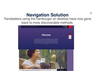
- 85. Navigation Solution Trendsetters using the hamburger on desktop have now gone back to more discoverable methods.
- 86. Navigation Solution Trendsetters using the hamburger on desktop have now gone back to more discoverable methods.
- 87. Navigation Solution Trendsetters using the hamburger on desktop have now gone back to more discoverable methods.
- 88. Navigation Solution Trendsetters using the hamburger on desktop have now gone back to more discoverable methods.
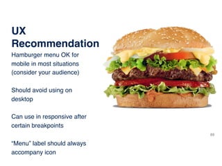
- 89. 89 UX Recommendation Hamburger menu OK for mobile in most situations (consider your audience) Should avoid using on desktop Can use in responsive after certain breakpoints “Menu” label should always accompany icon
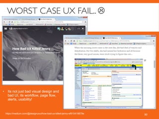
- 90. WORST CASE UX FAIL.. ☹ 90https://medium.com/@designuxui/how-bad-ux-killed-jenny-ef915419879e • Its not just bad visual design and bad UI, its workflow, page flow, alerts, usability!
- 91. EMPLOYEES ARE PEOPLE TOO! 91
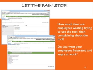
- 92. LET THE PAIN STOP! 92 How much time are employees wasting trying to use the tool, then complaining about the tool? Do you want your employees frustrated and angry at work?
- 93. THEN AND NOW How has design changed since the beginning of the web? 93
- 94. AMAZON, THEN AND NOW 94
- 95. YAHOO, THEN(1994) AND NOW 95
- 96. APPLE, THEN(1997) AND NOW 96
- 97. TWITTER, THEN AND NOW 97 • Simpler design • Clearer calls to action • Visual to show the product in action • Better logo ;)
- 98. 98
- 100. 100 SOME UX REFERENCES (CONT) http://developer.android.com/design/get-started/creative- vision.html https://developer.yahoo.com/ypatterns/ http://www.userfocus.co.uk/index.html http://www.usertesting.com/ http://rosenfeldmedia.com/
- 102. SILENCE THE SCREAMS. DON’T LET SCARY UI HAPPEN TO YOUR USERS! Happy Halloween!
- 103. IMAGES FROM SCARY UI 1!
- 104. FOR THIS FIRST USER TEST… DON’T CRASH THE PLANE. 104
- 105. ALLTHE FEATURES AND SETTINGS!! 105
- 106. CLICK WHATTO WHAT NOW? 106 If your buttons need instructions, relabel your buttons. (even if it means custom code)
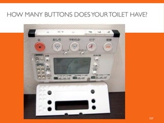
- 107. HOW MANY BUTTONS DOESYOURTOILET HAVE? 107
- 108. COMPARISONTABLE – NOT SO GOOD 108 • Too much text. • No clear column headers • Contrast between alt row bg color and copy not high enough. • Full borders add clutter • Overall: blah http://www.regions.com/personal_banking/savings_cds.rf
- 109. COMPARISONTABLE – MUCH BETTER 109 • Clear column headers • Clear y axis labels • High contrast on all rows between copy and bg color • Clearly delineated sections • Easy to scan http://www.firehost.com/compare
- 110. LOOKS GOOD, BUT IMAGERYTOO BIG! 110 • Clearly designed for large monitors • The main task users have is to search for flights, and that form is hidden. http://www.southwest.com
- 111. “PARALLAX” (NOTTHE GREEN LANTERNVILLAIN) 111 • Numbered navigation? • CTA to ‘Scroll down’ instead of “next” or “continue” ? • Navigation is clickable and has flyouts? • How do you visually know there is more content? Section padding is HUGE • Scroll Down CTAs jump around so you have to keep moving your mouse left and right. Keep them centered Visually okay, but… https://www.verizon.com/foryourhome/myaccount/ngen/upr/splash/myvzlearn.aspx
- 112. BETTER PARALLAX 112 • Clear that there is more content down below • ‘more content’ CTA (v) is centered and pointing to more content • More true parallax since background imagery scrolls at different speeds https://www.spotify.com/us/
- 113. GREAT PARALLAX 113 • Clear that there is more content down below • ‘more content’ CTA _v_ is centered and pointing to more content • More true parallax since background imagery scrolls at different speeds • Navigation/progress indicator on side shows you where you are and lets you click to jump navigate http://discover.store.sony.com/be-moved/
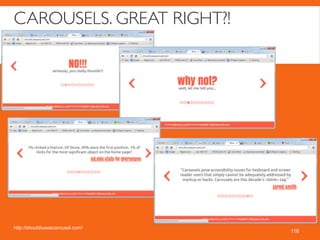
- 114. SCARY PARALLAX! (THE GREEN LANTERNVILLAIN) 114
- 115. NICE DESIGN (HADTO SHOW APPLE. NOT PARALLAX PER SE) 115 http://www.apple.com/iphone-6/
- 117. HOVER NAV. CONTROLYOUR FLYOUTS! 117http://www.carmax.com/ • onMouseover = BAD. Instant and annoying
- 118. HOVER NAV. MORE CONTROL OVERYOUR FLYOUTS 118http://www.ally.com/ • onHoverIntent! Quick mouseover does not trigger the flyout. Only show flyouts if user actually intends to stop their mouse and wait for a navigation dropdown. NOT annoying! http://cherne.net/brian/resources/jquery.hoverIntent.html
- 119. HUMOR BREAK! 119
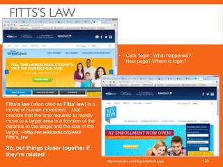
- 120. FITTS’S LAW 120http://www.flvs.net/Pages/default.aspx • Click ‘login’. What happened? New page? Where is login? Fitts's law (often cited as Fitts' law) is a model of human movement …that predicts that the time required to rapidly move to a target area is a function of the distance to the target and the size of the target. --http://en.wikipedia.org/wiki/ Fitts's_law So, put things closer together if they’re related!
- 121. PUTTHE DESIREDTHING NEAR WHERE USER HASTO CLICK/TAP 121
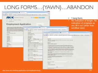
- 122. LONG FORMS…{YAWN}…ABANDON 122 • 1 long form. • No indication of length. No indication of progress as you fill it out (other than scrollbar size) http://www.rkk.com/long-application-form/application/long
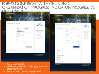
- 123. FORMS DONE RIGHT WITH CHUNKING, ORGANIZATION, PROGRESS INDICATOR, PROGRESSIVE DISCLOSURE 123 • Progress indicator • You know generally how long (how many steps there are) • Sections are chunked appropriately
- 124. SCHOOL WEBSITES ARE NOTORIOUSLY BAD (NO FUNDING) 124
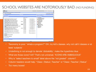
- 125. SCHOOL WEBSITES ARE NOTORIOUSLY BAD (NO FUNDING) 125 • Taxonomy is poor: “whats a program?” OH, my kid’s classes. why not call it classes or at least ‘subjects’ • Underlining is not enough to denote ‘clickability’, make the hyperlinks blue • What are those icons? AA? That’s not universal. “ICONS ARE AMBIGUOUS” • Why is “select teachers to email” label above the “not graded” column? • Column headers would help: “Class | Status | Teacher” or “Class | Teacher | Status” • Too many boxes!
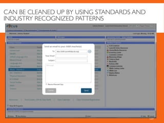
- 127. DON’T DESTROYYOUR LAYOUT! 127 • The pattern for emailing teachers is SO poor here. The form shows up in the content and smashes the list view left ,making it illegible. • When you click checkboxes next to email addresses, there is no feedback to user that your email will actually go to those people (UI needs feedback when user interacts!) I am not confident as a user, the system is working right. • Is there even a strong use case for emailing multiple teachers at a time?
- 128. CAN BE CLEANED UP BY USING STANDARDS AND INDUSTRY RECOGNIZED PATTERNS 128
- 129. CAN BE CLEANED UP BY USING STANDARDS AND INDUSTRY RECOGNIZED PATTERNS 129


