Location via proxy:   [ UP ]  
[Report a bug]   [Manage cookies]                
SlideShare a Scribd company logo

1

Task Two – Detailed Analysis of Music Magazine
I have decided to research the Hip Hop genre.
Front Cover
Typography
The font styles used across the magazine cover are Serif.
The magazine did this because Serif is bold and appeals
to the eye, which is why this is an effective font for a Hip
Hop magazine. The blood masthead attracts the
audience because it is bigger than the rest of the text
and the fact is it white makes it stand out more and
makes it the first place for the audience to look. They
chose to write ‘Kid Ink’ in a different bold large font to
also make the audience look at this first, which would
lead to their possibly being a bigger audience because it
would attract in fans before knowing what the magazine
is about. The Hip Hop genre needs the typography to be
bold and sharp; they achieved this by using Serif font instead of Sans-serif. The typography
is conventional for a Hip Hop magazine aimed at teenagers of both genders because it is
bold and ‘street’. The whole text is capitalised giving it an enthusiastic vibe.
Colour
The main colours used in this magazine cover and red, white and black. These colours give
the sort of street look which is effective for the audience. Red connotes danger; this is
effective to the Hip Hop genre because of the vulgarity of the language. The white stands
out against the red which would attract the fans of the BME magazine. Even the ‘April Issue’
is written in the colour scheme of red and black which includes it into the magazine more.
The colours used are conventional because red is mainly and vulgar colour for the Hip Hop
genre. For example the ‘XXL’ Hip hop magazine has the main colour scheme on red.
Image
The image used appeals to the target audience because it is of a celebrity with tattoos and
the fashion style that attracts the audience and encourages them to have their own fashion
identity. The magazine intended to attract. The artist featured is Kid Ink; having him on the
front cover is effective because he is an influencing artist for the target audience of
teenagers; having only one artist on the front also make sit effective because it shows the
magazine is mainly focused on him and it could attract a bigger audience by having a bigger
picture of just the one artist. The images are conventional for this genre of magazine
because the music artist on the front cover performs Hip Hop music which would attract the
readers eye is they are interested in that genre of music.

2

Layout
This magazine does not contain much text and
only has one picture of one artist which helps
makes the magazine look very ordered. The
magazine hasn’t followed the route of the eye
that most magazines decided is effective to
follow, this makes the layout more interesting
because even though the route of the eye has
not been used it still manages to attract the
audience. The masthead is in a very conventional
place because it is big and bold and the top of the
magazine which is usually where the audience
would look first because they want to know what
magazine it is and normally magazines put it
there because it is effective.
Mode ofAddress
The language of this magazine is very laidback and understandable; there are not many
words on the front cover which attracts the audience to read all of the text before they buy
it. There isn’t any particular text that would especially attract the audience, such as a
question. The mode of address is formal except ‘I GOTTA’ GET MINE’ but the only reason
this is the only informal piece of text is because it is the name of the song. This being the
only informal text on the front cover makes it stand out and attract the audience’s eye. It is
conventional for a Hip Hop genre magazine because they usually do not contain a lot of text
on the front cover they mainly include all of the information inside the magazine to make
the front cover look more appealing; also it is the language that appeals to the young target
audience.
Conventions
The magazine front cover is not as conventional as any other magazine would be, this is
because magazines are usually crowed on the front cover of other bands or artists in that
genre and they usually have more information that the magazine contains on the front
cover. This magazine is different because it is a personal magazine, some other magazines
do this such as ‘Fabulous’ which sometimes release magazines on just one artist. The other
magazines that are like this also do not contain as much text as others. This magazine could
be classed as conventional for some types of magazines because there are magazines that
do this, they do this because they want one artist to appeal to the audience. The front cover
relates to the to the music genre Hip Hop because Hip Hop music is vulgar and popular. A
key convention for this front cover is the colour scheme used. The colours on this magazine
are conventional because the colours used are usually on Hip Hop magazines.

3

Contents Page
Typography
Most of the fonts on this front cover are Serif
fonts except the two subtitles ‘Features’ and
‘Fashion’. They have the main text Serif because
Serif font is the conventional font for a Hip Hop
magazine. The ‘Contents’ really stands out
because it is bigger than the other text and much
bolder and sharper. Having the two subtitles in
Sans Serif font makes that also appeal to the
audience’s eye because it is different from the
rest. The contents is kept in the theme of the
front cover with the Serif font, this makes it more
appealing because if it was too different it would
look cluttered. The fonts relate to the target
audience because they want to attract teenagers,
and the bright fonts stand out and encourage the audience to read it. It connotes youth
because of the way ‘Contents’ is written making it seem very unprofessional.
Colour
The colours on the inside contents page are a conventional colour scheme of red, white and
black for the genre. The white is kept in most of the text on the contents page including the
title of the page and the actual contents list of the magazine. They use white for the
important parts because it is a basic colour for the magazine because the target audience
are both genders. The colours for the contents page follow the colours of the front cover
too, this is effective because they are the colours for that genre which makes the magazine
more appealing because the colour scheme is carried on throughout the magazine.
Image
The contents page again uses only one picture of an artist. This encourages the audience to
appreciate the ordered layout during the magazine, but also shows that it contains more
information than the front cover. The image used is again a celebrity associated with Hip
Hop music and fashion, this appeals to the target audience because it makes the magazine
seem more interesting when they see images of celebrities they may have an interest in
within that genre. The shot type for the image is a mid-shot in order to give the audience
more of perspective as to what the celebrity looks like. The element of the celebrity not
having a top on could be an influence to attract the target audience especially as the
audience is young teenagers so someone could be more encouraged to buy it if they see a
celebrity they like. The images are conventional for this genre of music magazine because
the artist featured is linked to the genre and the way the celebrity looks is also a main
importance to the readers.

4

Layout
The layout of the contents page is ordered;
however it is slightly more cluttered than the
front cover because it contains more
information. The way they have put all of the
information down one side or in the corners
helps it look less cluttered because it artist image
is still large to attract the audience. Regardless of
the magazine not really following the principle of
thirds the artist mainly is still in the middle of the
front cover and the text is also at the sides. The
route of the eye would still focus on the middle
square which is effective because the middle
square contains the section that would appeal to
the audience most. With the ‘Contents’ being so
big across the page it makes the magazine seem
exciting, this would encourage the target
audience to be more interested in the actual contents of the magazine.
Mode ofAddress
The language used for the headings are laidback and approachable, this helps because of
the audience they are trying to attract. One of the subtitles is ‘Fashion’ this word itself
would appeal to the target audience because that is a big piece of a teenagers interests that
would automatically catch the reader’s eye. Also underneath the subtitle of Fashion it says
‘To dress to impress’, this is effective because it could give out that the magazine could be
giving fashion style sense and help to people which would similarly appeal to the target
audience. The language used is quite informal, for example one of the headlines says’ Nice
and naughty’. Those choices of words are upbeat and fresh so would only appeal to a
certain target audience which is the target audience they are trying to reach out too.
Conventions
The magazine contents page is conventional for a Hip Hop genre magazine because typically
they would only have one artist on their contents page and not much information but it isn’t
conventional for any other genre because usually their contents pages are packed with
different celebrities and full of information on what’s inside the magazine. The contents
page is conventional for the colour scheme of the Hip Hop genre because it mainly contains
red and the wording is written in white and black. The image used is conventional for the
genre because it is a celebrity that is involved with Hip Hop; the way the artist is perceived is
also conventional because they are showed to be wearing nothing but lots of chains which is
conventional for that genre and is showing a fashion statement.

5

Double Page Spread
Typography
The main fonts on this are Sans
Serif; this is interesting because it
isn’t conventional for that genre
to have that font. The only text on
the page that is written in a Serif
font is the caption of the image
used. The main text of the story in
the magazine is using ‘dropped
capitals’ at the start of the paragraphs, this is effective because they stand out more to the
audience and it seems to break up the paragraphs to make them look more appealing to the
reader. The red ‘J’ in this middle is effective because it appeals to the eye making them
possibly look at the article and see that they want to read it.
Colour
The colours on the double page spread are the same colours as the front page and the
contents page; this is because this is an effective colour scheme for the genre. Even though
the background on the left page is red there isn’t a lot of colour included but they have still
made sure on the right page there is still red in it even though the background is white and
the writing is conventionally black. The magazine is called ‘Q’ and the logo in red which is
effective because it also matches the colour scheme of the genre. On the left page only the
left side of the background is red; this is effective because in the bottom right corner the
text is in red so they are opposite, if the whole background was red there would be too
much red.
Image
The image used is another celebrity that is included in the Hip Hop genre; this image being
there is effective because even though it says ‘Jay-Z’ the audience would be attracted to the
image than the writing so if fans of this celebrity see the image they will read the article. The
image also gives out a different fashion statement but still appealing the same target
audience, the celebrity is wearing a black t-shirt with black sunglasses; this is an effective
image because it makes him stand out more because of the glasses and it makes him seem
more mischievous. The image used is a mid-shot; this is effective because it shows more of
the artist and makes the article seem like it will be more in-depth on the artist.

6

Layout
The layout of the double page
spread is also quite a simple,
ordered layout matching the front
cover and the contents page. On
the left page is an image of the
artist from the Hip Hop genre, the
caption of the picture, ‘RapRadar’
which is the name of a blog and a
pull quote by the artist featured.
On the right page is an article
written about the artist on the left and the headline of the article. The route of the eye or
the rule of thirds has not been used which shows that the magazine is not very
conventional; even though the magazine isn’t conventional on this page the layout still
appeals to the target audience because the way they have set it by having 50/50 text and
image makes it interesting. The red ‘J’ in this middle of the article makes the audiences eye
automatically look towards the article.
Mode ofAddress
The language used in this double page spread is fairly formal language; this is effective
because even though the magazines target audience is teenagers who are normally paying
attention to the use of informal language, the article is written formally because it wouldn’t
be appealing to anybody if it was written in informal language. The words that have been
chosen in the article are not words that teenagers would usually use but they would still
know what they mean when they read the article; these words being chosen are effective
because they make the article seemmore interesting and well written. The language used
are not just going to appeal to their target audience but maybe other readers too, it
wouldn’t just be the teenager audience who would be willing to read this article. By using
those words they are ranging out their target audience; this is effective because if the article
was informal ‘teenager’ language any other audience would not want to read it.
Conventions
The magazines double page spread has a conventional colour scheme and image for the
genre. The content of the double page spread is quite conventional because usually a
double page spread will be focused on one celebrity with an article wrote about them. The
colour scheme used is conventional for the genre; even though this page doesn’t include as
much colour as the front page and the contents page they have still included all the main
colours, red white and black, into the page making it more effective. This makes it more
effective because the magazine looks more appealing to the audience if there is a constant
colour scheme the whole way throughout the magazine. The ‘dropped capitals’ are
conventional because magazines use this to make the pages look more appealing; the

7

dropped capitals are effective because they would automatically attract the readers eye and
the audience would look at the capital to figure out the rest of the word.

More Related Content

Task 2

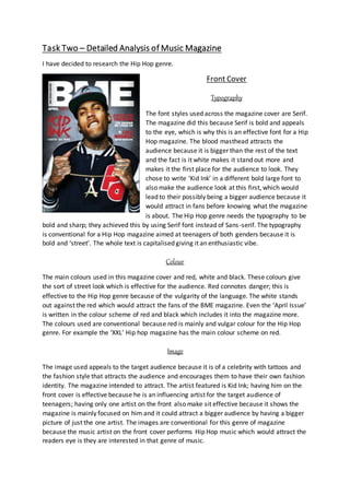
  • 1. Task Two – Detailed Analysis of Music Magazine I have decided to research the Hip Hop genre. Front Cover Typography The font styles used across the magazine cover are Serif. The magazine did this because Serif is bold and appeals to the eye, which is why this is an effective font for a Hip Hop magazine. The blood masthead attracts the audience because it is bigger than the rest of the text and the fact is it white makes it stand out more and makes it the first place for the audience to look. They chose to write ‘Kid Ink’ in a different bold large font to also make the audience look at this first, which would lead to their possibly being a bigger audience because it would attract in fans before knowing what the magazine is about. The Hip Hop genre needs the typography to be bold and sharp; they achieved this by using Serif font instead of Sans-serif. The typography is conventional for a Hip Hop magazine aimed at teenagers of both genders because it is bold and ‘street’. The whole text is capitalised giving it an enthusiastic vibe. Colour The main colours used in this magazine cover and red, white and black. These colours give the sort of street look which is effective for the audience. Red connotes danger; this is effective to the Hip Hop genre because of the vulgarity of the language. The white stands out against the red which would attract the fans of the BME magazine. Even the ‘April Issue’ is written in the colour scheme of red and black which includes it into the magazine more. The colours used are conventional because red is mainly and vulgar colour for the Hip Hop genre. For example the ‘XXL’ Hip hop magazine has the main colour scheme on red. Image The image used appeals to the target audience because it is of a celebrity with tattoos and the fashion style that attracts the audience and encourages them to have their own fashion identity. The magazine intended to attract. The artist featured is Kid Ink; having him on the front cover is effective because he is an influencing artist for the target audience of teenagers; having only one artist on the front also make sit effective because it shows the magazine is mainly focused on him and it could attract a bigger audience by having a bigger picture of just the one artist. The images are conventional for this genre of magazine because the music artist on the front cover performs Hip Hop music which would attract the readers eye is they are interested in that genre of music.
  • 2. Layout This magazine does not contain much text and only has one picture of one artist which helps makes the magazine look very ordered. The magazine hasn’t followed the route of the eye that most magazines decided is effective to follow, this makes the layout more interesting because even though the route of the eye has not been used it still manages to attract the audience. The masthead is in a very conventional place because it is big and bold and the top of the magazine which is usually where the audience would look first because they want to know what magazine it is and normally magazines put it there because it is effective. Mode ofAddress The language of this magazine is very laidback and understandable; there are not many words on the front cover which attracts the audience to read all of the text before they buy it. There isn’t any particular text that would especially attract the audience, such as a question. The mode of address is formal except ‘I GOTTA’ GET MINE’ but the only reason this is the only informal piece of text is because it is the name of the song. This being the only informal text on the front cover makes it stand out and attract the audience’s eye. It is conventional for a Hip Hop genre magazine because they usually do not contain a lot of text on the front cover they mainly include all of the information inside the magazine to make the front cover look more appealing; also it is the language that appeals to the young target audience. Conventions The magazine front cover is not as conventional as any other magazine would be, this is because magazines are usually crowed on the front cover of other bands or artists in that genre and they usually have more information that the magazine contains on the front cover. This magazine is different because it is a personal magazine, some other magazines do this such as ‘Fabulous’ which sometimes release magazines on just one artist. The other magazines that are like this also do not contain as much text as others. This magazine could be classed as conventional for some types of magazines because there are magazines that do this, they do this because they want one artist to appeal to the audience. The front cover relates to the to the music genre Hip Hop because Hip Hop music is vulgar and popular. A key convention for this front cover is the colour scheme used. The colours on this magazine are conventional because the colours used are usually on Hip Hop magazines.
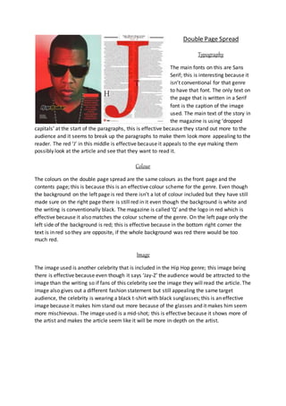
  • 3. Contents Page Typography Most of the fonts on this front cover are Serif fonts except the two subtitles ‘Features’ and ‘Fashion’. They have the main text Serif because Serif font is the conventional font for a Hip Hop magazine. The ‘Contents’ really stands out because it is bigger than the other text and much bolder and sharper. Having the two subtitles in Sans Serif font makes that also appeal to the audience’s eye because it is different from the rest. The contents is kept in the theme of the front cover with the Serif font, this makes it more appealing because if it was too different it would look cluttered. The fonts relate to the target audience because they want to attract teenagers, and the bright fonts stand out and encourage the audience to read it. It connotes youth because of the way ‘Contents’ is written making it seem very unprofessional. Colour The colours on the inside contents page are a conventional colour scheme of red, white and black for the genre. The white is kept in most of the text on the contents page including the title of the page and the actual contents list of the magazine. They use white for the important parts because it is a basic colour for the magazine because the target audience are both genders. The colours for the contents page follow the colours of the front cover too, this is effective because they are the colours for that genre which makes the magazine more appealing because the colour scheme is carried on throughout the magazine. Image The contents page again uses only one picture of an artist. This encourages the audience to appreciate the ordered layout during the magazine, but also shows that it contains more information than the front cover. The image used is again a celebrity associated with Hip Hop music and fashion, this appeals to the target audience because it makes the magazine seem more interesting when they see images of celebrities they may have an interest in within that genre. The shot type for the image is a mid-shot in order to give the audience more of perspective as to what the celebrity looks like. The element of the celebrity not having a top on could be an influence to attract the target audience especially as the audience is young teenagers so someone could be more encouraged to buy it if they see a celebrity they like. The images are conventional for this genre of music magazine because the artist featured is linked to the genre and the way the celebrity looks is also a main importance to the readers.
  • 4. Layout The layout of the contents page is ordered; however it is slightly more cluttered than the front cover because it contains more information. The way they have put all of the information down one side or in the corners helps it look less cluttered because it artist image is still large to attract the audience. Regardless of the magazine not really following the principle of thirds the artist mainly is still in the middle of the front cover and the text is also at the sides. The route of the eye would still focus on the middle square which is effective because the middle square contains the section that would appeal to the audience most. With the ‘Contents’ being so big across the page it makes the magazine seem exciting, this would encourage the target audience to be more interested in the actual contents of the magazine. Mode ofAddress The language used for the headings are laidback and approachable, this helps because of the audience they are trying to attract. One of the subtitles is ‘Fashion’ this word itself would appeal to the target audience because that is a big piece of a teenagers interests that would automatically catch the reader’s eye. Also underneath the subtitle of Fashion it says ‘To dress to impress’, this is effective because it could give out that the magazine could be giving fashion style sense and help to people which would similarly appeal to the target audience. The language used is quite informal, for example one of the headlines says’ Nice and naughty’. Those choices of words are upbeat and fresh so would only appeal to a certain target audience which is the target audience they are trying to reach out too. Conventions The magazine contents page is conventional for a Hip Hop genre magazine because typically they would only have one artist on their contents page and not much information but it isn’t conventional for any other genre because usually their contents pages are packed with different celebrities and full of information on what’s inside the magazine. The contents page is conventional for the colour scheme of the Hip Hop genre because it mainly contains red and the wording is written in white and black. The image used is conventional for the genre because it is a celebrity that is involved with Hip Hop; the way the artist is perceived is also conventional because they are showed to be wearing nothing but lots of chains which is conventional for that genre and is showing a fashion statement.
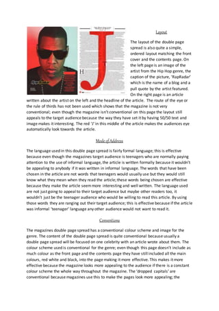
  • 5. Double Page Spread Typography The main fonts on this are Sans Serif; this is interesting because it isn’t conventional for that genre to have that font. The only text on the page that is written in a Serif font is the caption of the image used. The main text of the story in the magazine is using ‘dropped capitals’ at the start of the paragraphs, this is effective because they stand out more to the audience and it seems to break up the paragraphs to make them look more appealing to the reader. The red ‘J’ in this middle is effective because it appeals to the eye making them possibly look at the article and see that they want to read it. Colour The colours on the double page spread are the same colours as the front page and the contents page; this is because this is an effective colour scheme for the genre. Even though the background on the left page is red there isn’t a lot of colour included but they have still made sure on the right page there is still red in it even though the background is white and the writing is conventionally black. The magazine is called ‘Q’ and the logo in red which is effective because it also matches the colour scheme of the genre. On the left page only the left side of the background is red; this is effective because in the bottom right corner the text is in red so they are opposite, if the whole background was red there would be too much red. Image The image used is another celebrity that is included in the Hip Hop genre; this image being there is effective because even though it says ‘Jay-Z’ the audience would be attracted to the image than the writing so if fans of this celebrity see the image they will read the article. The image also gives out a different fashion statement but still appealing the same target audience, the celebrity is wearing a black t-shirt with black sunglasses; this is an effective image because it makes him stand out more because of the glasses and it makes him seem more mischievous. The image used is a mid-shot; this is effective because it shows more of the artist and makes the article seem like it will be more in-depth on the artist.
  • 6. Layout The layout of the double page spread is also quite a simple, ordered layout matching the front cover and the contents page. On the left page is an image of the artist from the Hip Hop genre, the caption of the picture, ‘RapRadar’ which is the name of a blog and a pull quote by the artist featured. On the right page is an article written about the artist on the left and the headline of the article. The route of the eye or the rule of thirds has not been used which shows that the magazine is not very conventional; even though the magazine isn’t conventional on this page the layout still appeals to the target audience because the way they have set it by having 50/50 text and image makes it interesting. The red ‘J’ in this middle of the article makes the audiences eye automatically look towards the article. Mode ofAddress The language used in this double page spread is fairly formal language; this is effective because even though the magazines target audience is teenagers who are normally paying attention to the use of informal language, the article is written formally because it wouldn’t be appealing to anybody if it was written in informal language. The words that have been chosen in the article are not words that teenagers would usually use but they would still know what they mean when they read the article; these words being chosen are effective because they make the article seemmore interesting and well written. The language used are not just going to appeal to their target audience but maybe other readers too, it wouldn’t just be the teenager audience who would be willing to read this article. By using those words they are ranging out their target audience; this is effective because if the article was informal ‘teenager’ language any other audience would not want to read it. Conventions The magazines double page spread has a conventional colour scheme and image for the genre. The content of the double page spread is quite conventional because usually a double page spread will be focused on one celebrity with an article wrote about them. The colour scheme used is conventional for the genre; even though this page doesn’t include as much colour as the front page and the contents page they have still included all the main colours, red white and black, into the page making it more effective. This makes it more effective because the magazine looks more appealing to the audience if there is a constant colour scheme the whole way throughout the magazine. The ‘dropped capitals’ are conventional because magazines use this to make the pages look more appealing; the
  • 7. dropped capitals are effective because they would automatically attract the readers eye and the audience would look at the capital to figure out the rest of the word.