True Spirit - Case Study
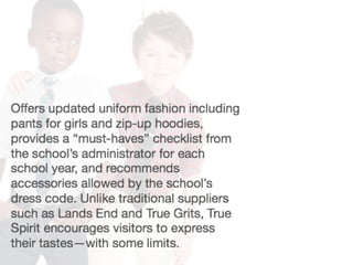
- 3. About the brand fresh modern lighthearted open appealing friendly curated there when you need us but not in your way
- 4. Market Segments Savvy Spender • Income: Upper Mid • Income Producing Assets: Moderate • Age Ranges: 35-54 • Presence of Children: Household with Children • Homeownership: Mostly Owners • Employment Levels: Professional • Education Levels: Graduate Plus • Ethnic Diversity: White, Asian, Mix Source: Nielsen 2013
- 5. Market Segments Pragmatic Purchaser • Income: Upper Mid • Income Producing Assets: Moderate • Age Ranges: 35-54 • Presence of Children: Household with Children • Homeownership: Mostly Owners • Employment Levels: Professional • Education Levels: Graduate Plus • Ethnic Diversity: White, Asian, Mix Source: Nielsen 2013
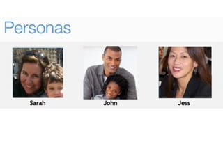
- 8. Sarah New to uniforms Tech Averse Tech Savvy SpendyFrugal Driver Concerns “ I want our family to fit in “ I hope I’m ordering the right thing
- 9. John Experienced Tech Averse Tech Savvy SpendyFrugal Driver Concerns “ I like the efficiency of online shopping “I want to have enough information so that I know I’m buying the right thing. Clothing should be reasonable priced.
- 10. Jess Administrator Tech Averse Tech Savvy SpendyFrugal Driver Concerns “ I want to make sure the parent’s needs are met, alongside admin goals “Giving parent choice in their purchases, while meeting quality and price goals. Making it easy for shepper to find items.
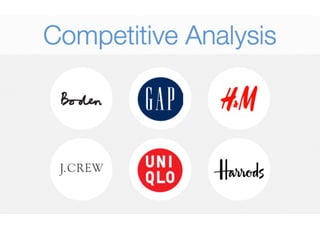
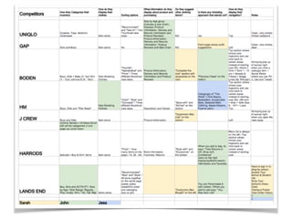
- 13. feature ANALYSIS Competitors How they Categorize their inventory What information do they display about product and purchasing Is there any intresting approach that stands out? UNIQLO Outwear, Tops, Bottoms, Underwear Size by Age group (includes a size chart) ; Product Information, Delivery and Returns Information n/a GAP Girls and Boys Product Information, Delivery and Returns Information, Product Reviews and Size Chart Front page shows outfit suggestions BODEN Boys, Girls > Baby (0 -3yr) Mini (1 - 12yr) Johnnie B (9 - 16yr) Product Information, Delivery and Returns Information and Product Reviews "Previous Views" on the bottom HM Boys, Girls and "This Week" Description and Detials Categrogry of "This Week" ( Kids Basics, Bestsellers, Sustainable Style, Selected Kid's Clothing, Sweet Dreams , Pyjama party) J CREW Boys and Girls Product Information When you add to bag, its says " Free Returns in UK, Shop wiht Conifdence" HARRODS Uniform Section > Endless Scroll with all the categrories in one page you scroll down Icons on the right displaying Brand search, Information and Favorites LANDS END Schools > Boy & Girl> Items More information, Favorites, Returns You can Personlaize it with Letters / When you add to cart says " You May Aslo Like" John Jess SarahFeatures they’d like
- 14. feature ANALYSIS John Jess SarahFeatures they’d like
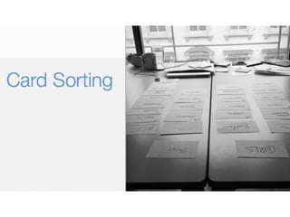
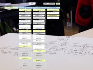
- 15. card SORTING A method used to help design or evaluate the information architecture of a site.
- 17. the design METHOD the client + + = foundation solution the research ux designer
- 19. sketching WIREFRAMES Boys Girls Unisex Sale Tops Bottoms Formal Gym Tops Bottoms Formal Gym Accesories Clothes Tops Bottoms Formal Gym Accesories Clothes Customer Support Contact UsScholarship Programs Free Shippings Free Returns Wishlist Bag (0) $0.00 Find your School Boys Girls Unisex About Search the siteSign In | Register Girls Tops Sort by Filter by Size Color Item Price 300 x 250 Ad (Medium Rectangle) Quick View 300 x 250 Ad (Medium Rectangle) Quick View Item Price Item Price Quick View Item Price 300 x 250 Ad (Medium Rectangle) Quick View 300 x 250 Ad (Medium Rectangle) Quick View Item Price Item Price Quick View Item Price 300 x 250 Ad (Medium Rectangle) Quick View 300 x 250 Ad (Medium Rectangle) Quick View Item Price Item Price Quick View Item Price 300 x 250 Ad (Medium Rectangle) Quick View 300 x 250 Ad (Medium Rectangle) Quick View Item Price Item Price Quick View Test / Iterate

