UI vs UX workshop
- 2. UI / UX Workshop Mobile Track Design
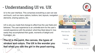
- 3. - Understanding UI vs. UX UI is the user interface. This comprises everything a user can see and touch, such as menu options, buttons, text, layouts, navigation elements, sharing options, etc. UX is why you made that change to affect how the user feels and behaves. The user experience is an umbrella term for the user’s overall experience with the product: what they liked about it, how easily they accomplished their goals, moments of delight and frustration, etc. The UI is the paint, the canvas, the types of strokes and colors. The UX is the wonder you feel when you see the girl in the pearl earring.
- 4. Tools you should learn
- 5. - UX Process
- 7. - Wireframing Who Uses Wireframes? In short, anyone involved in the product – in any capacity.Although designers, developers, and product managers typically create and use wireframes the most in their daily work, many people bene t from wireframes. Graphic Designers use wireframes to push the user interface (UI) development process. It can inspire the designer, resulting in a more uid creative process. And is ultimately used to create graphic mockups, interactive prototypes, and the nal design. Typically, a combination of sketching, storyboarding and wireframing in low or high- delity are used to achieve this. Developers use wireframes to get a more tangible grasp of the site’s functionality. It gives the developer a clear picture of the elements that they will need to code.
- 8. -Wireframing Why Should Anyone Use Wireframes? Wireframes are visual representations of an interface, used to communicate the following details to get everyone on the same page: ● CStructure – How will the pieces of this site be put together? ● ontent – What will be displayed on the site? ● Informational hierarchy – How is this information organized and displayed? ● Functionality – How will this interface work?
- 9. - UI / UX Mistakes 1. Poor UI/UX Design 2. Implementing too many features 3. Neglecting Target Audience 4. Tiring Tutorials 5. Making Things Difficult 6. White Space Is Missing 7. Sticking To Sign In 8. Trying To Copy Other Apps 9. Redesigning Without Proper Feedback 10. Ignoring Social Media Link 11. Not Informing The Happenings To User 12. Wrong Estimates Of Updates
- 10. - Poor UI/UX Design This is the biggest mistake a designer can commit during the creation stage. UI takes care of the placement of elements in the mobile app which not only affects the performance but also UX. While designing, place yourself in the user’s shoes and then decide about the design interface that will go for the app. A simple and interactive UI helps to engage users better as they can easily navigate across and use all the features.
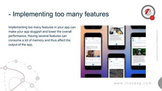
- 11. - Implementing too many features Implementing too many features in your app can make your app sluggish and lower the overall performance. Having several features can consume a lot of memory and thus affect the output of the app.
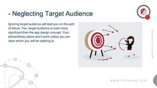
- 12. - Neglecting Target Audience Ignoring target audience will lead you on the path of failure. Yes, target audience is even more significant than the app design concept. Your extraordinary plans won’t work unless you are clear whom you will be catering to.
- 13. - Tiring Tutorials No doubt tutorials are important to guide a person with proper explanation, but most tutorials are a burden than a blessing. They are overloaded with excessive information and it’s just like beating about the bush with the subject.
- 14. - Making Things Difficult For mobile app designing, the KISS rule works very well. Yes, Keep It Short and Simple. Don’t complicate things as it will create confusion which will meddle in the working of the app.
- 15. - White Space Is Missing White space gives a breathing space to the page. Although taken for granted, but it adds a balance to your design and its elements. Don’t get so driven by other elements that you forget to include white space in your design.
- 16. Thank You
Editor's Notes
- https://onepotprojects.com/ux-design-my-workflow-tools-and-resources-dd752776f403#.dcmlur9pd
- https://think360studio.com/15-ui-ux-mistakes-that-can-ruin-your-mobile-app/


